Fine line bicep work is everywhere, and the quiet truth is that small changes in placement and spacing decide what stays crisp and what turns into a blur. The inner bicep moves differently from the outer curve, and fabric rubbing matters more than you think. Read on for soft, wearable bicep ideas and what to ask for so the design still looks clean after years.
1. Single-Stem Rose on the Inner Bicep
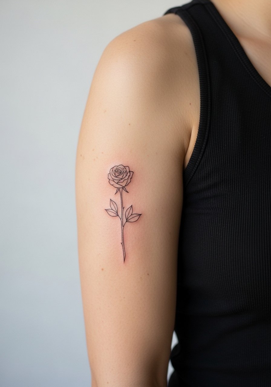
I've seen this version hold up better than tight, heavily shaded roses because it gives the linework breathing room. Ask your artist for slightly increased spacing between petals and a fine but confident needle depth so the thin stems do not blur as they age. Pain is moderate on the inner bicep because the skin is softer and more sensitive. Expect a single-session piece that takes under an hour. A common mistake is wanting micro details packed too close. For outfits, pair this with a racerback tank to show the inner arm when you want to, and wear a loose cotton top to the session so the artist can access the area cleanly.
2. Tiny Script Name Curving with the Muscle
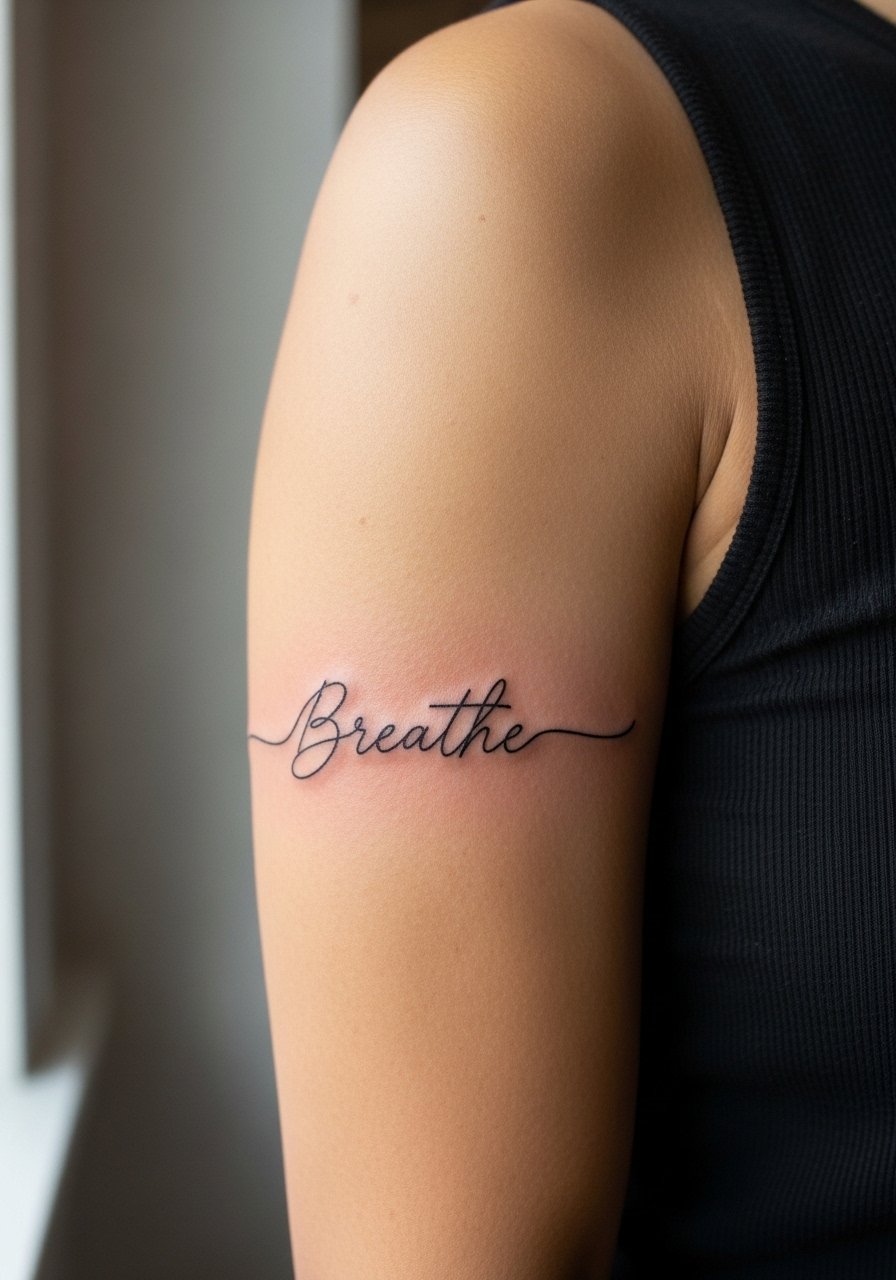
Fair warning, lettering that follows the bicep curve needs even spacing and planned letter height. When the script is too small, the letters merge over time. In consultation, show the exact font size and ask for a mock stencil while standing with your arm relaxed. Session time is short, usually thirty minutes. This style suits someone who wants discrete personal text but not a block of script. For showing it off, light tees with rolled sleeves frame the curve without crowding the lettering. Avoid putting long phrases here because the muscle movement causes irregular stretching.
3. Delicate Vine Cluster Wrapping the Outer Bicep

Most vine clusters age well if you let the stems breathe and limit tiny leaf veins. I recommend asking for dot work shading instead of dense gray wash. The session feels like light, repeated strokes rather than heavy buzzing. This is a good pick for someone who wants a soft, feminine look without bold saturation. A common mistake is over-layering leaves which feels pretty fresh but blurs after a few years. Pair the piece with a linen sleeveless top when you want the tattoo to read as part of an outfit.
4. Tiny Crescent and Stars Cluster Near the Shoulder
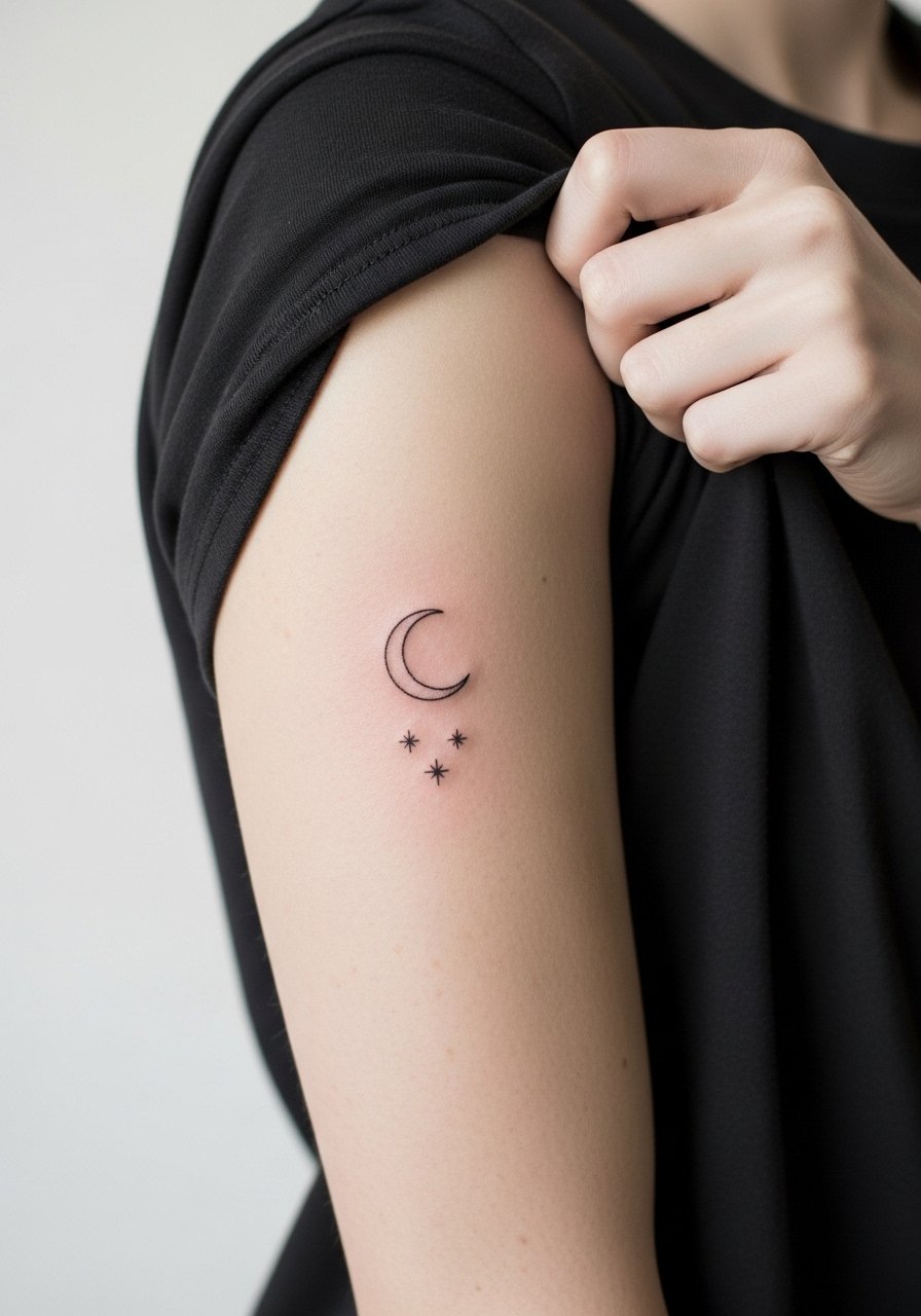
There is something quiet about a small celestial cluster resting high on the bicep. The main mistake I see is putting the moon too close to the shoulder seam where shirts constantly rub. Ask for the placement a finger width below the seam. Pain is low near the outer shoulder but can climb if the tattoo gets closer to the armpit. This piece takes under forty-five minutes and usually needs a touch-up around year two if the lines are ultra-fine. For nights out, a wide-neck blouse shows the upper bicep without shifting the fabric.
5. Micro-Realism Floral Sprig on the Inner Bicep
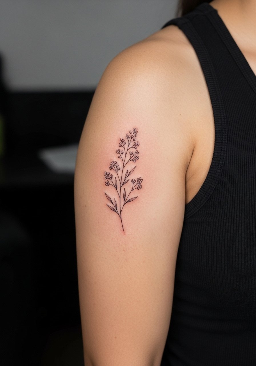
When you want depth without bold color, micro-realism is a great choice for the inner bicep if the artist scales the detail appropriately. Tell the artist during consultation you want the shading as dots and soft washes, not dense tones that can flatten with movement. This placement is more sensitive, so expect a slightly sharper sensation during the session. Overworking the skin to force contrast is the biggest error. For appointment day, wear a loose cotton tank that you can lift without trapping your arm under fabric.
6. Single Line Continuity Band Around the Mid Bicep
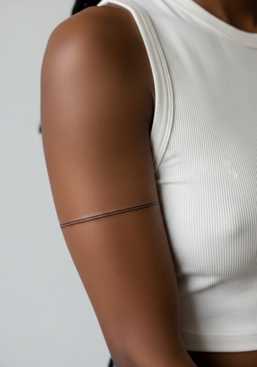
The continuity band reads modern and gentle when the line is placed on the flatter part of the bicep. The main controversy here is about line thinness. One camp says ultra-fine bands look elegant for a year and then blur. The other camp argues that skilled line depth and spacing keep the band crisp. Ask your artist how they balance line weight for longevity. Sessions are quick, often under thirty minutes. A common mistake is putting the band where muscle bulges, which makes the line look uneven when you flex. Pair this with a sleeveless knit top to let the band read without distraction.
Studio Day Picks
The inner and outer bicep pieces above have different prep needs, so pack items that make the session and first week smoother.
-
Stencil transfer paper kit. Lets you test exact placement on skin, especially useful for script and curve-following designs in the first six ideas.
-
Topical numbing cream. Applied per the product directions about forty-five minutes before can ease sensitivity on the inner bicep without changing how the artist works.
-
Thin protective film roll. Helps protect lower bicep and band pieces from shirt friction during the initial healing window.
-
Fragrance-free gentle body wash. Cleans the healing area without irritating delicate linework that tiny scripts depend on.
-
Aquaphor healing ointment. A thin layer for the first few days keeps moisture locked in and supports fine line settling without clogging.
7. Tiny Geometric Arrow Riding the Muscle Line
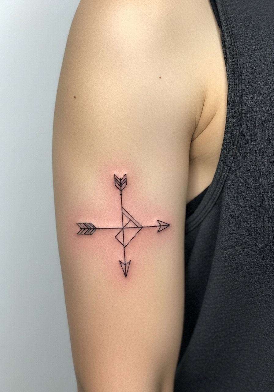
When done to follow the muscle, an arrow can feel tailored to the arm. The visual impact lead is clear here because the arrow reads directional from across the room. Ask for a stronger primary spine line and slightly reduced secondary details so the motif holds at one year. The session is short. A common mistake is requesting a tiny, intricate geometric pattern that ends up merging after healing. For everyday outfits, a short-sleeve button shirt with a rolled sleeve frames the arrow without covering the mid-bicep.
8. Petite Sunburst with Dot Work Halo
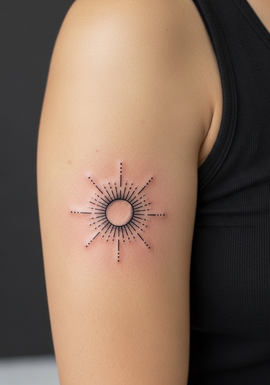
Aging leads matter with stipple shading because dots can soften into a wash if placed too densely. I advise asking for a spaced halo so the sunburst remains legible at two years. The pain is mild on the outer bicep. This design pairs well with layered bracelets if placed lower on the arm. For showing it off, a cropped tee or sleeveless dress keeps attention on the motif without fabric rubbing.
9. Mini Botanical Wreath Hugging the Inner Bicep
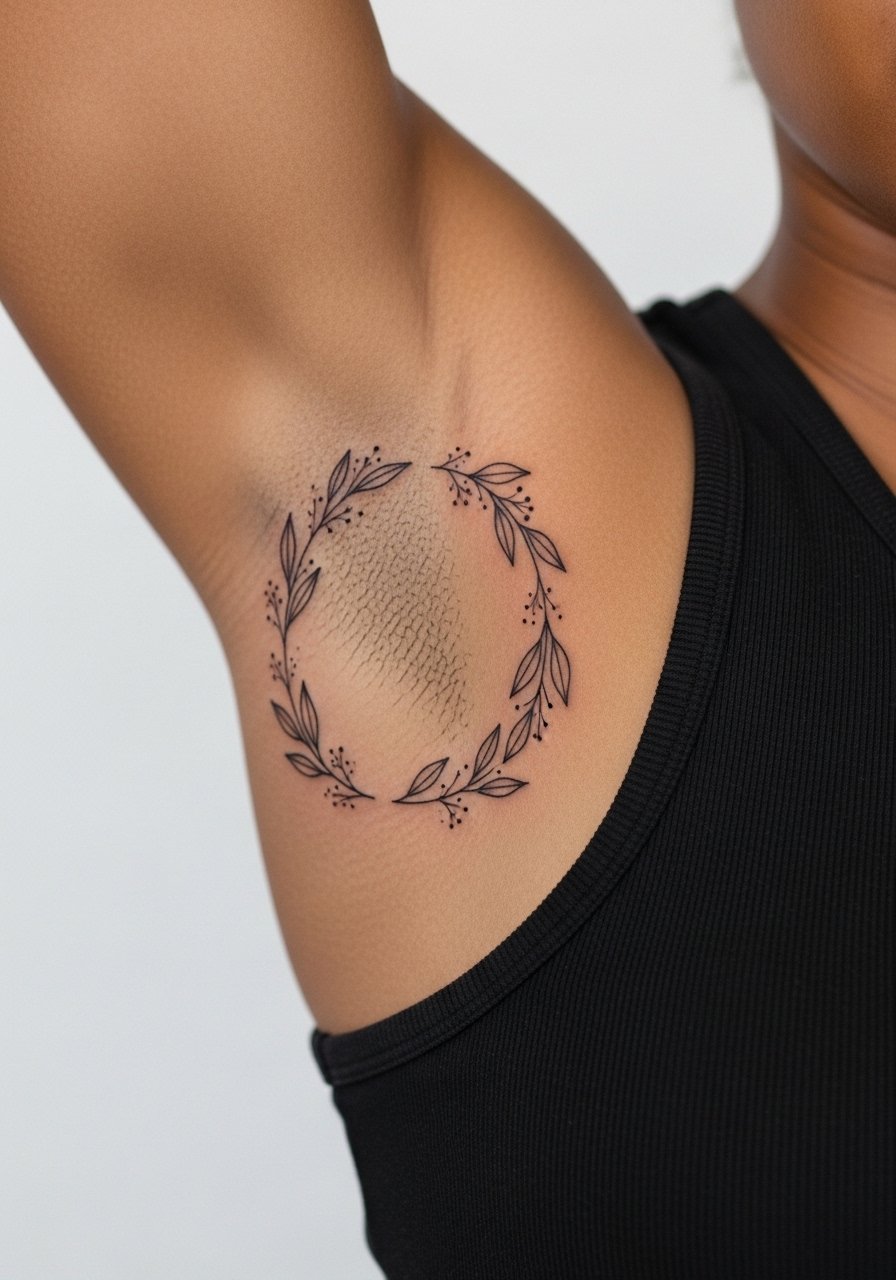
Most people choose a wreath for symmetry, but the inner bicep stretches with each arm movement. The biggest mistake is asking for identical leaf detail all the way around. Ask your artist to keep the lower arc slightly looser to avoid compression when the arm rests. Expect moderate sensitivity and a session around forty-five minutes. This is a soft, intimate piece that looks nice with sleeveless layering. Try a lightweight cardigan for evenings when you want the inner arm to peek without full exposure.
10. Single Dot and Tiny Line Pair
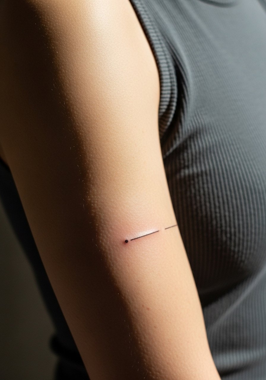
The power of tiny negative space is real here. Visual simplicity can be deceptive because placement decides legibility. For longevity, keep the dot slightly larger than what looks perfect on screen. The session is brief and the sensation mild. A common error is making the dot so small it disappears into skin texture over time. For styling, stacked slim bracelets can highlight a lower bicep dot without competing with the minimal design. Try a thin chain bracelet.
11. Fine Line Constellation Following Arm Contour
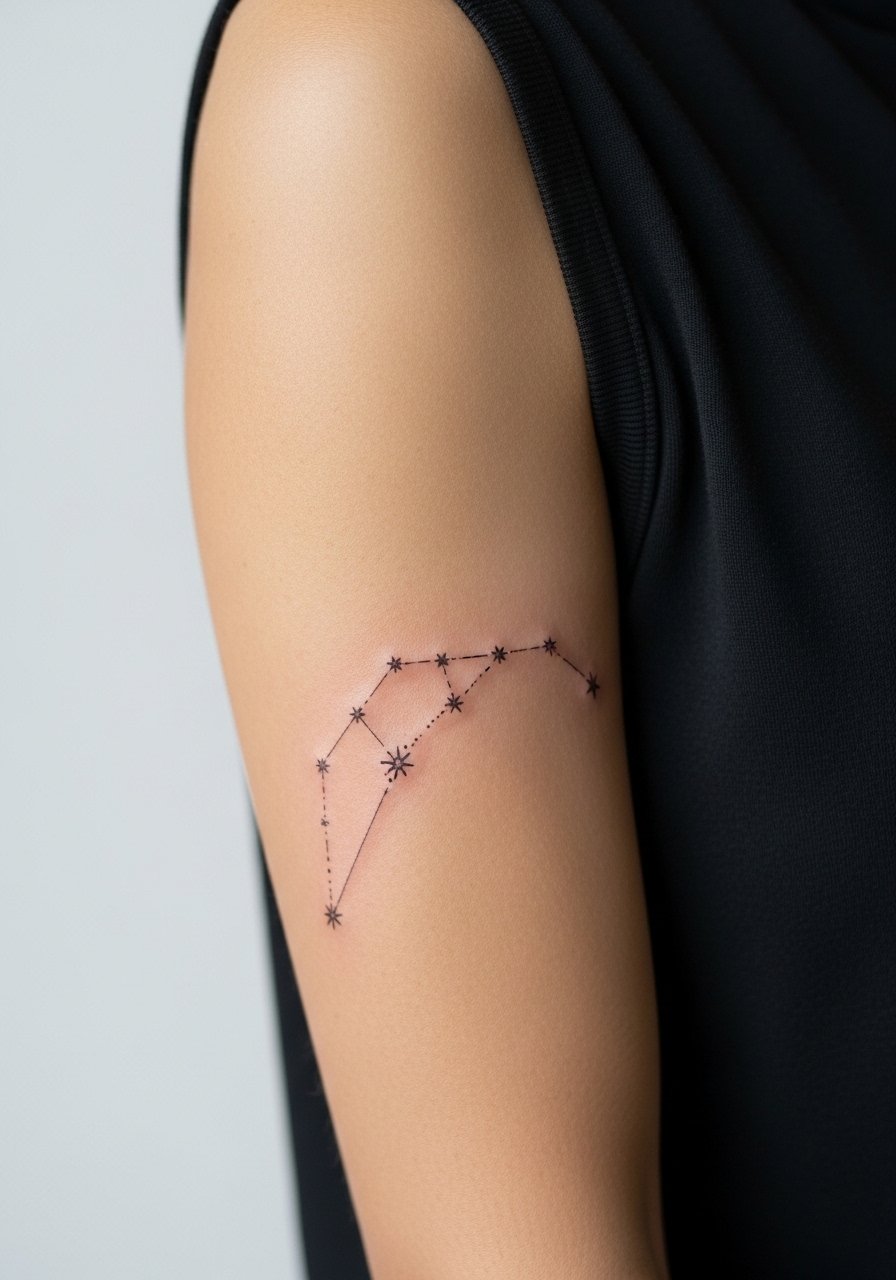
When constellations follow the arm contour they read as part of the body. Tell your artist you want slightly bolder star points than the connecting lines so the composition keeps dimension at six months. Sessions are layered but not long. The error I see most is packing too many tiny stars close together. For showing this one off, cuffed sleeves or a short-sleeve linen shirt make the pattern visible without crowding it.
12. Tiny Anchor with Negative Space
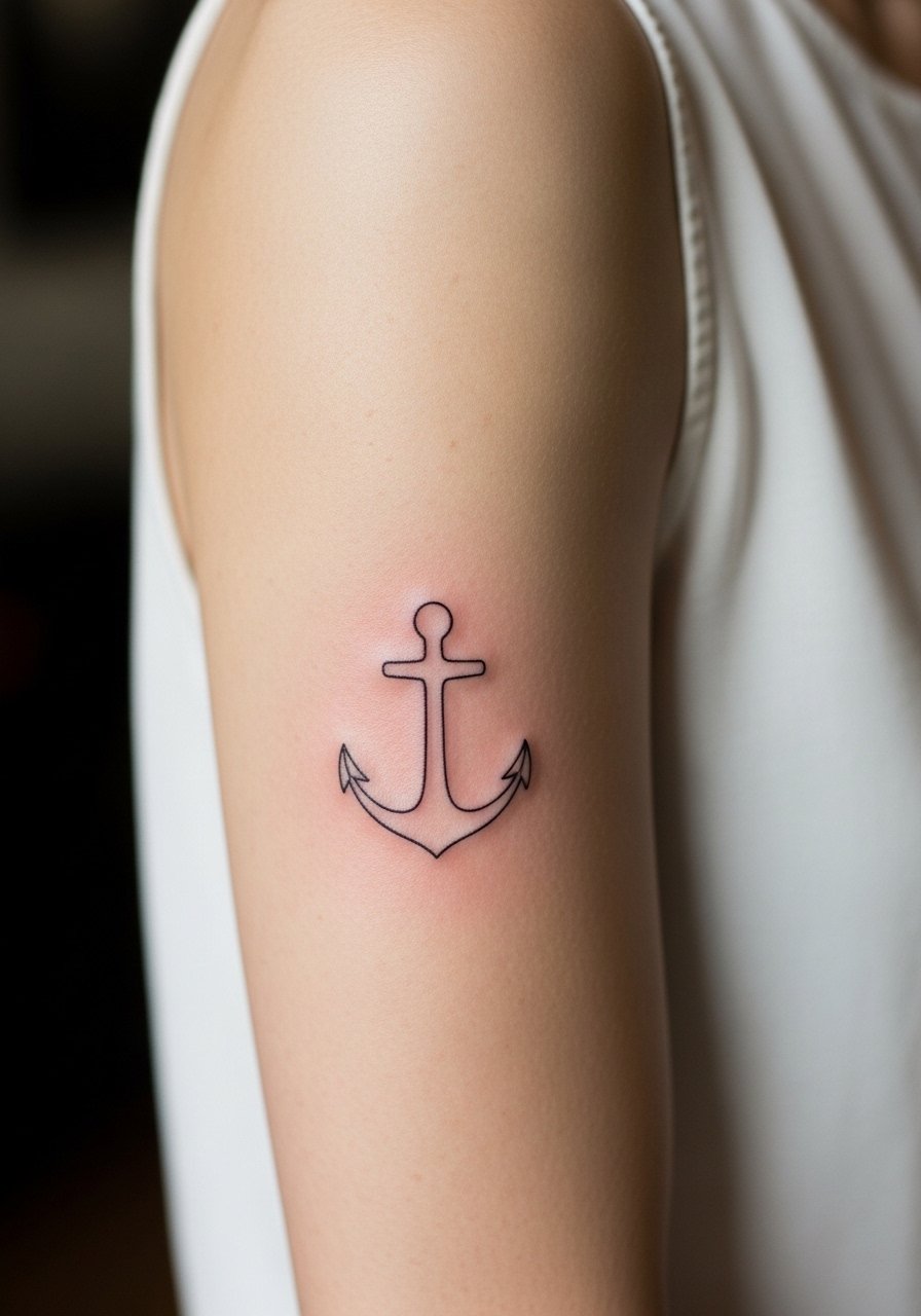
A negative space anchor reads crisp when the surrounding ink is kept thin. The visual trick is leaving skin uninked for the anchor shape instead of drawing the anchor itself. Discuss negative space intent during the stencil phase so margins are clear. This placement heals predictably and is a good choice for someone who wants a nautical nod without heavy saturation. For the session, wear a top that exposes the bicep easily. A lightweight tank dress works well for post-session mobility.
13. Thin Olive Branch Along the Muscle Ridge
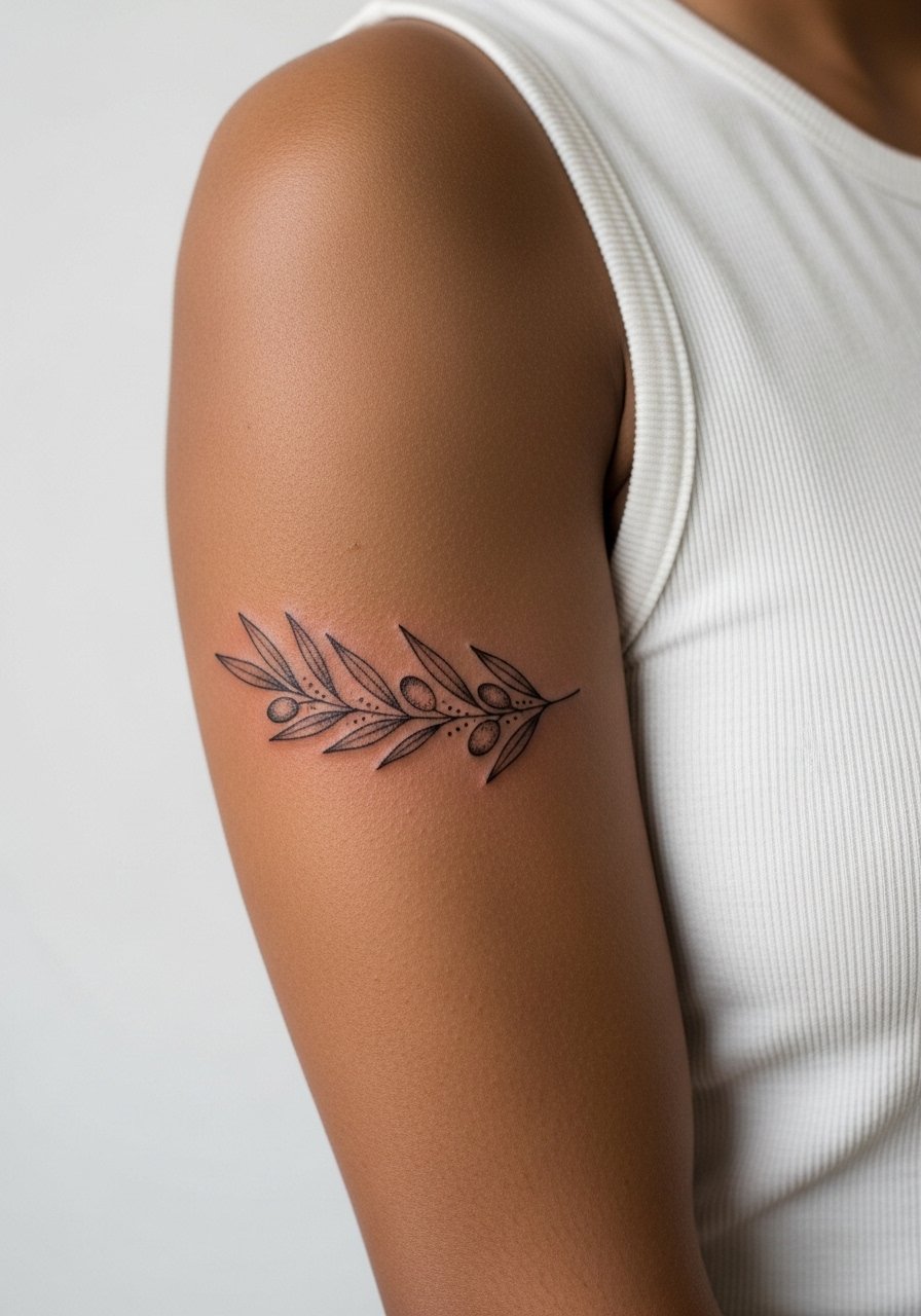
Personal observation: olive branches with spaced leaves keep their identity longer than versions with dense shading. Ask for leaf shapes that are slightly rounded rather than razor thin. The session is comfortable and usually under an hour. A common mistake is insisting on tiny veins in each leaf which tends to merge. Pair this piece with a button-down shirt worn loose so you can lift a sleeve to reveal the branch when you want.
14. Small Heart Outline Tucked Near the Inner Arm
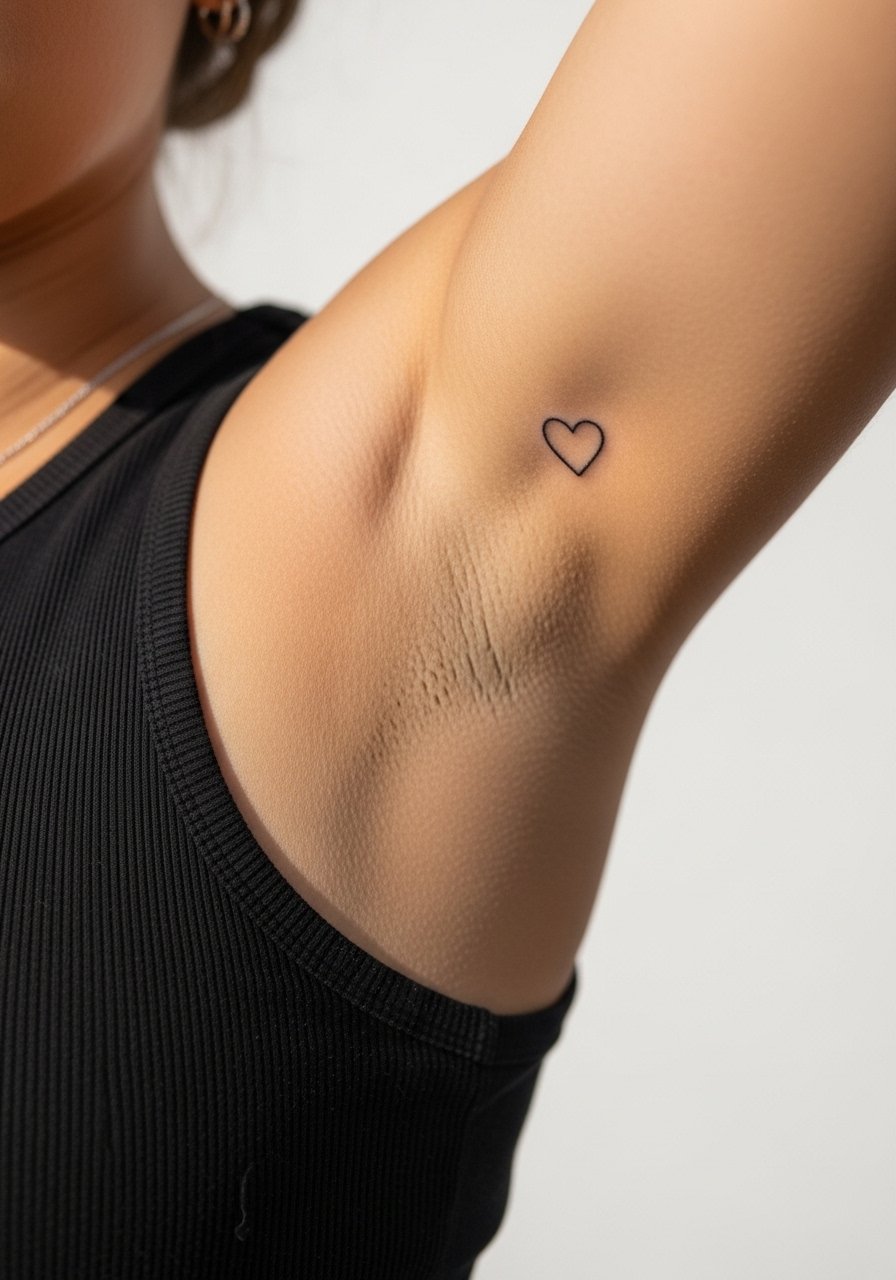
A tucked heart reads like a private sign when it sits just above the arm crease. Pain is more noticeable in this zone because of softer tissue. The biggest mistake is placing it too close to where clothing folds. Ask for a placement test with the stencil both standing and sitting. Expect a quick session. For keeping the piece private or showing it selectively, wear a loose short-sleeve tee you can push up when you want to reveal it.
15. Micro Floral Band That Follows the Bicep Curve
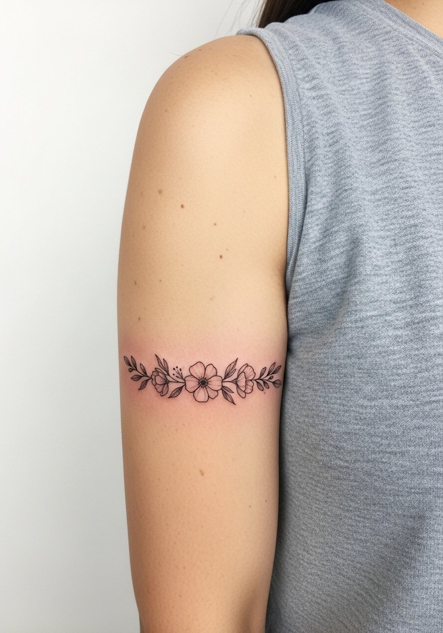
The floral band is decorative without being full sleeve. The aging/healing lead here is simple. Bands that are too dense blur inward at year two. Tell your artist you want negative space between floral clusters so the silhouette stays readable. Sessions can be longer if you want continuous wraps. Mistakes include requesting densely packed blooms that read as a gray band after healing. For evenings, a sleeveless slip dress shows the band elegantly.
16. Tiny Geometric Sun on Upper Outer Bicep
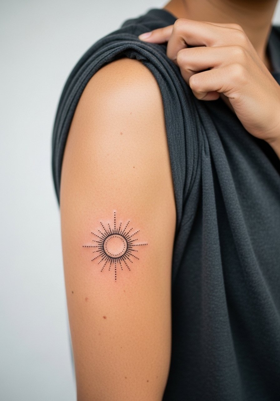
This placement has low friction from clothing and ages predictably. The mistake artists see is taking the geometry too small which causes loss of shape later. Ask for clear spacing and slightly bolder outer rays. Session time is short. For outfit pairing, a wide-neck tee keeps the piece visible without exposing more skin.
17. Minimalist Arrow Cluster Pointing Upward
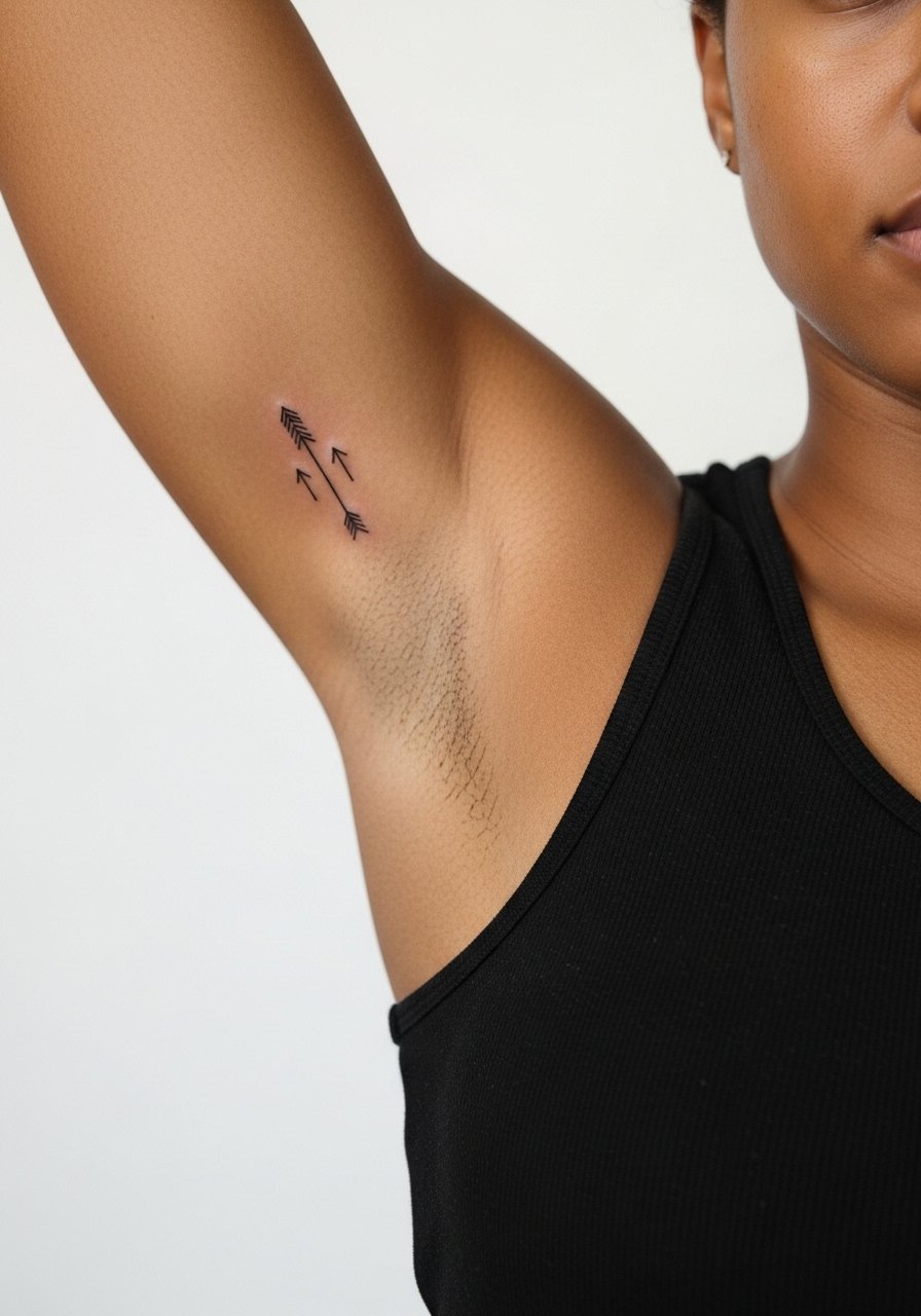
Consultation lead: ask for varied line weights so each arrow keeps its own presence. Inner bicep placement means sensitivity is higher and touch-ups may be needed sooner if the lines are ultra-thin. The session is layered but brief. A common mistake is aligning the arrows too tightly which causes them to visually merge. For showing this cluster, a cropped cardigan or sleeveless top gives a tailored reveal.
18. Petite Wave Motif Along Lower Bicep
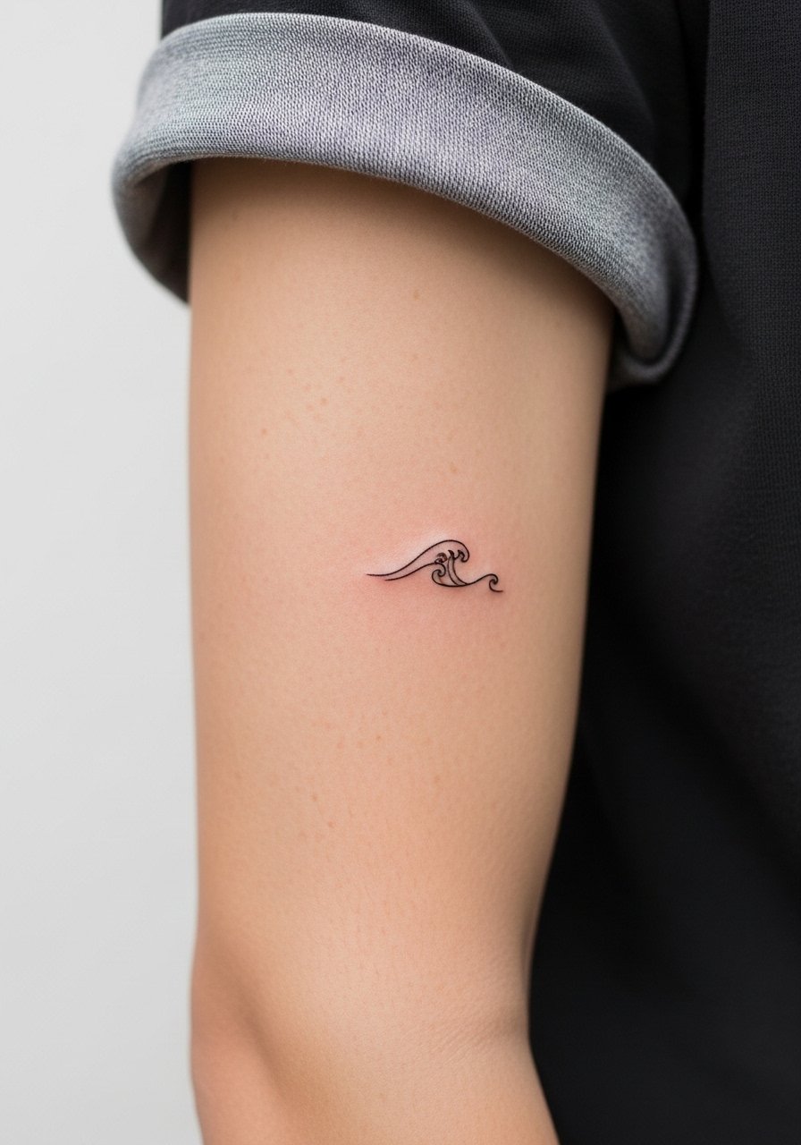
Visual impact lead: a small wave reads dynamic when placed lower on the bicep. The area sees regular movement with bending so keep the motif simple to avoid distortion. Expect a short session and mild discomfort near the elbow crease. A common error is adding too many tiny lines to represent water. For everyday wear, rolled sleeves and a short-sleeve cotton shirt make the motif peek out without catching on fabric.
19. Tiny Keyhole with Subtle Dot Frame
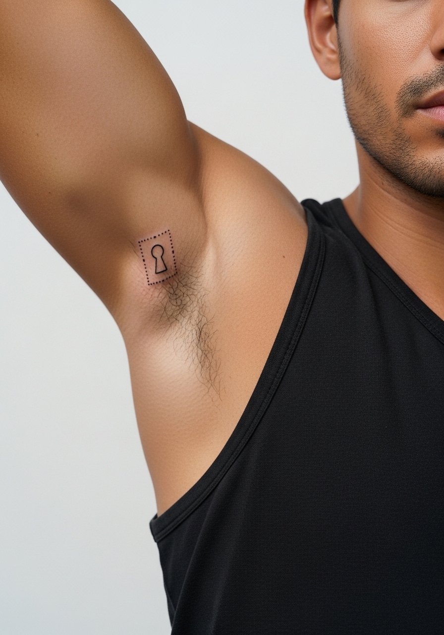
Mistake lead: people often want intricate engravings in a keyhole that cannot hold over time. Ask for a simplified center and a spaced dot frame to keep the motif readable at two and five years. The session is short but sensitive. This design pairs nicely with narrow band rings or a thin chain pendant that sits above the bicep area when you want subtle coordination.
20. Micro Compass with Negative Space North Marker
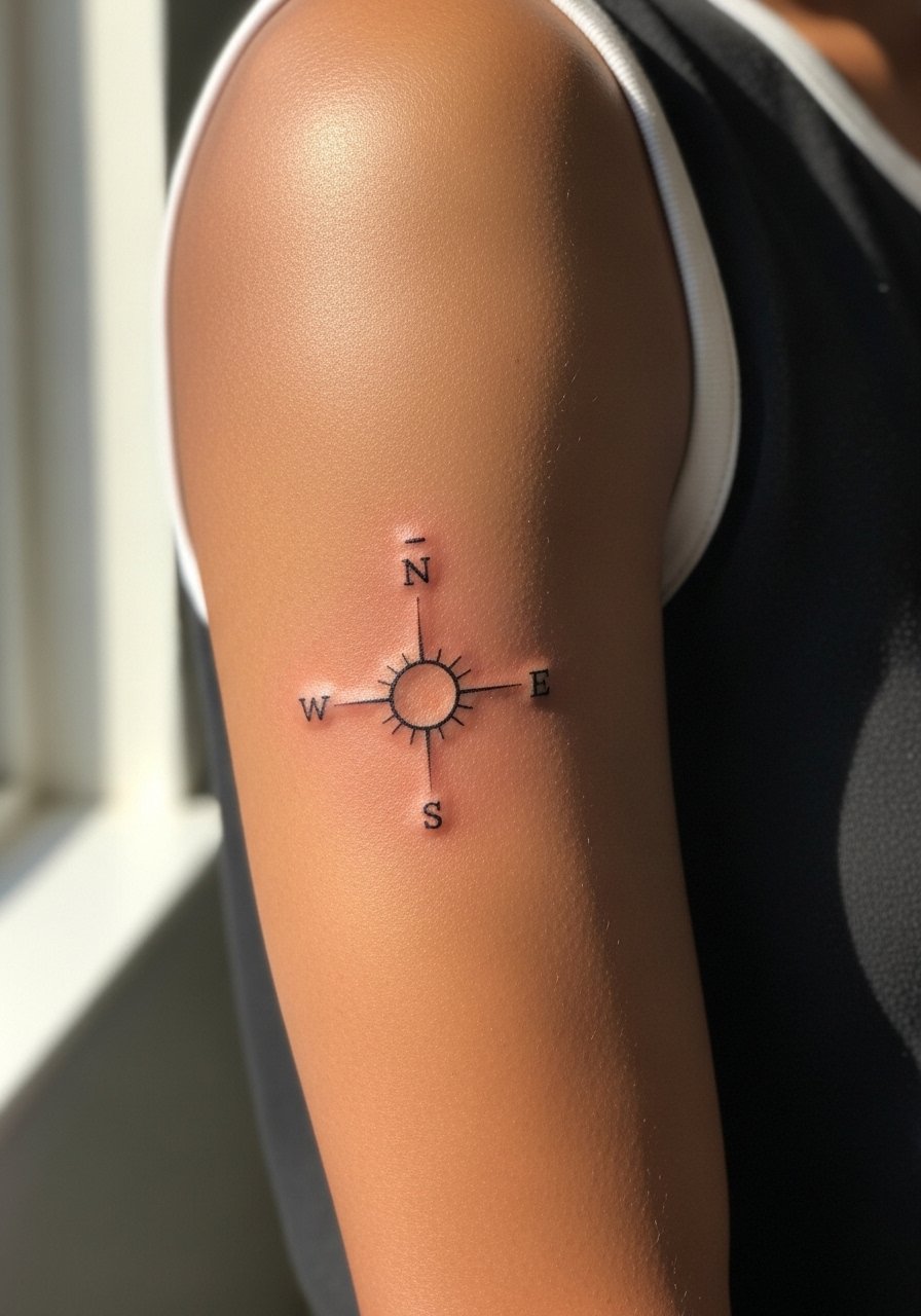
Consultation is key for compasses because orientation matters. Ask the artist to mark the north direction with negative space so the symbol retains clarity. The area heals well but very fine needlework may need touch-up at year three. Avoid heavy gray fill that removes the compass geometry. For travel-ready outfits, a lightweight utility shirt layers well and shows the bicep when sleeves are rolled.
21. Whisper-Thin Script Phrase Along the Inner Curve
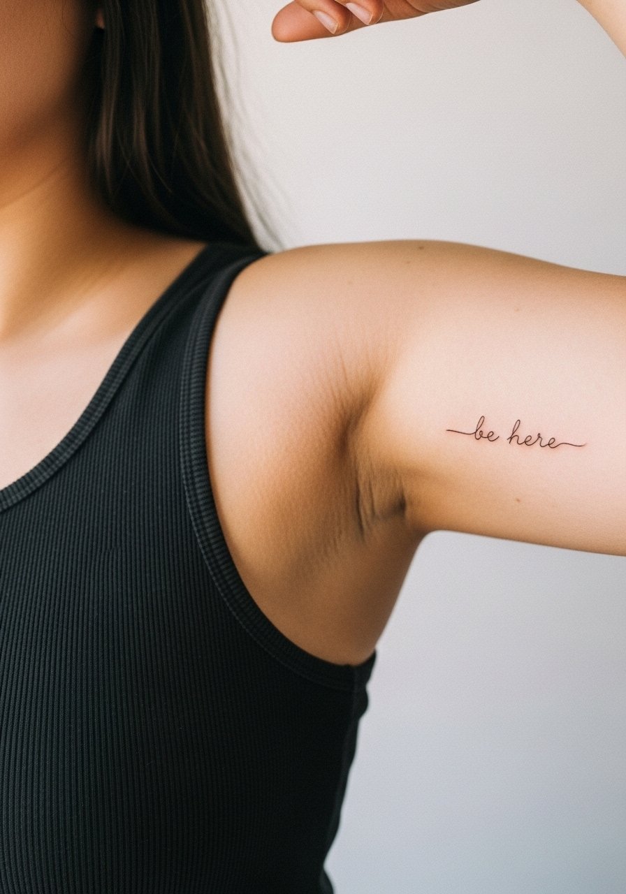
Mistake lead: phrases that use ultra-thin strokes can become unreadable as texture smooths. If you love whisper-thin script, ask for slightly stronger hairlines on downstrokes and a tested stencil while the arm is relaxed. Sensitivity is moderate. Expect a short session and plan for a possible touch-up around year two. For styling, a racerback dress or sleeveless top keeps the inner curve visible without pulling at the skin.
Frequently Asked Questions
Q: Will a fine line inner bicep tattoo blur faster than the same design on the outer bicep?
A: The inner bicep sees more skin stretch and friction from clothing, so fine line work can soften sooner there than on the outer bicep. Ask for slightly increased spacing and a modest line weight during the consultation. Placement testing with a stencil while standing and sitting helps predict how it will move.
Q: How visible will these tiny bicep tattoos be during professional activities that require short sleeves?
A: Small pieces on the mid to upper bicep usually show with short sleeves while tucked inner bicep work stays more private. If career visibility matters, place the design a bit higher or lower based on how your favorite shirts sit. A short-sleeve button shirt is a simple wardrobe test for visibility.
Q: Do dainty bicep scripts need different touch-up timelines than tiny botanical pieces?
A: Scripts often require touch-ups sooner because tight curves and thin counters can merge. Botanicals with spaced leaves tend to keep shape longer. Real timelines depend on sun exposure and skin type, but plan for a touch-up conversation at year two if your lines are ultra-fine.
Q: Is there a controversy about fine line on moving areas like the bicep that I should know?
A: Yes. One camp warns that fine line on moving areas blurs quickly because of constant stretch. The other camp says careful spacing and proper needle depth can make it last. The practical step is to discuss both views with your artist and review healed photos of similar placements in their portfolio.
Q: What should I wear to a bicep appointment to give the artist the best access?
A: Wear a loose tank top or a sleeveless button-down so the artist has clean access and your arm is not trapped under fabric. For work and travel, bring a light cardigan to wear home that will not rub the fresh piece.