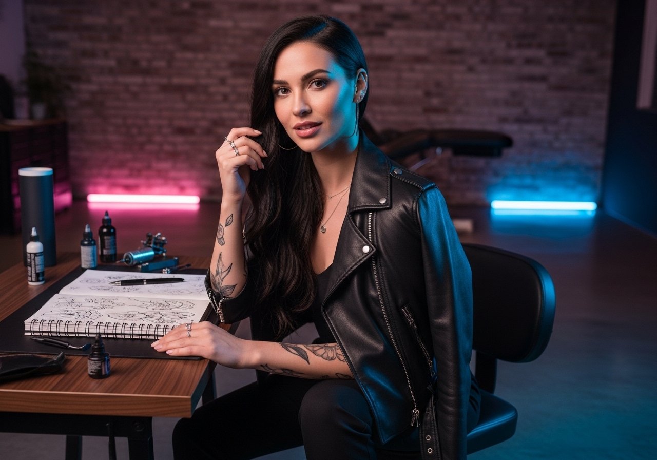
The fine line script everyone saves on their phone looks fragile when you first see it in the chair. Fresh ink reads crisp under studio light, and the questions start in that moment about size, placement, and whether it will still read clearly in two years. Pick a design with spacing and placement that matches your skin and lifestyle, and the next sections begin with wrist-first options that favor longevity.
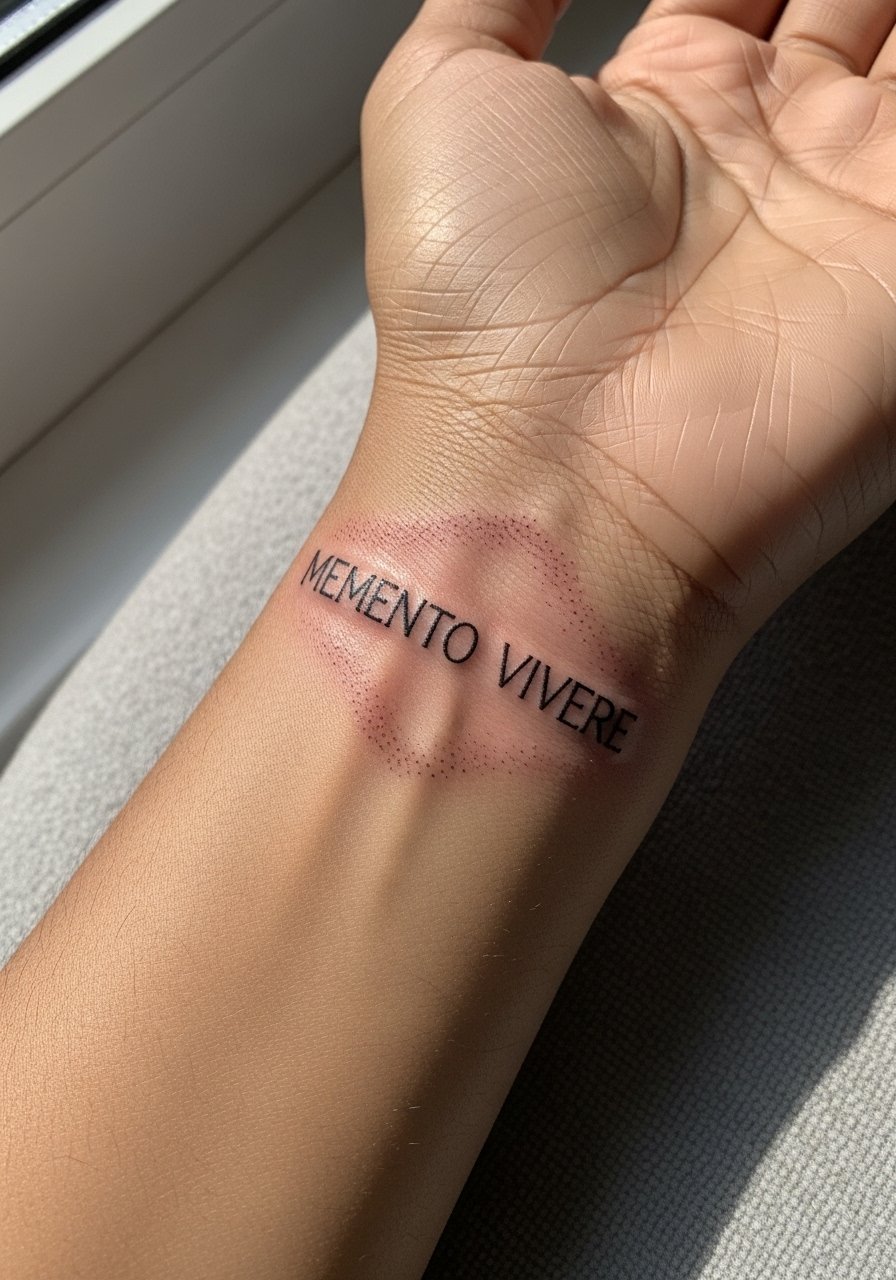
1. Faith Over Fear Cursive Script on the Wrist
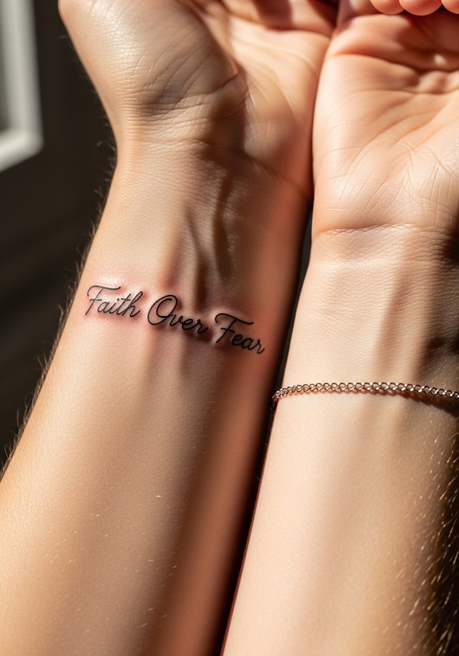
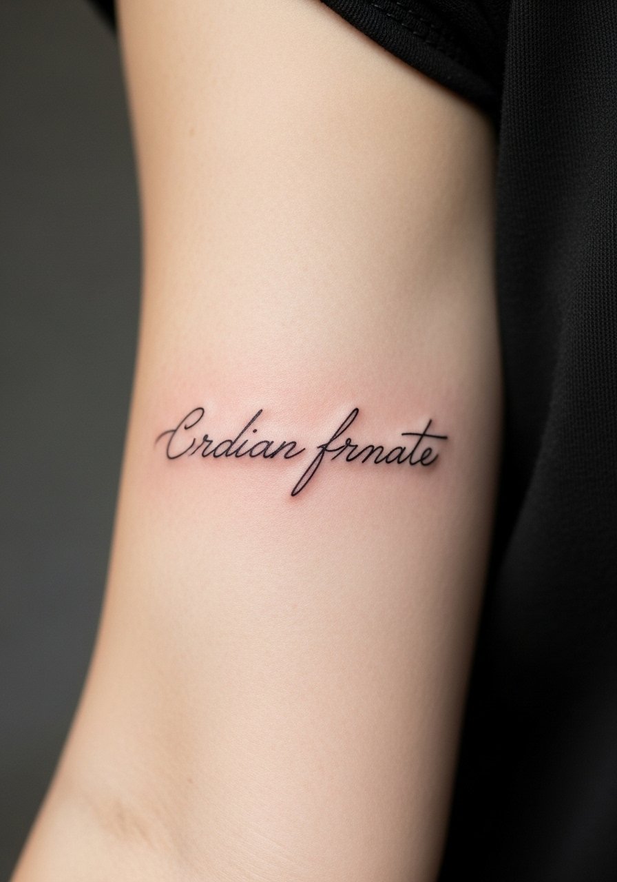
I see a lot of wrist scripts that were drawn too small and tight, and they blur inside a year. For a delicate wrist piece, ask your artist for slightly heavier linework than the reference so the letters keep shape after healing. Expect a short session and moderate pain that peaks where the bone is shallow. A common mistake is requesting ultra-micro script without allowing spacing between letters. This version holds better at six months and still reads at two years with a touch-up at year three. For showing it off, pair with a thin chain bracelet on the opposite wrist so the script stays the focal point.
2. Cross-Accented Script on the Upper Arm
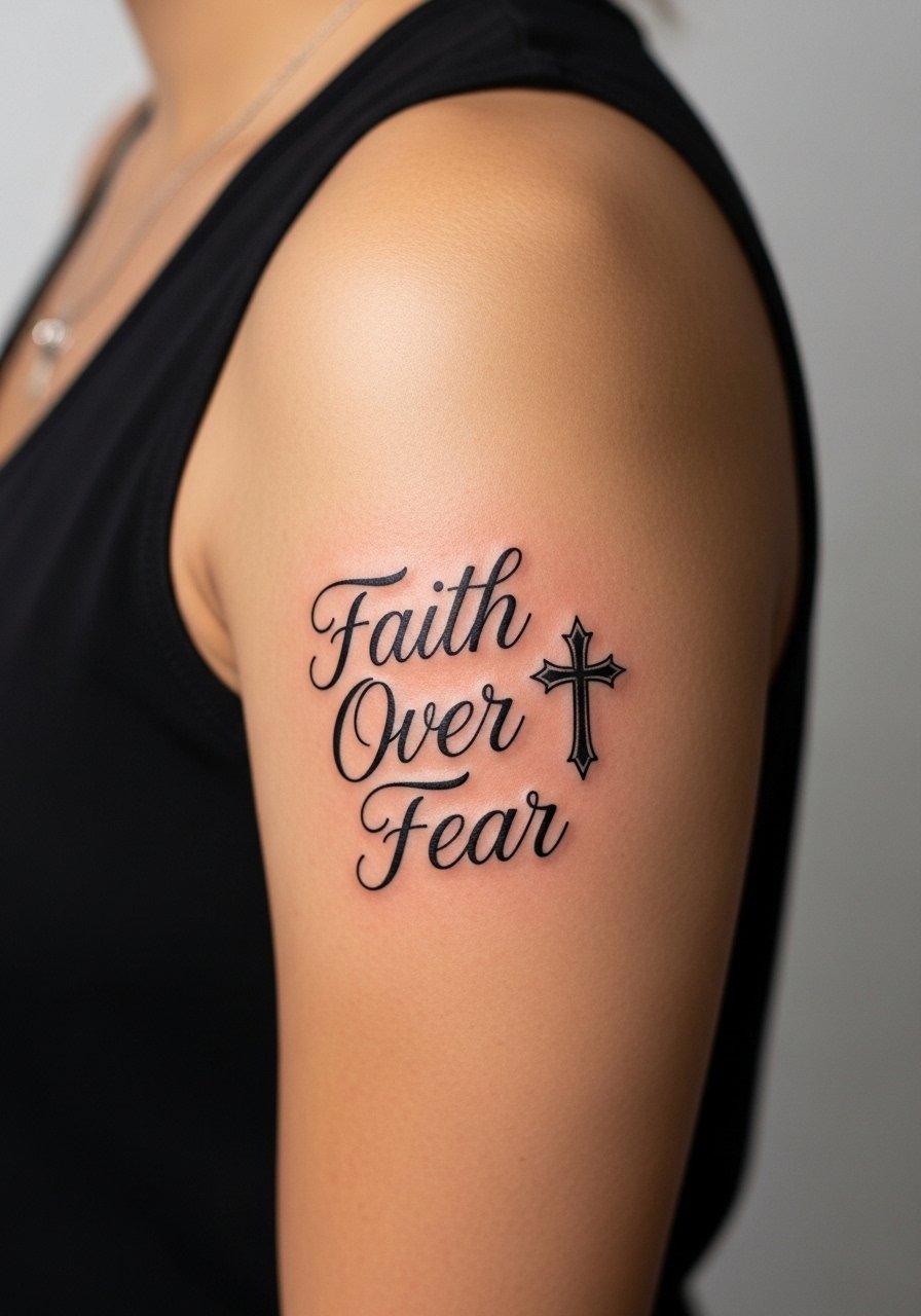
Fair warning: the outer upper arm tolerates bolder work with less fade than wrist scripts. If you want a religious accent, have the artist integrate a compact cross that does not crowd the lettering. Tell them to use clean outlines and moderate saturation for color accents so the cross reads on darker skin tones. The session is low to moderate pain and usually one appointment. A real mistake is asking for tiny colored fills next to thin script, because pigment can spread and dull contrast. For easy show-off, wear a solid black tank top after it heals so the design reads against a plain backdrop.
3. Minimalist Arrow Separating the Words on the Forearm
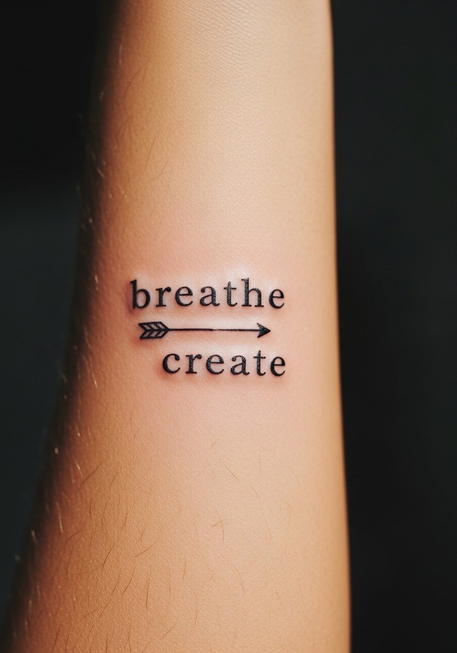
Most minimalist arrows age fine if they have room to breathe on the skin. I recommend a three-inch layout that sits on the inner forearm so the arrow visually divides the phrase without crowding the letters. During consultation, bring a reference showing exact spacing you want between "Faith" and "Fear" because micro adjustments change the whole read. Expect a one-session appointment and low to moderate pain. The common mistake is centering everything too tightly, which causes merging after healing. For session comfort, wear a linen rolled cuff shirt you can roll up easily to expose the inner forearm.
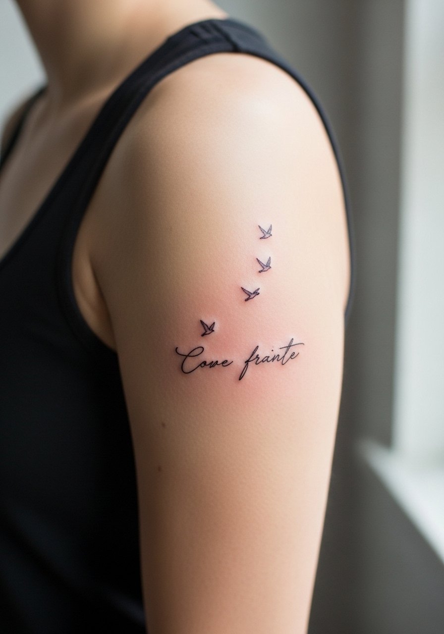
4. Intertwined Script with Birds on the Forearm or Ribcage
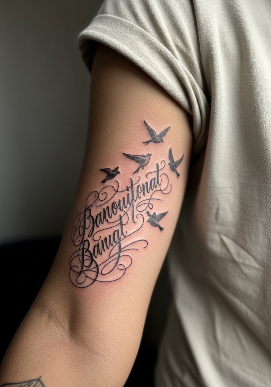
There is something about script that turns cinematic when tiny birds lift away from the letters. Choose the forearm if you want daily visibility, and choose the ribcage if you prefer something more private. For darker skin tones, ask for slightly heavier linework or subtle shading behind the script to keep contrast in photos. A common aging pattern is that super-fine swirls vanish first, so ask for clear open counters in the lettering. The forearm version is lower pain than ribs and usually one session. Pair a forearm piece with a cotton button-down you can roll sleeves on to show the birds without covering the script.
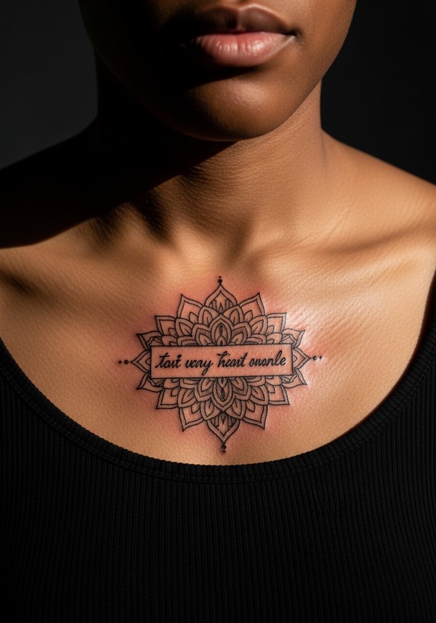
5. Watercolor Phrase on the Collarbone in Soft Washes

Most watercolor pieces start dreamy but lose saturation faster than black ink. If you love color, ask your artist to anchor the phrase in crisp black script with watercolor washes layered around it. That keeps the letters readable as the color softens. The collarbone placement looks great with off-shoulder tops and has moderate pain because the bone is close to skin. The common error is asking for tiny watercolor spots without a sturdy outline. For evenings out, an off-shoulder blouse frames the ornamental frame and keeps attention on the design.
6. Ornamental Frame Around Script on the Collarbone
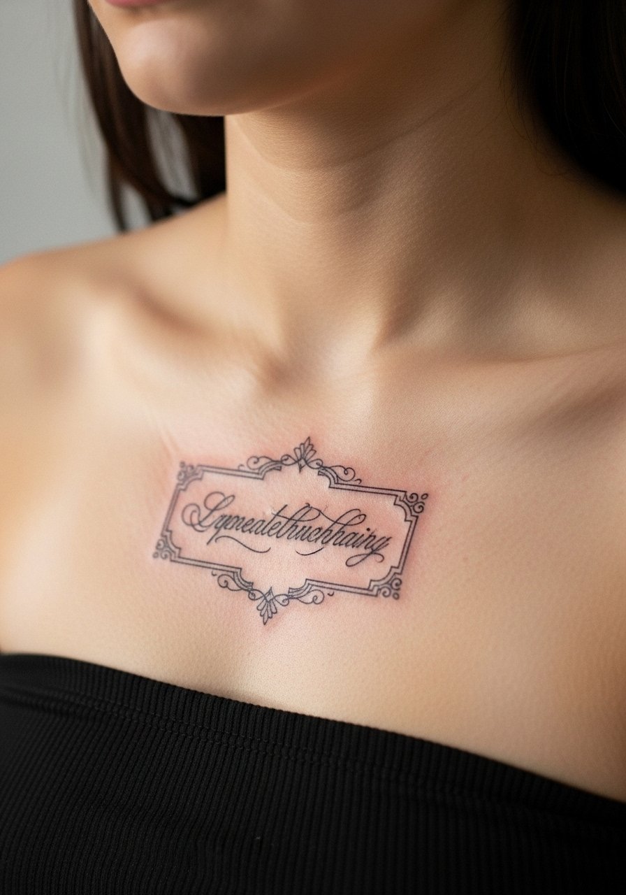
When you want a decorative border, request spacing between the ornamental filigree and the letters so the fine linework does not merge during healing. Most ornamental frames on the collarbone require one session with very precise stenciling. A common mistake is cramming too much filigree into a small area. The collarbone ages well for ornamental framing if the lines have breathing room. For the session, wear a strapless crop top or wide-neck shirt so the artist has clean access without exposing more skin than necessary.
Pre-Session Essentials
Those wrist and collarbone pieces above heal in different ways from larger blackwork. A few targeted items smooth the session and the first week for small delicate scripts and ornamental frames.
-
Tattoo Goo aftercare balm. A thinner, non-greasy option that many people prefer for fine line wrist pieces because it moisturizes without heavy buildup.
-
Indie Balm travel tin. Handy for winter appointments when a breathable balm helps avoid clogged pores on forearm and chest work.
-
Australian tea tree salve. Useful as a spot antiseptic for darker skin tones that can be prone to irritation during first-week healing.
-
Plain unscented lotion CeraVe. A gentle daily option after the first two weeks to maintain healed fine line clarity without additives.
-
Aquaphor healing ointment. A thin layer for the very first days locks in moisture on small script work without smothering the skin.
7. Bold Traditional Script with Flowers on the Hand
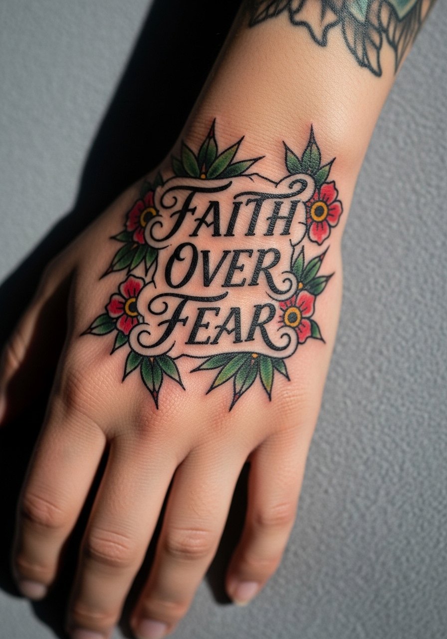
Hand tattoos read strong in photos but face more friction and faster fade because of washing and movement. If you want longevity, choose heavier outlines and saturated fills so the tattoo settles into a readable icon. Artists are split on hand work for fine details. One camp says hands are a high-fade zone and recommend bolder designs only. The other camp will still take on micro details with the understanding touch-ups will be necessary. Be explicit about how often you are willing to touch-up during consultation. Finger and hand pieces also come with career considerations in some workplaces.
8. Micro-Realism Wave Scene on the Inner Bicep
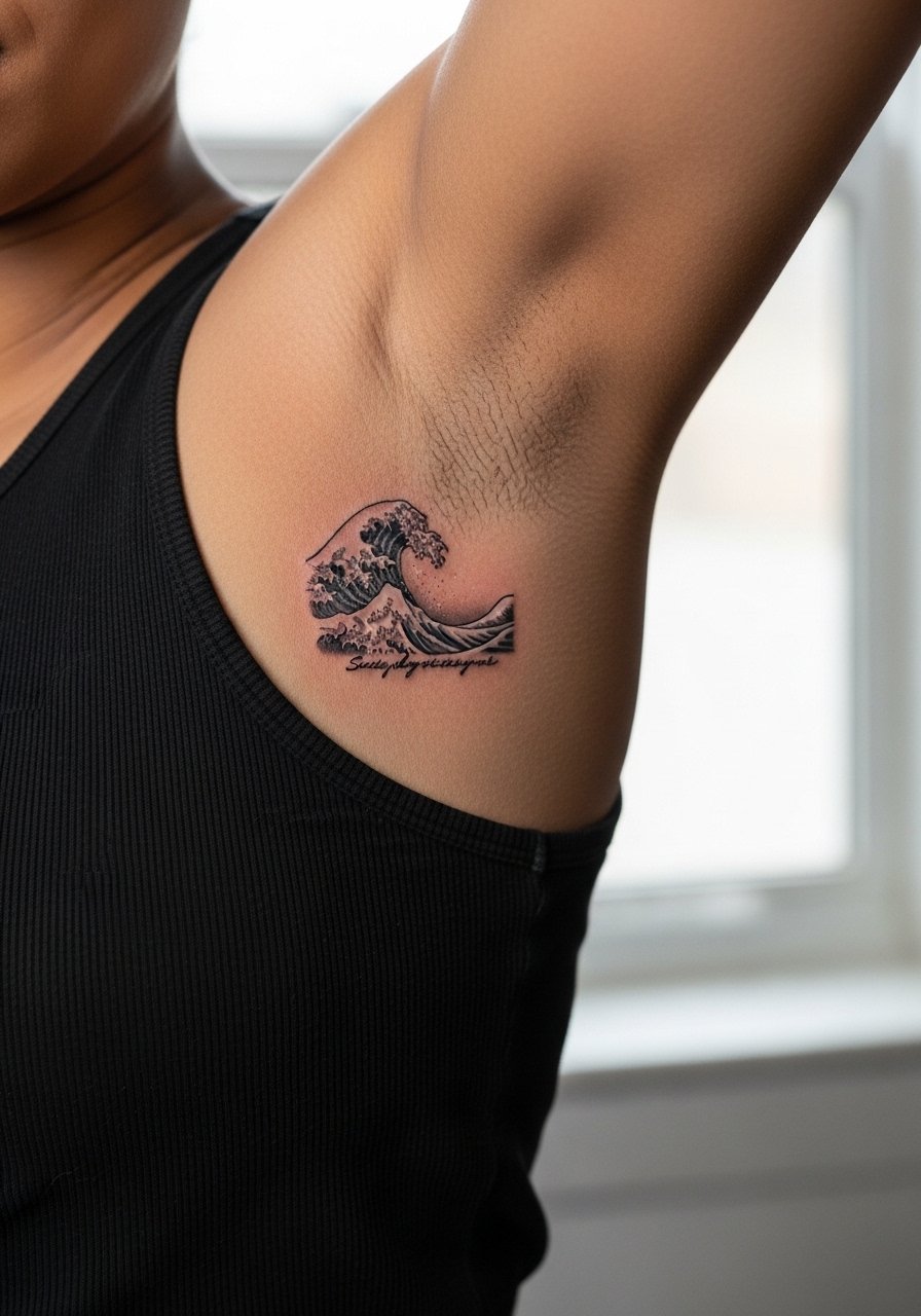
This placement is great for a tiny narrative that reads up close. The inner bicep gives a smooth canvas that holds detail better than the wrist. Expect higher pain as the area is tender and healing requires careful clothing choices. A common mistake is asking for ultra-detailed shading without allowing for size increase. Ask your artist to scale micro realism slightly larger than the photo reference so facial lines and tiny waves keep definition after healing. For the session, wear a tank top you can lift to expose the inner arm without rubbing the fresh ink.
9. Blackwork Outline Phrase on the Thigh

Thigh placement allows for bolder fills and larger lettering that will age slowly. I recommend blackwork outlines for anyone who wants contrast on medium to dark skin tones. The session is low to moderate pain and usually two sessions if you want saturated fills. A common mistake is choosing tiny script for the thigh when the canvas can support more impactful compositions. For summer wear, high-waisted shorts or a slit skirt shows the piece without constant sun exposure. Consider a touch-up at year two to restore saturation if you swim frequently.
10. Ornamental Mandala Frame Designed for Darker Skin
Fair warning: fine filigree can vanish on darker skin if the contrast is not planned. For a mandala frame that pops, ask your artist to increase spacing and use heavier anchor lines in key areas. The session takes precision and patience and may require a multi-step stencil adjustment. One mistake is insisting on ultra-fine concentric rings in a very small area. Ask for reference photos of healed work on similar tones during consultation. The design pairs nicely with off-shoulder blouses that reveal the decorative border without competing patterns.
11. Minimalist Knuckle Arrow for an Interactive Choice
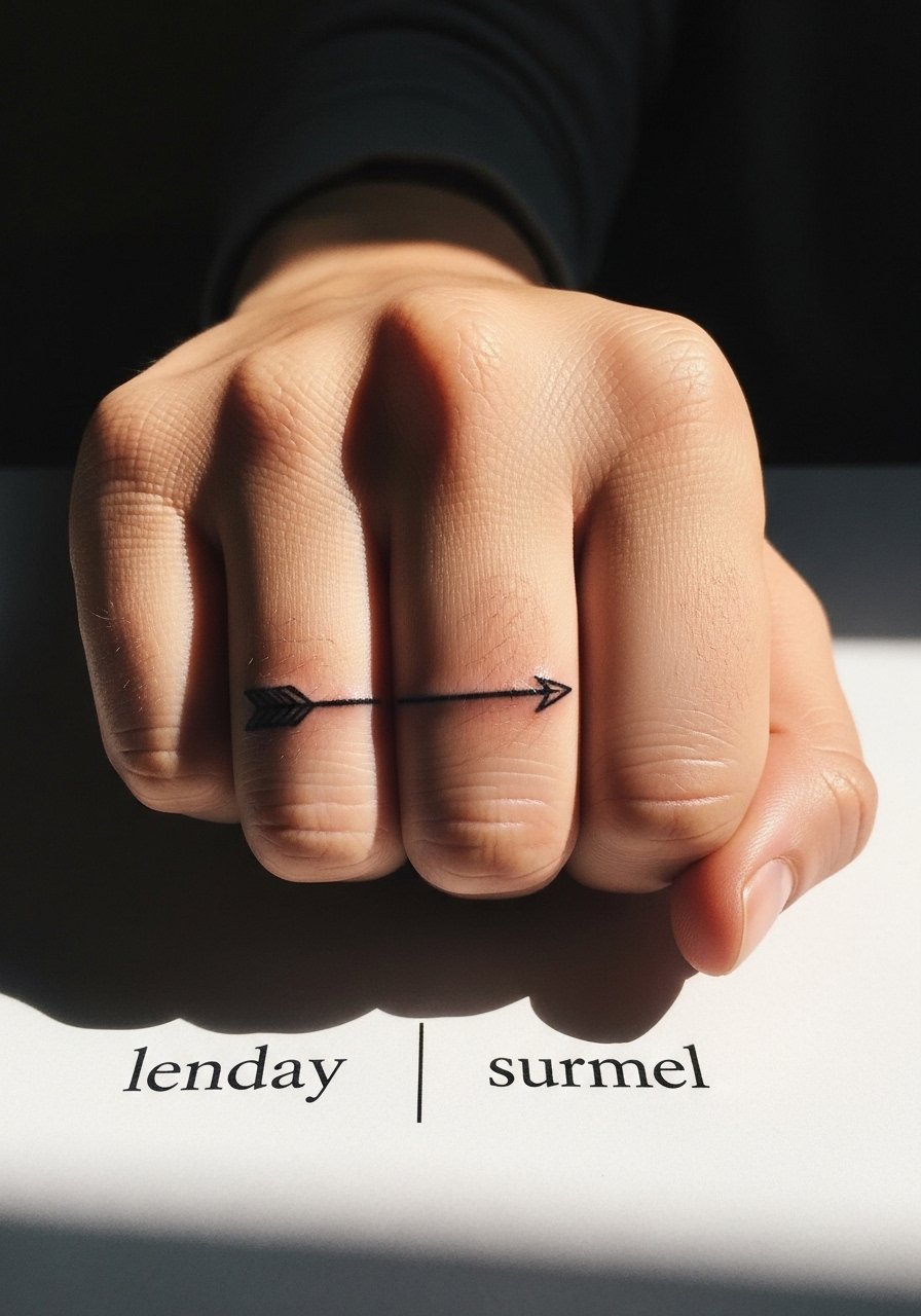
Knuckle work is bold even at micro scale because skin there lives through a lot of abrasion. Expect faster fade and plan on touch-ups within 12 to 18 months. A real mistake is putting delicate script across knuckles, where letters can smear and lose form. For the arrow idea, keep the lines clean and the glyphs simple. Pain is higher around the joints and the session is short. If you want to minimize visible wear, offset the knuckle arrows with a thin stacked ring set on the adjacent finger instead of heavy jewelry.
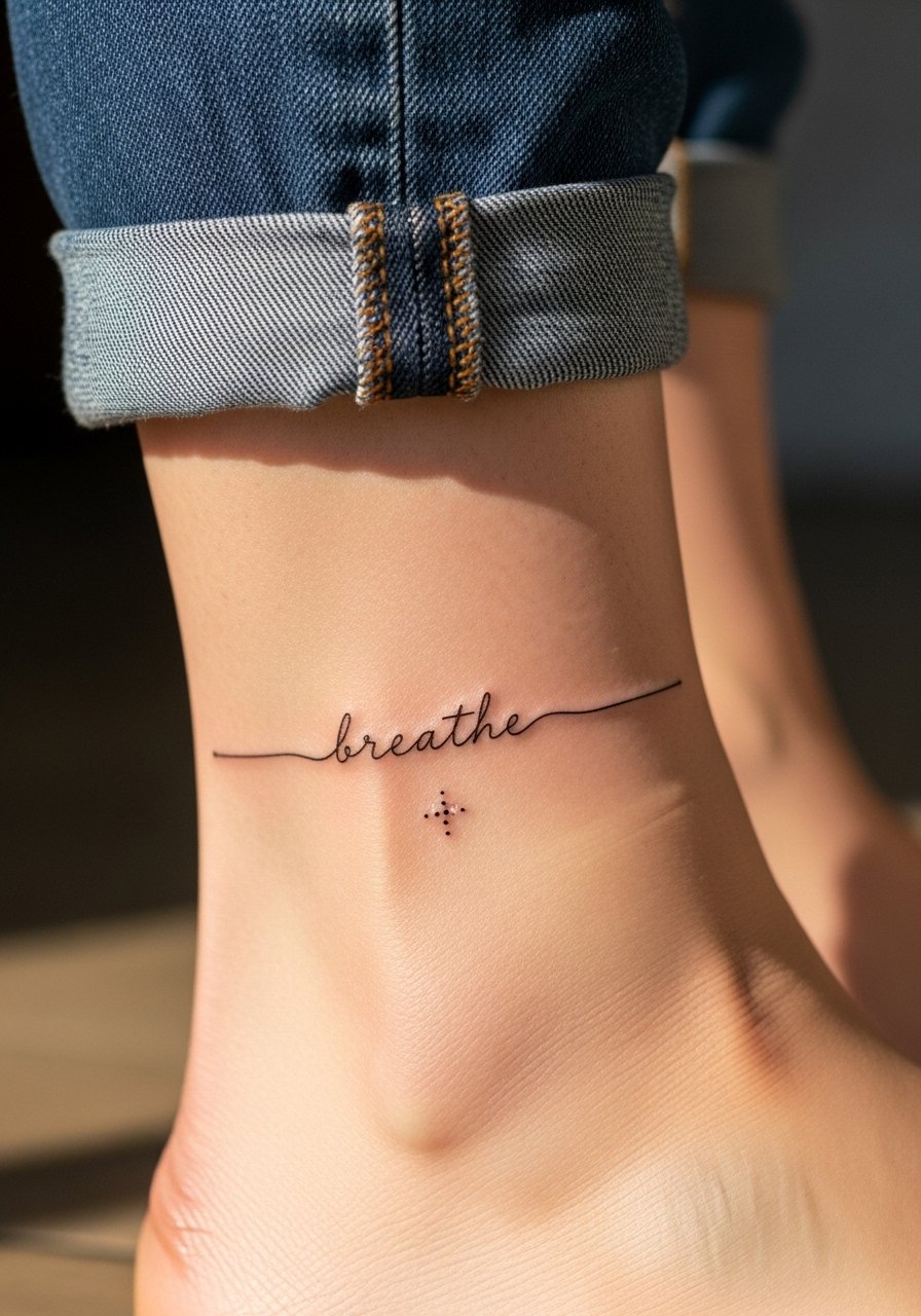
12. Pulse-Line Integrated Wrist Script
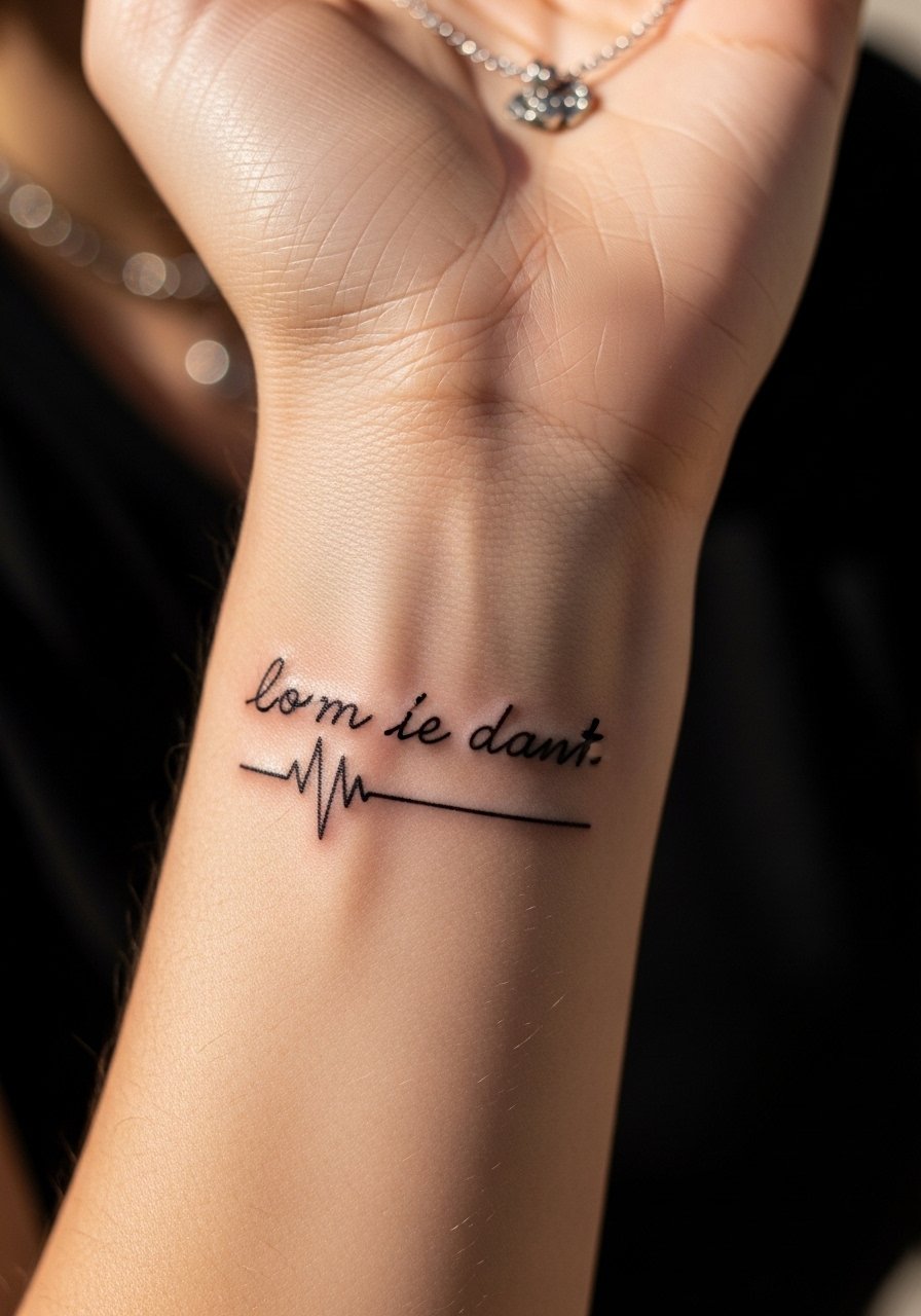
There is a visual rhythm to scripts that include a heartbeat line beneath the letters. Most people choose this when the wrist piece is an anchor. Ask the artist to keep the pulse-line simple and slightly bolder than a micro hairline so it does not vanish. Expect low to moderate pain and a single short appointment. The mistake is making the pulse-line so thin it disappears in six months. Pair this with a thin chain pendant necklace that sits above the wrist and does not compete with the script.
13. Faith Over Fear in Micro-Realism Portrait on the Ribcage

Most micro-realism on ribs looks incredible close up but the area moves a lot, and that motion affects how lines settle. The ribcage is a high-pain zone, so plan for breaks and a longer session. Artists disagree on fine line for ribs, with one camp cautioning that stretching blurs detail and the other saying precise depth and spacing make lines last. Name which side of that debate your artist usually sits on during the consultation. If you want a portrait, scale the face slightly larger than you imagine and expect touch-ups in two to three years.
14. Small Script with Blooming Flowers on the Forearm

This pairing ages well because the flower provides a visual anchor that tolerates softening better than thin swirls. In the consultation, ask the artist to space the petals away from the letters so pigment does not cross into the script. Expect low to moderate pain and usually one to two sessions depending on color. A common error is crowding both elements too tightly, which leads to muddy detail after healing. For show-off wear, roll the sleeves on a loose fit chambray shirt to put the forearm piece on display without patterns stealing focus.
15. Faith Over Fear as a Patchwork Starter for Future Sleeve
Designing a phrase to be the nucleus of future sleeve work changes how you plan the spacing now. Lay out negative space intentionally so the script can be surrounded later by flash or custom pieces. One common mistake is placing the phrase flush against where a larger element will sit, which forces awkward cover-ups. During consultation, mention that this is a patchwork starter and have the artist mock up where future fills might land. Expect a low pain session and a realistic touch-up window at year two if subsequent pieces influence pigment migration.
16. Faith Over Fear Blackwork Outline on the Calf

There is visual impact to large black outlines on the calf that carry well through years of movement. This site is forgiving of saturation and mass, so it is a good pick for those who worry about fine line fading. The session is moderate pain and may need multiple passes for dense fills. A mistake is asking for tiny ornate lettering on the calf where the area could support cleaner, larger glyphs. For beach season, high-waisted shorts or a flowy slit skirt shows off the calf without constant sun exposure.
17. Faith Over Fear in Stipple Shading Around the Wrist
Stipple shading adds texture and can give the phrase dimension without heavy color. I have seen stipple halos maintain detail longer than thin gray washes on active zones like wrists. Ask your artist for a light stipple gradient rather than a dense wash so the dots age into a pleasing softness. Pain and session time are similar to straight script. Avoid overly dense stippling that can merge into a gray patch after healing. Wear minimal wrist jewelry for the first two weeks to prevent rubbing.
18. Tiny Script Around the Ankle with Minimalist Accents
Ankle tattoos experience friction from socks and shoes, so expect slower healing and slightly higher risk of scabbing. The pain is low to moderate for most people and session time is short. For longevity, choose slightly bolder counters in the letters and ask for clean outlines around accents. A common mistake is putting extremely fine cross-hatching in a small ankle piece. For showing it off, roll jeans or wear sandals so the piece peeks out without constant abrasion. Consider coordinating footwear that avoids rubbing the fresh ink.
19. Collarbone Script with Stippled Ornamental Edging
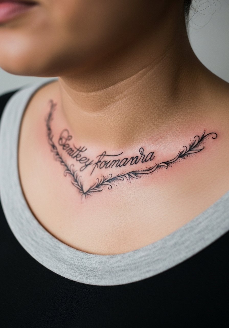
Most collarbone scripts look refined when the lettering has room and the edging is airy. The collarbone is tender, so expect sharp moments of pain during the session. A mistake is adding heavy ornament so close to the bone that the whole area becomes a single dark mass after healing. Ask for breathing room and test a stencil under different lighting so you can confirm placement. For show-off looks, a dainty necklace chain sits just below the text and frames it without competition.
20. Watercolor Phrase on the Thigh with Soft Edges

Watercolor on the thigh can read like a soft painting when healed if pigment placement and saturation are scaled up for skin absorption. Most watercolor fans I know accept that the colors will soften over the first year and may want a color refresh later. The thigh tolerates larger pieces and body changes with less distortion than the upper arm. A common error is expecting neon watercolor to stay vivid without dense layering. For summer visibility, choose high-waisted shorts or skirts that reveal the area without constant sun exposure.
21. Script with Tiny Birds That Scale for a Sleeve
The bird motif gives a phrase motion and scales well into sleeve work. If you plan to build around the phrase, reserve negative space above the birds and to the sides so future pieces can breathe. A common mistake is adding too many small filler elements right away, which limits future composition choices. The session is low to moderate pain and comfortable for multi-pass work. When you expand into a sleeve later, those birds can be anchors for background shading and larger motifs.
Frequently Asked Questions
Q: Will a fine line wrist script blur faster than a blackwork wrist phrase?
A: From what I have seen, fine line scripts tend to soften sooner because the ink sits in thinner channels. Choosing slightly heavier linework and planning a touch-up at year two gives the best balance between delicacy and longevity.
Q: How do I decide between watercolor and blackwork for a collarbone phrase?
A: Watercolor offers a softer, more painterly look but needs careful sun protection and occasional refreshes, while blackwork keeps its contrast longer. Think about how often you will be in the sun and whether you are okay with a color touch-up later.
Q: Are ribs or inner biceps better for micro-realism script?
A: The inner bicep gives a steadier canvas with less stretching than ribs, so detail usually holds better there. Ribs can support fine detail but require size increases and more pain tolerance, and they often need touch-ups after weight changes.
Q: Should I expect different healing for hand tattoos versus thigh tattoos?
A: Yes. Hands face constant washing and friction, which accelerates fade and scab wear. Thigh pieces sit under clothing more but see less abrasion, so they usually hold saturation longer.
Q: Where can I find recent healed examples from artists near me without naming specific studios?
A: Use local tags like #FaithOverFearTattoo and filters on tattoo apps, check TikTok healing duets, and ask in Reddit city threads that recommend fine line portfolios. Those discovery paths show healed timelines and help you find artists who work on similar skin tones.