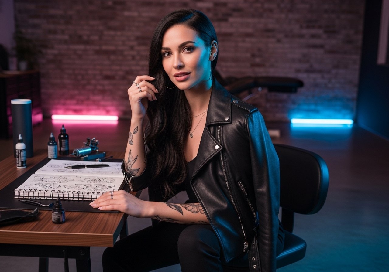
Fine line florals and ornamental bands are dominating saved boards, but what holds up on a curving hip is rarely the same thing that looks best in a flat photo. Placement, line weight, and how the piece sits on the pelvic crest decide whether a tattoo still reads at year three. Read on for 21 hip and pelvic ideas, with the consultation notes and wardrobe tips that help each option age well.
1. Floral vine wrapping the hip bone
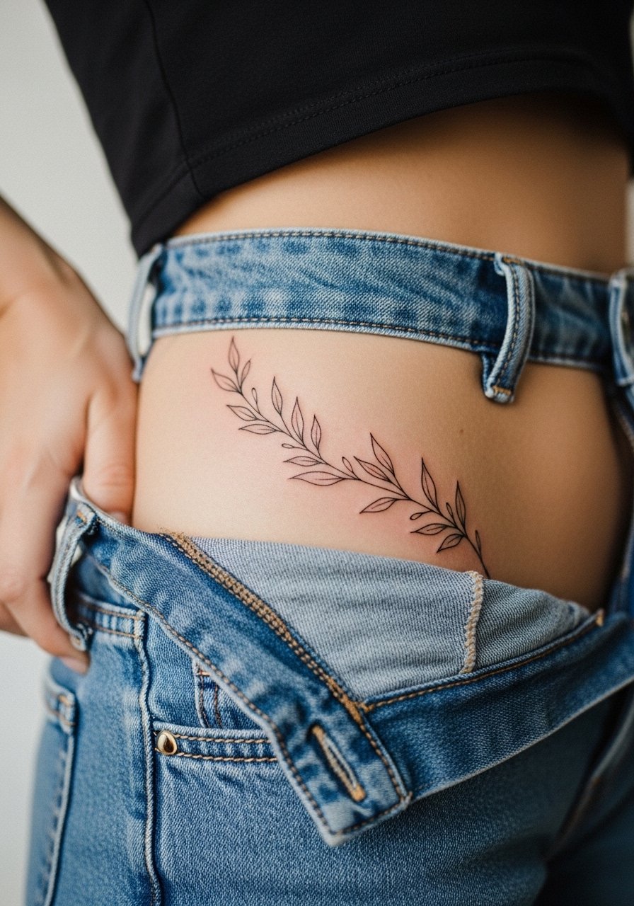
This is the go-to if you want a piece that follows your natural curve without overpowering it. Tell your artist to map the vine on your body in a standing mirror so the flow follows the pelvic bone, not the photo reference. Avoid ultra-fine single hairs for the main stem because very thin lines on the hip can fade into gaps by year two. Expect light discomfort where the needle crosses the bone and less on the fleshier sweep below. For showing it off, pair the piece with high waisted bikini bottoms in neutral tones that frame the vine, and wear loose drawstring linen pants to the session so the artist can drop the waistline easily.
2. Detailed rose dipping toward the thigh
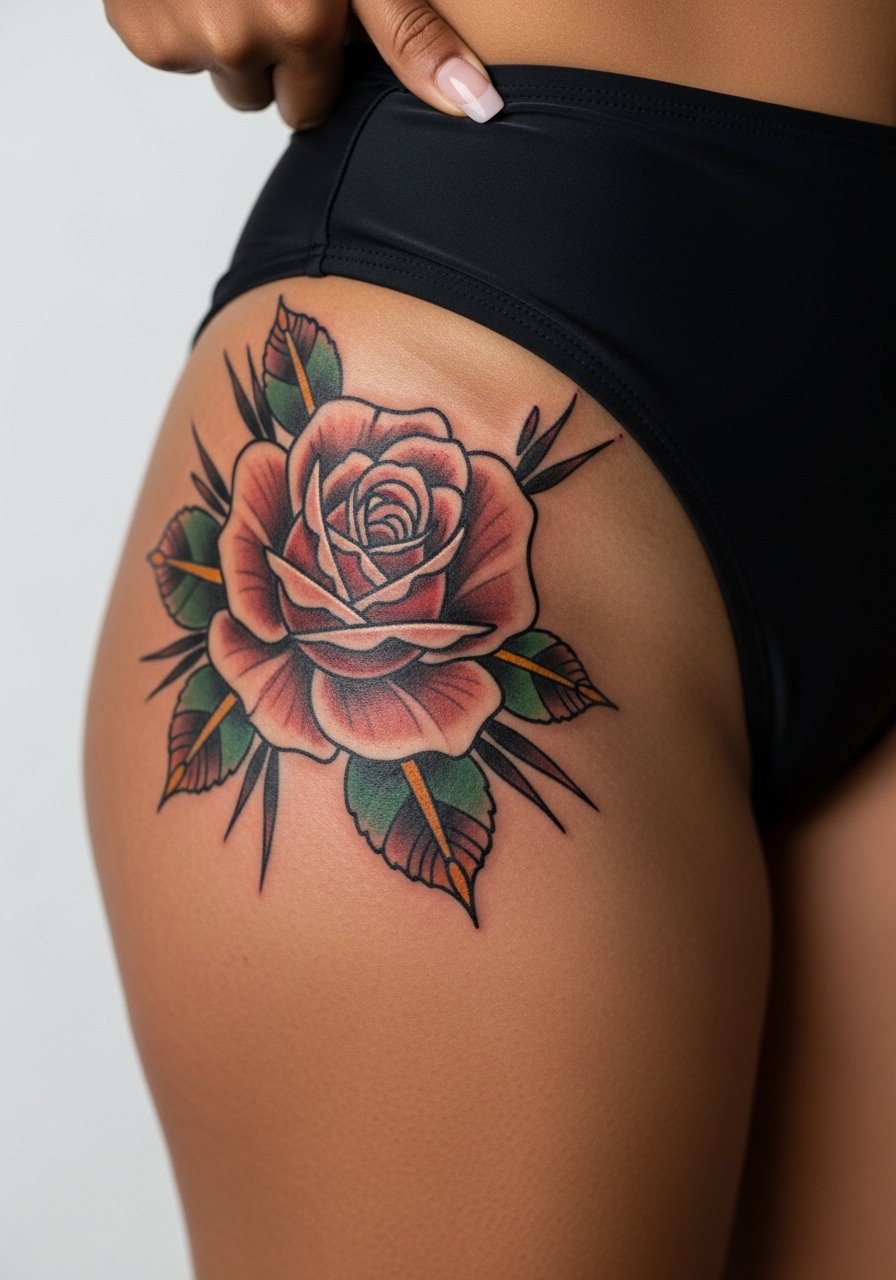
If you want bold petals that still read from a distance, this is the pick. Ask for a slightly thicker outline and saturated shading so the petals keep their shape through weight change and time. The common mistake is compressing the entire bloom into a tiny 2-inch spot. That creates heavy saturation that can blur on the hip dip. Sessions feel firmer when the needle rides the thigh rather than the fatty hip, so plan for two shorter sittings if you want detailed color work. For nights out, a thigh high slit maxi dress shows the bloom without tugging at healing skin.
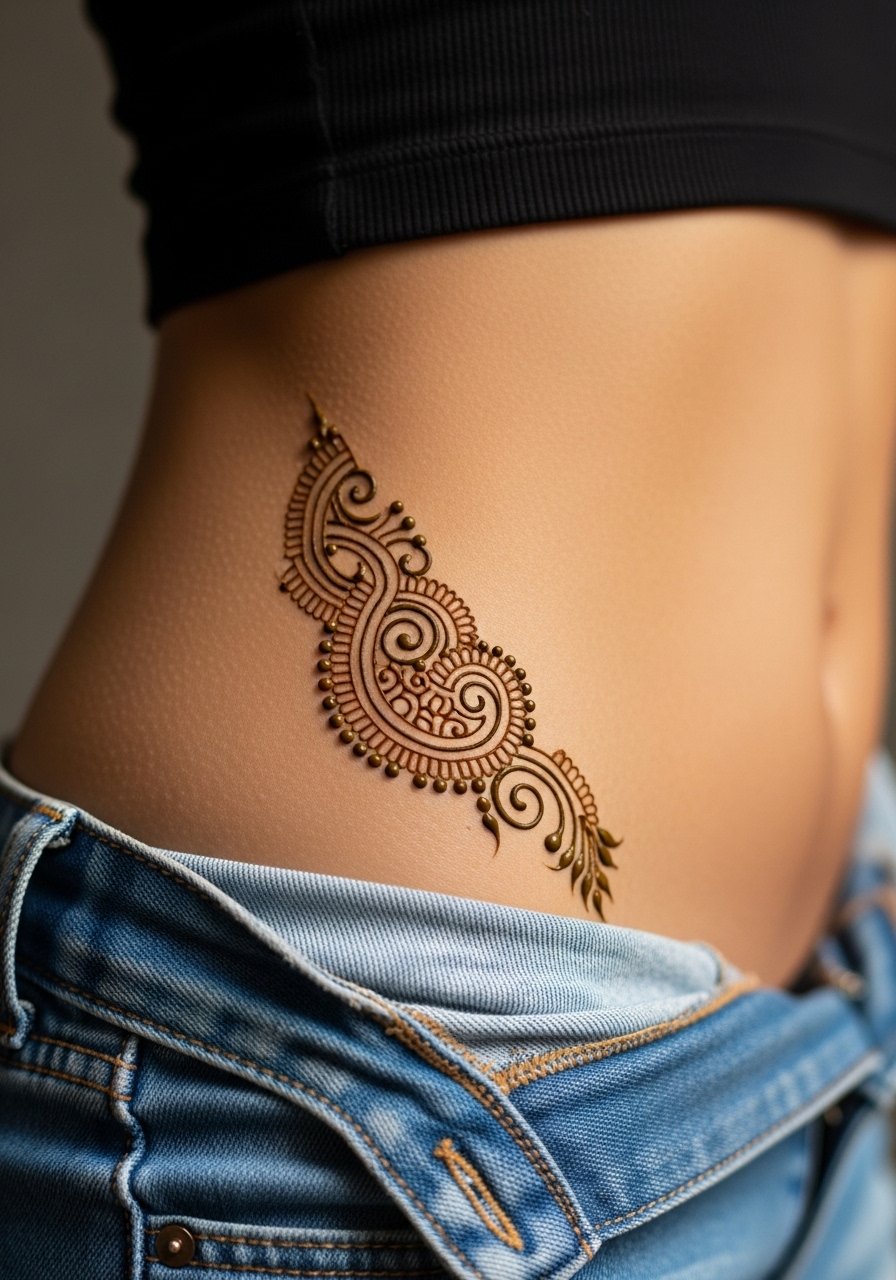
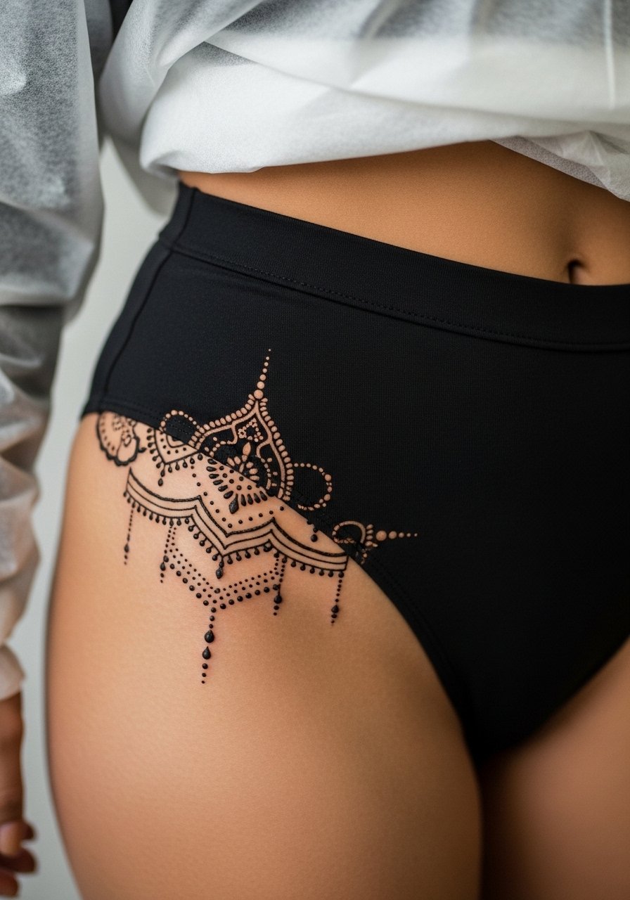
3. Lotus resting on the pelvic crest
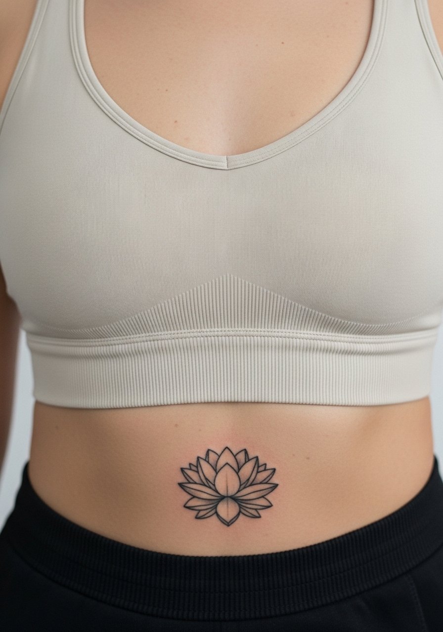
A single lotus centered near the pelvic crest keeps visibility discreet while carrying spiritual symbolism. Tell your artist to center the focal point on your pelvic crest rather than on an arbitrary photo outline so symmetry matches your anatomy. Fine line lotus tattoos can fade faster on darker skin if the ink is not packed correctly, so request slightly stronger saturation for each petal. Pain near the pelvic crest can peak at the bone, so expect a sharper sensation for brief stretches. Low-rise jeans pair well for discreet reveal, and wear button front shorts to the appointment for easier access.
4. Cherry blossom branch along the waistline
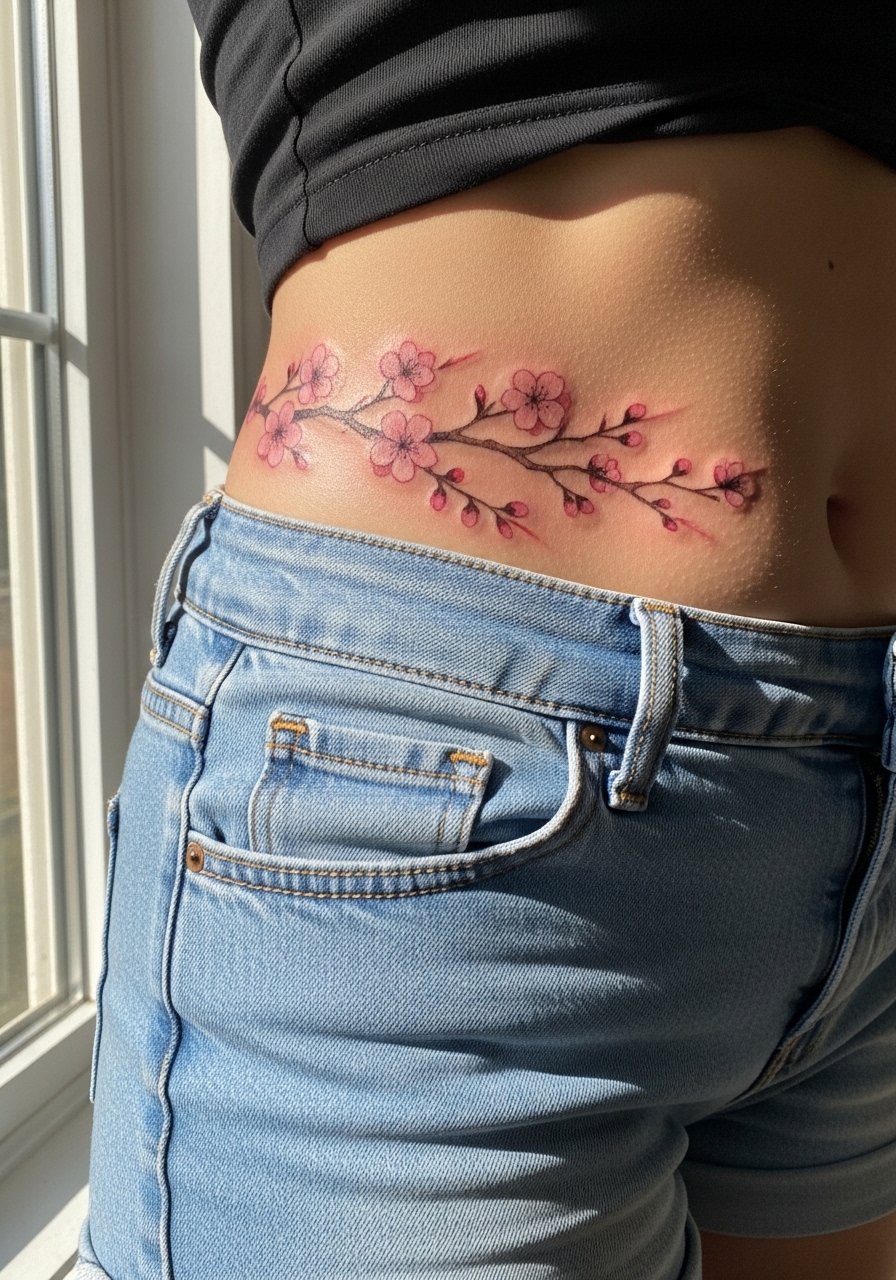
Cherry blossoms work with the hip curve if the branch placement is mapped while you stand and bend. For longevity, avoid extremely washed-out watercolor fills close to the skin surface. The mistake is using pastel washes without an anchoring outline, which washes out with time and friction from waistbands. Expect a gentle sting over the hip bone and softer sensation where the branch meets fleshier areas. For showing off the branch, a pair of hip hugger shorts gives a summer peek without rubbing the healing ink.
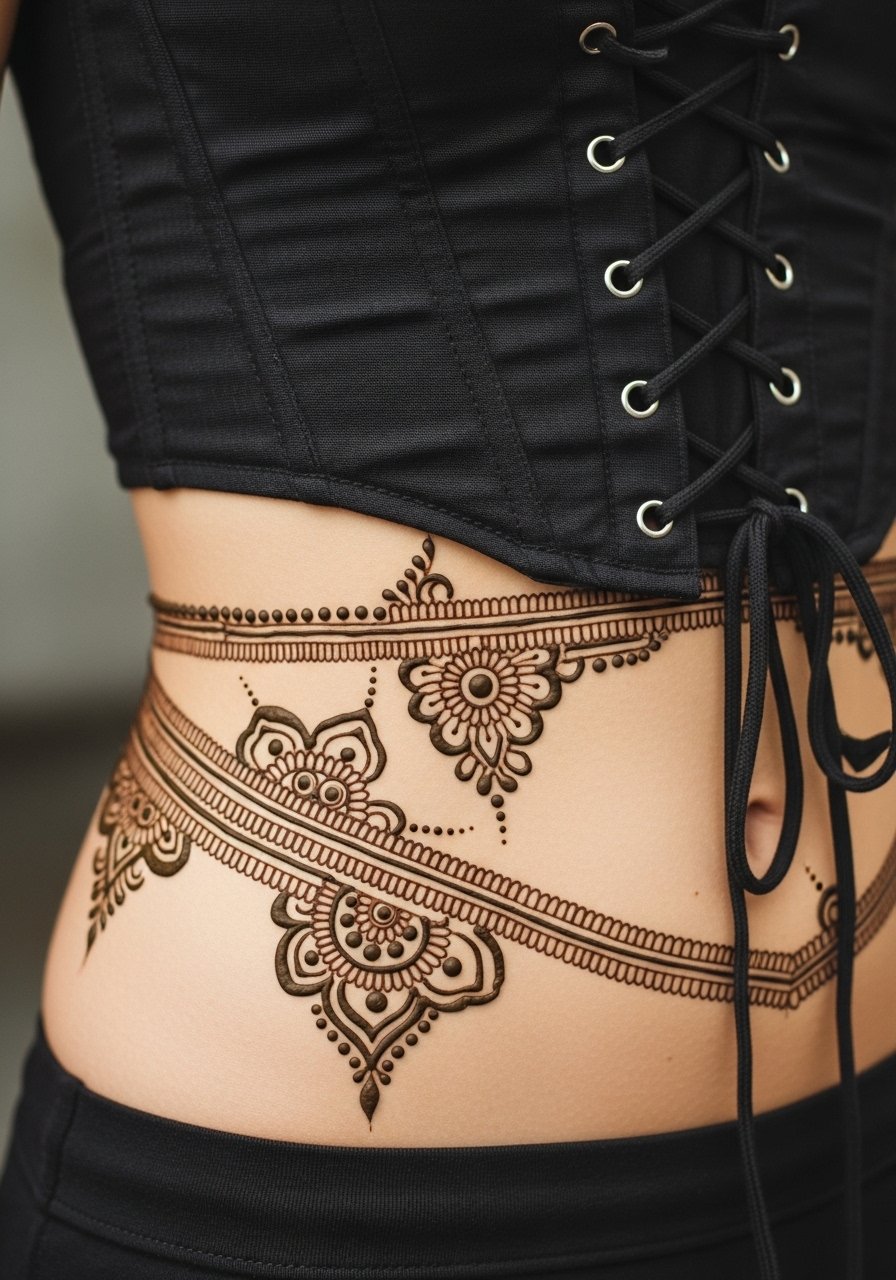
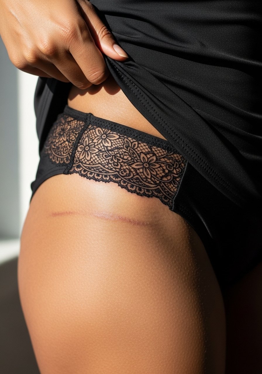
5. Lace pattern that mimics lingerie edging
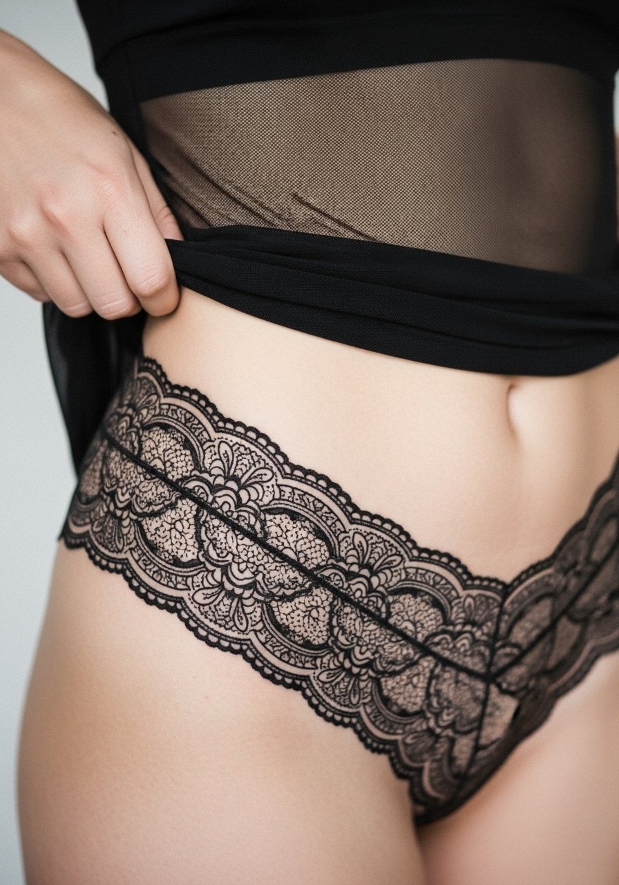
Lace bands create a jewelry-like band that reads as intentional body-integrated ornament. During consultation, bring photos of lingerie edges you like and ask the artist to adjust line spacing so the lace breathes over a curve. Small, dense lace dots can merge over time if placed on a soft, fleshy dip. Expect moderate pain on the bony rim and milder on the soft tissue. Pair the finished piece with a sheer mesh bodysuit or lace-up corset top when you want the jewelry effect. For the session, wear elastic-free lounge pants so the area is easy to access.
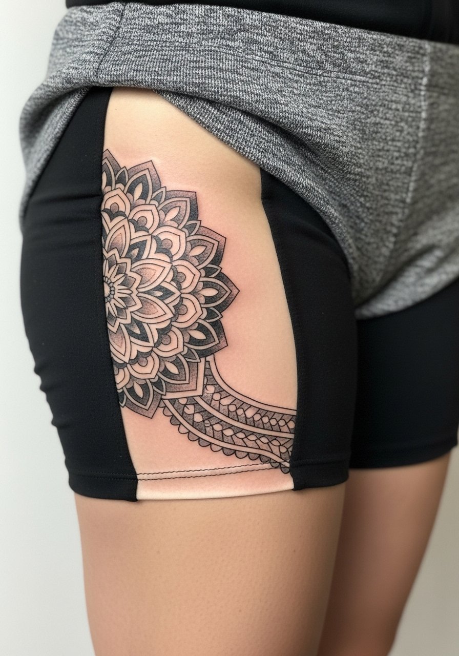
6. Mandala centered in the hip dip
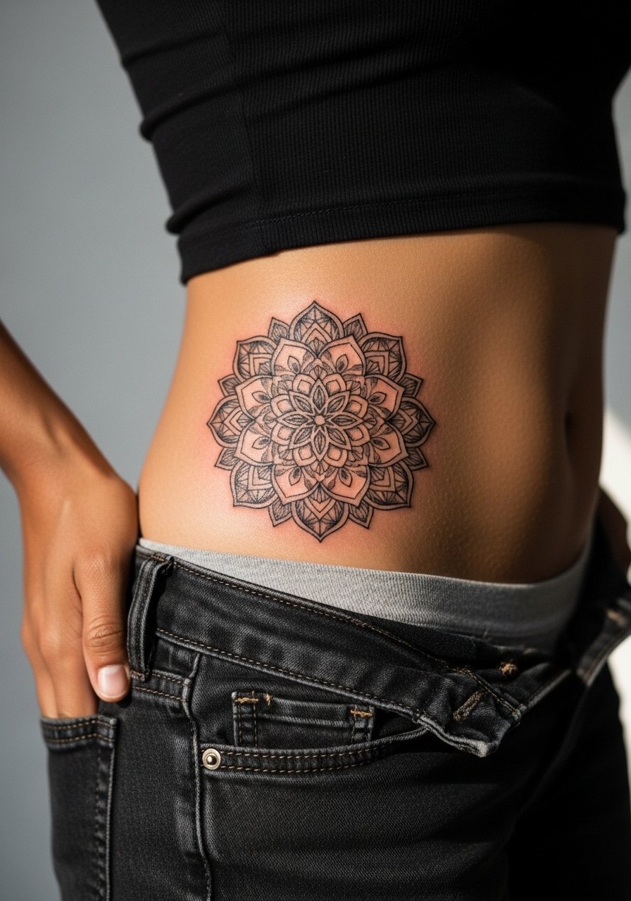
Mandalas are symmetry-dependent, so have your artist stencil while you stand and rotate slightly to ensure the design sits level when you move. The biggest error is making the mandala too small, which forces tight linework that tends to merge after healing. Dense blackwork ages well for saturation, but expect longer sessions and touch-ups for perfect symmetry. For festival-ready looks, pair this with bike shorts or olive slit dresses that reveal the wrap when you move. If you are considering protective wraps during healing, weigh the Saniderm versus dry healing debate with your artist because both camps have strong opinions on friction zones.
Heal Smart
The lace, vine, mandala, lotus, cherry blossom, and rose pieces above all share friction and placement concerns around the waistband and hip dip, so a small kit tuned to those issues makes studio day and week one easier.
-
CeraVe healing ointment. A thinner emollient that many people use in humid climates to avoid thick pore clogging around waistband friction during initial heal.
-
Australian Gold SPF 30 tattoo balm. Post-heal sun protection that goes on without leaving a white cast, useful if your hip design will see direct sunlight at the beach.
-
Green Sheep balm. A thin formula people mention for pelvic areas that face a lot of fabric rubbing, good for the first dry healing days.
-
Japanese rice bran balm. Lightweight and less greasy for sensitive tones on the hip and thigh when Aquaphor feels heavy.
-
Tattoo Goo healing ointment. A thicker option some prefer for keeping color stable in dense floral work, helpful when a rose or peony needs saturation during early settling.
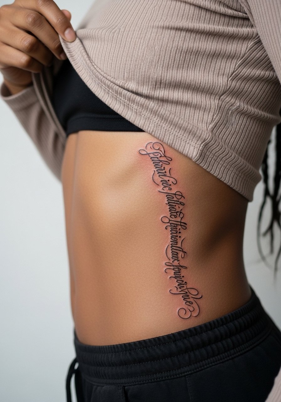
7. Script curving along the hip bone

Script hugs the hip curve beautifully when the baseline follows the bone. In consultation, trace the exact curve on skin and ask the artist to show the stenciled text while standing so the letters fall naturally. The fine line debate splits artists into two camps. One group says fine script looks elegant but may fade faster on the hip. The other group says with slightly bolder line weight and proper needle depth it can settle and hold. Ask where your artist stands and budget a small touch-up at year one. During the session, pain is moderate on the bone. Low-rise jeans work for discreet reveals.
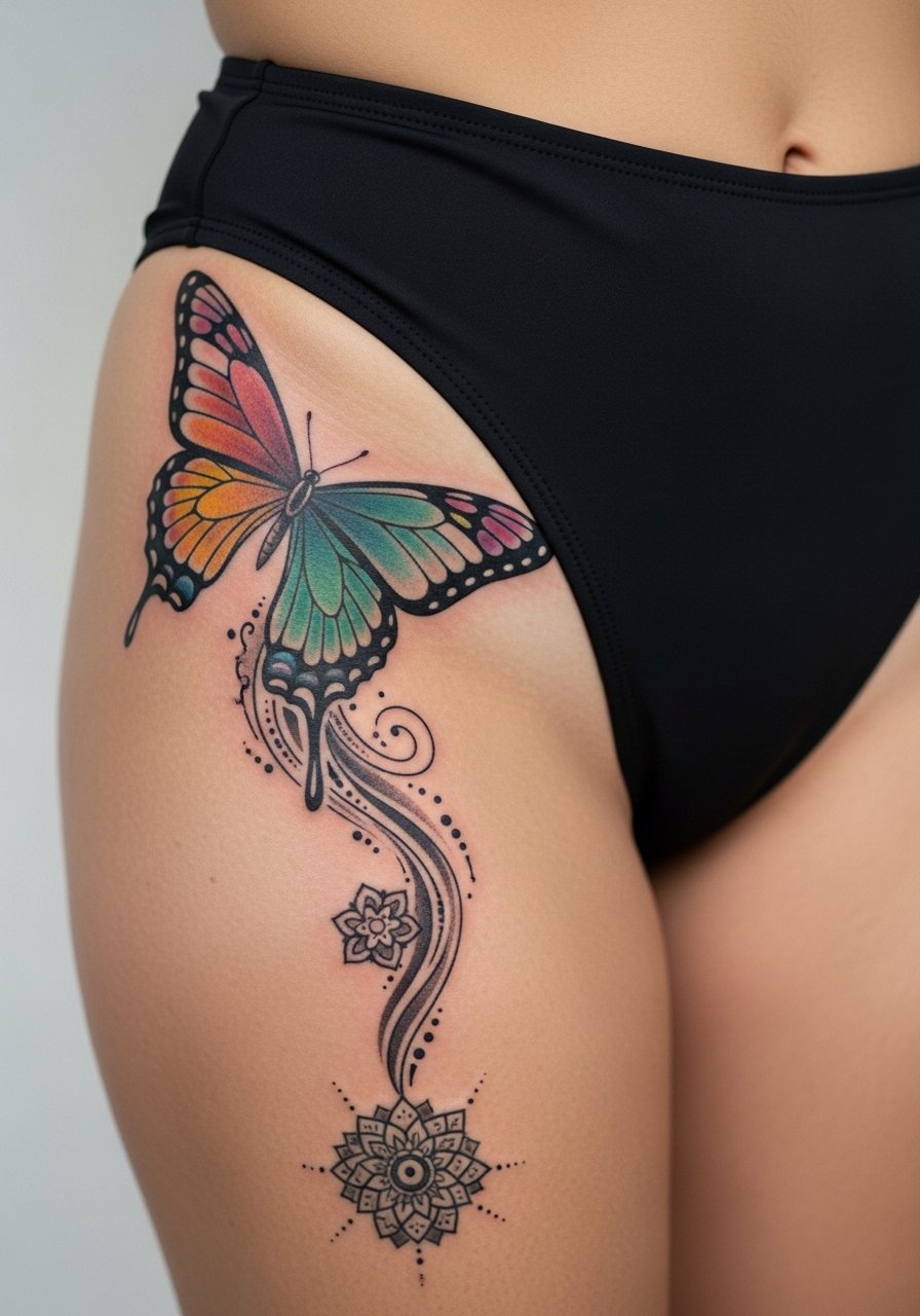
8. Butterfly emerging from the hip curve
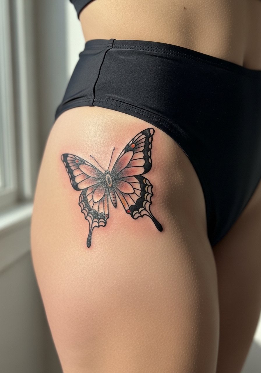
A butterfly is an organic motion piece that benefits from being slightly larger than the tiny finger-size versions. Ask for clear wing outlines and medium saturation within the wings so color keeps contrast as it ages. The error is compressing too many color blends into a small patch. Pain is lighter when the shape sits on the fleshy side of the hip, and sharper near the pelvic rim. For casual wear, festival season styling likes hip hugger shorts or belt bags that let the wings peek out.
9. Henna-inspired filigree band
Henna-style dotwork mimics body jewelry without metal. The trick is spacing the dots so they keep shape over skin that moves. Tell your artist you want bead spacing that allows for slight stretch. Overly dense dotwork on the hip dip can blur, so keep bands with room between motifs. These sessions are often multi-pass because stipple shading takes time. Pair the finished piece with a lace up corset top for that jewelry vibe. For healing, avoid tight waistbands the first two weeks.
10. Snake coiling around the pelvis
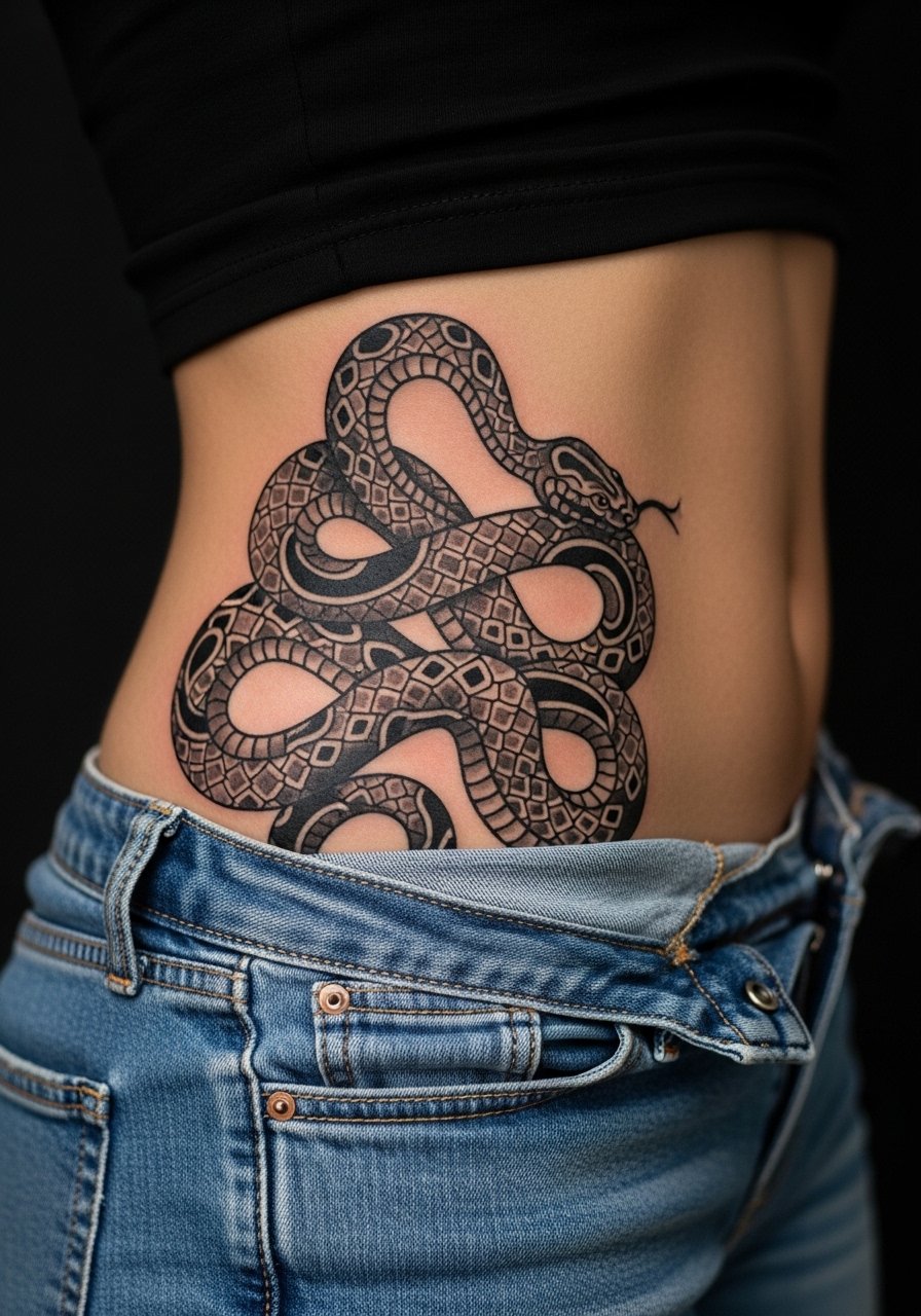
Snakes look dynamic when their body wraps the hip and thigh, and the scale shading can enhance curvature. Ask for a tapered coil that reads as movement across the hip rather than a static loop. Common mistakes include forcing a symmetrical coil that fights natural anatomy, which invites distortion after weight change. Expect sharper pain where the needle travels over pelvic bone and gentler sensation on fleshy parts. This type of black and gray work ages well with proper saturation, but dense shading may need a touch-up at year two. For session comfort, wear baggy shorts that can be lowered without pressure on the area.
11. Organic geometric waves on the side hip
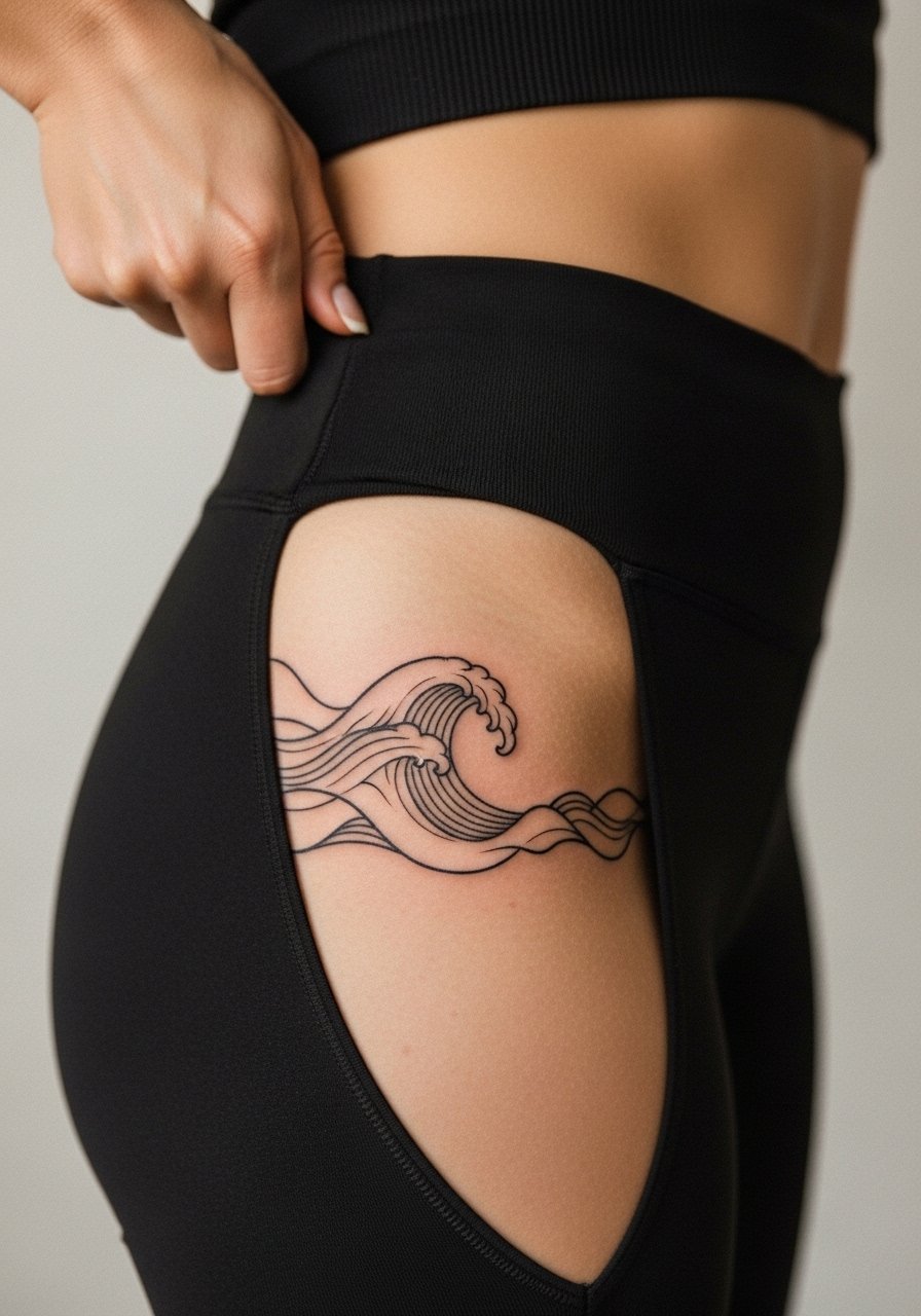
Geometric waves play with the body line without forcing strict symmetry. When you consult, request the artist to stencil and have you move so the waves read while you sit and walk. Too-tight geometry on a curved hip leads to distorted straight lines after healing. The pain is mild to moderate depending on proximity to bone. For clean line extension wear side cut leggings or ribbed crop tops that visually continue the graphic. Plan for a touch-up if you notice lines softening after one year.
12. Peony cluster flowing down the thigh
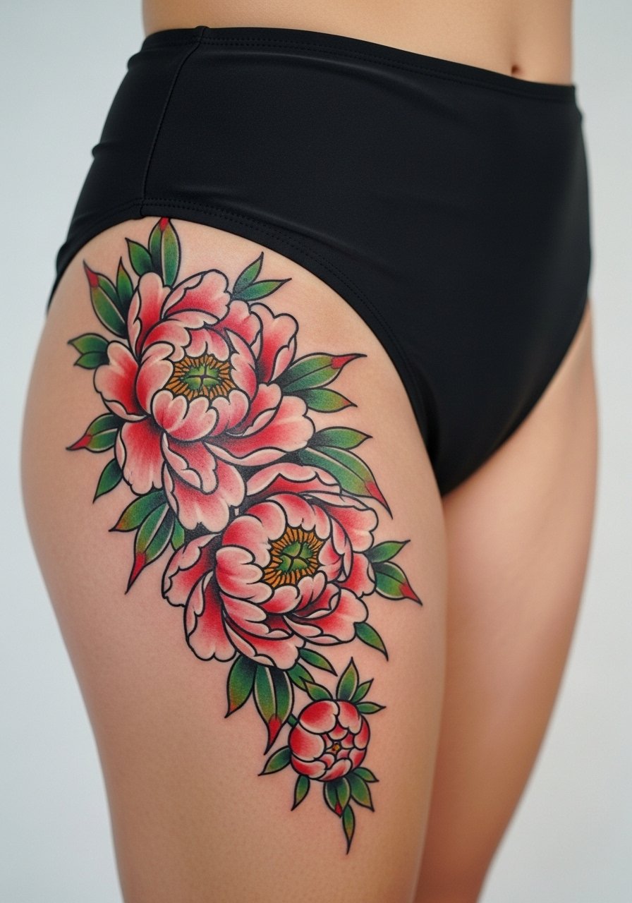
Peonies thrive when scaled to the hip-to-thigh canvas. Ask the artist to place the largest bloom where the body naturally widens so petal edges do not sit directly on the hip dip. A common mistake is trying to cram multiple large blooms into a small area, which forces heavy saturation and blowout risk. Sessions are usually two or three to layer color and shading. For a bold reveal, combine the piece with thigh high slit skirts or bike shorts under dresses so the flow remains visible.
13. Ornamental side body script for length
Long script that follows the side torso reads elongated and elegant when letter spacing is generous. Request an artist who shows healed script examples on similar skin tones because fine line can disappear on darker skin if placed too shallow. The mistake is squeezing cursive into a tight baseline. Expect variable sensation when the stencil crosses ribs versus soft hip flesh. Side-cut tops in monochrome work well for framing this look. Ask the artist about touch-up timing because script often benefits from a one-year refresh.
14. Jewelry-style beaded hip band
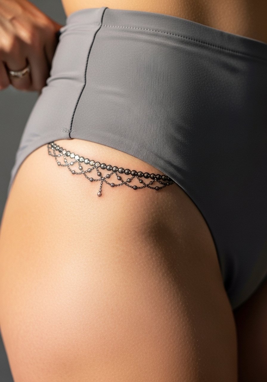
A beaded band can act like permanent jewelry if placed just right. Bring photos of necklaces or belly chains you like and ask for proportional spacing so the beads do not merge when the skin shifts. Tiny white highlights or packed black beads help maintain contrast as the piece heals. This design is less prone to distortion if the main beads sit over the pelvic crest rather than the soft dip. Pair with a gold chain belt women or high-waisted swimwear to mimic the jewelry effect.
15. Surreal ink-blot abstract that follows curves
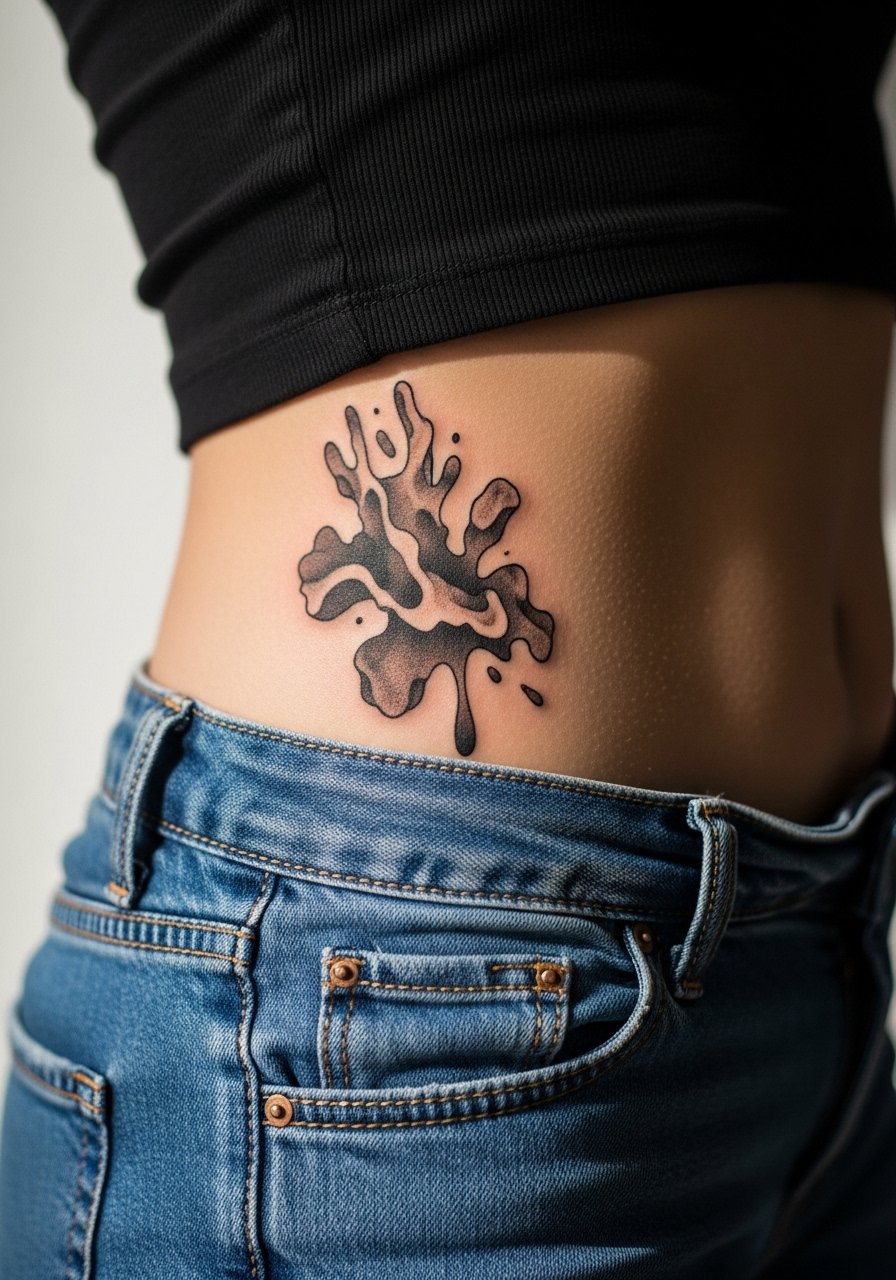
This option leans experimental and avoids strict motifs, which can be forgiving as the body changes. Tell the artist you want organic edges that read as negative space when you move. The typical error is over-detailing small shapes that lose identity as the skin stretches. Expect varied sensation based on how close the ink sits to the bone. Because the design uses blotches and fades rather than fine lines, it usually needs fewer touch-ups over time. For session comfort, bring loose drawstring pants.
16. Small minimalist symbol at the hip bone
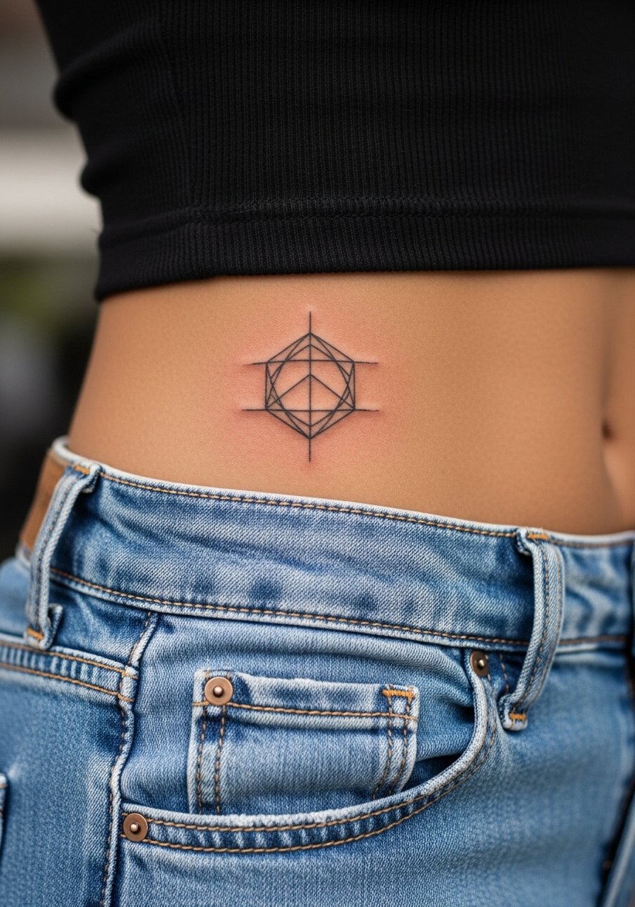
A tiny symbol is a smart first hip tattoo if you want discretion. Ask for slightly bolder line weight than you would choose for a wrist piece, because the hip skin can soften the edges during healing. The mistake is picking a micro size without accounting for blowout risk on curvy spots. Pain is higher where the needle hits bone, so expect short sharp bursts. Low-rise jeans show the placement off and are easy to adjust at the session, so consider wearing low rise jeans women to your appointment.
17. Try henna first, then ink
Testing a design with henna on your hip gives you a moving preview before committing to ink. Use a henna template sized for your hips and live with it for a few days while wearing your usual clothes so you can see how waistbands interact with the motif. The common oversight is assuming henna will behave exactly like ink on stretch and color, but henna lets you test placement and movement first. Session wear for the real tattoo should match what you used during the henna trial so the artist sees identical placement.
18. Festival-ready mandala wrap
A wrap-style mandala is designed to be seen with movement at festivals and outdoor events. Ask for spacing that leaves open negative space between rings so the mandala breathes as you bend. Too-compact rings are the main reason mandalas blur on hips. Pain and session time increase with diameter, so split the work into two sittings if the design exceeds five inches. Pair with bike shorts women or olive maxi skirts when you want the piece to peek while dancing.
19. Lace edge that doubles as a cover-up
Lace motifs are excellent for concealing scars when the pattern is dense enough to mask texture but open enough to look like lace. Bring clear photos of the scar and ask the artist to design lace elements that land over textured areas. The common error is using too much open negative space around the scar, which leaves it visible. Expect medium pain and a focused session that works with the scar tissue. For private reveals, a sheer sarong or mesh bodysuit frames the area without hiding the covering pattern.
20. Butterfly-meets-mandala transitional piece
Blending motifs can give you motion with structure when planned carefully. Tell your artist you want the butterfly wings to transform into geometric elements so the piece reads both organic and architectural. The mistake is forcing two full designs into a small footprint. Pain varies with how much the artist shades versus outlines. For wear, pair with minimal hip-hugging swimwear or a slit maxi dress that lets the junction show on movement.
21. Dotwork jewelry on the pelvic crest
A dotwork jewelry motif on the pelvic crest reads intimate and ornamental. Since this is an intimate placement, the session may require a specialist and a calm, professional studio environment. Design spacing matters more here than anywhere else because tight dots can merge with movement and weight change. Expect sharper sensations over bone and a steady nerve-like feeling in thinner areas. For the appointment, consider a disposable tattoo gown or high-waisted bottoms you can shift to expose only the needed strip.
Frequently Asked Questions
Q: How do I decide between fine line florals and neo-traditional flowers for a hip piece?
A: Fine line florals look airy and subtle, but on hips they can fade faster if the line weight is too thin. Neo-traditional flowers use stronger outlines and saturation, which tends to hold up better on curved, friction-prone areas. I recommend asking your artist for healed photos of similar placements on varied skin tones, and plan a one-year touch-up for any floral work.
Q: Does the hip area hurt more than the thigh or ribs?
A: Pain varies by exact spot. The bony rim of the pelvis can feel sharp and intense for short bursts, while the fleshy outer hip and upper thigh are usually milder. Overall, hip tattoos are often reported as less painful than ribs. Bring a plan for breaks, and wear session clothes that your artist can shift without tugging at the area.
Q: Fine line fans say their pieces look great fresh but fade fast. What is the debate about fine line on hips?
A: Artists split into two camps on this. One camp says fine line fits the aesthetic but the hip's movement and friction cause the lines to soften within a couple of years. The other camp says with slightly bolder line weight and correct needle depth, fine line can settle and stay legible. The middle ground is to test with modest line weight and plan a touch-up if you value long-term crispness.
Q: How should I dress to a hip tattoo session to make access easy and reduce rubbing during healing?
A: Wear loose, elastic-free bottoms you can lower without pressure on the area. For outer hip pieces, loose drawstring joggers are convenient. For inner hip or pelvic crest work, button-front shorts or a disposable gown keeps the area accessible while maintaining modesty.
Q: Will weight changes distort a hip tattoo a lot?
A: It depends on placement. Tattoos centered on the pelvic crest or bony hip hold shape better than those spanning a fleshy hip dip. If weight fluctuation is likely, choose placements that sit over bony landmarks or design elements that embrace organic flow rather than strict symmetry.
Q: Should I use protective film or dry healing on the hip?
A: Both camps have advocates. Some say protective film reduces scabbing and friction, while others worry about trapped moisture in sweat-prone areas. Talk to your artist about the studio's experience with hip placements and try a short protective window if you live in a dry climate, otherwise light balm or dry healing may work better for heavy friction zones.