
Fine line neck work is everywhere online, but the neck changes how ink behaves in a way most people underestimate. It sits where sun, movement, and shirts meet, so a design that reads sharp at six months can blur by year three if the line weight was too tiny. Below are 27 illustrative neck tattoo ideas that balance impact with longevity and real styling that helps you show them off.
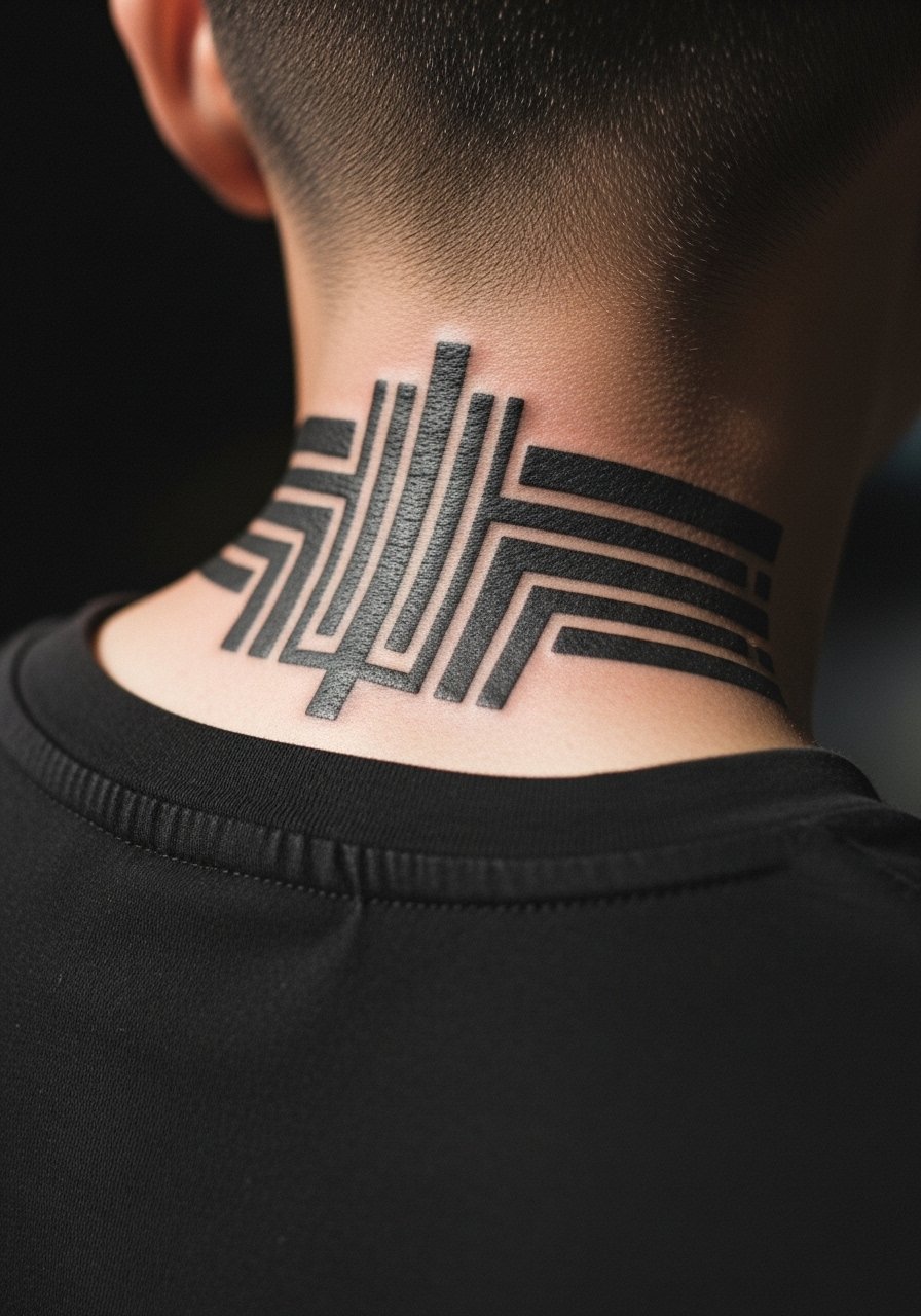
1. Bold Blackwork Nape Shield
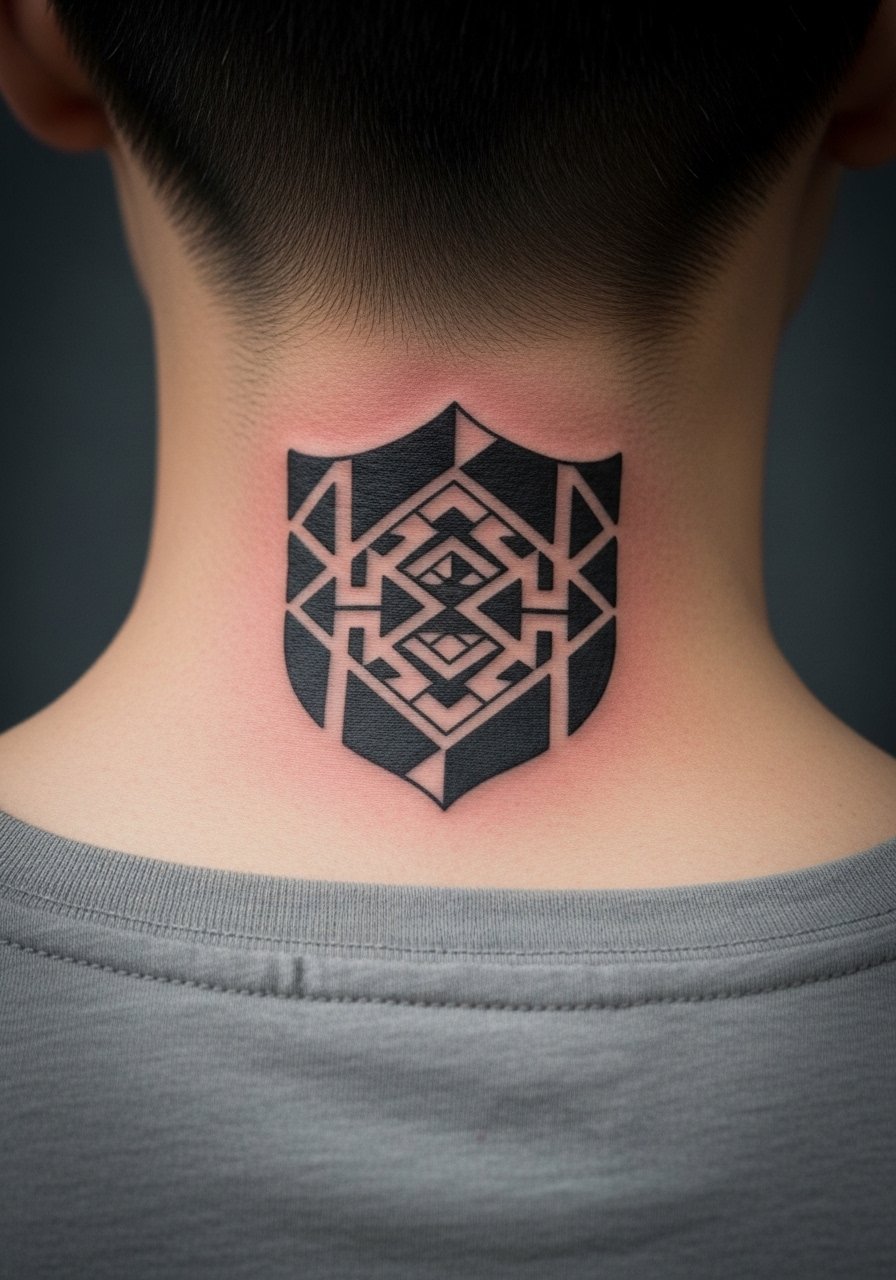
The nape is a forgiving canvas for saturated blackwork because the skin there holds pigment differently than the throat. Expect moderate pain when the artist works close to the spine, but session times are short for compact shields. Tell your artist you want heavier linework and solid fill rather than tiny detail. Small concentric patterns in the same piece often suffer blowout, so wider shapes and strong negative space hold up better over the years. For showing it off wear a crewneck tee with the neckline slightly lower on the back. Note on career visibility: visible nape pieces read bold in conservative workplaces, so think timing.
2. Script Along the Side Neck
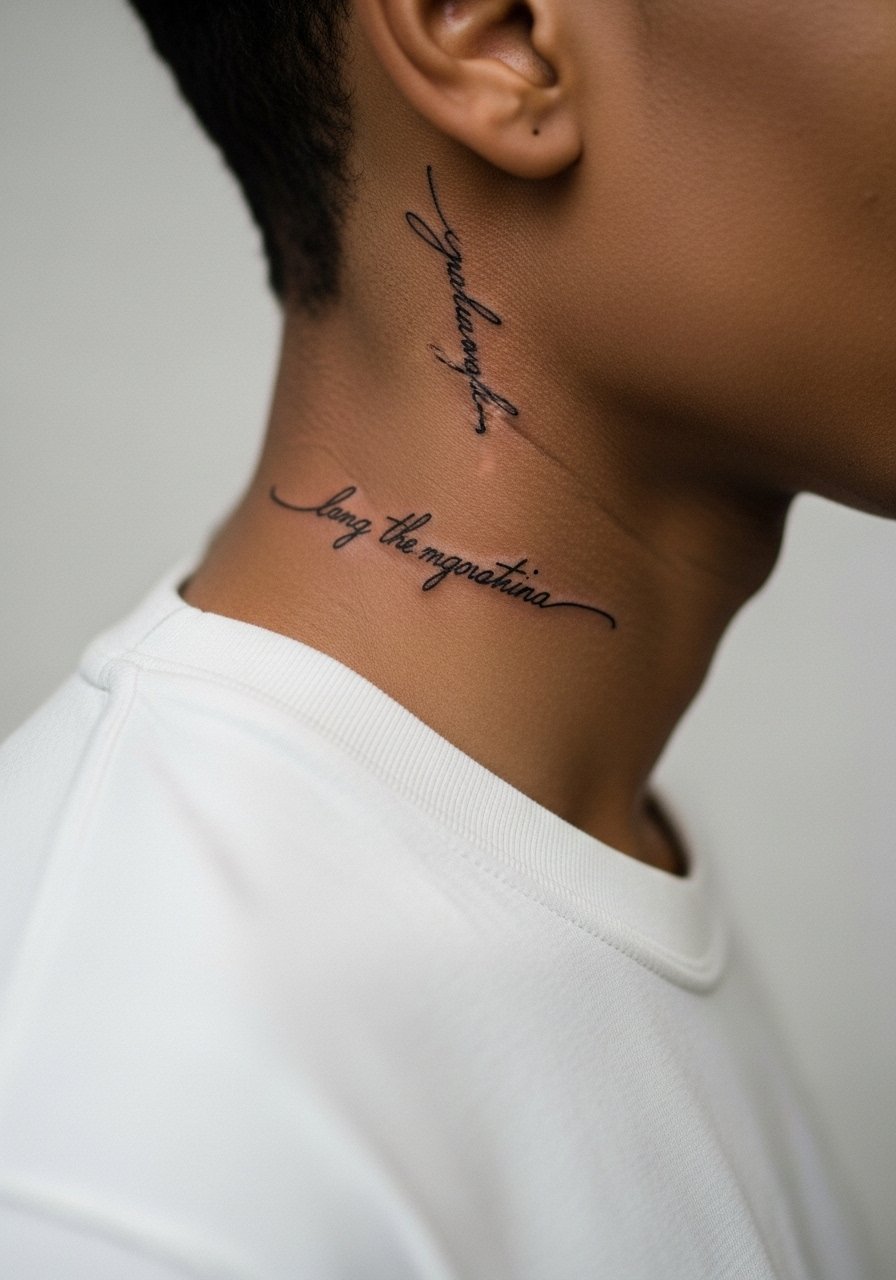
Delicate script can look extremely personal when it hugs the side of the neck. Pain is sharp for short bursts, and the session usually finishes quickly. The most common mistake is asking for ultra-thin letters without spacing. Tiny script on the neck often merges after a few years, so ask for slightly bolder strokes or more letter spacing during consultation. For session day wear a wide-neck shirt you can pull aside easily. Hand the artist a clear reference showing the exact letter spacing you want. Visible neck script can affect first impressions, so plan placement with that in mind.
3. Micro-Realism Portrait on Side Neck
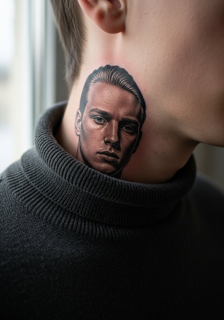
Micro-realism on the neck is impressive up close, but it asks a lot from the artist and from the skin. Expect longer session time for shading and a realistic touch-up at year two. One camp argues micro-realism should avoid the neck because motion and thin skin blur subtle shading. The other camp says with proper depth and very skilled shading it can hold up. Ask your artist where they stand and to show healed examples on neck skin. For showing the detail try a thin chain pendant necklace that frames the portrait without covering it. Career and visibility concerns apply here more than for hidden placements.
4. Traditional Rose on the Side of the Neck
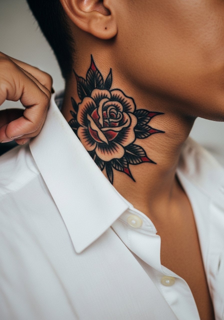
Classic traditional linework and bold saturation age predictably on neck skin. The thicker outlines and heavier saturation work in your favor because they resist early blurring. Tell your artist you want crisp outlines and solid color panels rather than thin decorative filigree. Expect moderate pain and a single session for a medium-sized rose. For casual showing pair it with an open collar shirt so the bloom peeks out naturally. Note on workplace perception: classic motifs are sometimes easier to read as art than as a statement, but visibility is still high.
5. Minimalist Barbed Wire Wrap
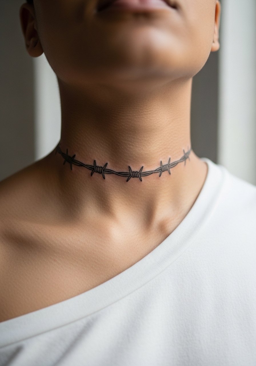
Wraps read bold because they encircle motion zones that catch light. The pain profile spikes at the front near the throat. The main error is asking for the wire too thin. Tight thin wraps can feather and lose definition, so request slightly thicker wire and clear spacing between barbs. Session time is typically short but expect a touch-up once the piece settles. For a rugged show-off look layer a bomber jacket with the collar open. Remember visible wraps are high commitment in professional settings.
6. Geometric Line Cluster at the Adam’s Apple
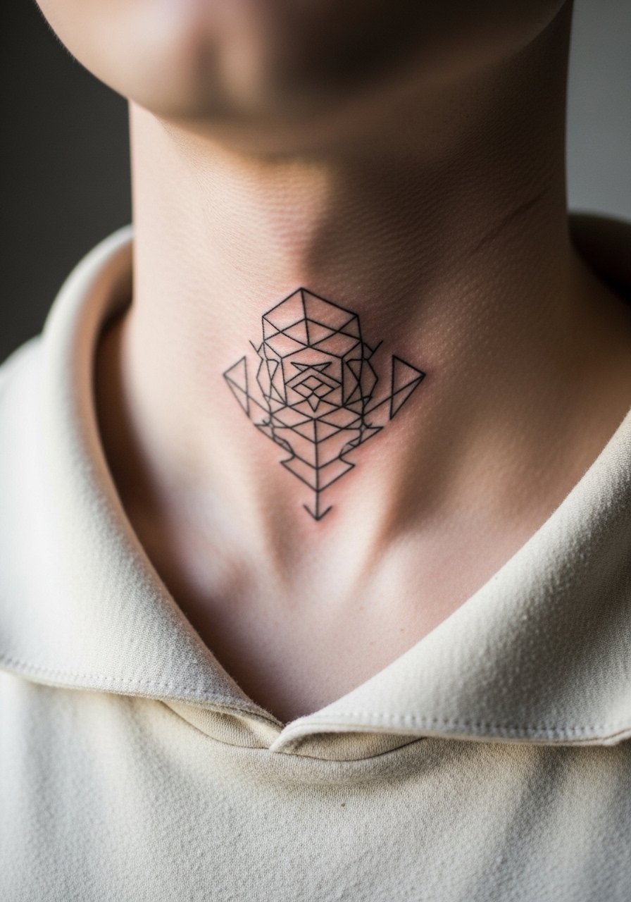
The throat area is finite real estate with constant movement, so geometry needs breathing room. Fair warning: this location is sensitive and can be more painful than side neck work. The most common mistake is asking for dense geometry too close together. Ask for negative space and thicker linework on intersecting points to avoid early merging. Session time varies with complexity. For showing the piece wear a v-neck tee that frames the top of the chest and throat. Visible throat pieces carry strong social meaning, so think through timing and context.
Studio Day Picks
The side neck and throat pieces above demand different prep than the nape and collarbone work, so a few targeted items make studio day smoother.
-
Stencil transfer paper kit. Lets you test placement on the neck and confirm spacing before the needle touches skin.
-
Topical numbing cream. Applied as directed eases sharp sensitivity near the throat without changing ink saturation.
-
Thin protective film roll. Helps neck pieces avoid friction from collars during the first few days of healing.
-
Fragrance-free body wash. Gentle cleansing keeps neck linework clean without irritating fresh ink.
-
Aquaphor healing ointment. A thin layer during the earliest phase locks in moisture for delicate neck linework without clogging pores.
7. Single Needle Dotwork Nape Mandala

Stipple shading and dot work reward distance and symmetry at the nape because the pattern reads as texture rather than tight lines. Sessions are longer when the design is dense. The usual mistake is scaling a mandala too small for the nape. Tiny stipple clusters can merge into a grey patch, so ask for spacing and larger radiating rings. Dot work ages well when contrast is maintained, but expect a touch-up at year three for midtone areas. For evening wear a button-down shirt with the collar slightly open complements the round composition. The nape is visible with short haircuts so plan accordingly.
8. Neo-Traditional Swallow Along the Collar
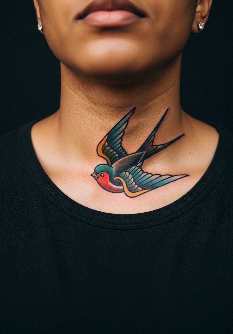
Neo-traditional shapes use bold outlines and punchy color that resist early fading on neck skin. Pain is mild to moderate near the collar area and session times are moderate. The error is over-detailing small feathers. Keep the bird slightly larger with bold wing shapes and strong color blocks to maintain clarity over time. For casual showing pair it with an open collar shirt so the bird can peek above the neckline. Remember color saturation on darker tones needs a little more time in the chair for full coverage.
9. Single-Line Minimal Band Across the Front
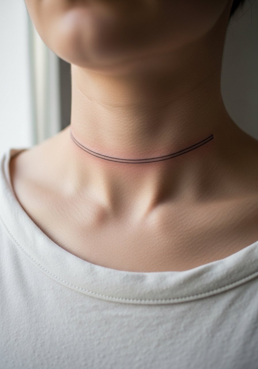
A simple linear band reads modern, but tiny line weight choices make or break the result. The biggest mistake is choosing the thinnest possible line. On the neck you want a line that reads clean from a distance, so prompt your artist for a slightly heavier single-line weight and consistent depth. Expect a short session with a probable touch-up in a couple of years. For styling, a thin chain necklace sits below or above the band and frames it without covering it. Public visibility is immediate so plan where you want attention to fall.
10. Ornamental Collar Tattoo with Negative Space
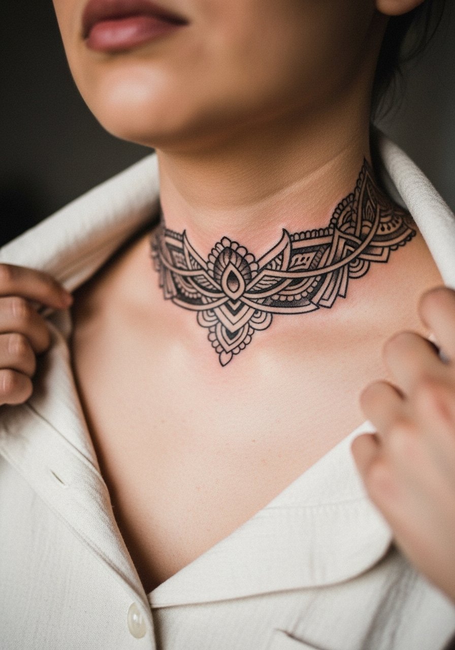
Ornamental pieces that tuck into the collar area leverage negative space to breathe, which helps with long-term clarity. Pain around the collarbone is moderate because the skin sits over bone. The common mistake is packing too many small flourishes close to each other. Ask for open rings and spaced motifs to prevent merging. These pieces pair nicely with a crewneck sweater worn slightly lower to let the design peek. Visibility is high during casual wear so think about how it frames the face.
11. Small Symbol Behind the Ear Extending to Neck

A discreet symbol tucked behind the ear that reaches the upper neck reads understated in many situations. The area is sensitive and session time is short. The mistake is placing too much detail behind the ear. Keep the motif bold and simple so the neck portion keeps its shape. For session comfort wear a button-up shirt you can slip off without pulling across the head. Because this sits near hairlines, styling choices like short haircuts or tucked-back looks affect how visible the piece is.
12. Bold Script Around the Throat, Job Debate Included
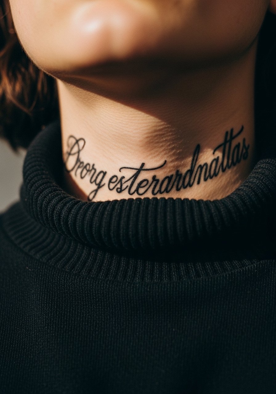
Script wrapped around the throat reads like a statement because it sits center stage. One camp argues visible throat script is a powerful form of self-expression. The other camp warns it triggers workplace bias and can close doors in conservative fields. Both viewpoints matter. Make your choice with timing in mind and ask about healed examples. The error is choosing an ornate typeface that loses legibility as it settles. For evenings out a leather jacket with the collar unzipped frames the script. A throat piece is high-visibility so weigh career timing carefully.
13. Whip Shaded Nape Flame Motif
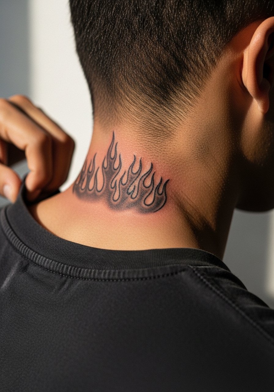
Whip shading creates motion, which suits flame motifs at the nape. Session time depends on the amount of gradation. The common mistake is relying on hair-thin whip strokes without solid anchor lines. Anchor the design with thicker outlines so the shaded texture sits against contrast and keeps definition. For a casual reveal try a henley shirt with a lower back collar. The nape is sensitive to sun exposure from the back, so plan sun protection as the piece heals.
14. Small Geometric Cluster at the Side Neck

Clusters of geometric shapes can read modern without leaning decorative if you allow spacing. The main error is cramming too many tiny triangles. On neck skin you need room for each vertex to breathe. Sessions are short and people often need a touch-up for line inconsistencies after settling. For a day-to-day look pair the piece with an open collar shirt or a plain tee so the geometry stands out. Because the neck moves a lot, expect subtle shifts in crispness over several years.
15. Floral Vine Curving Along the Side Neck
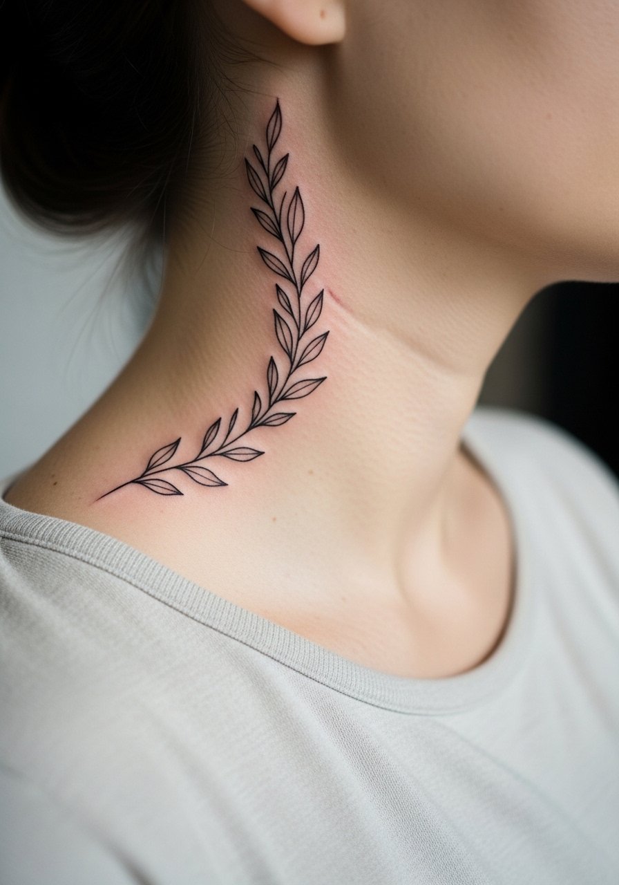
Curving vines follow natural contours, which helps this design sit comfortably on the neck. Pain varies with placement around the jawline. The usual error is requesting ultra-fine leaves packed tightly. Ask for slightly bolder leaf stems and moderate spacing to prevent early blurring. Sessions can be broken into short sittings for comfort. For showing off try layered necklaces like a thin chain pendant that rests above the vine without covering it. Visible botanical work tends to soften with sun exposure, so keep it covered in strong sunlight when healing.
16. Blackwork Bar Pattern Across the Back of the Neck
Solid black bars at the back of the neck are simple but demanding on saturation. Expect a slightly longer session to pack even color. The main mistake is patchy fill that shows fast. Request even saturation and a follow-up check in the chair. For casual wear a crewneck tee that sits low on the back shows the bars subtly. Back-of-neck pieces are often covered by longer hair, so think about haircut choices when planning timing.
17. Gothic Lettering Along the Side Throat

Gothic type benefits from bold strokes that survive neck movement. The frequent mistake is choosing overly ornate flourishes that lose legibility as the ink settles. Ask for clean counters and thicker stems to maintain contrast. Expect a short to moderate session and a likely touch-up at year two. For a layered look wear an open collar shirt to show just enough of the text. Visible Gothic script reads strong and can shape public perception.
18. Tiny Icon at the Center of the Throat

Small single icons are straightforward but hit the highest visibility zone. The error is making the icon too small for the throat. A tiny symbol here can lose form as it settles, so ask for slightly more scale. Sessions are quick and recovery is short, but expect touch-ups because of constant movement. For a subtle look keep collars higher or layer with a thin chain necklace that sits above the icon. A centered throat mark reads like a statement so consider timing with work.
19. Scripted Name Curving Under the Jawline

Names under the jaw pair well with the face because the curve follows facial geometry. The common mistake is choosing a fragile script that blurs. Request medium letter weight and extra spacing between characters. Pain is spotty around the jaw and session length is short. For off-duty styling try a racerback tank or open collar so the name is visible without being front and center. Keep in mind visibility at eye level when choosing text size.
20. Anchor Motif Near the Collarbone and Lower Neck
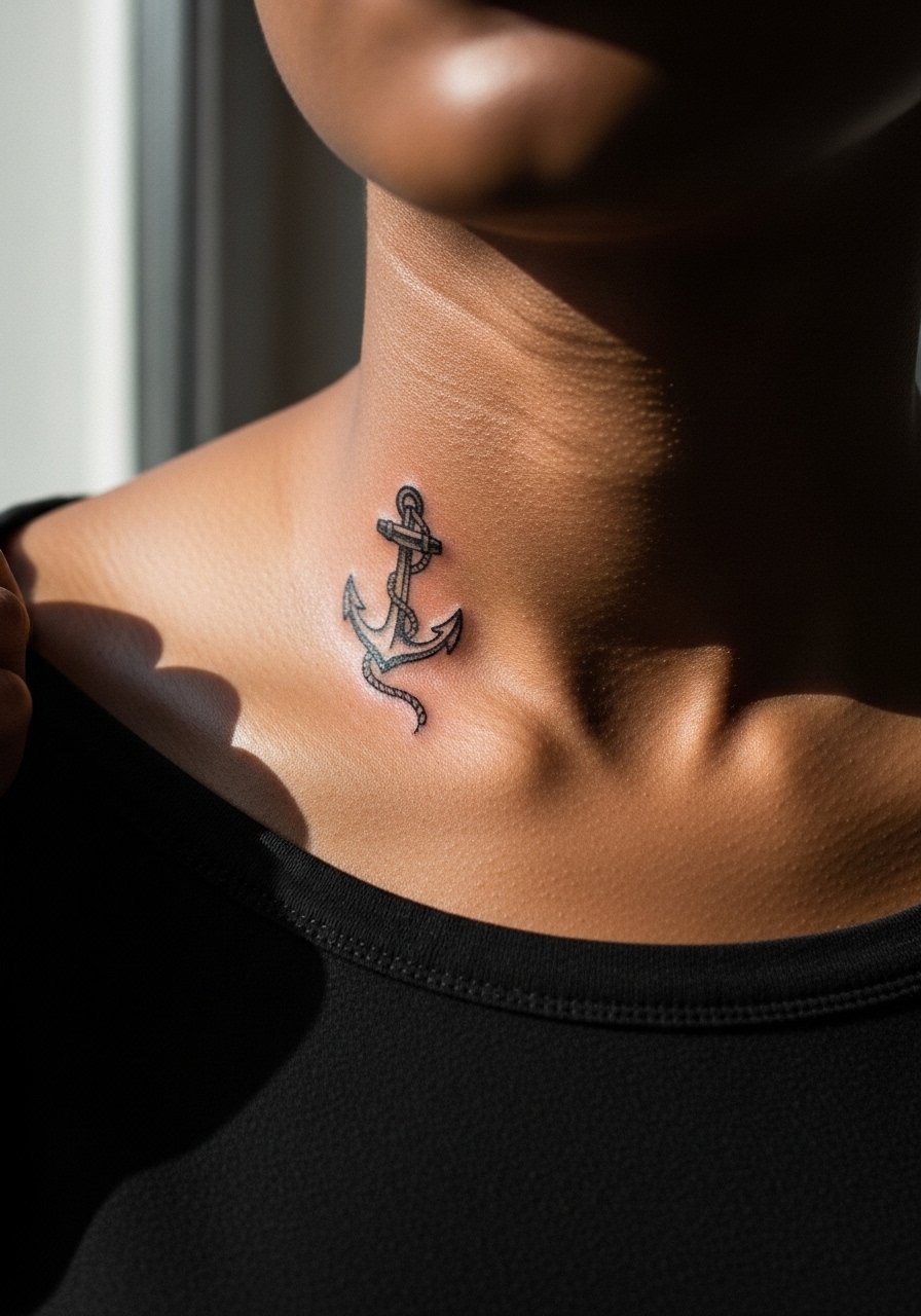
Anchors are small, strong symbols that age well when kept bold. The mistake is adding unnecessary tiny rope details that can blur on neck skin. Opt for a bold fluke and simple shank to keep contrast. Sessions are brief and touch-ups may be needed in shaded areas. For a nautical casual look pair the piece with a striped crewneck tee that sits low on the neck. The lower neck placement keeps visibility moderate compared with the throat.
21. Single Bold Line Rising from the Collarbone
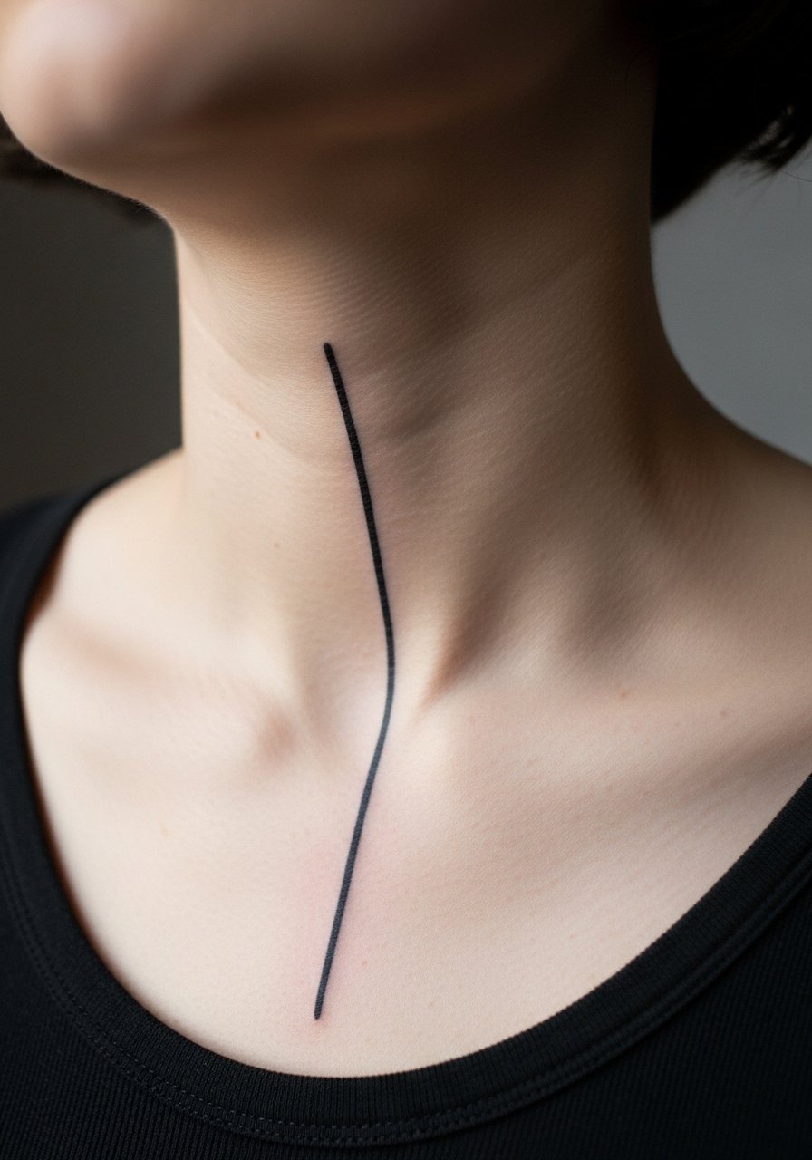
A single bold vertical line is visually simple and surprisingly durable because saturation is high. The typical error is making the line too thin. Ask for a consistent needle depth and solid fill to reduce patching later. Session time is short and touch-ups are usually minimal. For showcasing the line pick a v-neck sweater or low-cut shirt that centers attention. This minimal approach reads modern and keeps care straightforward.
22. Two-Tone Black and Grey Compass at the Side Neck
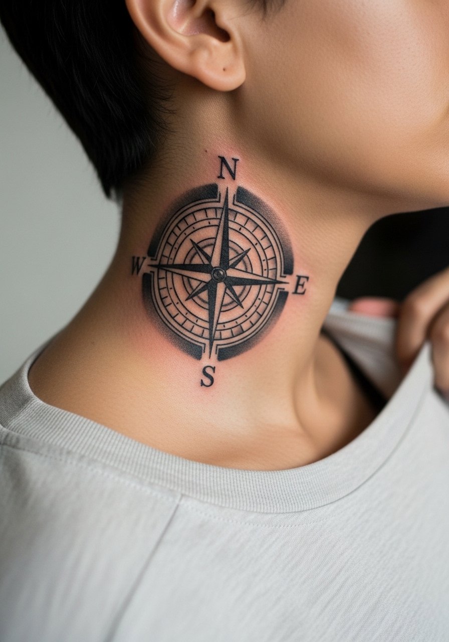
Compasses combine linework and shading, which plays well on neck skin when contrast is prioritized. The common mistake is too-fine inner detail. Ask for bolder cardinal points and softer midtone shading to keep the map readable. Sessions are moderate in length. For travel-minded styling layer a thin pendant necklace that does not sit on the compass. Because of constant motion near the jaw, expect subtle softening over several years and plan a touch-up window.
23. Encircled Zodiac Glyph at the Side Neck

A circled glyph is a compact design that scales well on the neck if the circle is bold. The mistake is choosing tiny glyphs with thin enclosing rings. A thicker outer ring protects the inner mark as the skin shifts. Sessions are short and touch-ups are predictable. For showing it subtly use a button-down shirt with the collar open. Zodiac glyphs are personal and highly visible, so think about placement relative to the jaw and ear.
24. Mandorla Shape at the Upper Neck
Mandorla shapes use symmetry and negative space to create a sacred geometry feel that suits the upper neck. Too many tiny inner details is the main error. Keep inner elements larger and let the negative space do the work. Expect a medium-length session and a likely touch-up for shaded sections. For evenings wear a loose button-down shirt you can pull aside to reveal the piece. Upper neck placements are highly visible with short haircuts, so plan accordingly.
25. Thin Wave Line Following the Neck Curve
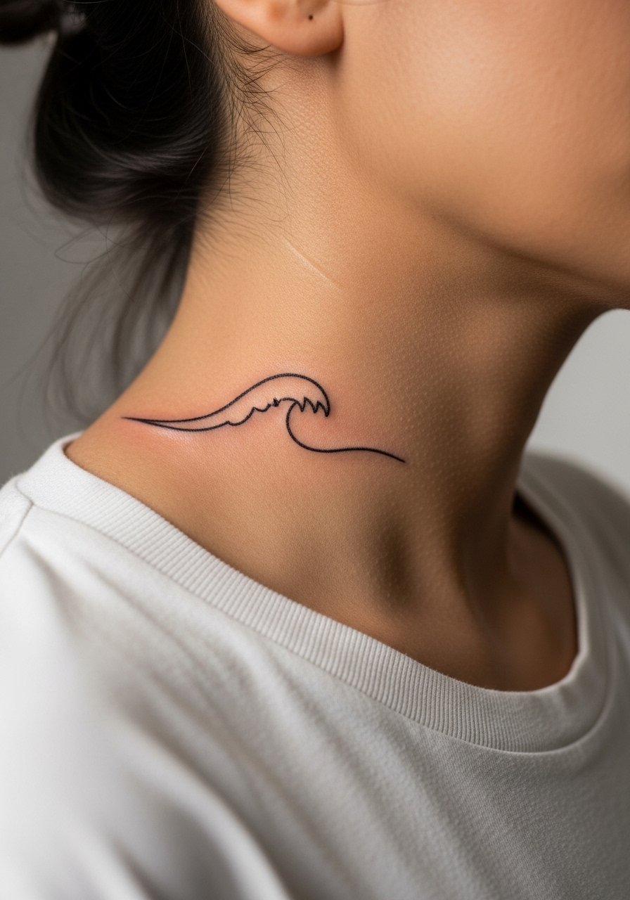
A flowing wave reads well because it follows natural motion, but ultra-thin lines on the neck do not last. The common fix is to increase line weight slightly and add subtle spacing in overlapping segments. Sessions are short and healing predictable. For casual styling try a racerback tank or open collar so the curve shows cleanly. Waves age with sun exposure, so protect the area while it heals.
26. Small Portrait Silhouette at the Lower Side Neck

Silhouettes read well when kept graphic with clear edge definition. The error is trying to include facial micro-features that blur on neck skin. Keep the silhouette bold and use contrast to communicate form. Session time is short and expectations for touch-ups are moderate. For showing it off wear an open collar shirt so the lower neck area is visible without being obvious. Keep in mind visibility to employers and family when placing personal imagery.
27. Small Arrow Tracing the Side Neck Line
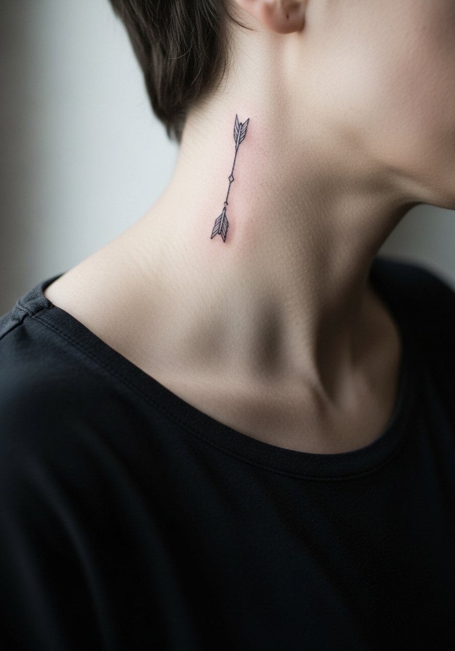
Arrows are classic minimal marks that do well when kept bold and linear. The common mistake is making the shaft too thin or the head too ornate. Ask for a clean shaft with a defined head and slightly thicker line weight. Sessions are quick and touch-ups are usually minimal. For a clean look pair it with a thin chain pendant that sits above the arrow. An arrow on the neck reads intentionally visible, so think through timing.
Frequently Asked Questions
Q: How painful is neck tattooing compared with the forearm or chest?
A: The neck is generally higher on most pain scales than the forearm and can be comparable to the chest near the collarbone. Thin skin over cartilage and constant movement make some spots more sensitive. Short sessions and topical numbing can help, and lighting clothing choices like a wide-neck shirt make the appointment more comfortable.
Q: Will fine line neck tattoos blur faster than bold blackwork?
A: From what I have seen, fine line work on the neck tends to soften sooner than bold blackwork because the ink sits in a thin, mobile area. Bigger line weight and spacing improve longevity. Expect touch-ups earlier with delicate scripts and plan line weight with your artist accordingly.
Q: Do visible neck tattoos affect hiring prospects?
A: There are two camps. One group treats visible neck tattoos as acceptable self-expression and sees them as neutral or positive. The other group reports they still trigger bias in conservative fields. The impact depends on industry and geography, so match timing and placement to your career moves.
Q: How often do neck tattoos need touch-ups?
A: It depends on style and exposure. Bold blackwork might settle with a minor touch-up around year two or three. Fine line and micro-realism designs often need touch-ups sooner. Plan a realistic window of two to four years for most styles, and discuss the expected timeline during the consult.
Q: What should I wear to the appointment for a throat or side neck piece?
A: Wear a wide-neck shirt or an open collar button-down you can pull aside without tugging over your head. That keeps access clean and comfort higher during the session.
Q: Can small script or symbols on the neck be made to last without heavy touch-ups?
A: Yes, if you scale them slightly up and use stronger line weight and spacing. The trick is to avoid the smallest possible size. Ask the artist for healed photos of similar neck work so you see real results on skin like yours.
Q: Are there special artist qualifications I should look for for micro-realism on the neck?
A: Seek artists who show healed neck examples of micro-realism in portfolios and who discuss needle depth and healing windows. Artists experienced with neck skin types and who can show you long-term healed photos reduce the chance of surprises.