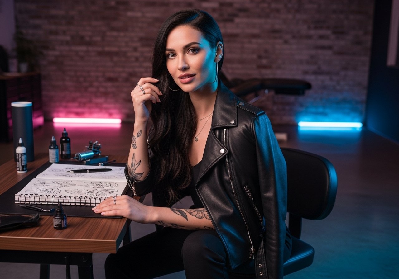
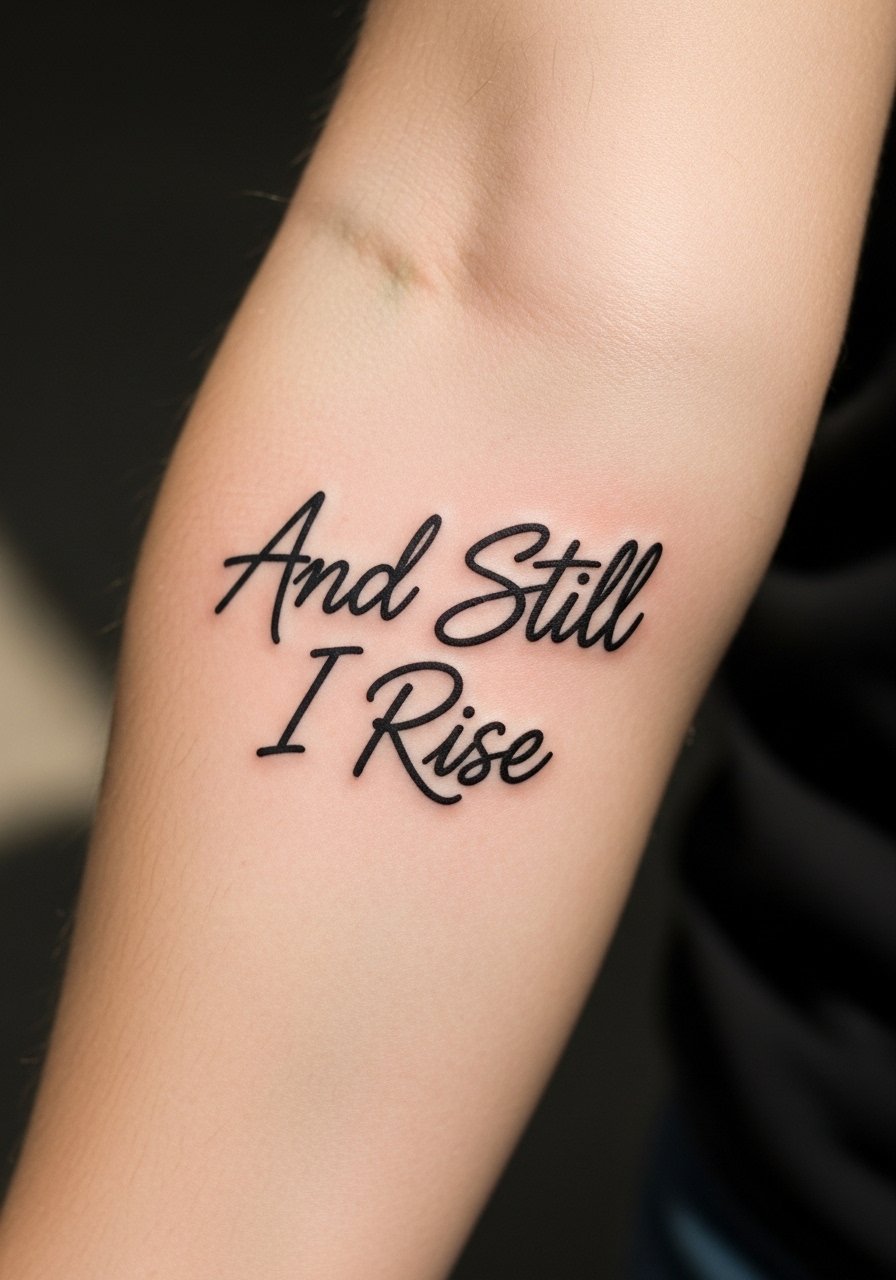
Fine line tattoos are trending on every mood board right now, and the reality is the ones that still read crisp at year five are rarely the flashiest pieces. Bold blackwork and considered spacing win longevity. If you want Angelou's line inked in a way that ages as well as it reads, start with a durable layout and a placement that suits your daily life. The first sketch below shows you how.
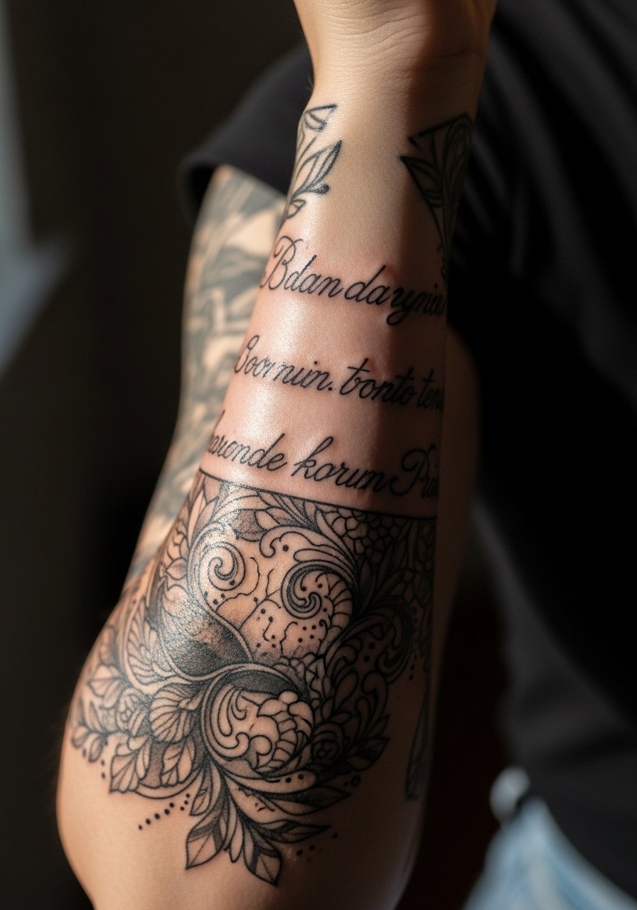
1. Blackwork Script on Outer Forearm
I recommend a bold black script on the outer forearm when readability over time matters more than delicacy. Tell your artist you want medium-to-thick linework and consistent spacing between letters. The biggest mistake is asking for ultra-thin cursive that looks fragile on photos but blurs in two to three years. Expect a one- to two-hour session and moderate pain. For showing it off, rolled-up sleeves or a linen short sleeve button-up frame the forearm without stealing attention.
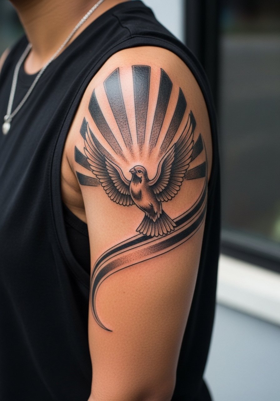
2. Phoenix Rising on Shoulder Cap
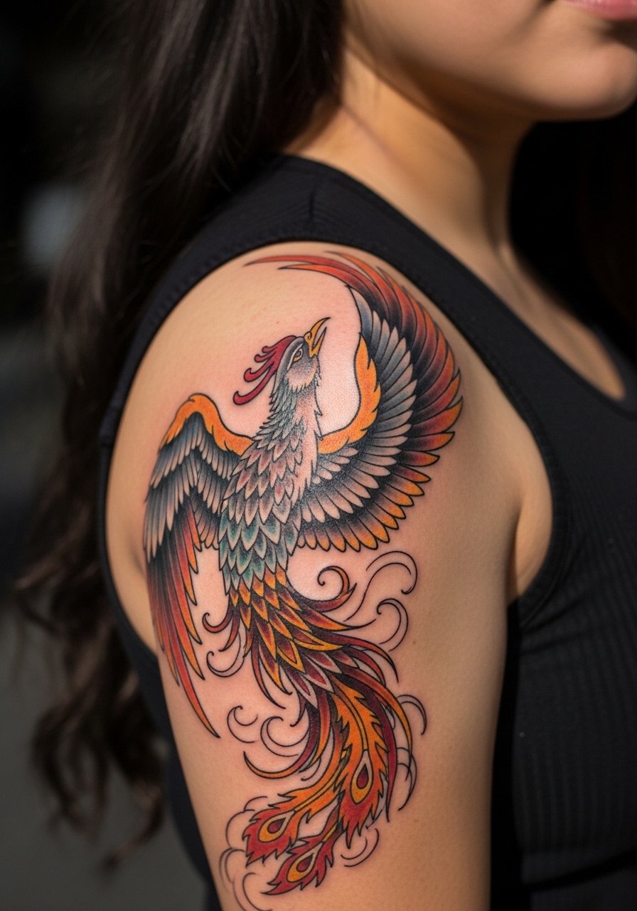
A shoulder phoenix gives scale without demanding time in the chair that a full back piece does. Ask for bold outlines with saturated fills so the image reads at a distance. A common pitfall is tiny feather detail placed too close together. That detail looks great fresh and then softens. Session time is typically two to four hours and pain is mild to moderate. Wear a sleeveless athletic tank to the appointment so the artist has clear access.
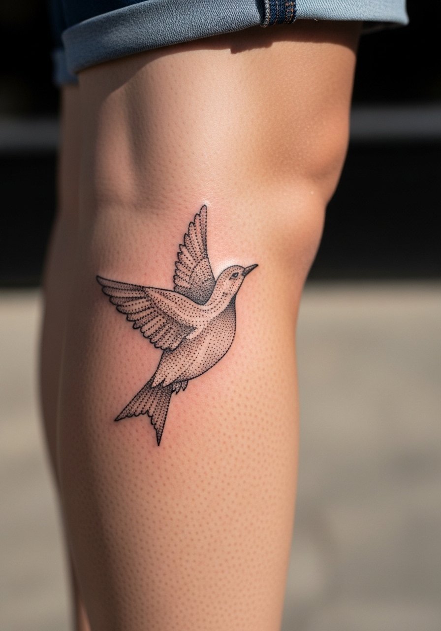
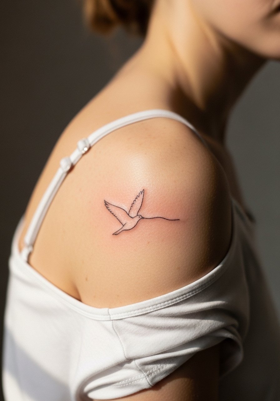
3. Minimalist Rising Bird on Inner Wrist
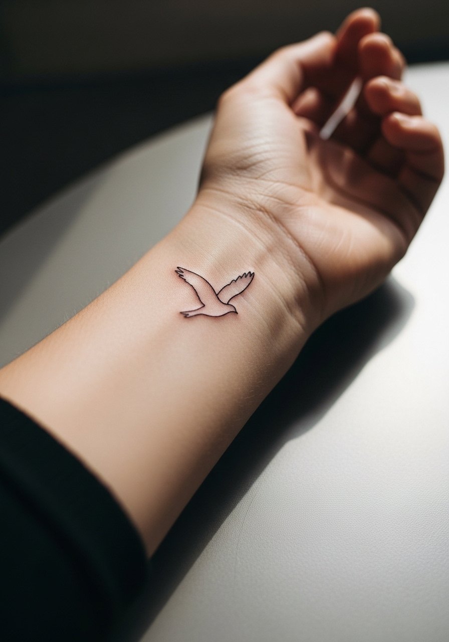
The inner wrist is perfect for a tiny rising bird if you want a subtle symbol rather than full text. Tell the artist to keep the wings simplified and avoid dense detail. Tiny work on the wrist sees a lot of washing and friction, so expect touch-ups sooner than forearm work. Pain is low to moderate. This placement pairs nicely with a thin gold stacked bracelet on the opposite wrist for balance.
4. Figure Breaking Free from Chains, Upper Arm
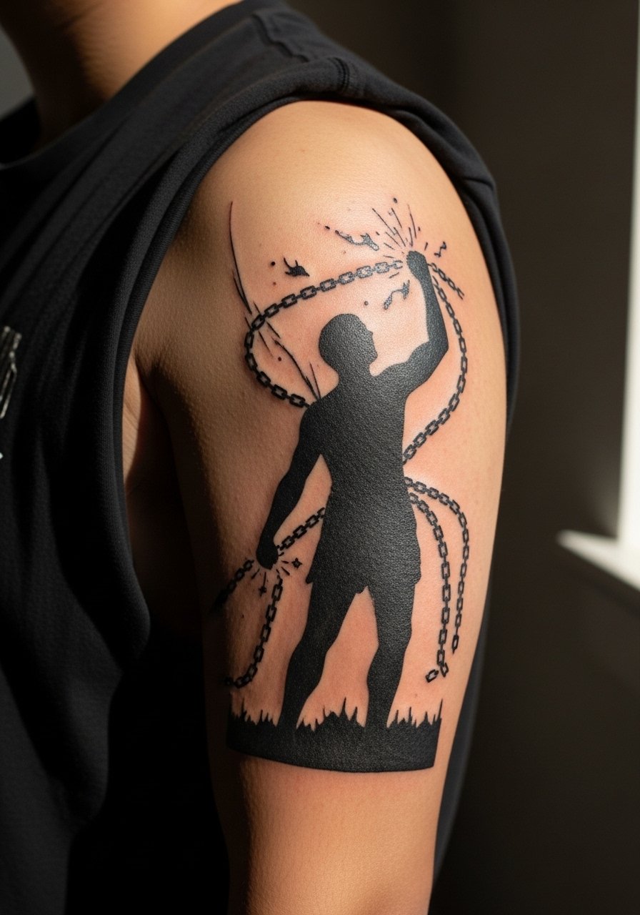
This design reads like a small narrative and works best on the upper arm where there is canvas for detail. In consultation, specify which elements you want simplified so the figure does not become a muddy shape after healing. People often cram tiny chain links, which age into a blur. Upper arm sessions run moderate in time and pain, and the area tolerates saturated black well. For wearing it out, a loose button-down shirt you can pull aside keeps the piece visible without rubbing during the first week.
5. Watercolor Abstract Flow on Upper Back
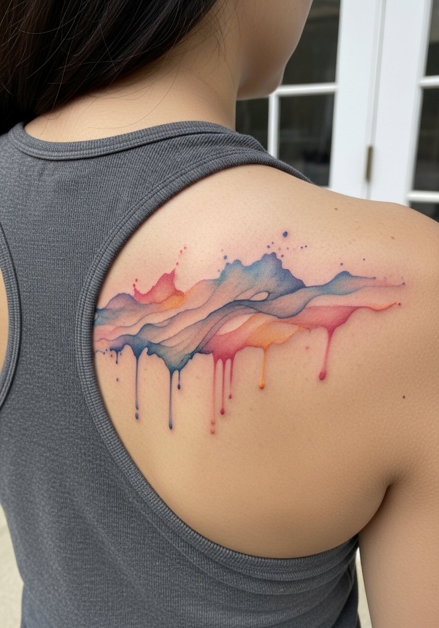
Watercolor offers an ethereal take on the rise motif but requires realistic expectations about fading. Ask for a strong black or dark anchor line so the form remains legible as pigment softens. The usual mistake is relying solely on soft color with no anchor, which can vanish into the skin tone. Sessions may span multiple sittings and the healing feels like a larger area scab cycle. Wear a racerback tank top to the appointment so the artist can reach the upper back cleanly.
6. Cursive Script Along the Collarbone
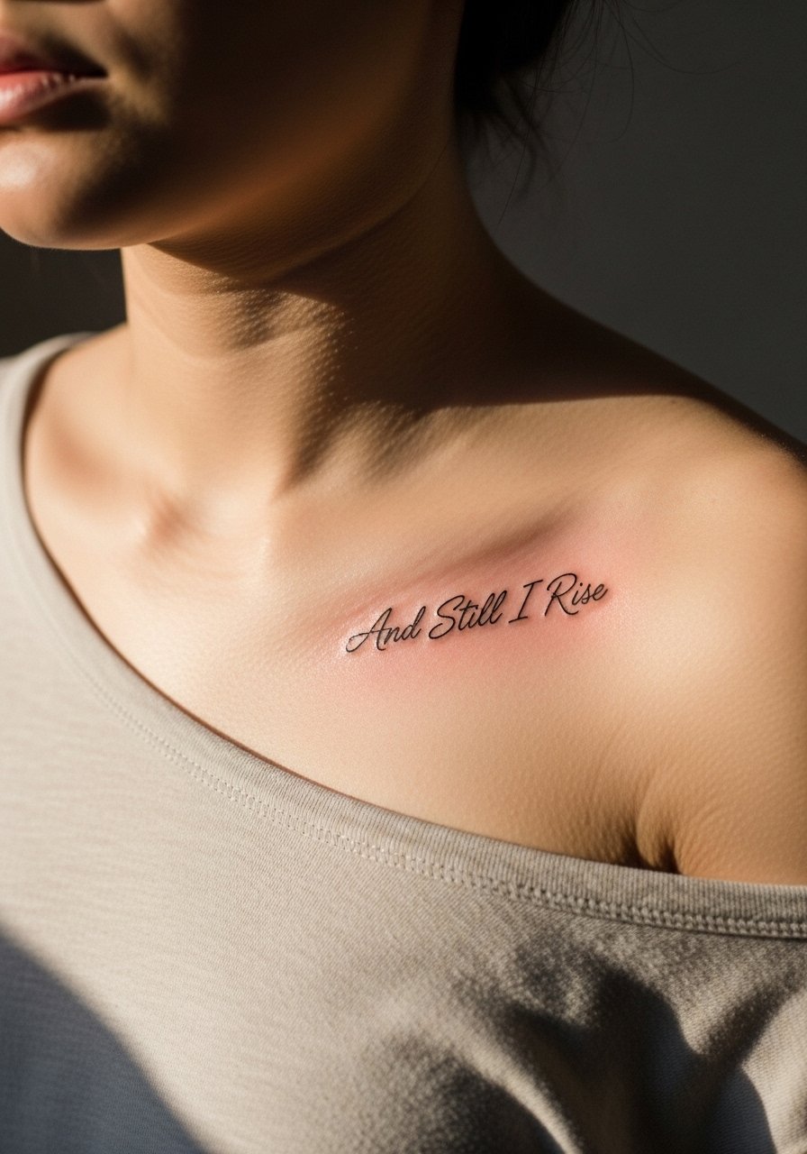
Collarbone script is intimate and flat enough to keep letters readable when done with consistent depth. A common error is placing script too close to the bone, which can cause patchy saturation. Be explicit about letter height and kerning during consultation. Pain is higher near bone but session time is usually short. Pair the healed work with delicate jewelry and an off-shoulder top for evenings out.
Studio Day Picks
The wrist, collarbone, and shoulder pieces above need slightly different prep and a few small items make the session and first week easier.
-
Stencil transfer paper kit. Lets you preview line placement on skin so you can confirm size and flow before the needle starts.
-
Topical numbing cream. Applied as directed before the session eases sensitivity on collarbone and wrist areas.
-
Thin protective film roll. Good for low-friction zones like the forearm and collarbone during the first few days.
-
Fragrance-free gentle body wash. Cleans without irritating fresh ink, useful when showering the upper back or shoulder.
-
Aquaphor healing ointment. Thin application helps keep linework moist without suffocating, which is handy for fine script and wrist work.
7. Arrow Upward Motion on Forearm Inner Side
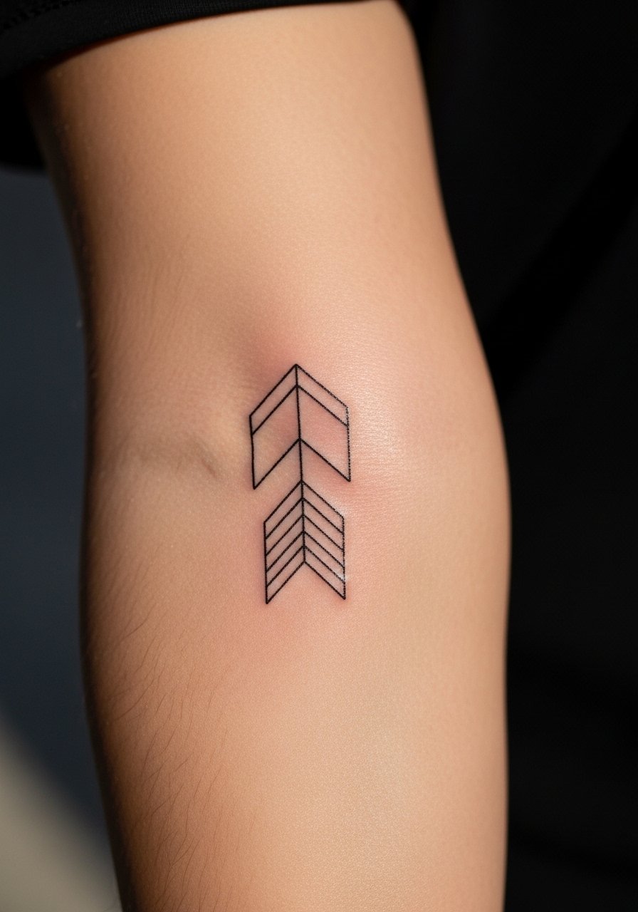
An upward arrow reads clearly and occupies minimal space, which makes it a reliable choice for someone who wants a symbolic reference without script. Ask your artist for a slightly thicker stem so the arrow remains sharp as the skin moves. Too thin and the stem can feather over time. Pain is mild and sessions are short. For sessions, wear a short sleeve button-up that you can roll or pull aside easily.
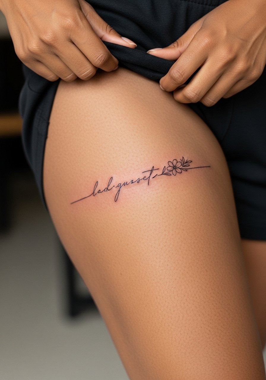
8. Floral Integration Around Script on Thigh
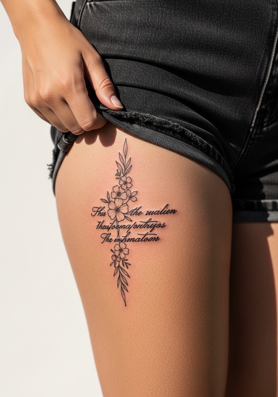
Thigh pieces allow for scale and flow, and pairing a phrase with botanical elements softens the composition. During consultation, ask for negative space between petals and letters so each element keeps its identity. The main mistake is over-detailing small flowers that later blend into the script. Thigh sessions are moderate in pain and longer in time. For after the session, shorts or a wrap skirt like a high-waisted shorts make dressing and swelling management easier.
9. Single-Line Script Down the Spine
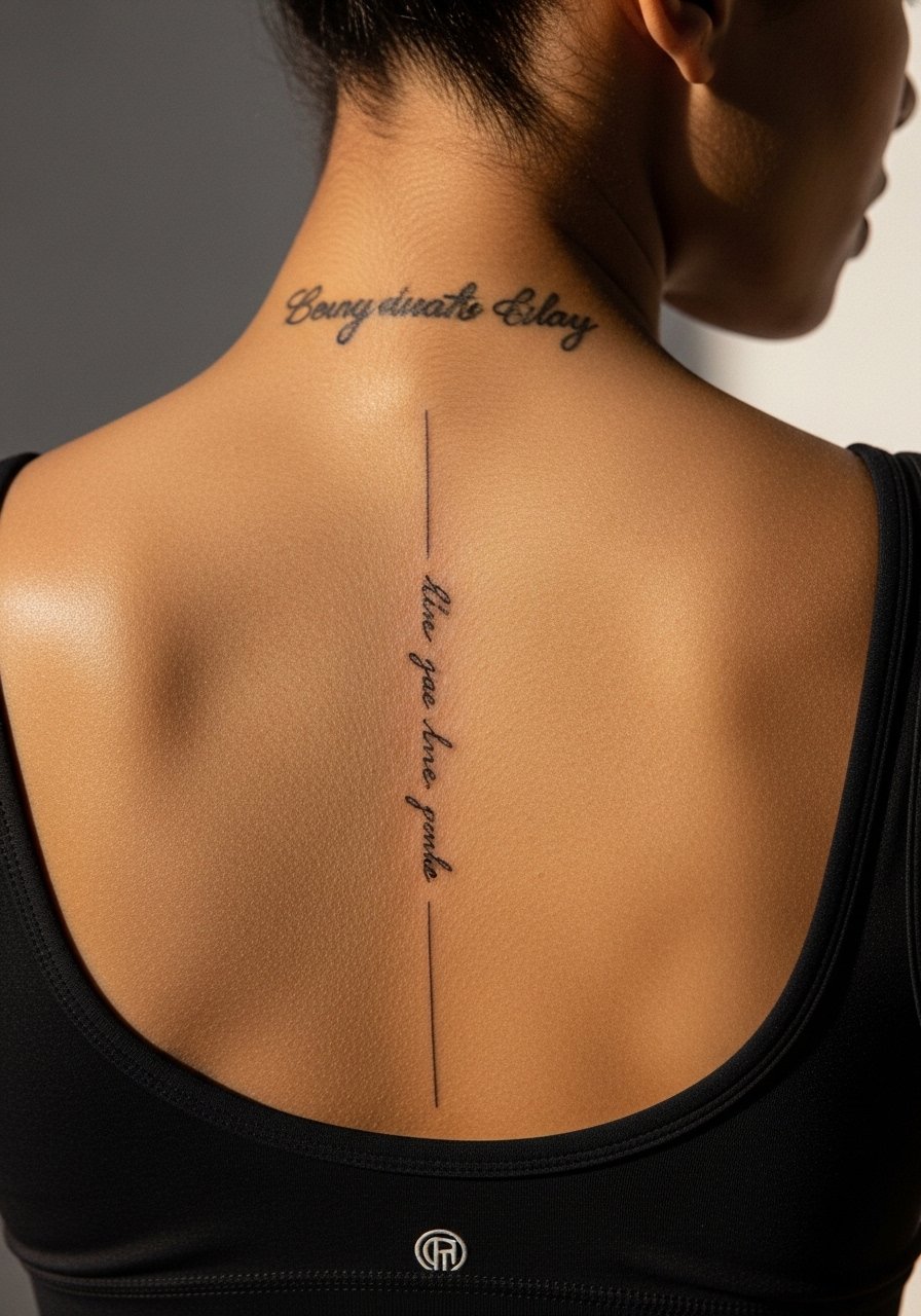
Spine scripts have a natural vertical flow, but the curvature and stretching of the skin changes letterforms. Request a slightly larger letter height than you think you need to maintain legibility over time. One camp argues fine line on the spine blurs quickly. The other camp says with proper depth it can last. Ask your artist where they stand before booking. Pain is higher on the spine and sessions are paced accordingly. Pair this with open-back pieces when you want it to show.
10. Micro-Realism Small Phoenix on Inner Bicep
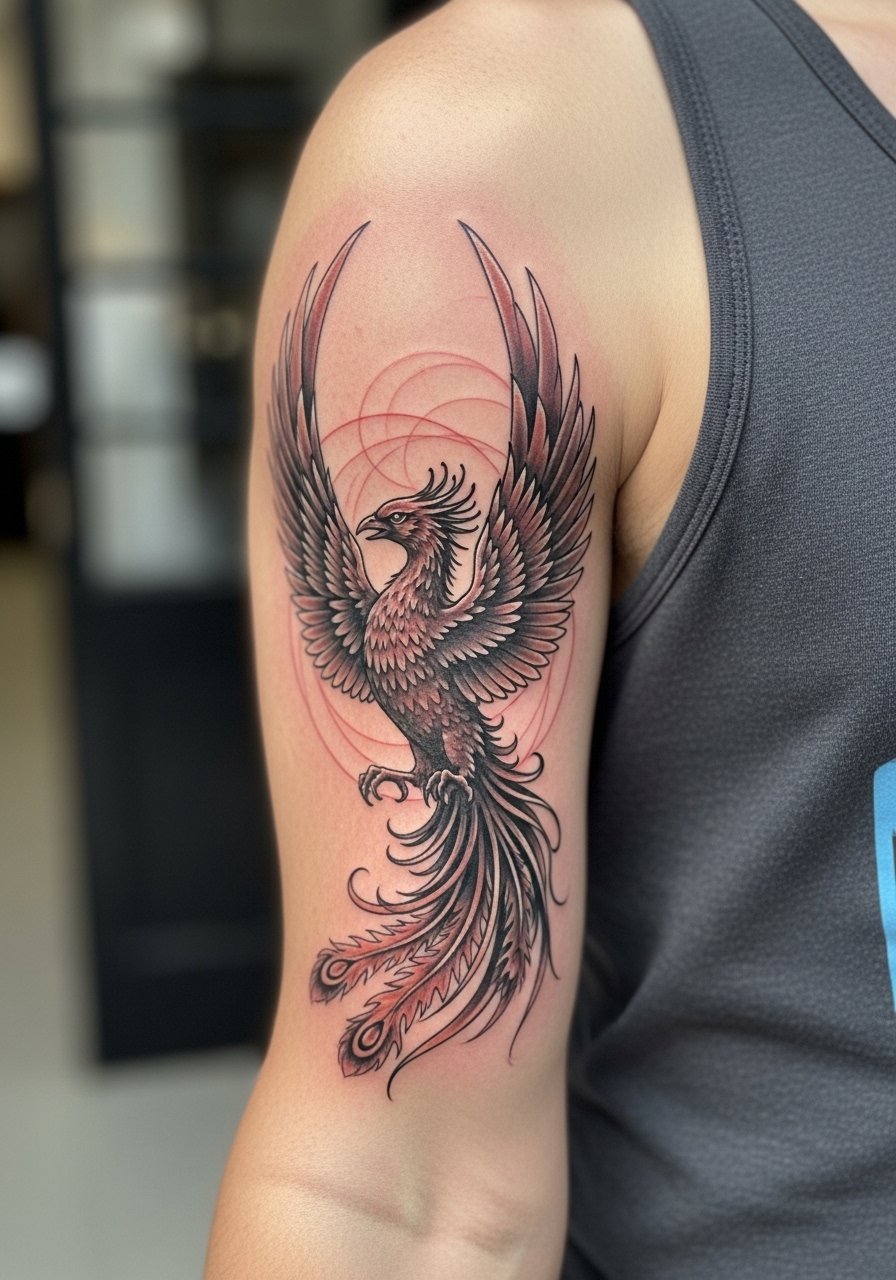
An inner bicep micro phoenix reads as a private emblem that looks detailed up close. Tell the artist to keep contrast between highlights and shadow so the bird maintains dimensionality after healing. People sometimes overwork tiny shading which can muddle over a year. Expect moderate pain when the arm is raised and a single long session. Wear a loose tank top that allows the arm to be positioned comfortably.
11. Neo-Traditional Thigh Phoenix with Flames
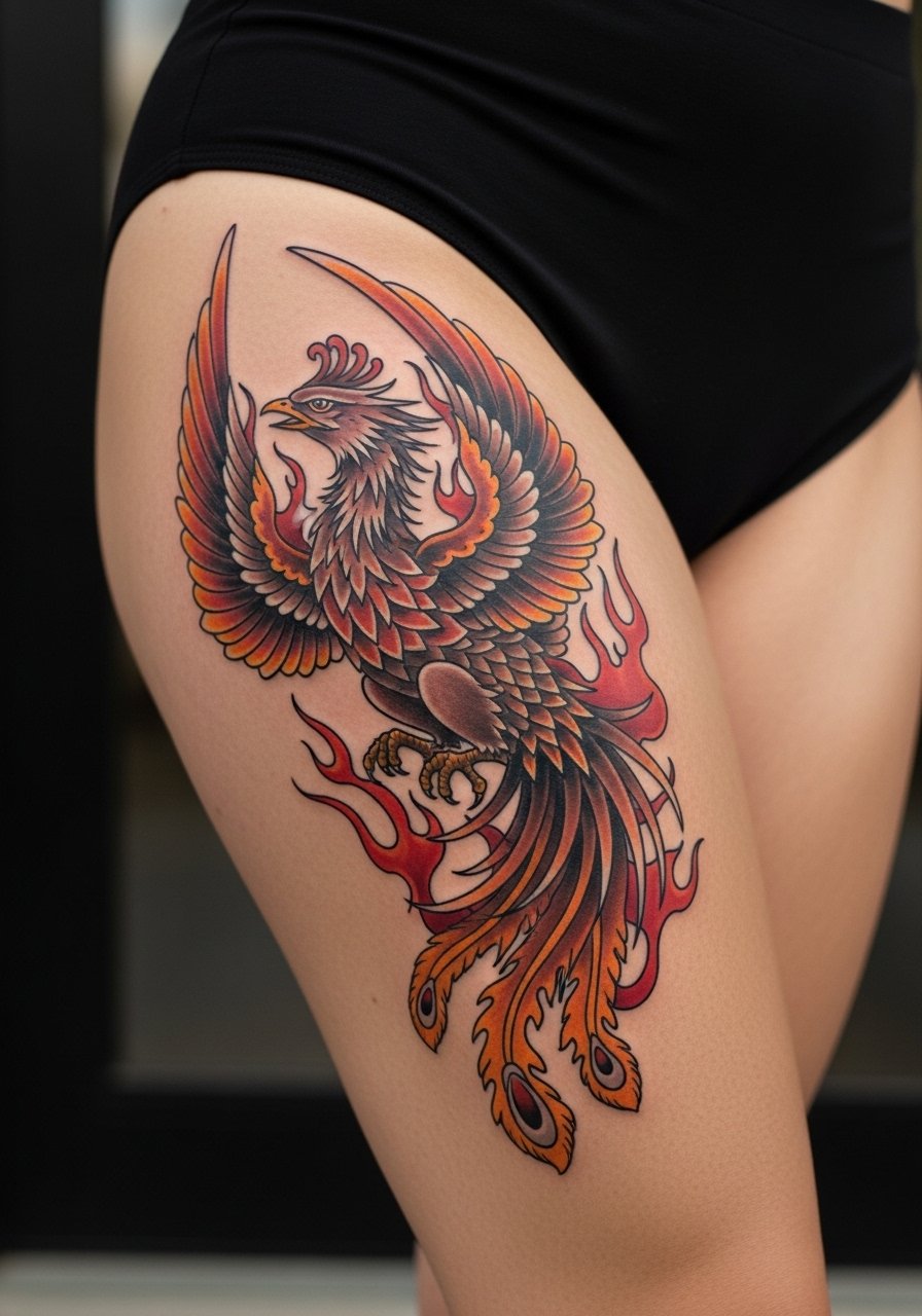
Thigh space lets a phoenix get dramatic and age well because color saturation can be deep. Specify that you want bold outlines to anchor the watercolor or fill tones. Avoid tiny stipple fills that fall apart with time. Sessions are long and may be broken into two sittings. For showing the piece, choose swimwear or a skirt; a high-waisted bottom frames the area without rubbing.
12. Ankle Tiny Script with Star Accent
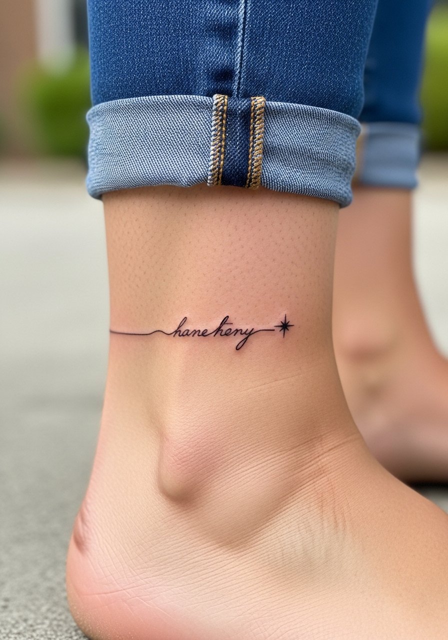
Ankle script is delicate and sees a lot of friction from socks and shoes. Ask for slightly firmer linework and plan to avoid tight footwear while healing. The common mistake is expecting a one-and-done fix; this area often needs a touch-up. Pain is low but bony. For display, cropped pants or sandals help, and a no-show socks combo keeps the ankle visible without rubbing.
13. Hand Signature-Style Script
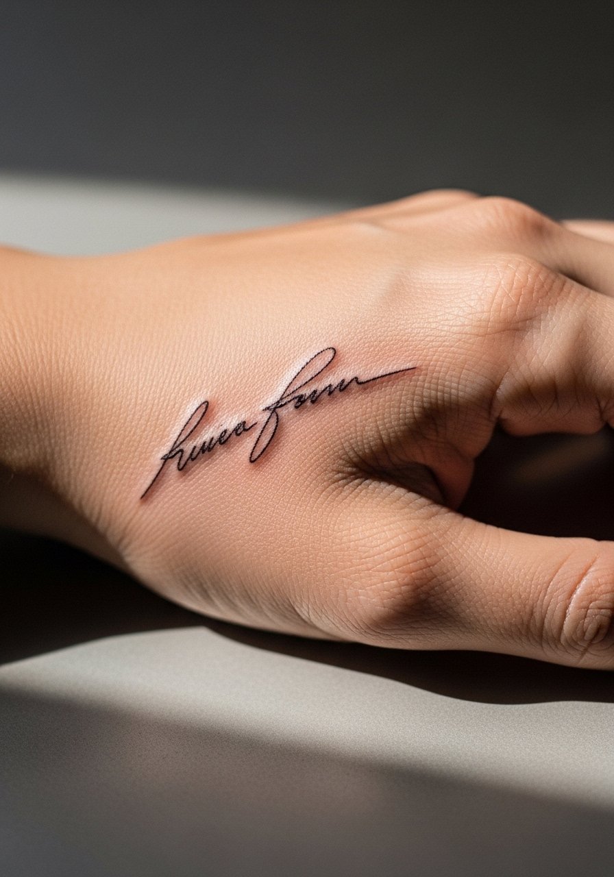
Hand tattoos are high-visibility and high-maintenance because of constant washing and exposure. If you choose a signature script here, request thicker letterforms and accept a likely touch-up within a year. A common regret is choosing ultra-fine caps that disappear under daily wear. Pain can be sharp. Consider workplace implications before booking and ask your artist about their hand tattoo experience.
14. Shoulder Cap Half Sleeve with Rising Bird Motif
A shoulder half sleeve allows motifs to connect without committing to a full sleeve. Plan for a composition that breathes so lines do not crowd. Overly dense patterning near the armpit causes early blurring. Sessions are multiple and pain is moderate. For the day of, a sleeveless athletic tank is practical for access.
15. Upper Back Montage with Script and Phoenix
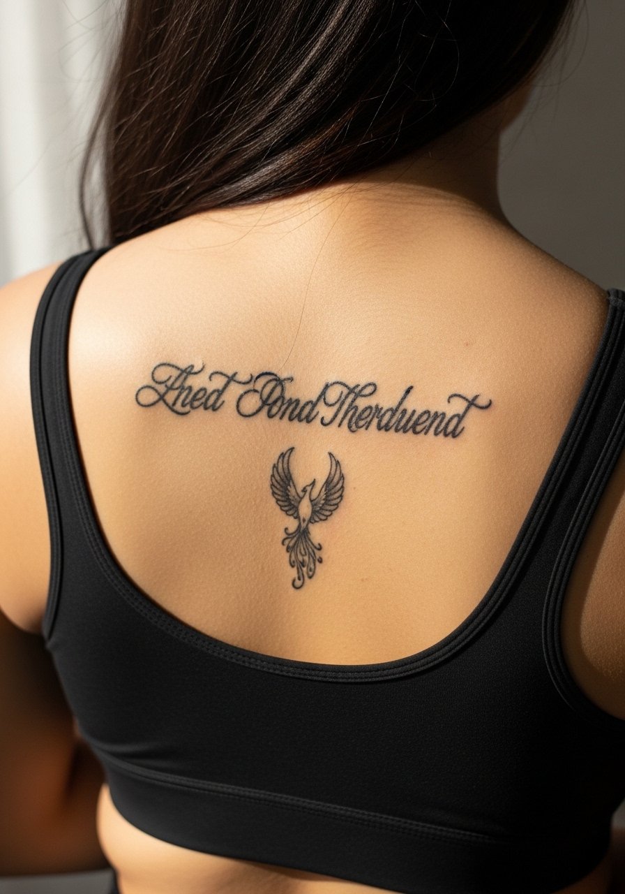
Combining text and imagery on the upper back works when you plan hierarchy. Tell the artist which element should read first and which is secondary. A frequent error is giving equal visual weight to both, which competes visually. Sessions can be long and healing needs loose clothing like a low-back sports bra to avoid rubbing.
16. Sleeve Accent: Small Script Between Larger Pieces
If you are adding "And Still I Rise" into a sleeve, ask the artist to match line weight and spacing to the surrounding flash. Place the script where arm movement will not compress letters. The mistake is shoehorning text into a busy area. Sessions depend on how much of the sleeve is new work. For everyday styling, rolled-up sleeves and a minimalist watch on the opposite wrist keep the arm balanced.
17. Sternum Fine Line Botanic Piece
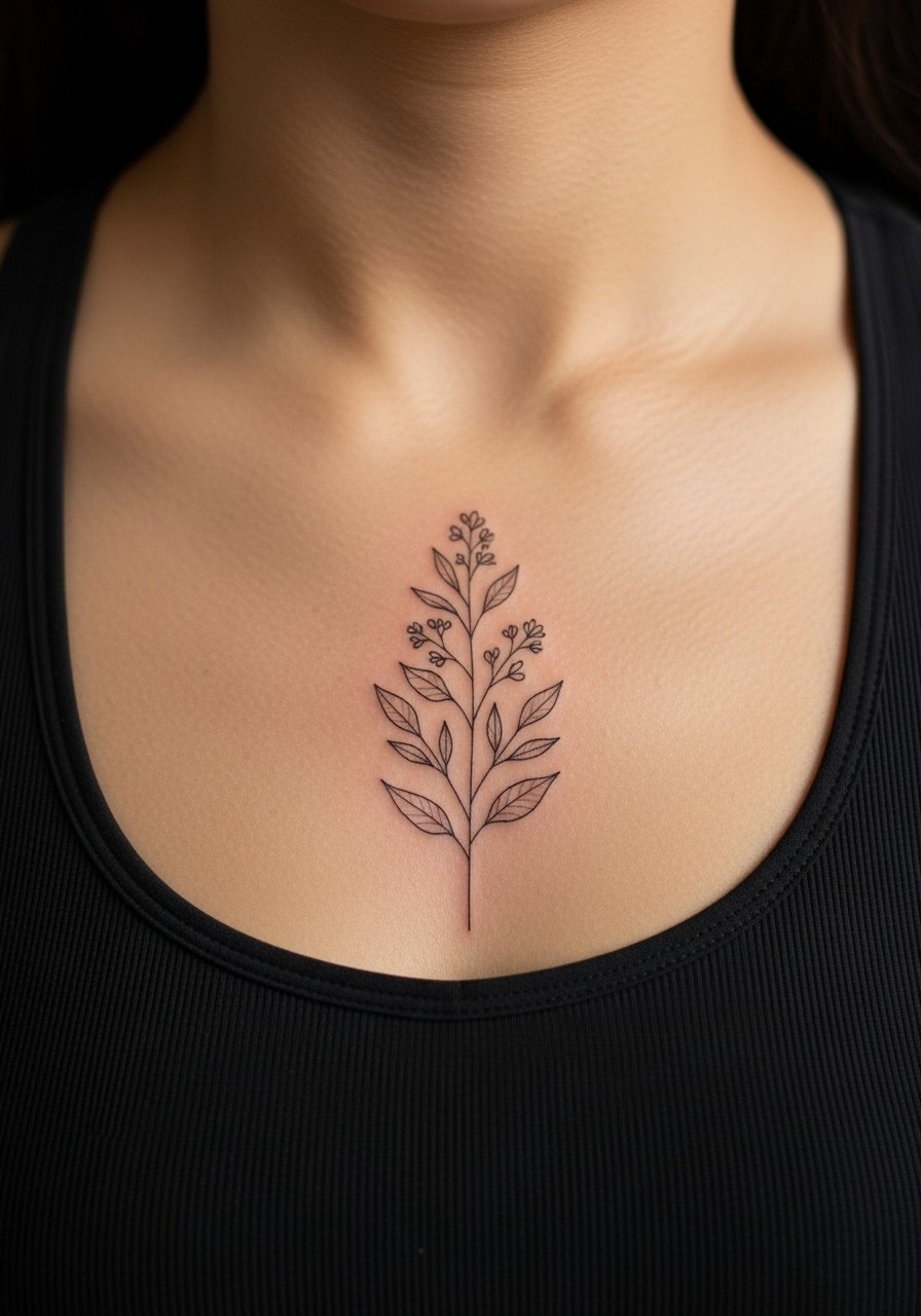
Sternum tattoos are intimate and beautiful, but they are also sensitive during application. Ask for slightly bolder spacing to keep the design legible as the area stretches. One camp cautions against very thin script across the sternum because the skin shifts with breathing. The other camp says precise depth and placement alleviate the problem. Pain is higher and sessions are paced. For the appointment wear a fitted sports bra you can remove or shift easily.
18. Inner Thigh Script with Floral Accent
Inner thigh work is private and tolerates softer shading well. Tell your artist you want spacing that accounts for muscle movement and possible weight changes. Tiny tightly packed letters can warp with time. Sessions feel different because the area is softer and bruises can show. Wear loose shorts for the appointment and afterwards choose breathable bottoms for comfort.
19. Calf Rising Bird with Dot Work
Calf canvas suits vertical compositions and handles stipple shading gracefully. Ask for a clear contrast between dot work and outline so the bird does not dissolve into texture. The main mistake is too-dense stippling at small scale. Pain is moderate and sessions are manageable. For the appointment, pull on athletic shorts that allow the leg to lie flat.
20. Foot Constellation with Mini Script
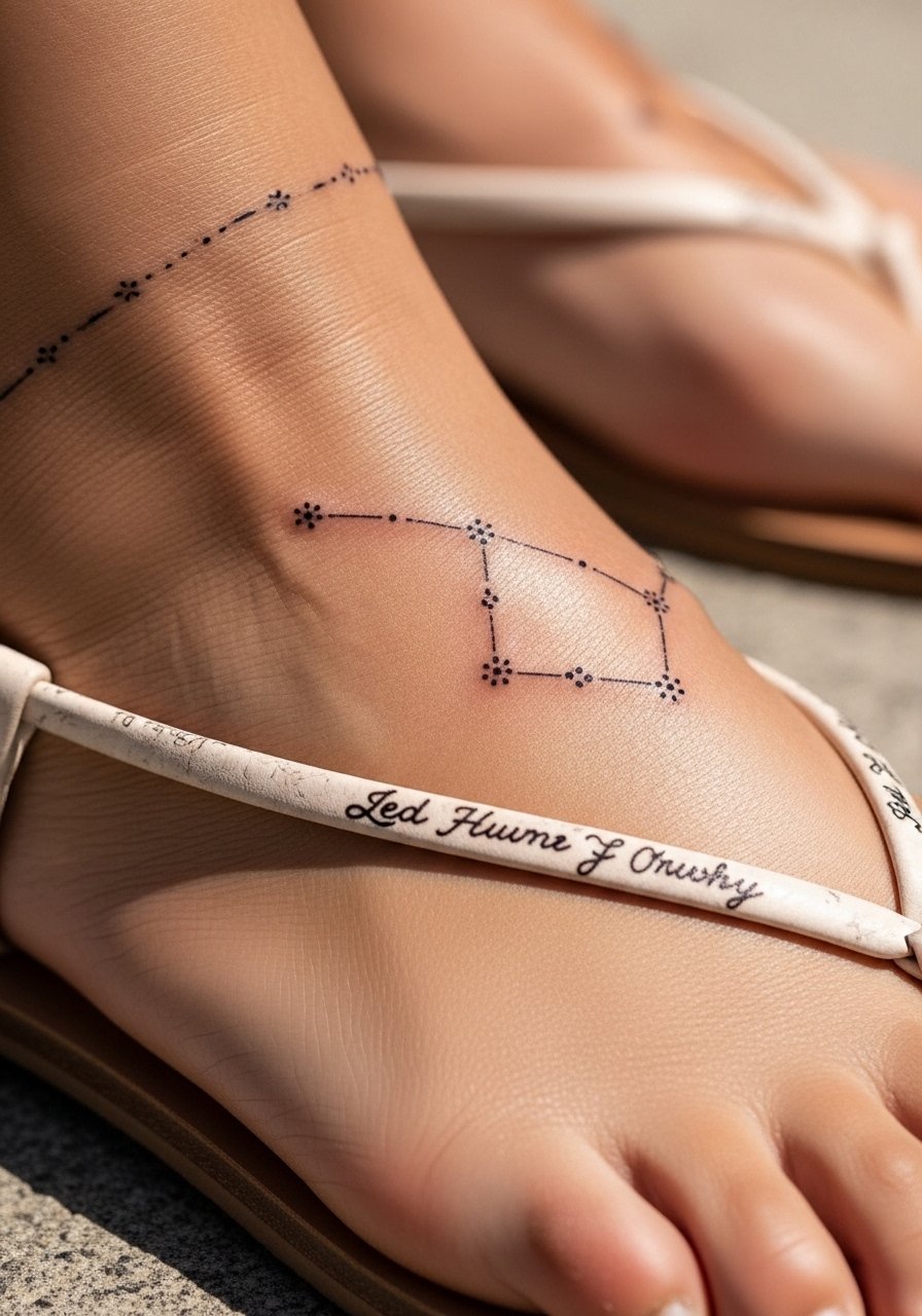
Top-of-foot tattoos are delicate and often fade faster due to friction from shoes. Specify slightly thicker dots for stars and a compact script partner to withstand wear. A common regret is expecting a one-year maintenance-free result. Pain is higher on the foot and healing requires shoe choices that reduce rubbing. For showing it off, sandals or cropped pants work best.
21. Hip Floral Arch Around Script
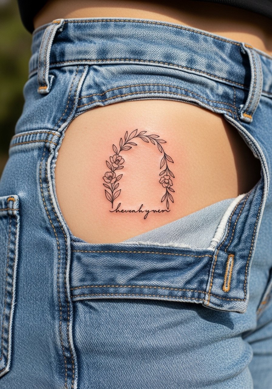
Hip tattoos change with body movement and clothing pressure, so ask the artist to position the script where fabric will not constantly rub. Many clients regret placing fine letters too low where waistbands sit. Sessions can be moderate and swelling happens. Choose high-waisted pieces when dressing to avoid abrasion during healing and wear high-waisted jeans that sit comfortably above the ink.
22. Chestplate Stylized Script Above Sternum
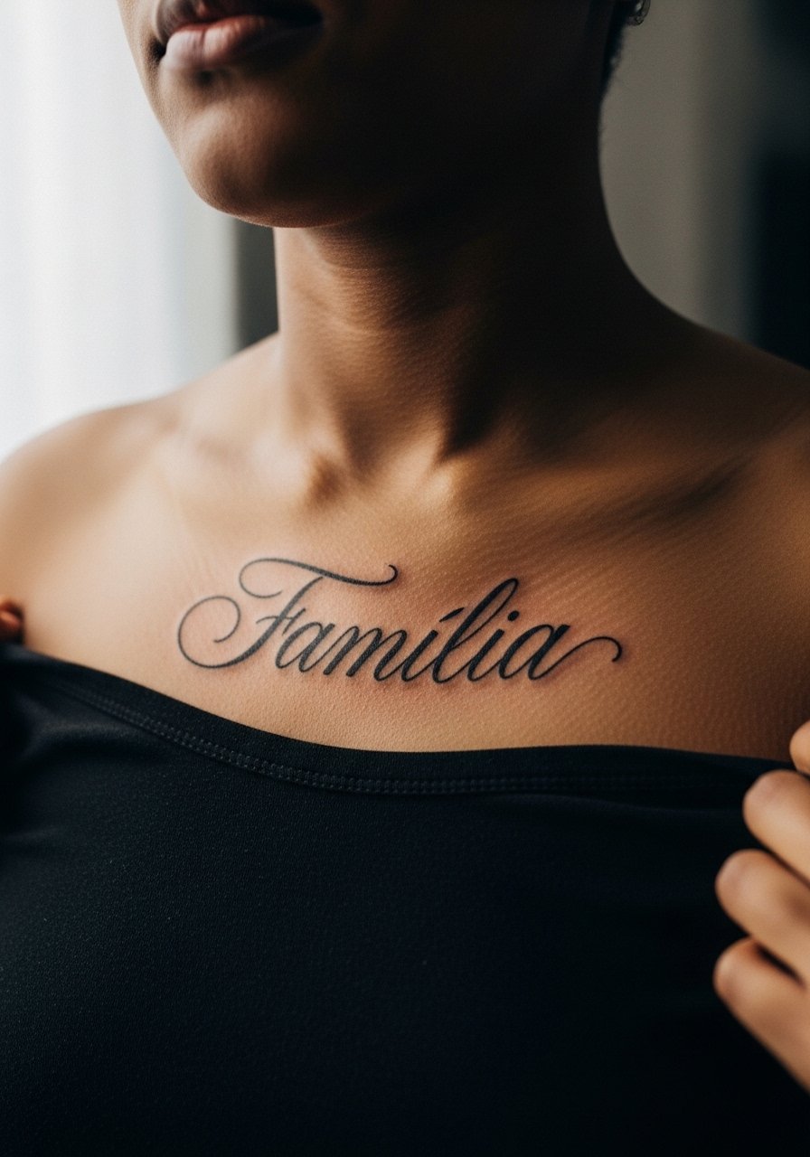
Upper chest scripts are visible and flattering when spaced well. Request that the artist maps the arc to your clavicle and tests size with a mirror. The usual error is picking a script that conflicts with the natural slope of the chest. Pain is moderate. For clothing, open-collar shirts or wide-neck tops keep the area framed without covering the piece.
23. Ribcage Large Cursive Phrase
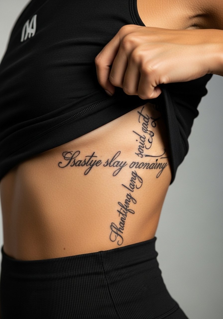
Rib text can be gorgeous but also tricky because of movement and stretch. Artists split on this placement. One camp says fine line on ribs blurs within two years due to skin stretch. The other camp says appropriate spacing and needle depth prevent that. You should ask your artist which side they are on before committing. Rib sessions are commonly more painful and paced into short sittings. Bring a loose top that you can shift during breaks.
24. Back Shoulder Blade Single Bird
A shoulder blade bird offers a quiet placement that is easy to conceal. Ask for a slightly thicker outline so the silhouette remains crisp after healing. The main mistake is tiny internal detail that the area cannot support at small scale. Pain is low to moderate. Choose open-back dresses or a racerback tank to highlight the piece when you want to show it.
25. Lower Back Flowing Script with Floral Ends
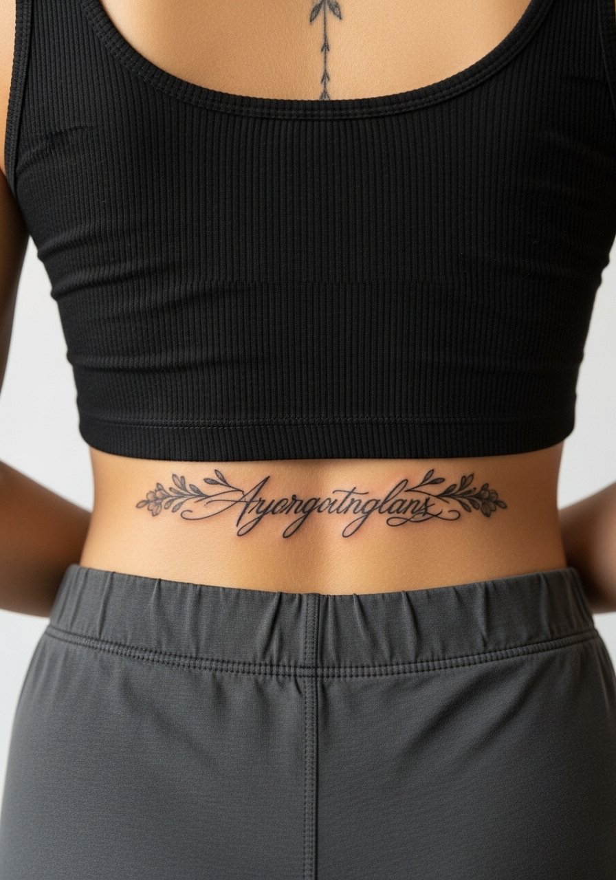
Lower back script suits wider horizontal phrases and moves well with clothing lines when positioned intentionally. The common error is placing text where waistbands press, causing blurring. Sessions are moderate and healing requires loose waistbands for a few weeks. For styling, low-back dresses or a cropped tee and high-waisted bottoms show the area cleanly.
26. Tiny Finger Script on Side of Finger
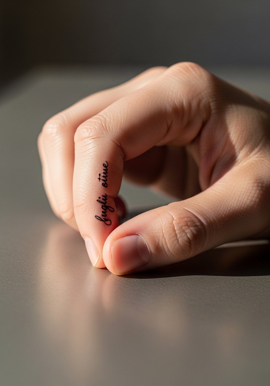
Finger scripts are ultra-visible but often need frequent touch-ups because the skin renews quickly and the area bleeds pigment into surrounding tissue. Ask for slightly bolder forms and accept the maintenance. The mistake is expecting permanence like a forearm piece. Pain can be sharp. Keep in mind workplace considerations before choosing this spot.
27. Side Neck Small Script Near Hairline
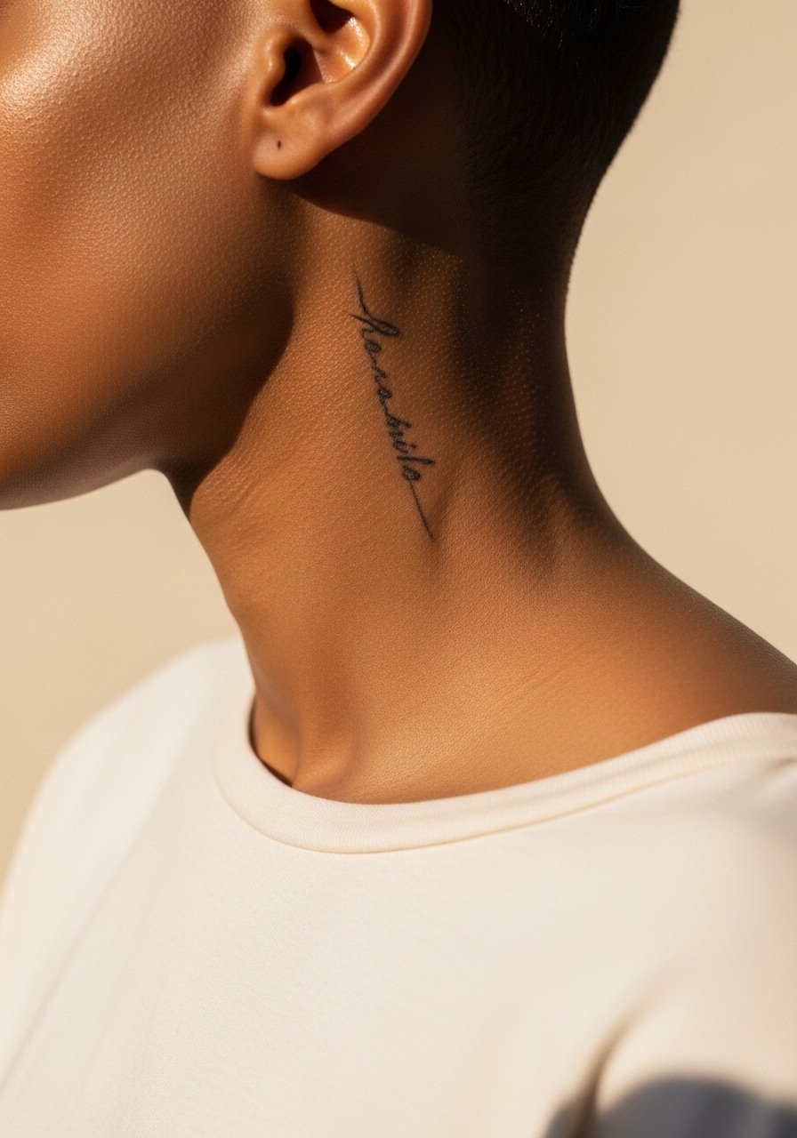
Neck scripts are highly visible and require confidence. Tell the artist you want letter spacing that accounts for movement and hair friction. Tiny, tight script under the hairline can fade with shampooing. Pain is moderate and healing needs gentle care. If you plan to show it occasionally, pair with wide-neck tops and a delicate pendant necklace that sits above the script without covering it.
Frequently Asked Questions
Q: Will fine line script like "And Still I Rise" blur faster than bold script on areas like the ribcage or wrist?
A: Fine line scripts are more sensitive to placement. On high-friction and high-movement areas like the wrist and ribs, thin lines tend to soften sooner. Ask for slightly larger letters and consistent needle depth if you want fine line on those areas, and be prepared for a touch-up timeline that may be sooner than for bold work.
Q: How should I dress for a collarbone or sternum session so the artist has easy access and the area does not rub during healing?
A: Wear loose or wide-neck tops you can shift without going fully bare. For collarbone and sternum work a wide-neck shirt or a fitted sports bra works well. A wide-neck shirt lets the artist move the fabric aside and keeps you comfortable during breaks.
Q: If I want a phoenix but only have time for a short session, which placements give the best impact without multiple sittings?
A: Shoulder cap and outer calf handle medium-sized phoenixes in fewer hours because they tolerate bold outlines and saturation. Thigh and upper back are better when you want large scale and multiple sessions.
Q: Do watercolor-style pieces need different long-term care than blackwork pieces?
A: Watercolor pigments tend to soften faster, so sun protection and periodic touch-ups help. Blackwork anchors a composition visually as color fades. Both need sensible sun protection and moisturizing during the healing window.
Q: Should I be concerned about cultural sensitivity when using Angelou's poem as tattoo text if I am not from the same background?
A: This depends on personal context and intent. Some people choose to attribute the line while others adapt wording to reflect their own experience. A thoughtful conversation with friends or community members you trust can help you decide how to honor the source without appropriating it.