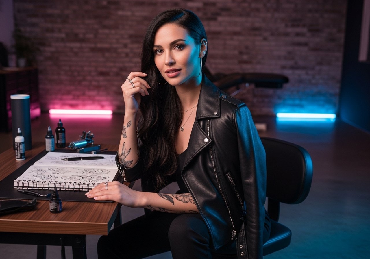
The stencil sits on the inner forearm and suddenly the design looks more intimate than it did on the phone screen. I watch people decide in that moment whether they want something that reads clean at year one, or something built to hold for a decade. These 21 references focus on clean execution, realistic aging, and simple wardrobe pairings that actually help the ink show up without stealing attention.
1. Fine Line Mountain Range on Inner Forearm
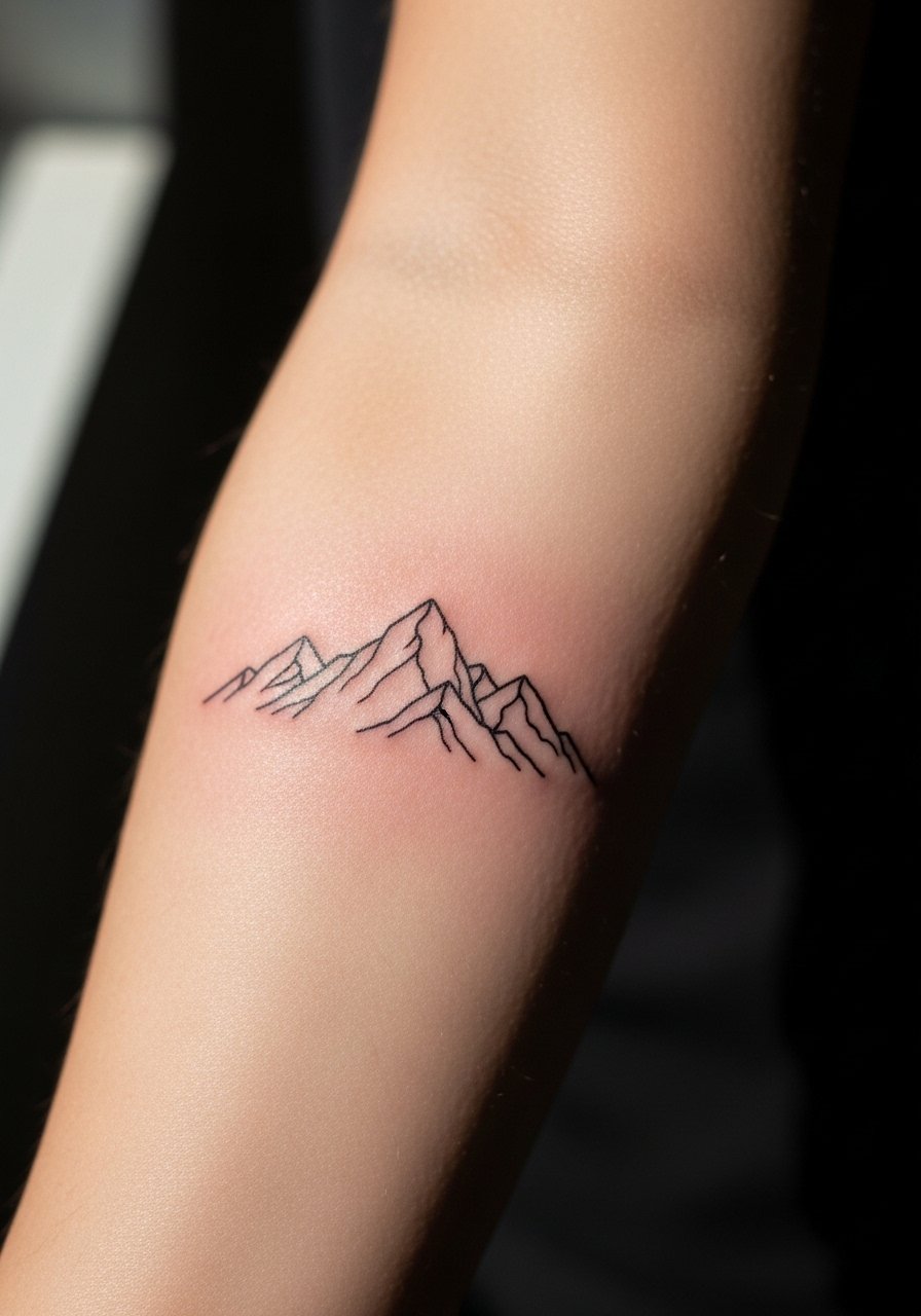
I recommend this when you want something personal that still reads from a short distance. Tell your artist you want slightly heavier lineweight than the absolute micro look so the ridgelines keep separation as the skin settles. Most people make the mistake of asking for ultra-thin lines that blur into single strokes by year three. Expect a one- to two-hour session and mild soreness along the inner forearm. At six months the peaks look crisp. At two years the thinnest lines will soften and may need a targeted touch-up at year three. For showing it off, roll sleeves and try a loose button-down shirt that frames the forearm without hiding the linework.
2. Micro Script Coordinates Along the Vein
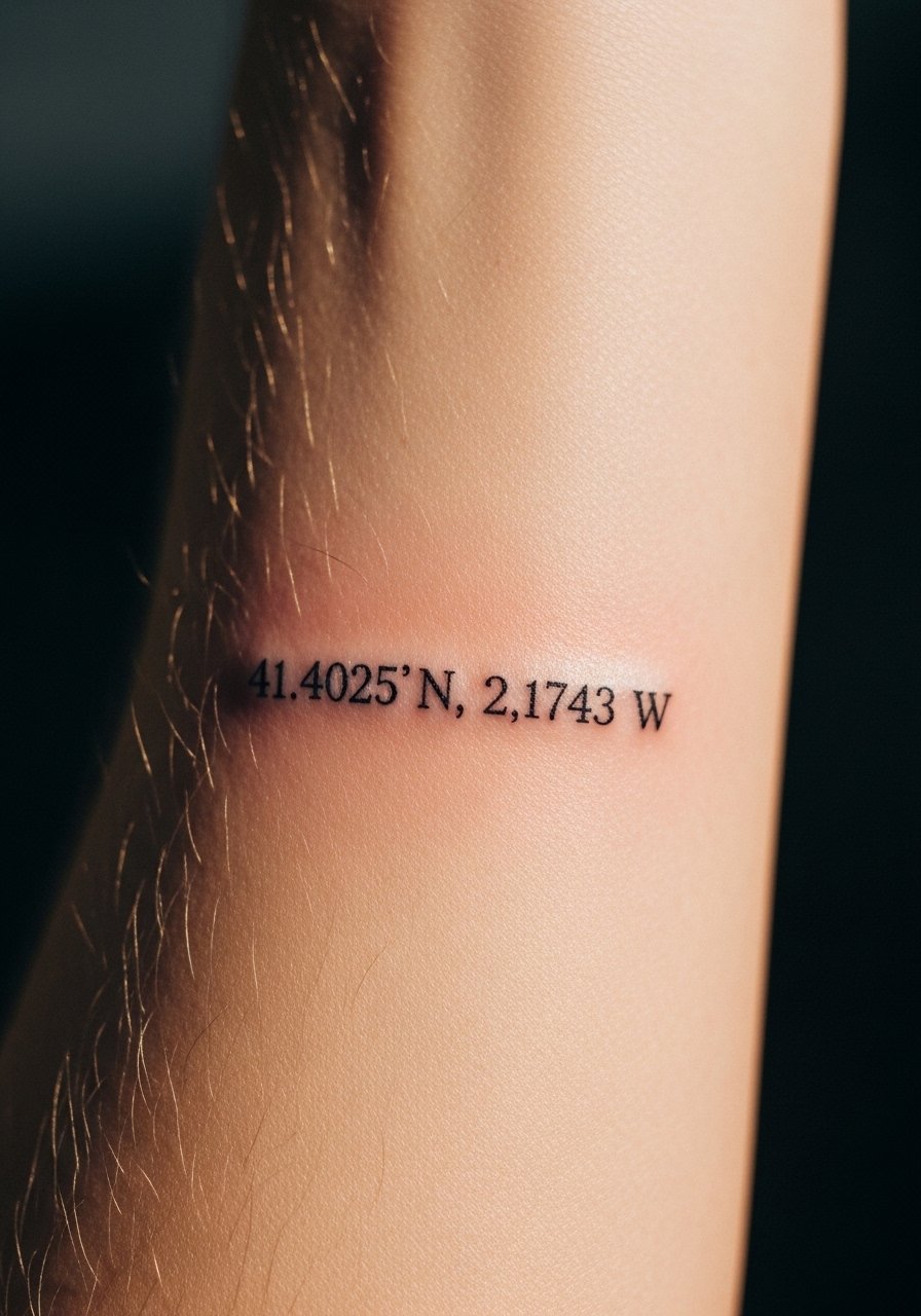
Small text over the inner forearm feels intimate and works well for dates or coordinates. When you consult, show exact lettering and specify spacing so the digits do not crowd. The common error is choosing a font with too many thin strokes. That leads to blurring and illegible numerals after a couple of years. Session time is usually under an hour and you'll feel sharp needlework along the nerve line near the wrist. Plan a touch-up at year two or three for clarity. Pair this with a simple accessory like a thin chain bracelet to draw attention without covering the text.
3. Minimalist Botanical Stem, Single Needle
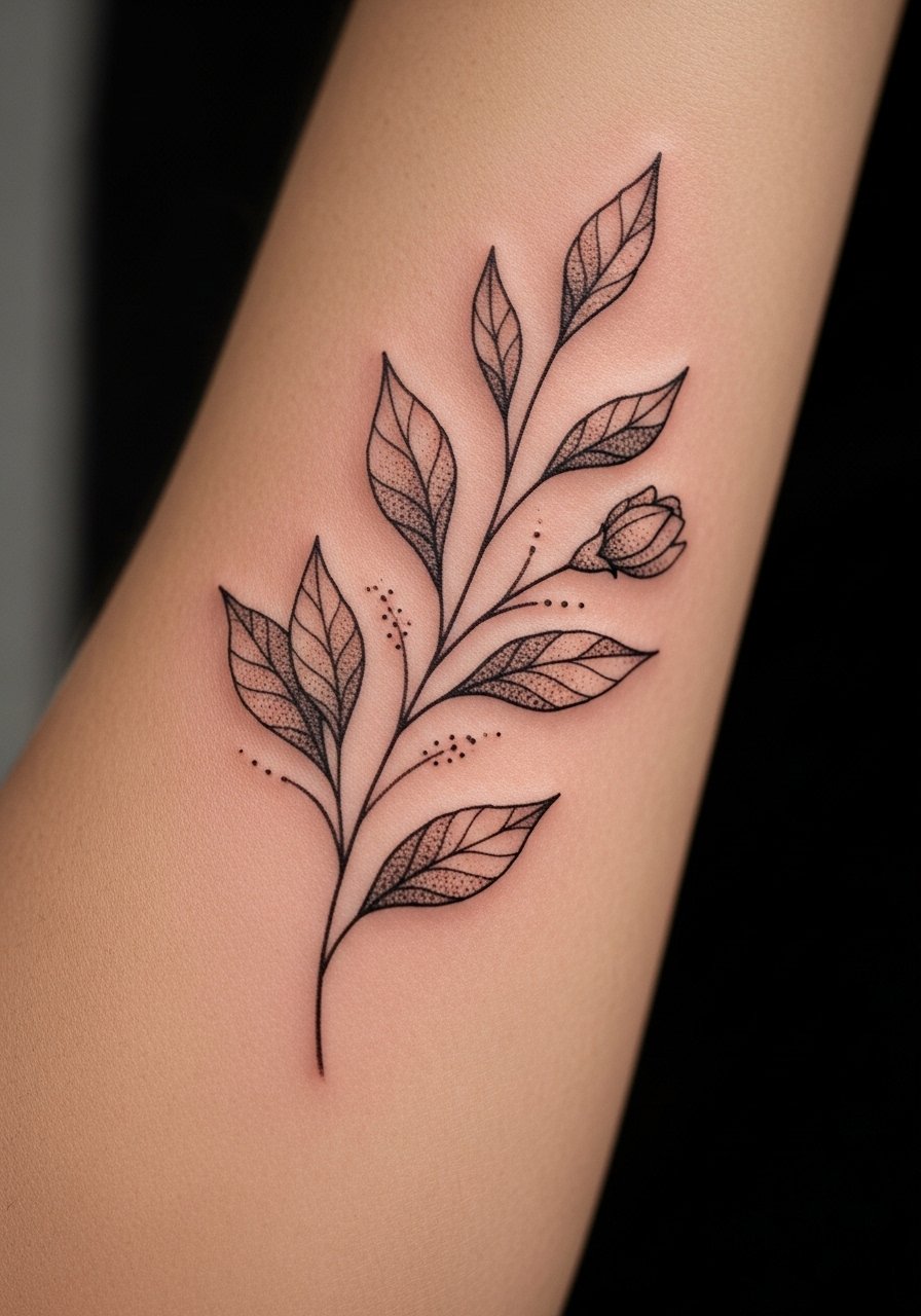
I've seen this style hold up best when artists use a little spacing between leaves and stem. In consultation, ask the artist to avoid filling micro foliage too densely. The mistake is packing in tiny leaves that merge into a gray mass over time. Expect a two-hour session and a dull ache along the inner forearm. At six months the stipple shading reads soft. At five years the stem may need a small touch-up to restore edge contrast. For casual show-off, wear a rolled-sleeve linen shirt in neutral tones so the ink sits against calm fabric rather than bright prints.
4. Geometric Line Cluster with Negative Space
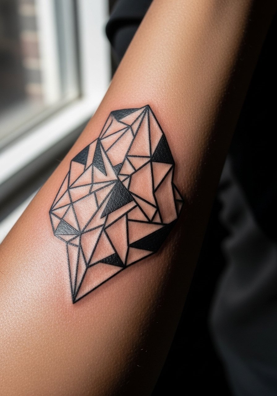
This reads graphic and modern when given room. Tell your artist you want a mix of bold and thin lines and specific spacing between elements so negative space holds. The common mistake is compressing patterns too tightly, which causes merging and muddiness later. Sessions range from 90 minutes to three hours depending on density. Blowout risk increases if the lines are pushed too deep near the wrist, so ask about needle depth. At two years the composition should still read if spacing is correct. Pair it with a minimalist watch that complements the angles without crowding the forearm.
5. Small Blackwork Anchor with Solid Fill
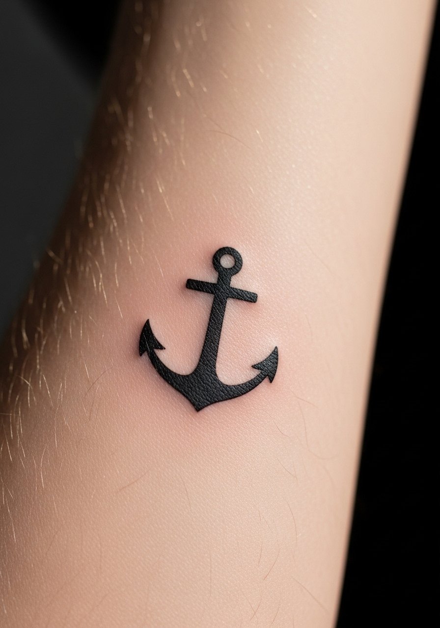
Blackwork fills age well if saturated correctly. In the consult, request a slightly denser fill than you think you need to account for future fading. People often underestimate how much saturation an anchor needs, which leads to patchy areas. The session is short and people report an intense but brief sting as the needle crosses the dense fill. At six months the fill will even out. Expect touch-ups at year four if you want peak saturation maintained. For a low-key reveal, roll sleeve cuffs or wear a short-sleeve henley that lets the anchor peek out.
6. Micro-Realism Eye for a Personal Focal Point

Micro-realism reads intimate and demands precise shading. When booking, bring close-up reference photos and ask the artist about contrast levels so the pupil keeps depth as it heals. The mistake is asking for photographic detail at too small a scale, which softens into an indistinct gray patch. Sessions can run longer because of careful shading. Expect tenderness when the needle works near thin skin areas. At two years the piece will still read if contrast was prioritized. Wear a racerback tank on session day so the artist has easy access to the inner forearm without fabric shifting.
Studio Day Picks
Those inner forearm references above range from thin script to dense blackwork, and a few small items make the session and first week smoother for both thin line and filled pieces.
-
Stencil transfer paper kit. Helps you preview layout on skin before the artist inks, which is handy for coordinate and micro script pieces.
-
Topical numbing cream. Applied per instructions reduces sharp sensitivity along the inner forearm during denser fill sections.
-
Thin protective film roll. Useful for keeping the inner forearm clean during the first days when clothing rubs the area.
-
Fragrance-free gentle body wash. Cleans the healing skin without stripping ink, which matters for fine line and stipple shading.
-
Aquaphor healing ointment. A thin application early on helps keep delicate linework from drying into scabs that can pull out pigment.
7. Single Needle Script with Looping Tail
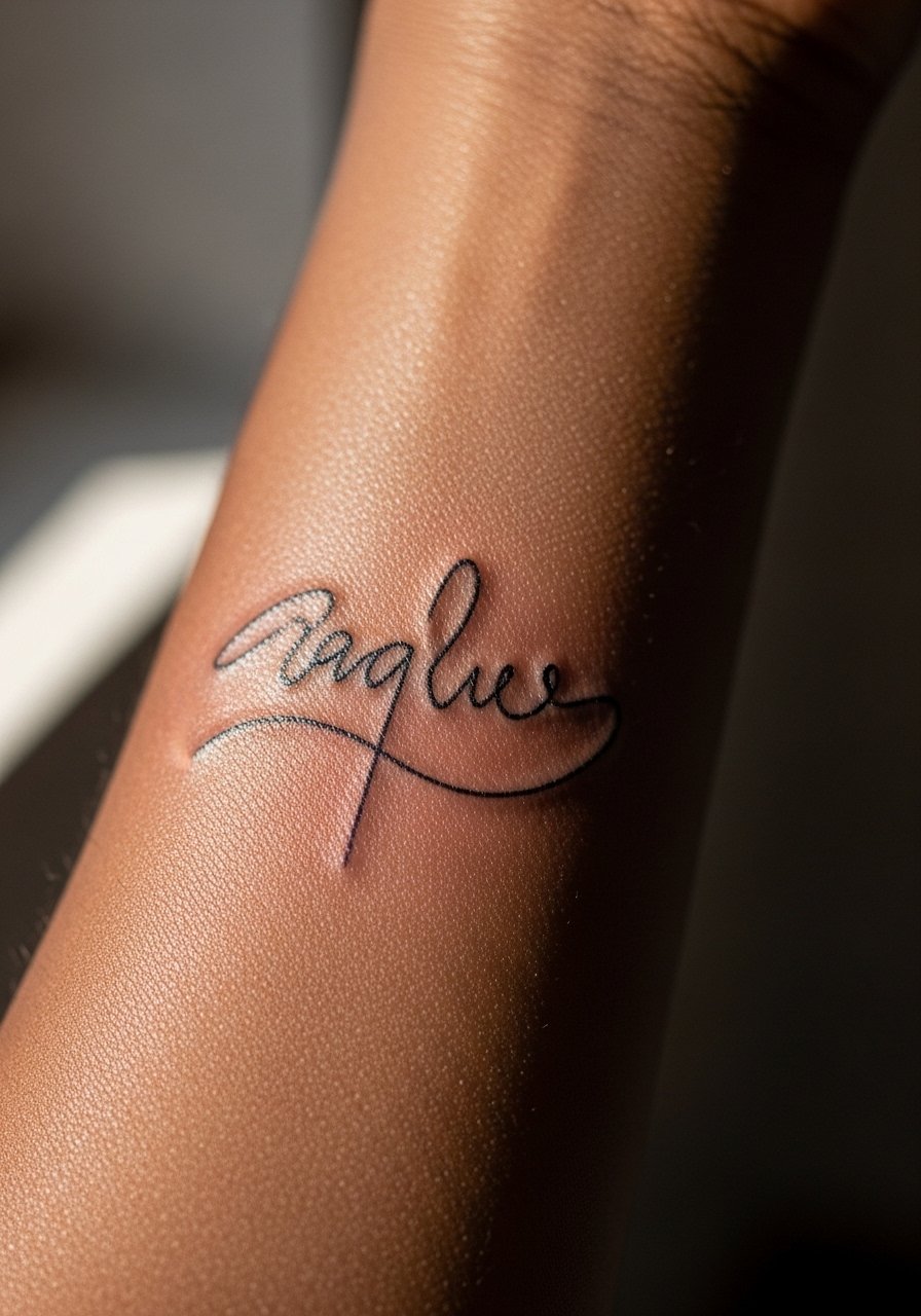
Personal script holds best when spacing and baseline are mapped directly onto the skin. Tell your artist you want a steady baseline and show examples of exact letter spacing. The common error is choosing a heavily flourished script too small. The tails and loops need breathing room or they will fill in. Expect a focused session under an hour and a light soreness along the median nerve area. At five years the thicker parts will remain readable while the thinnest strokes may need a touch-up. For evenings out, cuff a long-sleeve shirt so the script appears and disappears with movement.
8. Constellation Dots and Tiny Stars
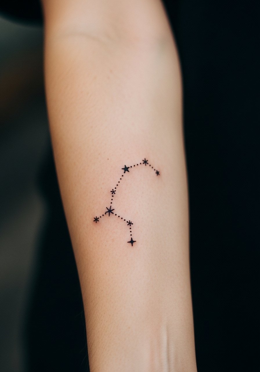
Constellations work well when dots have variable sizes to maintain a sense of depth. During the consult, ask that key points be slightly larger so they anchor the composition. The mistake is using uniform micro-dots that blur together over time. These pieces are quick and feel like a light, repeated tapping. At two years the map looks softer but still legible if dots were spaced intentionally. Pair this with a stack of thin metal bracelets so the constellation reads against a simple accessory. Consider a thin cuff bracelet that sits above the tattoo without rubbing it.
9. Linear Wave or Water Line
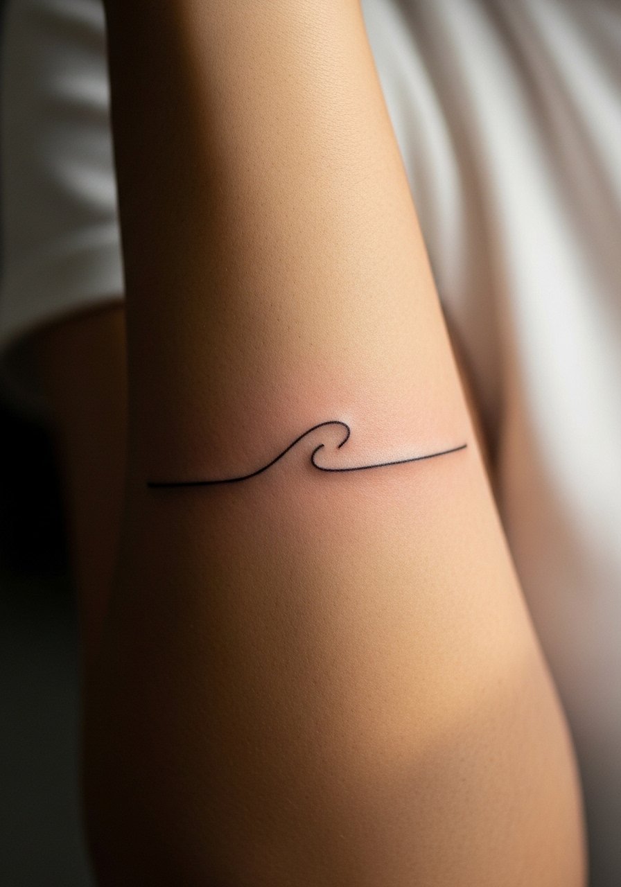
A single flowing line can act like a signature across the forearm. Tell the artist you want a slightly variable stroke so the line breathes with the arm's movement. The common mistake is asking for a perfectly rigid line that looks mechanical as the skin moves. Sessions are brief and many describe the sensation as a steady scratch more than a deep burn. Over time the wave softens but keeps its gesture if the line weight was intentionally varied. For session comfort, wear a short-sleeve tee you can roll up without constricting the arm.
10. Traditional Rose, Scaled Down for the Inner Forearm
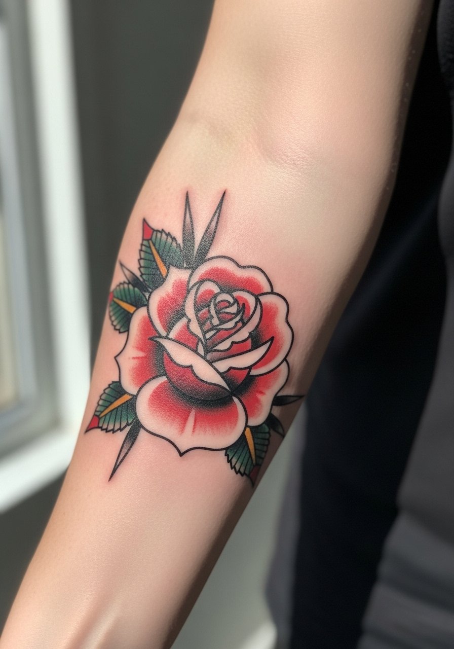
Traditional elements translate well when artists keep bold outlines a little thicker on the forearm. Say you want clean outlines with restrained color or no color to reduce touch-up frequency. Folks often try to miniaturize full-color roses too much and the petals lose separation. Expect a two-hour session with sharp spots where the needle works petals. At two years the outline should remain strong and any color may fade. For wearing, cuff a rolled-sleeve linen shirt that shows the flower at the edge of the sleeve.
11. Chain Link Band That Wraps the Forearm
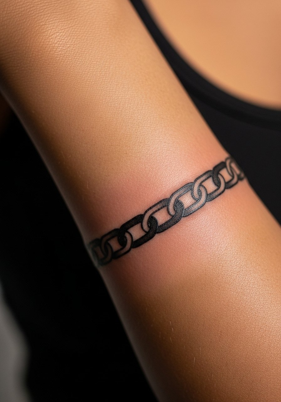
Bands read best when the links are spaced so they do not merge. Ask your artist to leave micro-gaps and to map the wrap around the arm while standing. The mistake is too-tight chains, which blur into a single dark band over time. This session is short but precise and you will feel repeated needle passes where the line crosses. Expect touch-ups at year three if links sit near low-motion areas. For show-off, a minimalist watch strap can sit above or below the band to frame it without rubbing.
12. Dot Work Mandala Strip

A mandala strip plays well on the forearm if the artist uses larger dots near the center and lighter stipple outward. In consultation, ask how the pattern will wrap with the skin grain and avoid hyper-dense areas. People ask for tiny centers that collapse into a dark blur. Sessions can be longer due to detailed stippling and you may feel a persistent tapping. At five years the pattern still reads if spacing was respected. For a clean look under sleeves, try a rolled-up shirt cuff that reveals the strip without chafing.
13. Small Compass with North Arrow
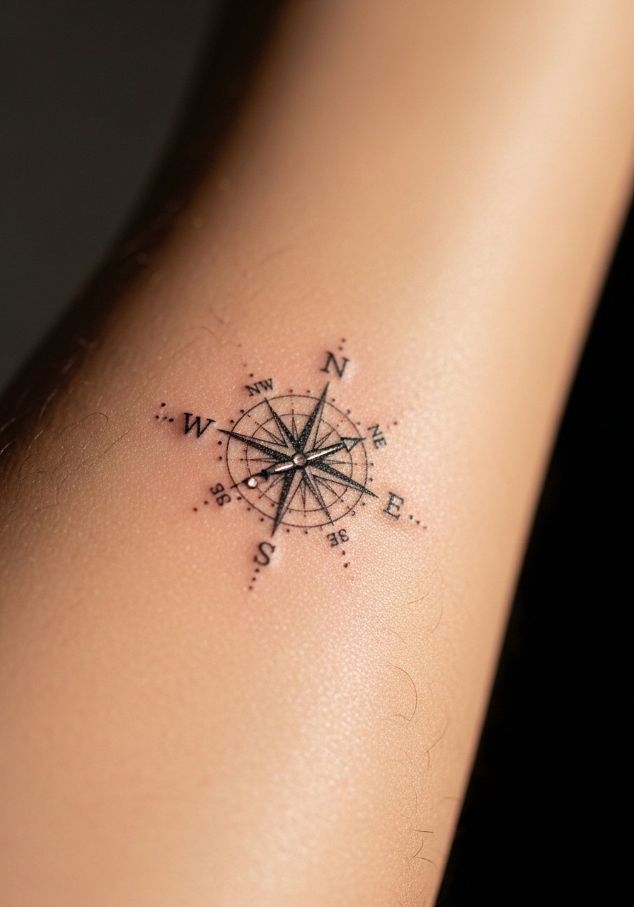
Compasses need clear cardinal points so the main lines remain dominant. Tell your artist you want a stronger north arrow and slightly bolder cardinal lines. The mistake is making all spokes identical and too thin, which makes orientation ambiguous after healing. Sessions are quick and feel like steady work along the nerve. By year three the cardinal lines will need a touch-up if you want crisp directionality. This design pairs well with a simple leather band bracelet that echoes the compass aesthetic.
14. Minimalist Animal Silhouette
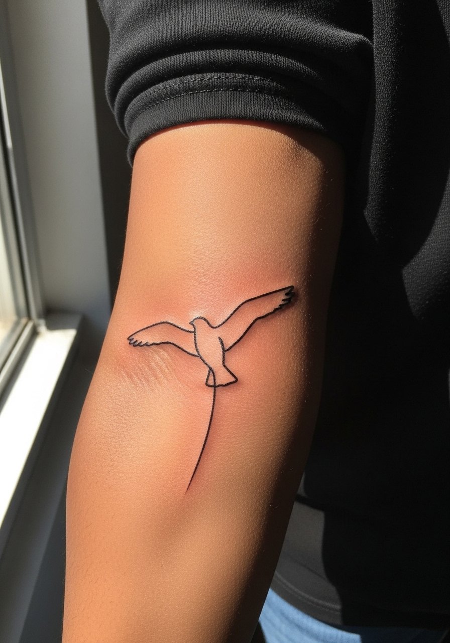
Silhouettes work when the outline is not fragile. Ask your artist to thicken key curves so the silhouette keeps its shape as the skin stretches. Common mistakes include using hairline strokes that fill in and lose shape. Sessions are usually under an hour and the sensation is quick with a few sharp passes. At two years the silhouette remains readable if the outline was given structure. For layering with clothes, a short-sleeve button-up shows the silhouette when you want and hides it when you do not.
15. Waveform or Soundwave Tattoo
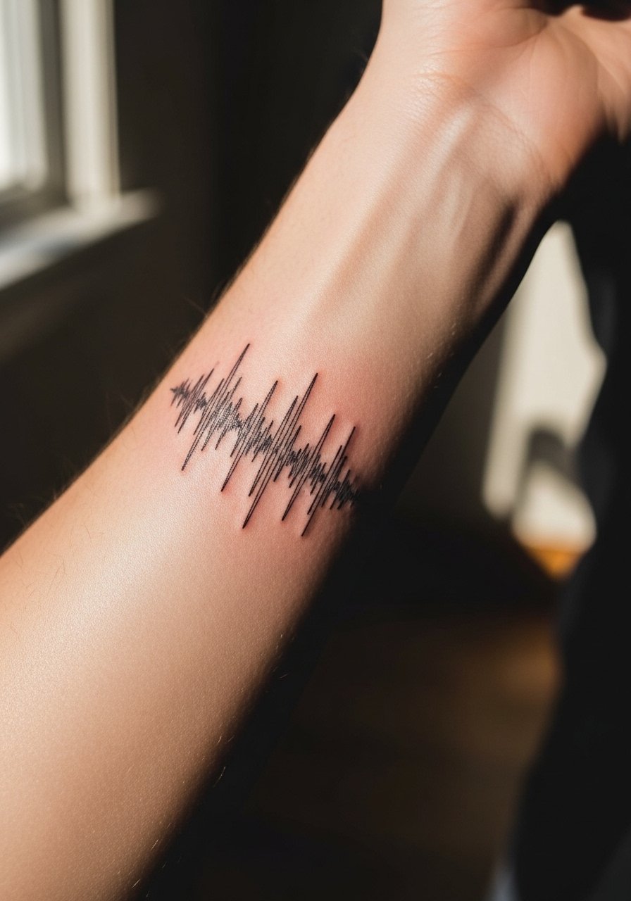
Soundwaves are literal and need exact scaling for recognition. Bring the exact audio clip or waveform image and ask the artist to keep thinner peaks slightly thicker than the micro lines. The mistake is shrinking the waveform so detail disappears into noise. Sessions are short and feel like repeated light scratching. Over time the smallest peaks will soften and a small touch-up can restore definition. Wear a rolled-sleeve tee for casual reveals that do not rub the forearm.
16. Thin Arrow Down the Forearm
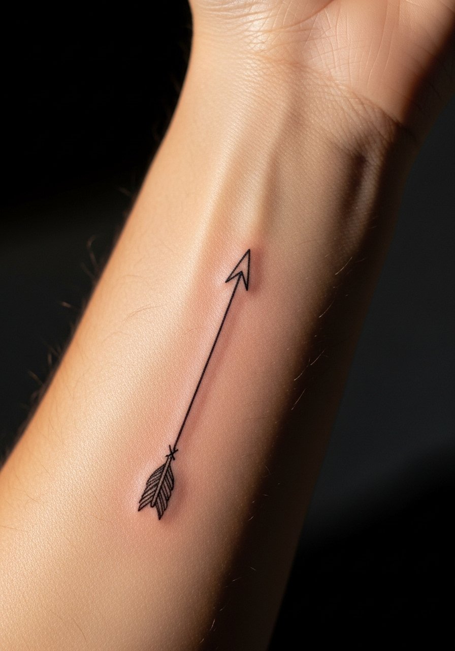
Arrows read as directional statements when the line is consistent but not fragile. Tell your artist to keep incremental line weight so the shaft stays visible over time. The mistake is using hairline shafts that disappear into the skin texture. Sessions are quick and the inner forearm hums as the line is laid. At two years the arrow keeps its gesture, though the thinnest parts may lose edge. For session comfort, a loose tank top gives the artist access without fabric shift.
17. Botanical Wrist-to-Forearm Band
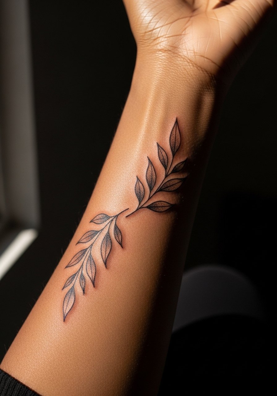
Bands that start at the wrist need deliberate tapering so the design reads as it moves up the arm. Discuss scale with the artist so leaves do not get denser near joints. People pack too much detail into the wrist band where skin moves more and that causes early blurring. Sessions can run one to two hours and you will feel sensitivity where veins sit near the wrist. At five years the higher forearm detail holds better than wrist detail which may need touch-ups. Pair this with a thin leather bracelet that sits below the band rather than on top of it.
18. Abstract Brush Stroke, Textured Look
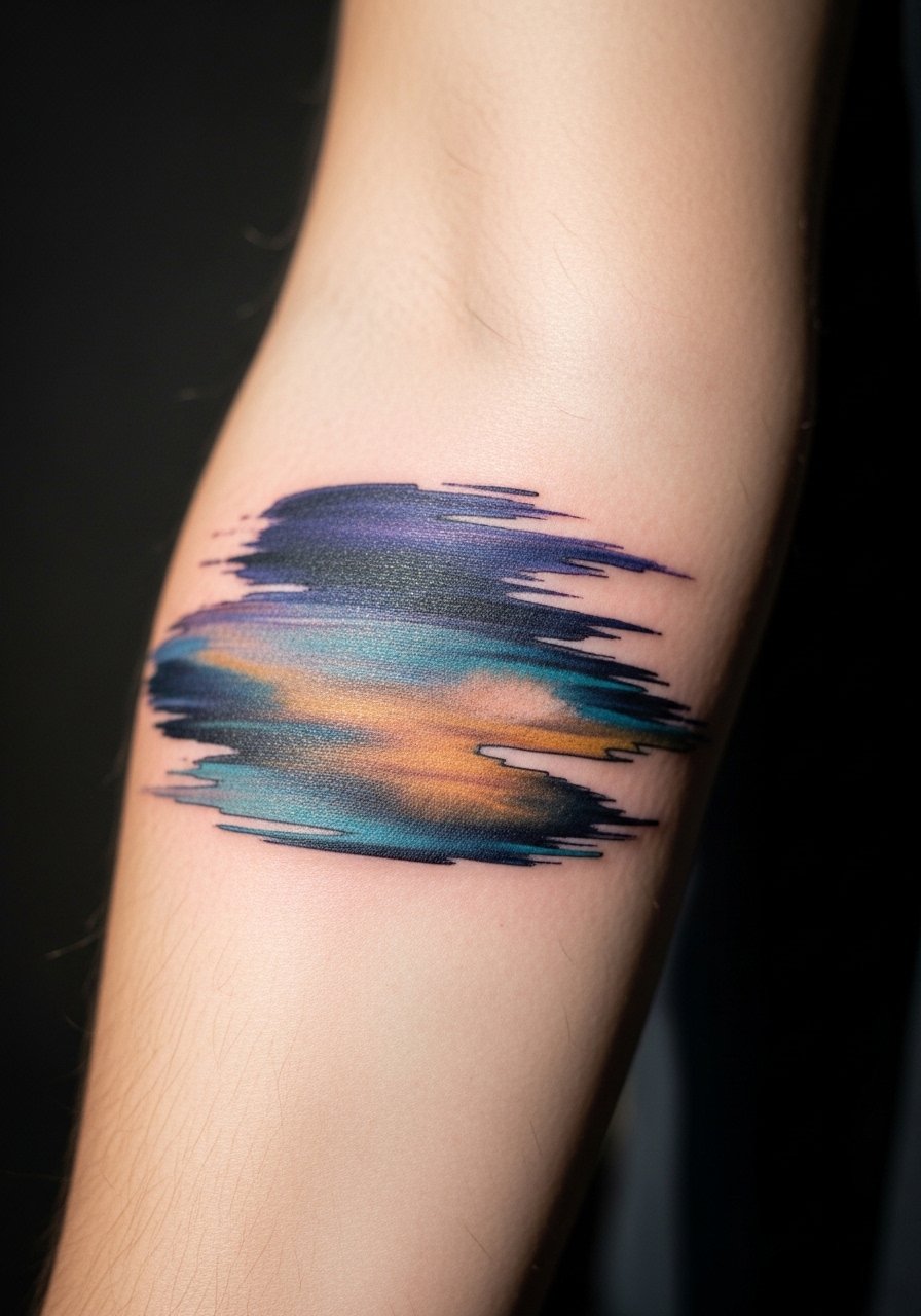
Brush stroke pieces require clear areas of intentional negative space to read as art rather than random gray. Tell your artist to plan the negative space and to use varying needle pressure for texture. The mistake is asking for textured fills without mapping empty zones, which creates a muddled patch. Sessions vary by complexity and you will feel varying pressure as the artist layers texture. At three years the gesture will remain if space was respected. For visual balance, wear a short-sleeve tee that shows the sweep without competing prints.
19. Morse Code Line of Personal Phrase
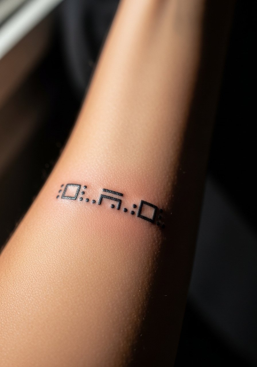
Morse code pieces are discreet if dots and dashes are scaled so they do not fuse. Ask your artist to size elements slightly larger than micro specs. The mistake is too-fine spacing that turns the code into a gray strip. Sessions are short and feel repetitive. At two years the code should remain legible if spacing and spot size were prioritized. For subtlety, pair with a thin bracelet that sits nearby without rubbing the line.
20. Tiny Map Outline of a State or Country
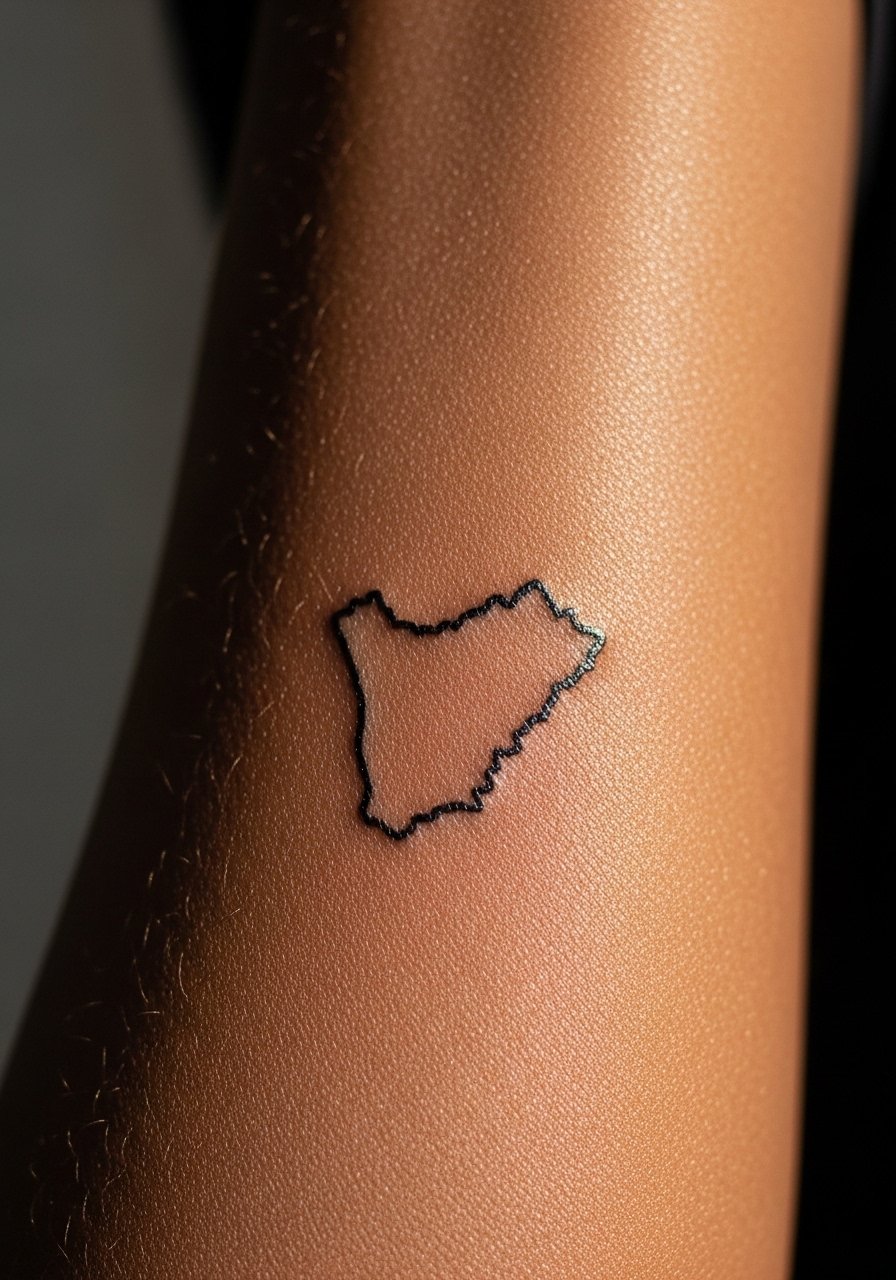
Outlines need clarity so key coastal features are slightly emphasized. In the consult, point out which coastline or bay should be recognizable and ask for tiny boosts in those spots. The mistake is shrinking the map so small that peninsulas vanish. Sessions are brief and the sensation is a focused line across the skin. At three to five years the silhouette keeps its shape if the critical points were given slight weight. On session day wear a loose button-down shirt that can be rolled to expose the inner forearm without binding.
21. Clean Typography Word, Lowercase Minimal
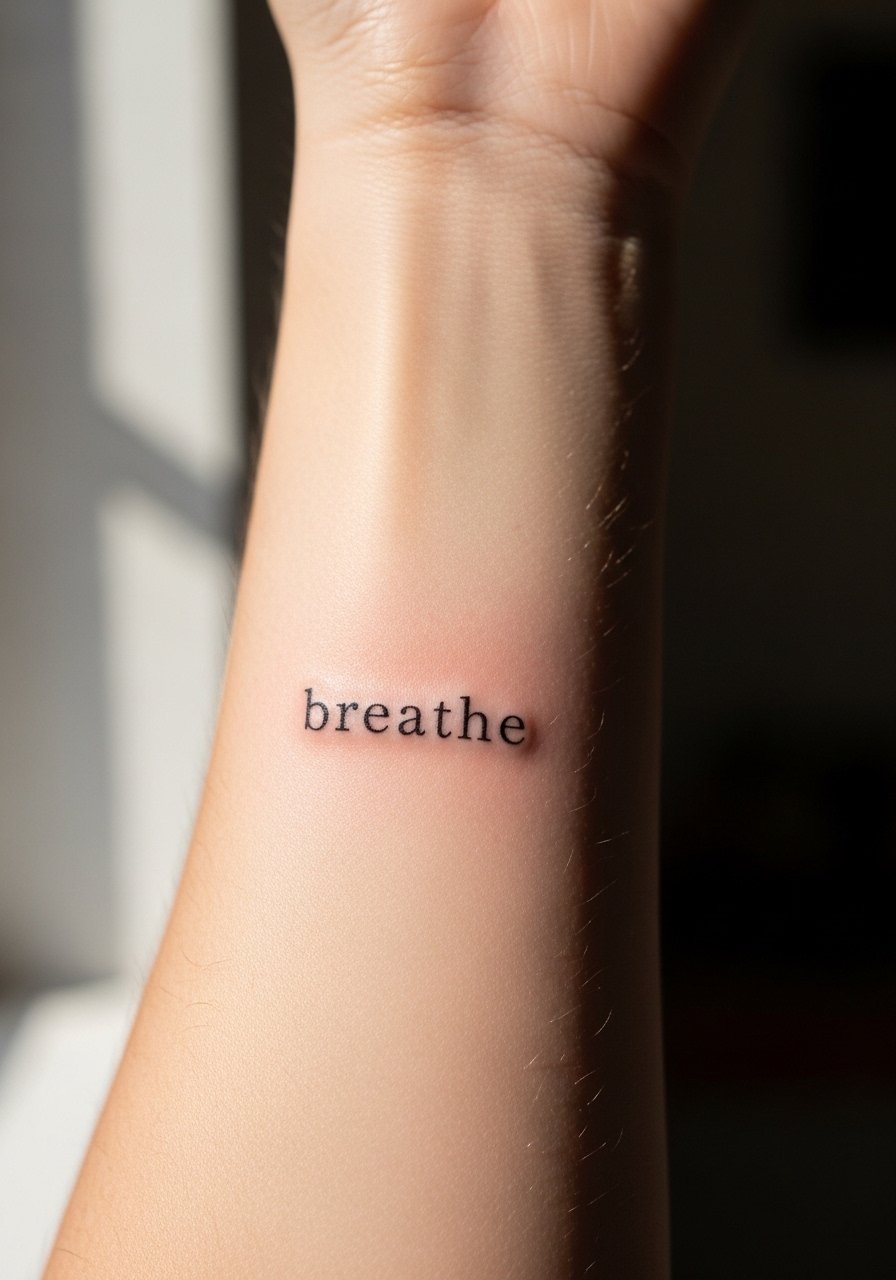
A single word reads well when letter spacing is deliberate. Tell your artist the exact font weight and baseline you prefer so counters remain open. The common mistake is picking a super-condensed typeface that collapses with time. Session time is short and you will feel precise needlework along the letters. Expect a touch-up at year two to renew the thinnest strokes if you want razor clarity. For everyday wear, a thin chain pendant sits just above the word without competing.
Frequently Asked Questions
Q: Will fine line pieces on the inner forearm need frequent touch-ups?
A: It depends on how thin the linework is and the spacing. Fine line tends to soften faster than bolder work. If you want longevity, ask the artist to use slightly heavier lineweight in key areas and expect a touch-up around year two to three for the most delicate parts.
Q: Are there controversy points about fine line on forearms I should know?
A: Yes, there are two clear camps. One group argues fine line fades and blurs faster and therefore should be avoided in high-motion areas. The other group says with correct depth and spacing fine line can hold up well. Ask the artist which side they sit on and request portfolio examples of forearm pieces aged two to five years.
Q: How should I dress for a session that targets the inner forearm?
A: Wear a loose button-down or a short-sleeve shirt you can roll up so the artist has clean access without fabric pulling. I often recommend a garment you do not mind getting ink on subtly during stenciling. A breathable top also keeps you comfortable under studio lights.
Q: Do blackwork fills on the inner forearm scar more than fine lines?
A: Heavy blackwork requires saturation which can feel more intense during the session, but it does not automatically scar if done at proper depth. Overworking the same spot raises scarring risk. Choose an artist experienced with forearm fills and plan a slightly longer session rather than forcing saturation in one pass.
Q: How does skin tone affect choosing line weight and color for inner forearm tattoos?
A: Skin tone influences contrast and how a color reads. On deeper tones, slightly bolder outlines and higher saturation can help details remain visible over time. On lighter tones, thinner lines can read clearly but may still need touch-ups. Bring reference photos and ask the artist how they adjust design choices by skin tone.