
Fine line watercolor trends look effortless on gallery boards, but they often demand more planning than people expect. The loose washes that make a "Get Rich Or Die Trying" motif feel jaunty can wash out if placed over thin skin or if the linework is too faint. Read these ideas with a clear sense of placement, what to tell your artist, and how to dress for the session so the wash and script hold over time.
1. Scripted Phrase on Inner Forearm
I recommend the forearm for a loose watercolor script because the skin there handles thin strokes better than the ribcage. Tell your artist you want the script at medium lineweight with tiny color bleeds around letters, not a full wash overwhelming the type. Expect a low to moderate pain level and a single two-hour session for a clean result. A common mistake is asking for almost invisible lines. That looks ethereal fresh and fades into a smudge over a few years. For the session, wear a loose button-down shirt so the artist can roll the sleeve up without tugging. Images of how the script looks at six months and at two years help set realistic touch-up expectations.

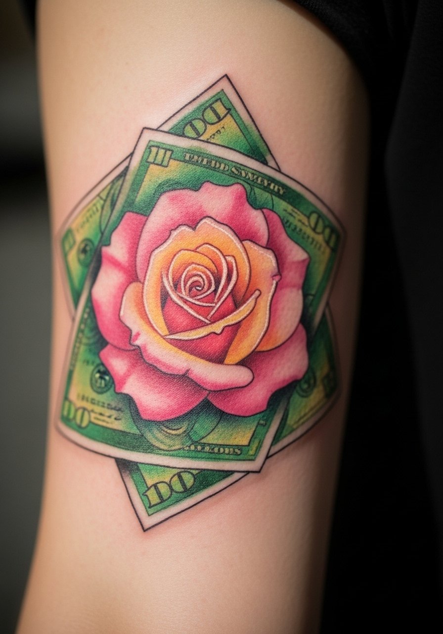
2. Watercolor Money Rose on Outer Bicep
I've seen this pairing look lively when the rose uses saturated reds and the bills sit in a translucent green wash behind it. Ask for bolder linework around the petals so the design reads after a few years and request the money elements to be suggested by negative space rather than heavy detail. Outer bicep sessions are moderate on pain and comfortable for two to three hours. Common mistakes include packing too many tiny details into the bills, which merge over time. For showing it off, the piece pairs well with rolled-up sleeves or a racerback tank that lets the bicep read in motion. Expect a touch-up at year two if you want crisp edges.
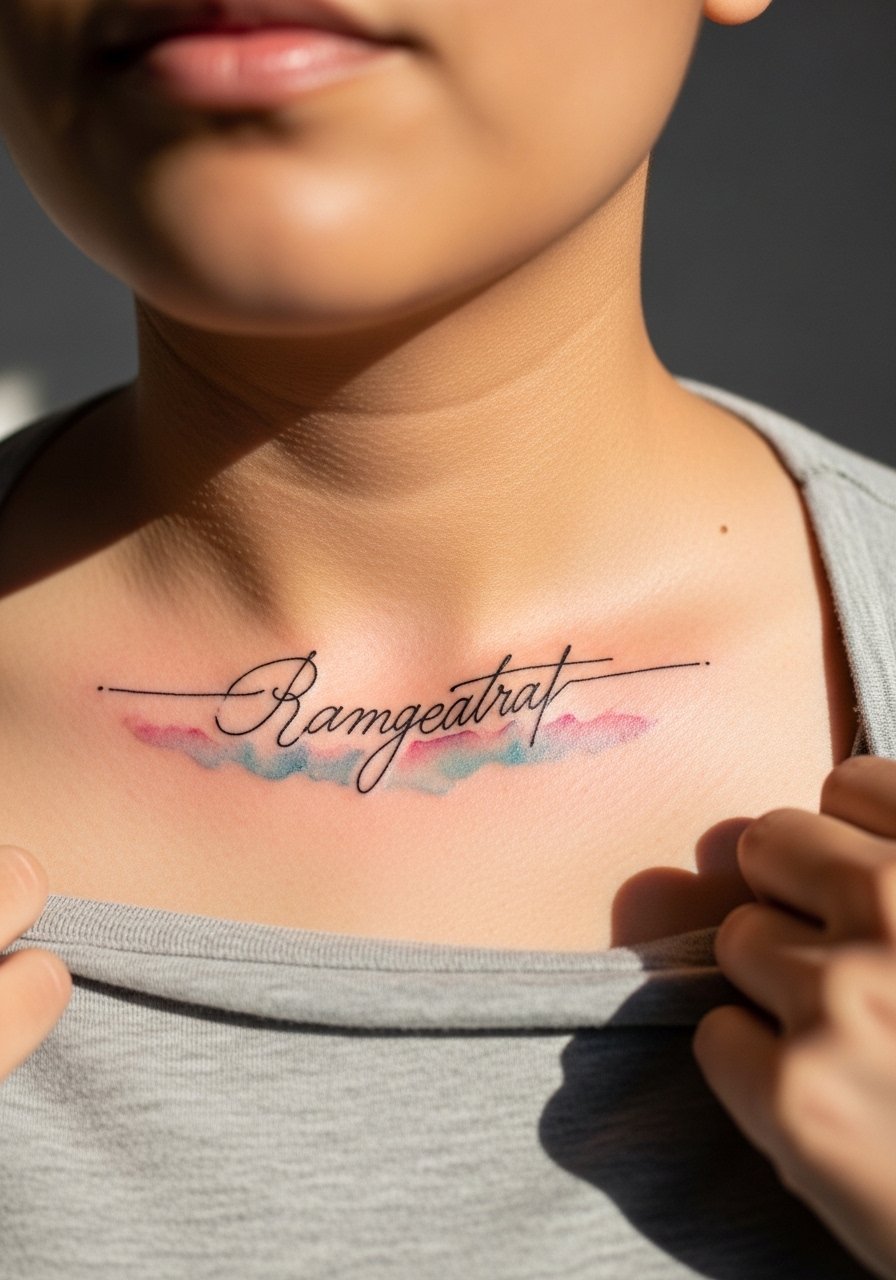
3. Collarbone Script with Blended Wash
This placement reads as part of an outfit when paired with open necklines. The collarbone sits shallow so I advise asking for stronger linework around the script and a thin veil of color below rather than a heavy paint stroke. Pain is low to moderate and most sessions finish under an hour. A common version that ages poorly uses a heavy full-bleed wash that pools into creases. For session access, wear a wide-neck shirt you can pull slightly aside. This design pairs well with a thin chain pendant that sits above the lettering and keeps attention on the upper chest without crowding the script.
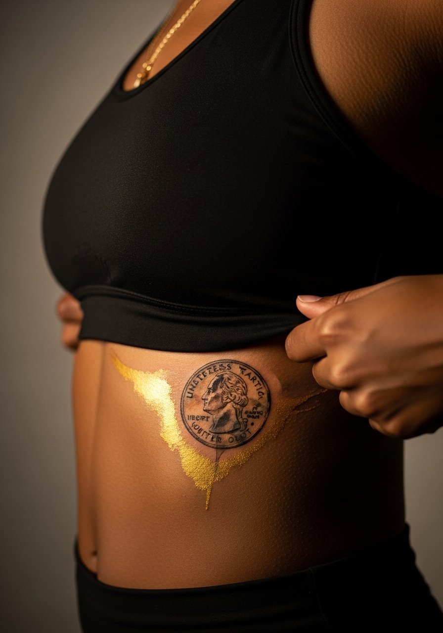
4. Ribcage Wash with Coin Motif
Fair warning, ribs are a high pain area but they photograph dramatically. Artists are split on fine detail on the ribs. One camp argues the skin stretch and movement blur thin ink within two years. The other camp says proper depth and generous spacing keep fine work legible. If you choose ribs, ask for slightly more spacing and avoid micro-detail in the coin faces. Sessions can run two to four hours with breaks. For the appointment, wear a zip-up hoodie or sports bra so the artist can expose just the side you need. The biggest mistake is packing a tiny scene into a curved area that needs breathing room.
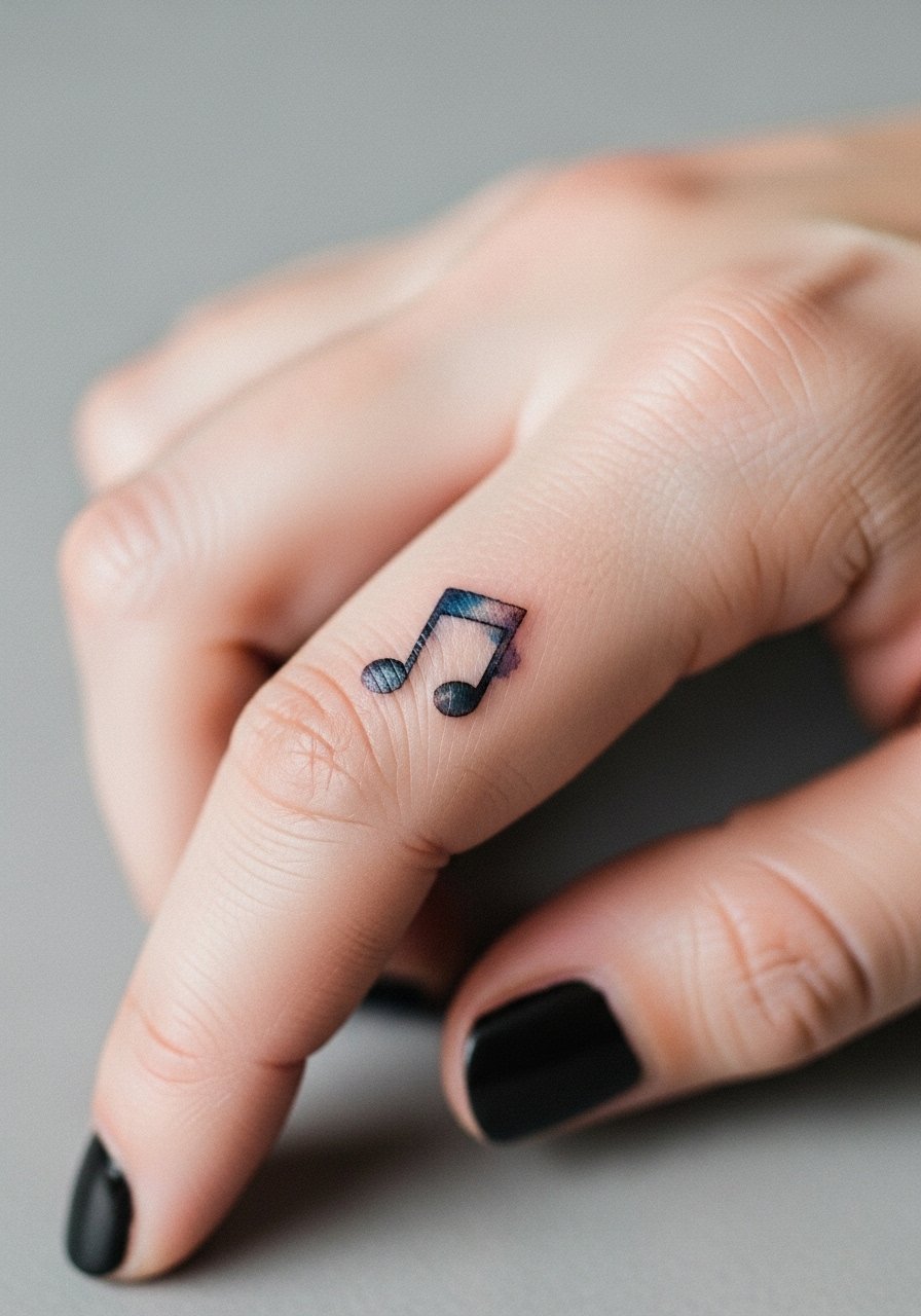
5. Tiny Finger Note with Splash Accent
Finger pieces look charming but they demand honesty about longevity. Expect faster fading because of constant washing and friction. I tell people to aim for slightly bolder script or a small dot cluster that holds pigment longer. Sessions are short but may require touch-ups at year one or sooner. A common error is asking for hairline script without planning for touch-ups. For showing the tattoo off, a minimalist ring stack keeps attention on the finger without covering the ink. Finger tattoos are a visible commitment so think about jobs that still matter to you.
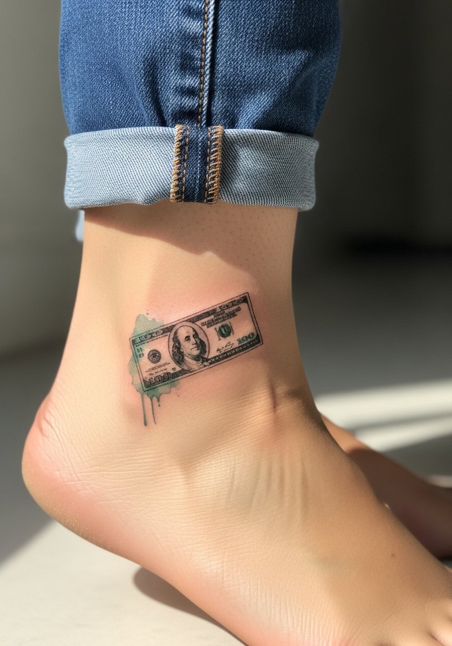
6. Ankle Bill Sketch with Pastel Wash
An ankle watercolor looks delicate and moves with footwear styles. The skin near the ankle is thin so I recommend moderate linework and a soft pastel wash that does not wrap under the ankle bone. Expect moderate pain and a session under two hours. The usual mistake is going too light with color so the piece vanishes after a year. Pair this with sandals or rolled jeans for evenings out, and for the session wear jeans you can roll up so the artist can access the area without the fabric rubbing. Plan for a touch-up at year two if you want saturation restored.
Pre-Session Essentials
Those forearm and ankle pieces above need different prep than chest and rib work, so a few targeted items smooth the session and the first week of healing.
-
Stencil transfer paper kit. Lets you see how the placement will sit on skin before the needle touches down, which matters for script and small motifs.
-
Topical numbing cream. Applied per product instructions it takes the edge off high-sensitivity spots like ribs and ankles.
-
Thin protective film roll. Useful for finger and ankle pieces that face constant friction from shoes and daily washing.
-
Fragrance-free gentle body wash. Cleanses healing skin without irritating delicate watercolor edges.
-
Aquaphor healing ointment. A thin application in the first days locks in moisture for fine line and watercolor work without clogging the surface.
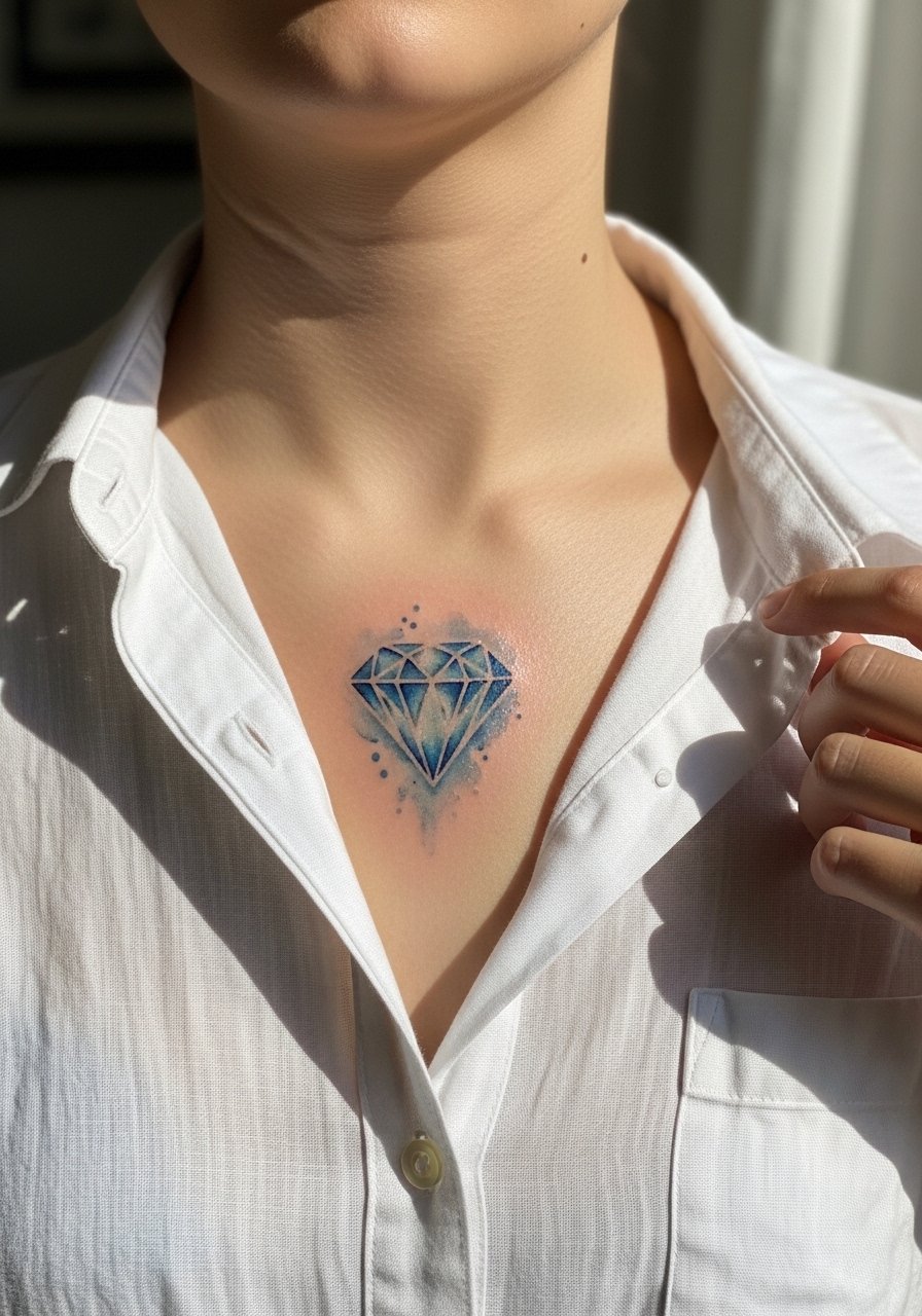
7. Watercolor Diamond on Chest Panel
Most upper chest pieces show well with low contrast washes that sit beneath stronger linework. The chest moves during breathing so ask for the main shapes to be slightly oversized to keep form over time. Pain is moderate and sessions vary from one to three hours depending on size. A common mistake is thinking the chest will read like paper. It will not. For session access wear a button-down shirt you can pull aside. If you want an evening look, an open collar top frames the diamond and makes the watercolor read like a deliberate accent.
8. Back Shoulder Stack of Cash Blossoms
There is something about layering floral shapes with bill-like leaves that reads as both feminine and cheeky. The shoulder tolerates saturation well but avoids tiny script inside the stems. Ask for moderate saturation and larger negative space islands so the wash does not merge. Sessions can be broken into two sittings of two hours each. A mistake is crowding this zone with many little motifs that age into blur. For the appointment, wear a tank top you can pull off easily so the artist has clear access to the shoulder. Over time expect a gentle softening of the wash and a possible touch-up after three years.
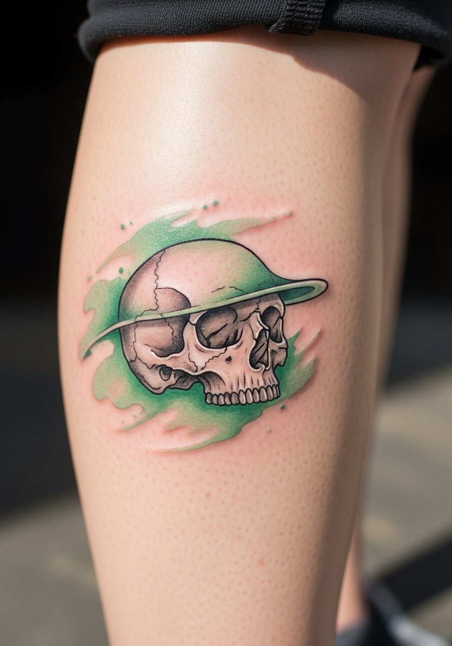
9. Watercolor Skull with Money Wash on Calf
A calf piece has room to breathe so it suits more illustrative watercolor work with bold contrast. Tell the artist you want strong linework around the skull and a soft money-colored wash behind it for depth. Calf sessions are moderate on pain and usually two to three hours. A frequent error is squeezing too much tiny shading into the wash. For showing it off, pair the calf with shorts or a mid-length skirt and consider platform sandals that keep the tattoo visible without rubbing. Expect the wash to settle and soften at year three requiring a color refresh if you want crisp saturation.
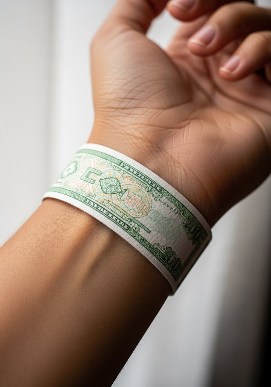
10. Minimal Banknote Wrist Band
A thin band of watercolor suggesting stacked notes wraps well around the wrist when the linework is bold enough to resist fading. Wrists face constant washing so ask for moderate lineweight and a thin protective border that hints at coins without tiny engraving. Session time is short and pain is low to moderate. The mistake is choosing hairline detail. For styling, stacked bracelets can either hide or highlight the band, so choose dainty stacking bracelets to complement the piece without smudging the color. Plan for a touch-up around year two.
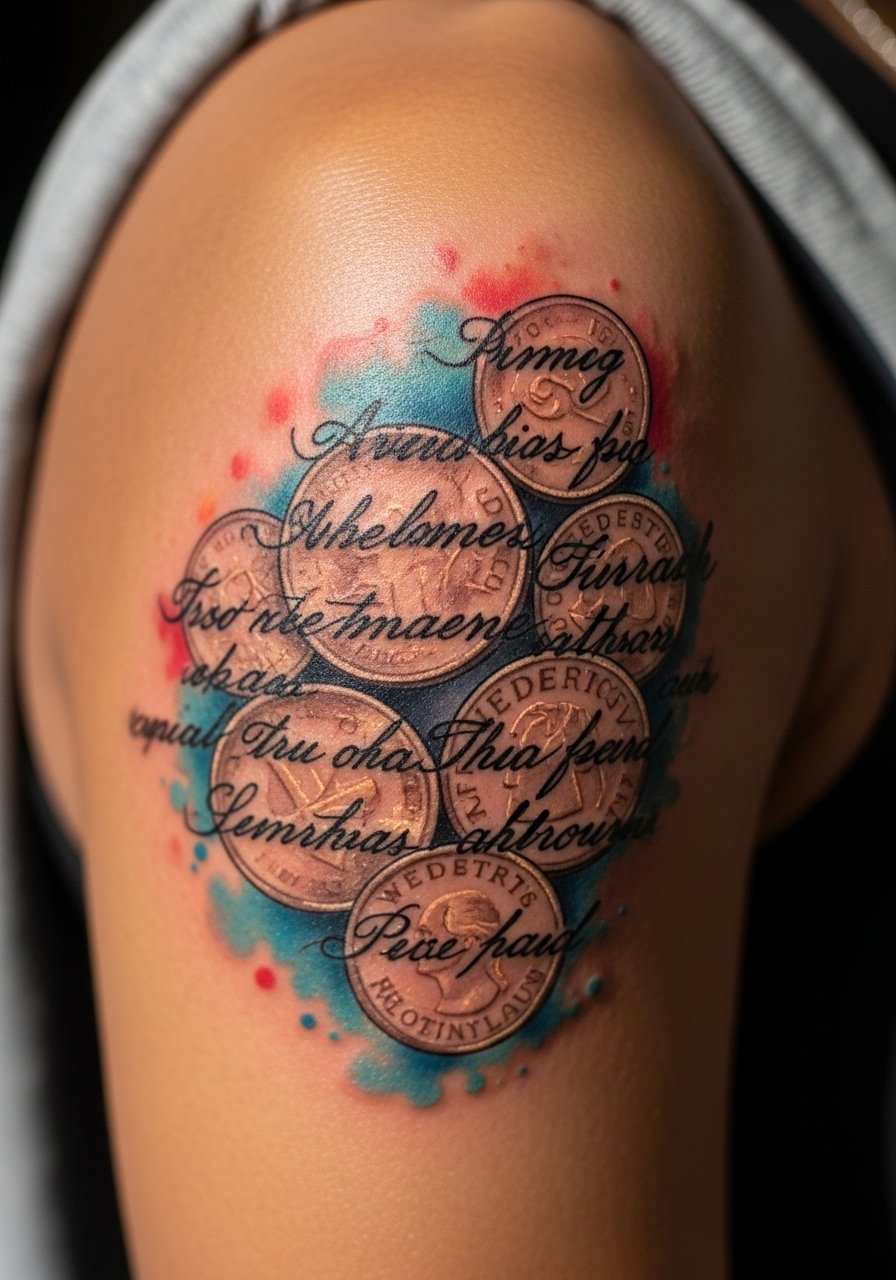
11. Script Overlaid on Watercolor Coin Cluster
Overlaying script on a watercolor cluster reads best when the script has a thin outline or shadow so the letters stay legible as the wash softens. I recommend asking for slightly heavier script weight than you might on plain skin. Expect a one to two hour session and low to moderate pain depending on placement. A common mistake is placing tiny script directly over a dark wash. For showing it off, a thin chain pendant can sit above the overlay without competing. Let your artist mark the placement on skin so you see the interaction before they tattoo.
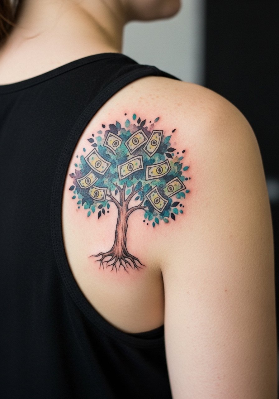
12. Shoulder Blade Money Tree
A shoulder blade canvas handles a taller composition like a money tree with roots that fade into a green wash. The skin there tolerates saturation but the scapula moves under clothing so plan for spacing. Sessions are often two sittings. The error I see is putting tiny leaves that merge into a wash. For the session, wear a tank top with a wide back opening so the artist can work without fabric flap. The piece ages into a soft watercolor field that may need a color top-up after several years depending on sun exposure.
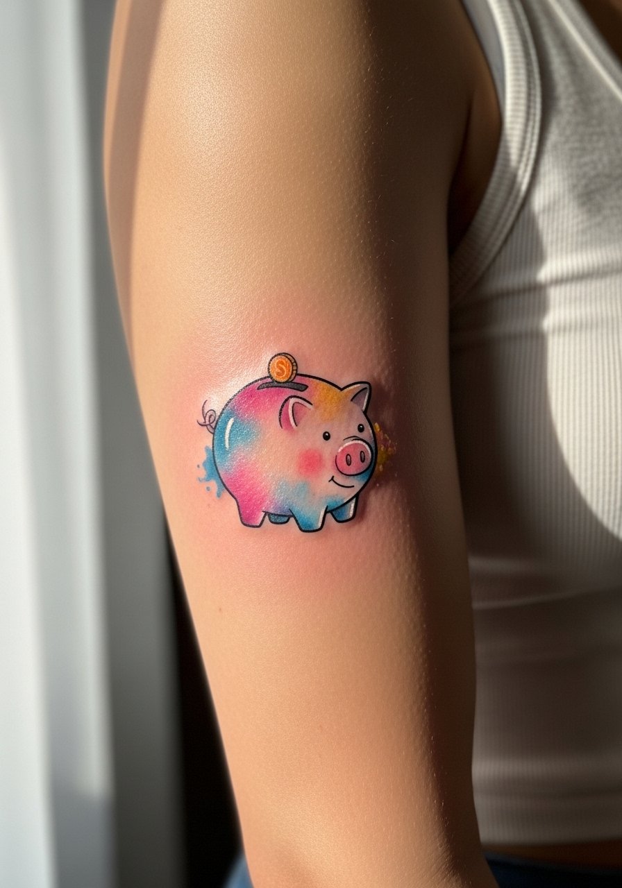
13. Small Piggy Bank on Inner Bicep
Inner bicep placements give privacy but demand an experienced hand for even linework. Pain ranges from moderate to high when the arm is raised. Ask for stronger linework and a shallow wash behind the piggy bank so the coin detail does not collapse. A common mistake is assuming inner arm skin stays static. It does not and fine details can blur. For the session, wear a tank top with ample armholes so the artist can access the area with the arm raised. Expect a touch-up at year two to restore crispness if you want it to stay sharp.
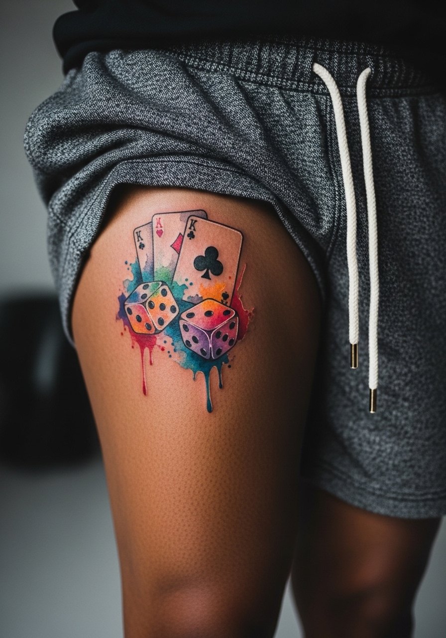
14. Watercolor Dice and Card Suite on Thigh
Thighs accept larger watercolor fields and hold saturation well because they are less exposed to sun. Ask for bolder contouring on the dice faces and a loose wash connecting the cards so the composition reads from a distance. Sessions can be long, often three to four hours split across sittings. A mistake is cramming tiny numbers onto card faces that blend together. For your appointment wear loose drawstring shorts so the artist can roll the leg up without pressure on the area. Thigh placements age slower and often only need touch-ups at year three or later.
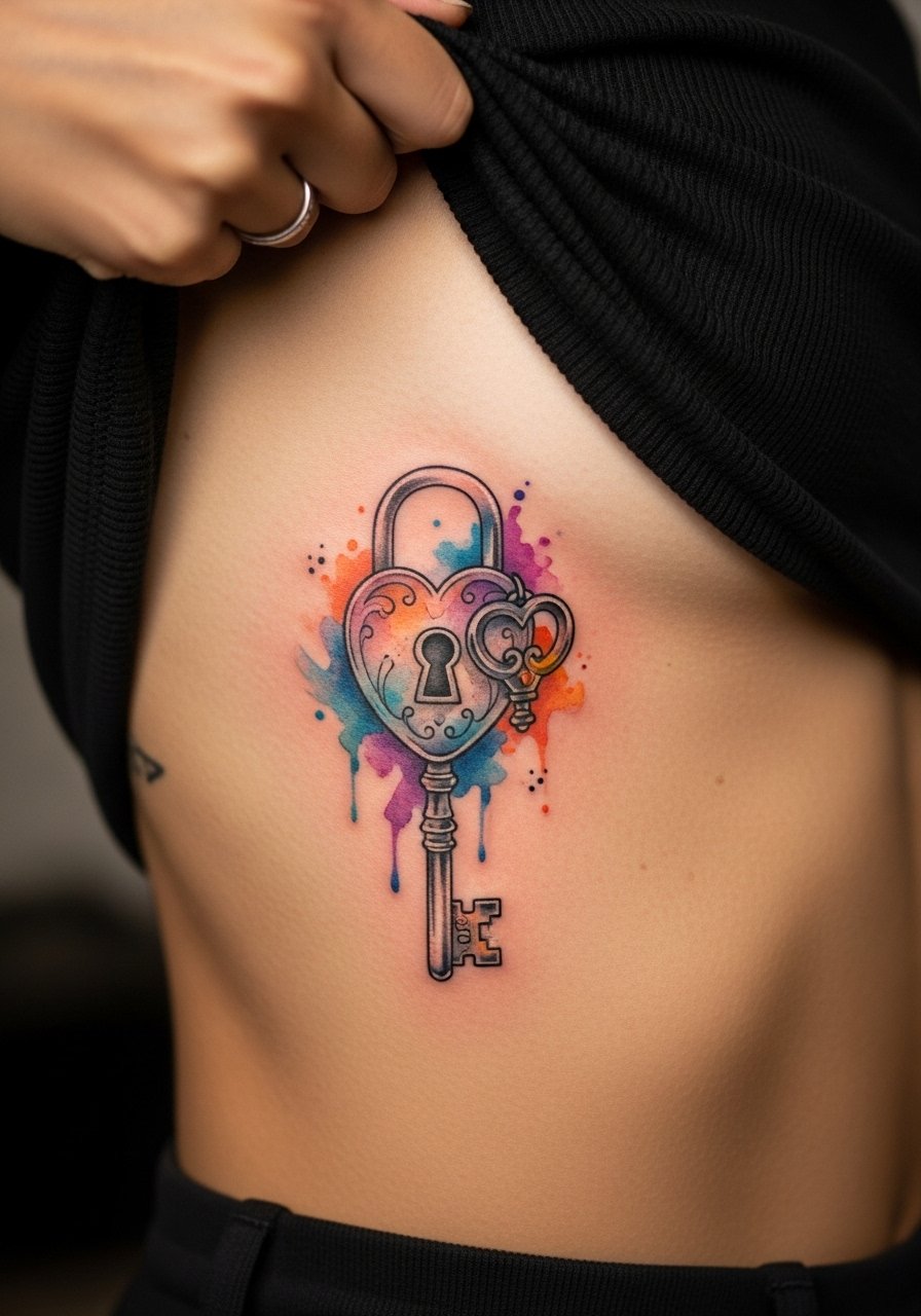
15. Tiny Lock and Key on the Side Rib
Side rib motifs read intimate and symbolic but they share the rib caveat: debating artists split. One group warns that thin linework on the ribs blurs quickly. The other group argues generous spacing and deeper placement settle fine. If you choose the side rib, keep the lock and key slightly larger and focus on negative space to define detail. Sessions are painful and usually done in one focused sitting. For the appointment wear a cropped top you can lift so only the rib area is exposed. Expect a potential touch-up at year two if you want crisp key teeth.
16. Watercolor Stack of Coins on the Calf Inner Curve
This location gives a vertical canvas and suits stacked coin imagery that uses wash for depth. The inner calf moves less and heals predictably. Ask for heavier outlines on the coin edges so the stack reads over time. A common mistake is asking for too many tiny engravings inside each coin. Sessions are moderate in length and pain is generally low. For showing it off, mid-calf boots or crew socks rolled down keep the piece visible without friction. Touch-ups may be needed around year three to restore color punch.

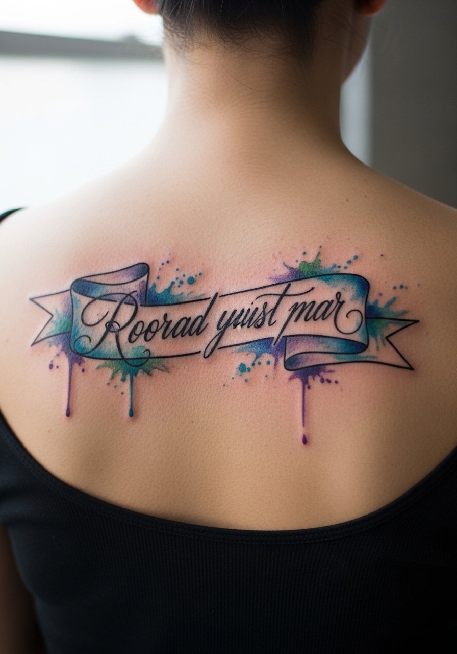
17. Script Banner Across an Open Back
An open-back banner with a watercolor wash reads elegantly when paired with simple fonts and solid outlines. The back tolerates saturation well but avoid tiny serifs that vanish over time. Sessions range from one to three hours. One mistake is centering the banner too low into the lumbar area where garments rub. For the appointment, wear a backless dress or shirt you can pull aside so the artist accesses the upper back without exposing other areas. Over years the wash will soften and may benefit from a gentle color refresh.
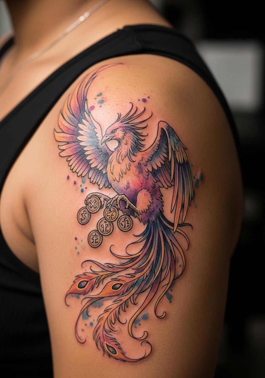
18. Watercolor Phoenix Holding Coins on the Shoulder Cap
A shoulder cap suits dynamic pieces like a phoenix clutching coins because the curve adds movement. Ask for contrasty linework on the bird and a loose gold wash for the coins. Sessions often take two sittings. A common error is putting too many tiny feather details that blur into a wash. For showing the piece, sleeveless tops or open-shoulder blouses let the phoenix read without interference. Expect the overall composition to soften at year three with possible selective touch-ups to keep the bird crisp.
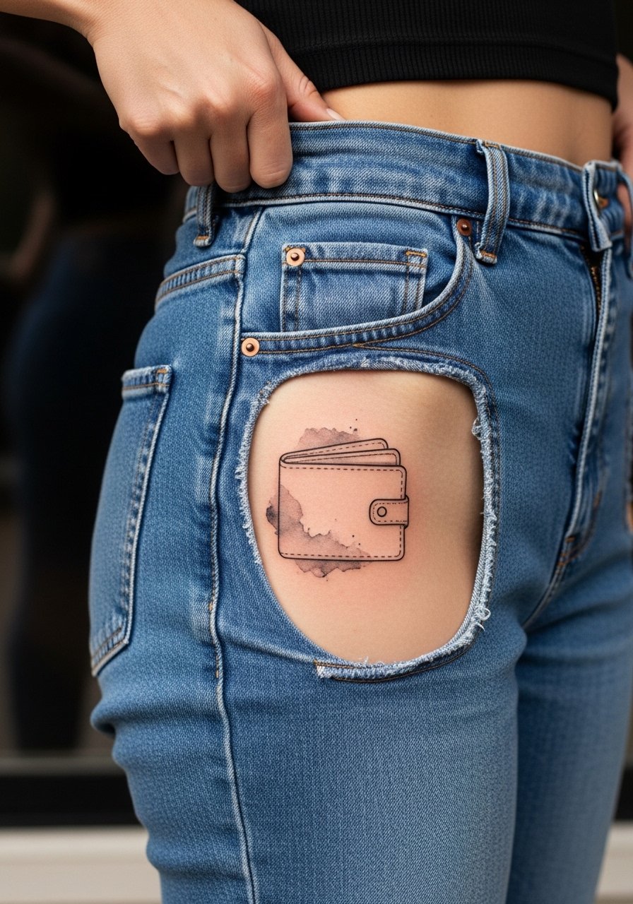
19. Minimalist Wallet Outline with Background Wash on Hip
Hip placements are discreet and pair well with minimalist outlines plus a watercolor ground. The hip moves with clothing so ask for a slightly larger wallet silhouette to prevent compression blur. Sessions are moderate to long depending on size and the area can be tender. A mistake is choosing ultra-fine detail in a zone that faces constant rubbing. For the session, wear high-waisted denim or swimsuit bottoms so the artist can expose only the hip area without full undressing. Hip pieces age gently when shielded from sun and friction.
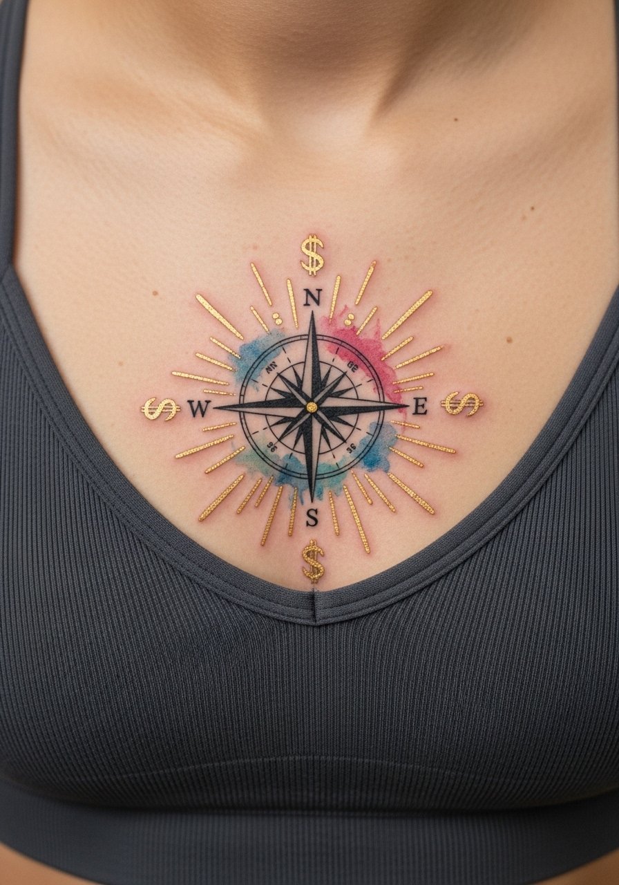
20. Watercolor Compass with Dollar Rays on the Sternum
Sternum pieces photograph powerfully but require special framing for the image and for the session. The sternum sits shallow so avoid extremely fine internal detail. Pain can be high and sessions are intense. The typical mistake is packing a complex scene into a tight sternum plane. For the appointment, wear a fitted sports bra or bandeau so the artist can expose only the sternum area. This design benefits from bold contours around the compass points and a loose gold wash for the dollar rays so it remains readable at year two and beyond.
21. Small Portrait with Watercolor Background on the Forearm
Forearm portraits require careful planning because facial details can lose definition as washes soften. I suggest a small portrait with a painterly wash behind it and slightly bolder facial contours. Sessions are moderate to long depending on realism. The common error is expecting full photorealism in tiny dimensions. For showing it off, roll your sleeve to reveal the piece and pair it with a loose linen shirt in neutral tones that lets the portrait be the focal point. Plan a touch-up at year two for lines that soften.
Frequently Asked Questions
Q: Will watercolor-style tattoos like these need different touch-up schedules than traditional saturated work?
A: From what I've seen, watercolor pieces often need touch-ups sooner because the pigments are applied more diffusely. Expect to revisit your artist around year two or three for color boosting if you like the original vibrancy. Placement and sun exposure change the timeline a lot.
Q: Which placements on this list are most likely to need touch-ups first?
A: Fingers, wrists, and ribs tend to need touch-ups sooner because of washing, friction, and skin movement. Forearms and thighs usually hold color longer. Ask your artist for examples of healed work on the same placement before you book.
Q: How do I tell an artist I want watercolor but also longevity?
A: Ask for stronger linework at key contours and a lighter wash that does not hide the edges. Bring healed reference photos and ask the artist how they manage saturation and spacing. Use discovery pathways like local shop directories, hashtag searches, and Reddit portfolios to find someone with healed examples.
Q: Are there wardrobe choices that help watercolor tattoos heal better or show off faster?
A: Yes. For session comfort, loose clothing or items you can shift without tugging are best. For showing off, open-collar tops, rolled sleeves, and minimalist jewelry keep attention on the tattoo. A thin chain pendant can frame collarbone script without crowding it.
Q: Do employers still screen for visible tattoos from these placements?
A: It depends on the industry and region. Hands and visible neck tattoos can still affect hiring in conservative workplaces. If that is a concern, choose placements like the thigh, upper back, or inner bicep that are easy to cover.
Q: Can I mix traditional black outlines with watercolor fills in one design?
A: Yes and many people do. The combination can improve longevity because the outlines anchor form as the wash fades. Be explicit in consultation about how bold you want the outlines versus how painterly you want the wash so the final balance looks intentional.