
Fine line neck work is everywhere online, but the tattoos that still read crisp after a few years are usually the ones planned with aging in mind. From talking with artists in five shops across Brooklyn and watching healed portfolios, I learned which line weights hold and which placements demand spacing. Below are 21 neck-focused ideas, each with what to ask for in consultation, how it ages, and how to wear it so the design reads as intended.
1. Fine Script on the Side of the Neck
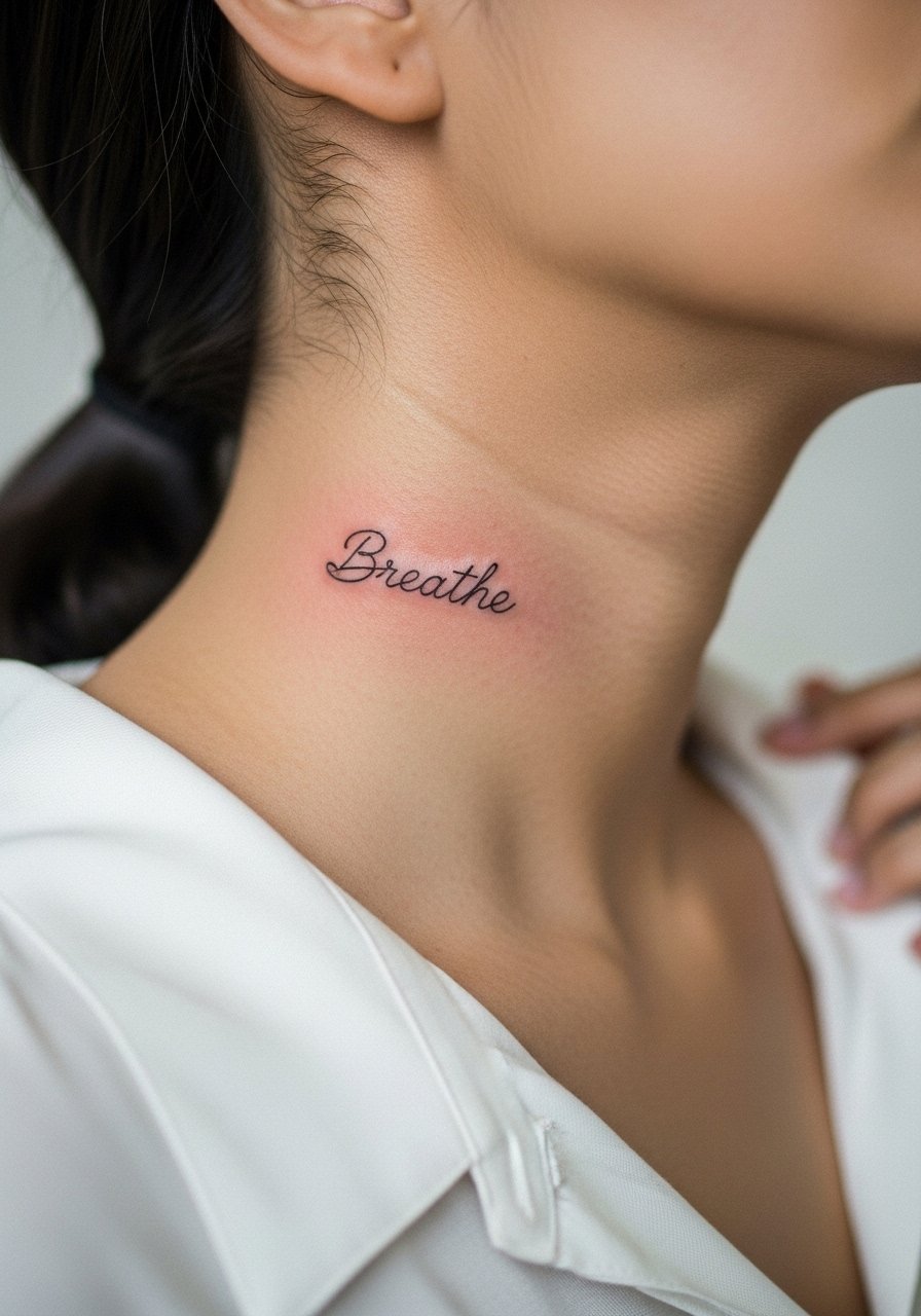
I recommend this when you want subtle messaging without a full throat piece. Ask for slightly heavier line weight than what shows on Instagram so small letters do not blur at year two. Common mistake is going too tiny and expecting the same clarity as on paper. Expect the first year to keep crisp counters then softly soften by year three, with touch-ups likely around year three to five. Pain ranks medium since the skin is thin and near cartilage. For showing it off, a wide-neck tee or a slightly unbuttoned shirt frames the lettering without competing with necklaces.
2. Minimal Geometric Collar Accent
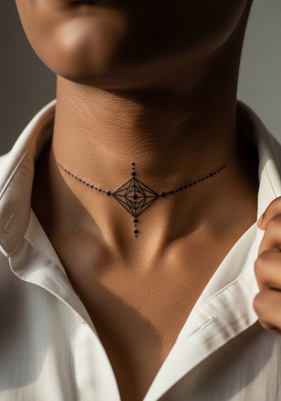
This is ideal if you want a piece that reads as an accessory under shirts. The trick is spacing. Lines and dots packed too tightly will merge as the skin settles. Tell your artist you want clear negative space around each element. Aging is forgiving when elements are bold and spaced, and tighter grids will need touch-ups sooner. Session discomfort is brief but noticeable because you are over the bone. Pair with an open collar shirt to let the geometry peek out without overexposing the entire neck.
3. Micro-Realism Rose at the Nape
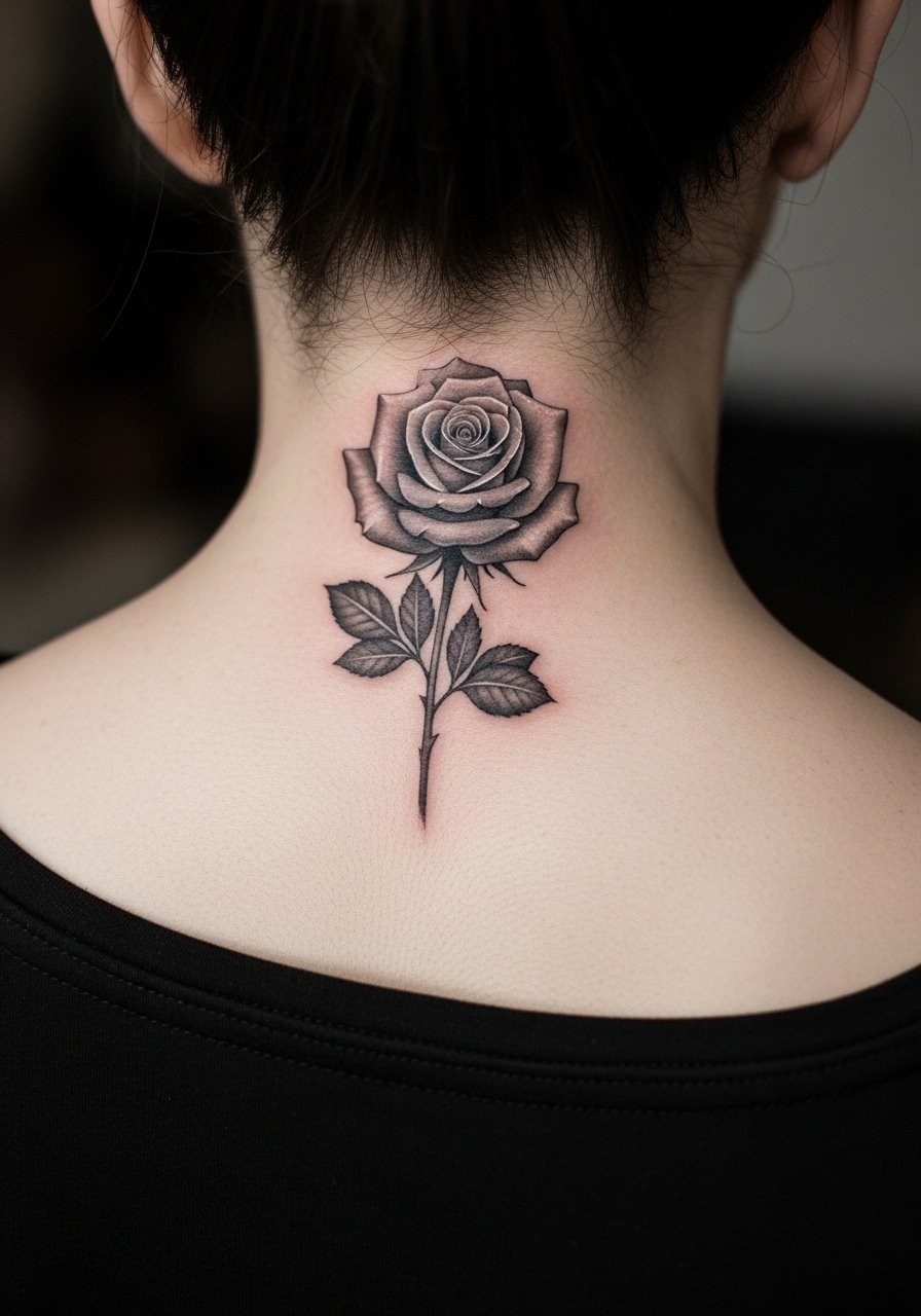
Choose this when you want floral detail without a throat commitment. Ask for stipple shading rather than dense grey wash so the petals read individually as they age. A common error is asking for too much tiny detail in a small area. At six months the stipple shows texture, at two years the petals soften and at five years contrast lowers unless saturation was planned. Pain is lower on the nape than the front neck. For nights out, pair a thin chain pendant necklace so jewelry sits above the rose without crowding it.
4. Bold Blackwork Back-Of-Neck Block
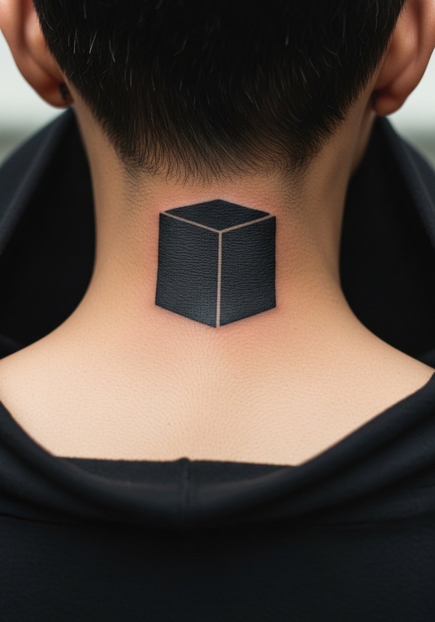
This one ages predictably because saturation is the asset. Artists split into two camps on heavy blackwork near the hairline. One camp says solid fills are resilient and keep shape for years. The other camp worries about blowout along thin neck skin. Ask the artist about needle depth and edge crisping. Expect low-fuss aging, but touch-ups may be needed where the hairline meets the ink. Pain is medium. For daytime looks, a leather jacket frames the block and keeps attention on collar-level silhouettes.
5. Tiny Symbol Behind the Ear, Low on the Neck
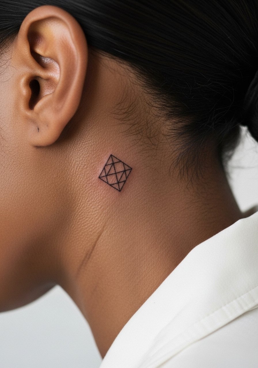
Behind-the-ear placements read small and personal. Because the area is a tight curvature, the stencil placement matters more than many people realize. Tell your artist you want the piece laid flat to the skin and preview the stencil while sitting up. This zone moves with hair and collars so friction can dull the edges. Keep in mind some workplaces still react to visible neck work. For session clothes, bring a collarless button-down you can tuck hair behind so the artist has clean access.
6. Scripted Name Along the Side Neck
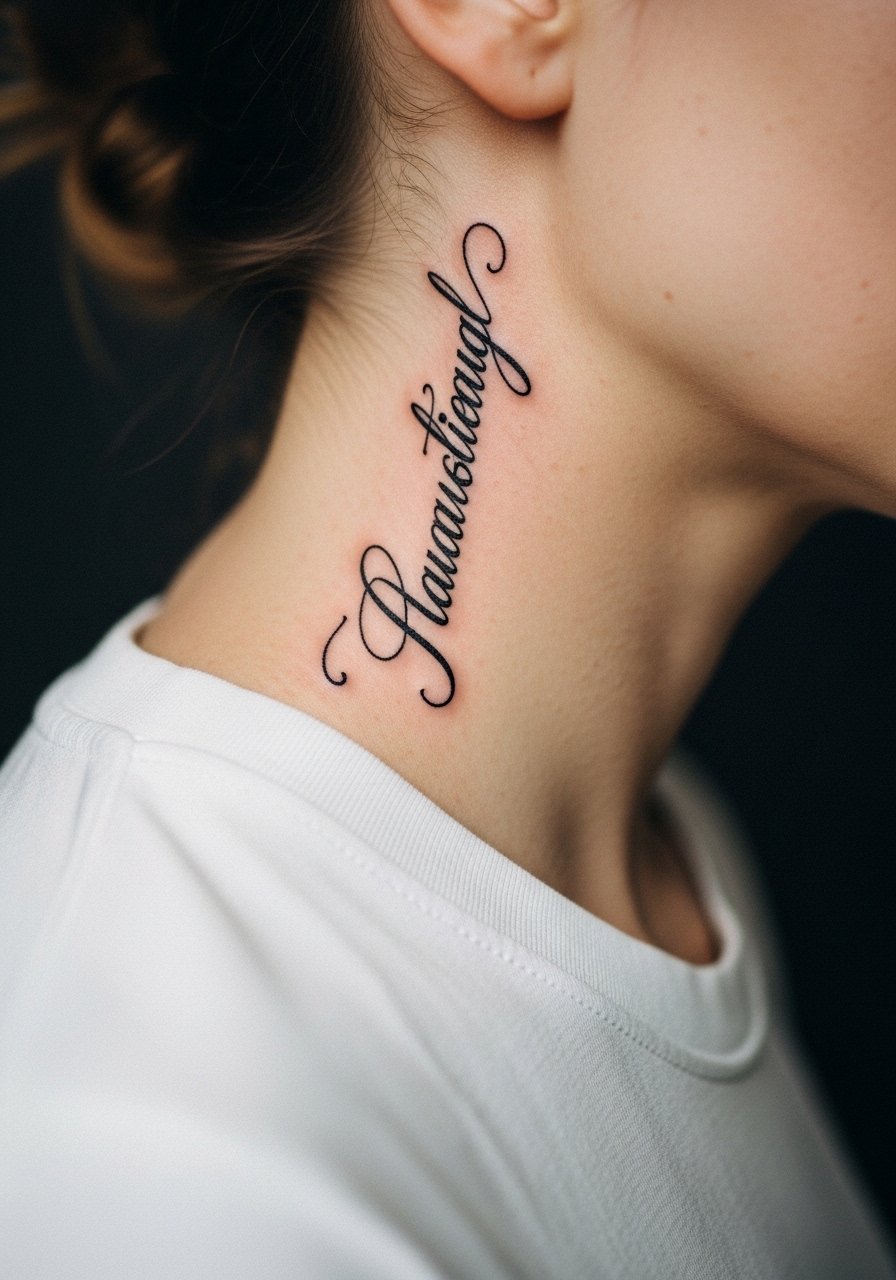
Name script on the neck is deliberate and visible. The most common mistake is choosing ornate flourishes that fill up and blur. Ask for moderate spacing between letters and a slightly heavier stroke so counters hold. Expect the look to soften by year two and need a touch-up by year three if you want it to remain crisp. Pain is medium due to thin skin. This placement pairs well with a simple chain necklace worn above the script to frame it without overlapping the letters.
Studio Day Picks
The delicate scripts and fine dots above heal differently from solid black blocks, so a few targeted items make the session and first week easier.
-
Stencil transfer paper kit. Lets you preview exact line placement on the neck area, which is crucial when curvature can shift proportions.
-
Tattoo-specific topical numbing cream. Useful for front-neck sessions where sensitivity near cartilage spikes the pain.
-
Breathable silicone dressing roll. Helpful for neck pieces that rub against collars or straps during the first few days.
-
Fragrance free gentle body wash. Cleans the neck without stripping pigments during the healing window.
-
Aquaphor healing ointment. Thin application in the first 48 hours eases scabbing on delicate neck linework without suffocating the skin.
7. Tiny Cross Centered Under the Jawline
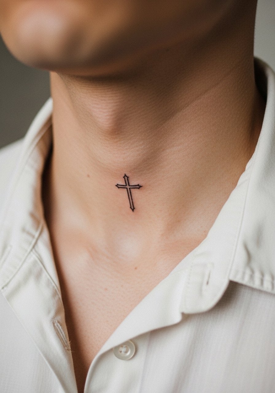
This placement reads very visible when short-haired or wearing low collars. A frequent error is placing the cross too small relative to jaw width. Ask the artist to scale it so negative space keeps the form readable at distance. Expect subtle softening by year two because the throat moves with swallowing and talking. Pain is higher near cartilage. For session wear, pick an open collar shirt you can easily adjust without tugging on the area.
8. Micro Dot Work Mandala on the Side Neck
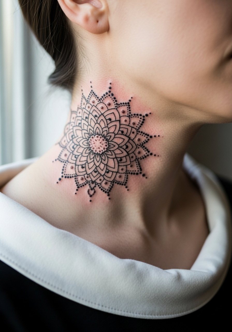
The mandala looks delicate when done with stippling, but there is a debate among artists. One camp says dense dot work on the neck retains its pattern if spaced correctly. The other camp warns that movement and thin skin blur stippling into wash. Name both camps when you consult and ask which technique your artist favors. If you prefer longevity, request slightly increased spacing and bolder outer ring lines. Expect touch-ups at year three for tight dot clusters. Pain is medium.
9. Chain-Link Collar Tattoo
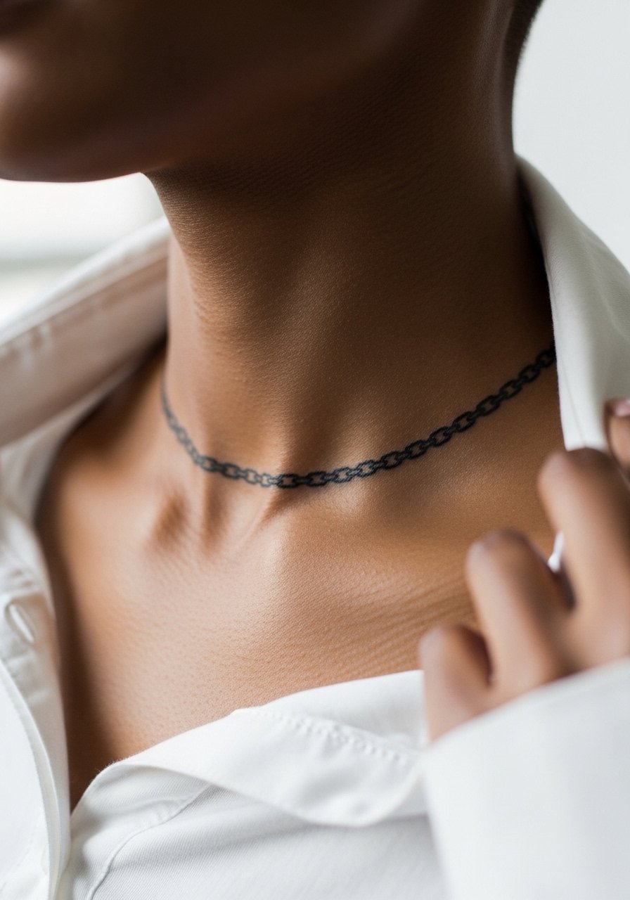
This reads like jewelry when scaled correctly. The main risk is making links too small so they merge. Tell your artist you want defined negative space between links and ask to see how it looks in motion. At six months the links look crisp, at two years lighter but still readable if spacing was preserved. Pain sits mid-range. Pair daytime outfits with a crew neck tee left slightly open so the chain illusion is visible.
10. Small Geometric Triangle Stack on the Front Neck
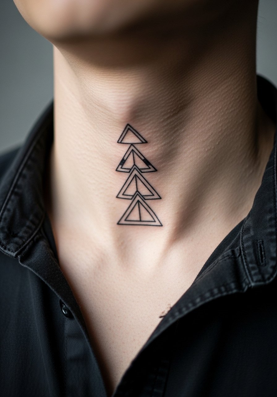
Vertical stacks need breathing room. The usual mistake is stacking too many elements in a narrow column. Request more space between shapes and slightly thicker outlines to preserve form. At 6 months the stack reads crisp, at 2 years the thin outlines may fade into softer shapes. Touch-ups at year three are common. Expect moderate pain over the throat. For a night look, layer an open button shirt to let the triangles peek through.
11. Traditional Dagger Pointing Down at the Throat
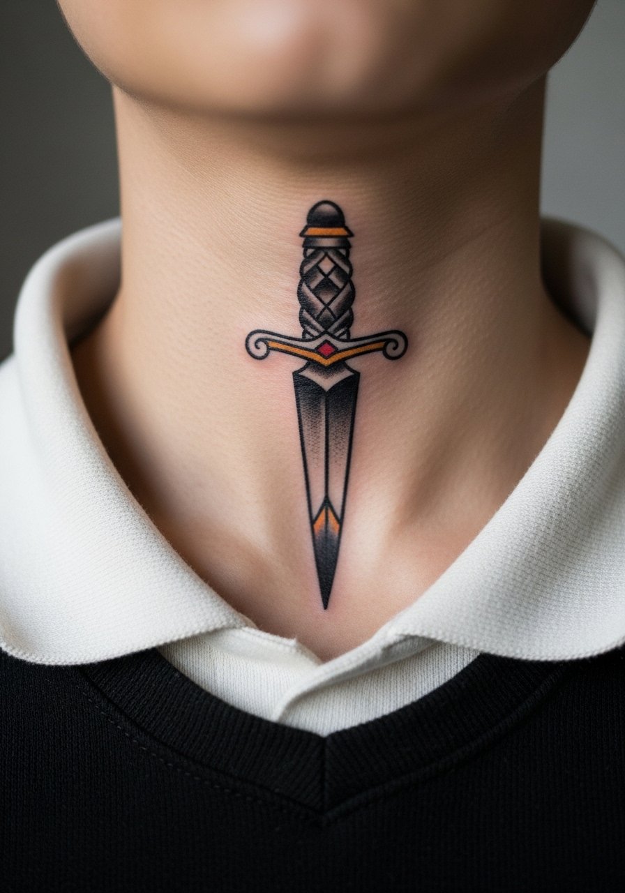
The dagger ages well if the outline is bold and saturation strong. The most common error is relying on thin outlines for a bold concept. Ask for robust linework and guarded shading to keep contrast. This style can handle rough wear, and touch-ups are less frequent than for fine line. Pain is higher near the center because of proximity to cartilage. Pair with a leather jacket to create a deliberate contrast between clothing texture and the bold piece.
12. Script Ribbon Along the Jawline
Flowing script along the jaw can frame the face if executed with spacing in mind. Avoid ornate loops that land near hair follicles or beard lines because they blur faster. Tell your artist to test the script with the stencil while you move your head to make sure it sits right. At two years expect some softening if facial hair rubs the area daily. Pain is mild to medium. For a balanced finish, consider a simple chain necklace that sits below the ribbon so the script remains the focal point.
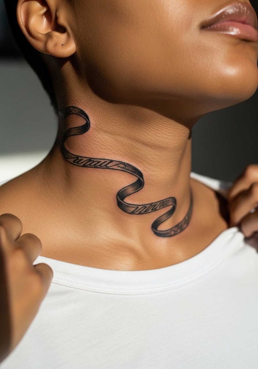
13. Single-Line Wave Across the Lower Neck
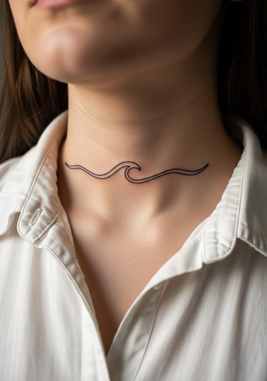
Continuous single-line pieces look modern but demand steady line weight. The main mistake is inconsistent pressure that creates uneven rhythm across the curve of the neck. Ask for a consistent stroke and preview the stencil sitting upright. Expect subtle blur after two to three years, especially where the line crosses skin folds. Pain is moderate. This design shows best with a rolled sleeve linen shirt or an open collar that leaves the lower neck visible.
14. Small Zodiac Glyph at the Side Neck
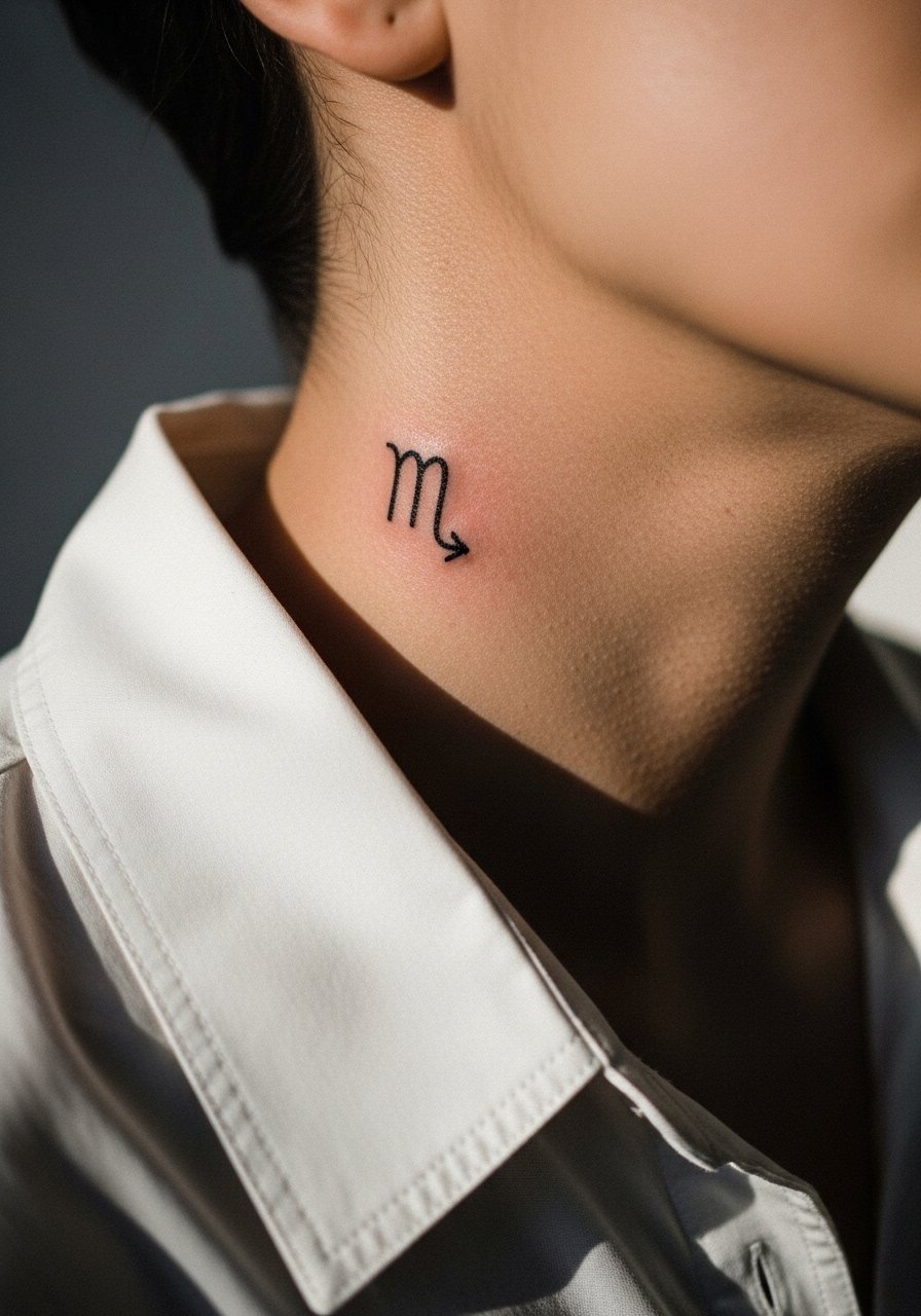
Glyphs are concise and readable when scaled properly. Common error is making the glyph too ornate or tiny. Ask for clean vector-style linework with modest negative space. At year one it reads clear, at year three the smallest strokes may need reinforcement. Pain is medium. Pair with a thin chain pendant to give the glyph a jewelry-like context.
15. Black Ink Bar Behind the Ear, Low Neck Edge
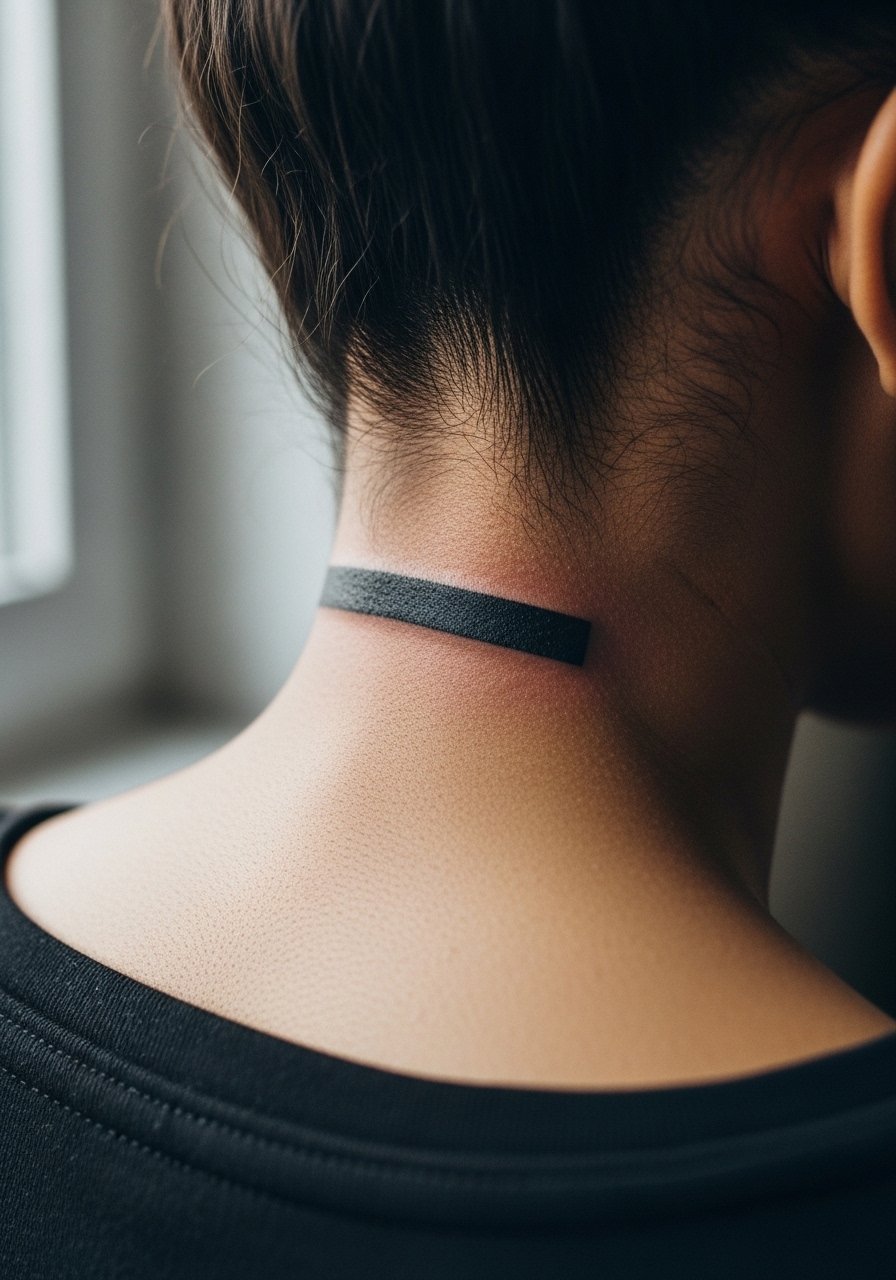
Solid bars are graphic and low-fuss when bold. If the bar is too narrow it can warp visually as hair grows or the skin moves. Ask for a balanced width that complements your head shape. Aging is straightforward because the fill maintains silhouette. Pain is low to medium. For sessions, short hair or hair tucked back helps the artist keep a clean edge.
16. Ornamental Filigree on the Lower Neck
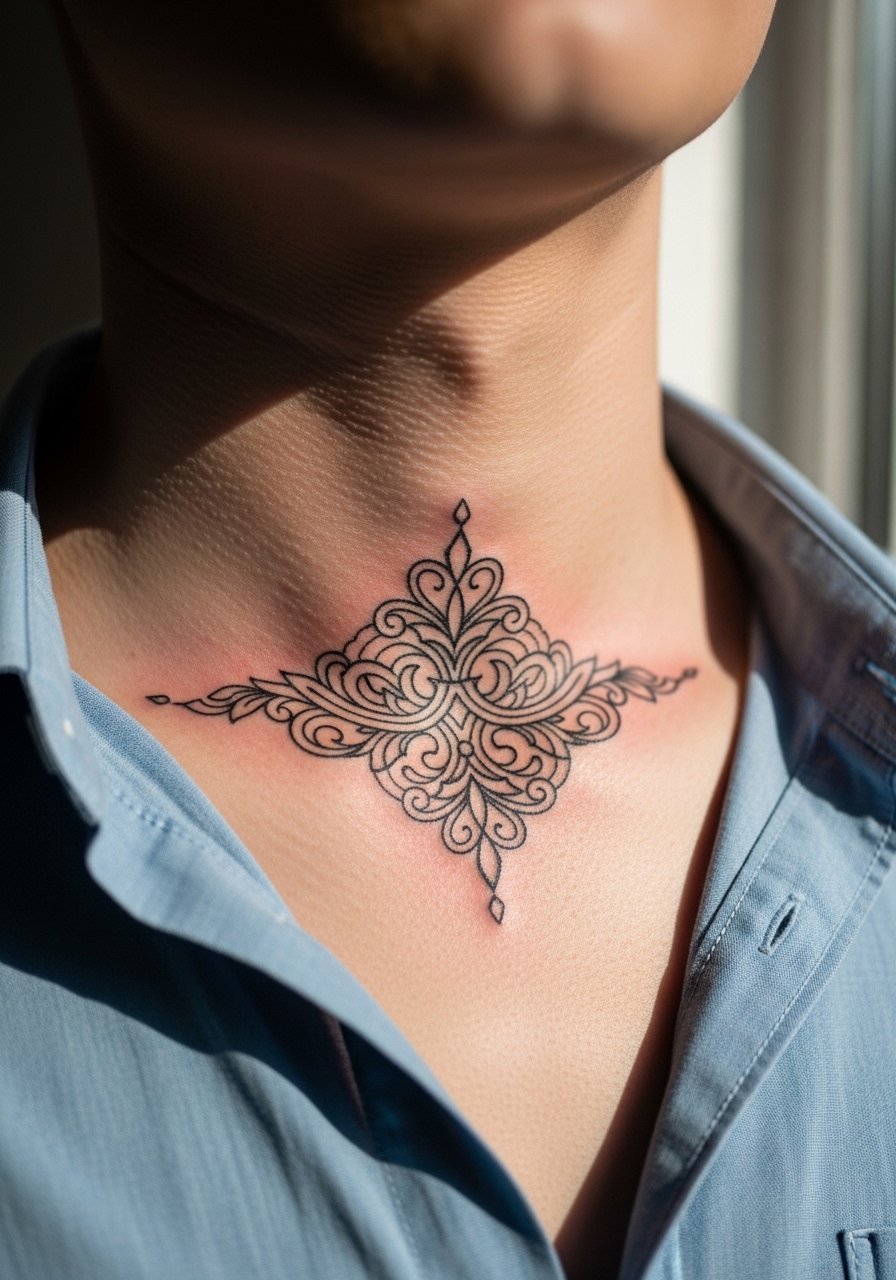
Filigree reads ornate but can become muddled if the lines are too thin. The consultation note here is to ask for slightly thicker outer lines and finer inner detail so the silhouette stays elegant as it ages. Expect delicate inner work to fade sooner than the outer frame, and plan for touch-ups at year three. Pain is moderate because of proximity to bone. Styling-wise, a wide-neck shirt shows off the filigree without overexposing the chest.
17. Anchor Pointed at the Collarbone
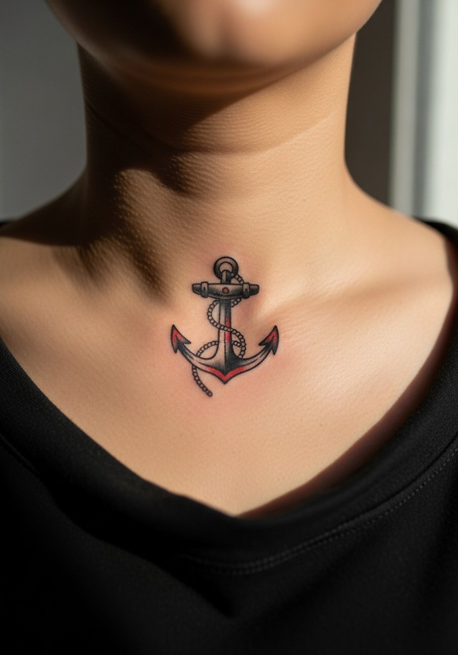
Classic motifs like anchors handle time well when the outline is bold. The common mistake is small anchors with weak linework that blur into a spot. Ask for a confident outline and guarded shading. Aging is forgiving, with touch-ups much less frequent than for micro work. Pain is lower since the collarbone area has more tissue than the throat. Pair with a racerback tank or open-neck layering so the anchor sits like a pendant.
18. Subtle Wave Pattern Encircling the Side Neck
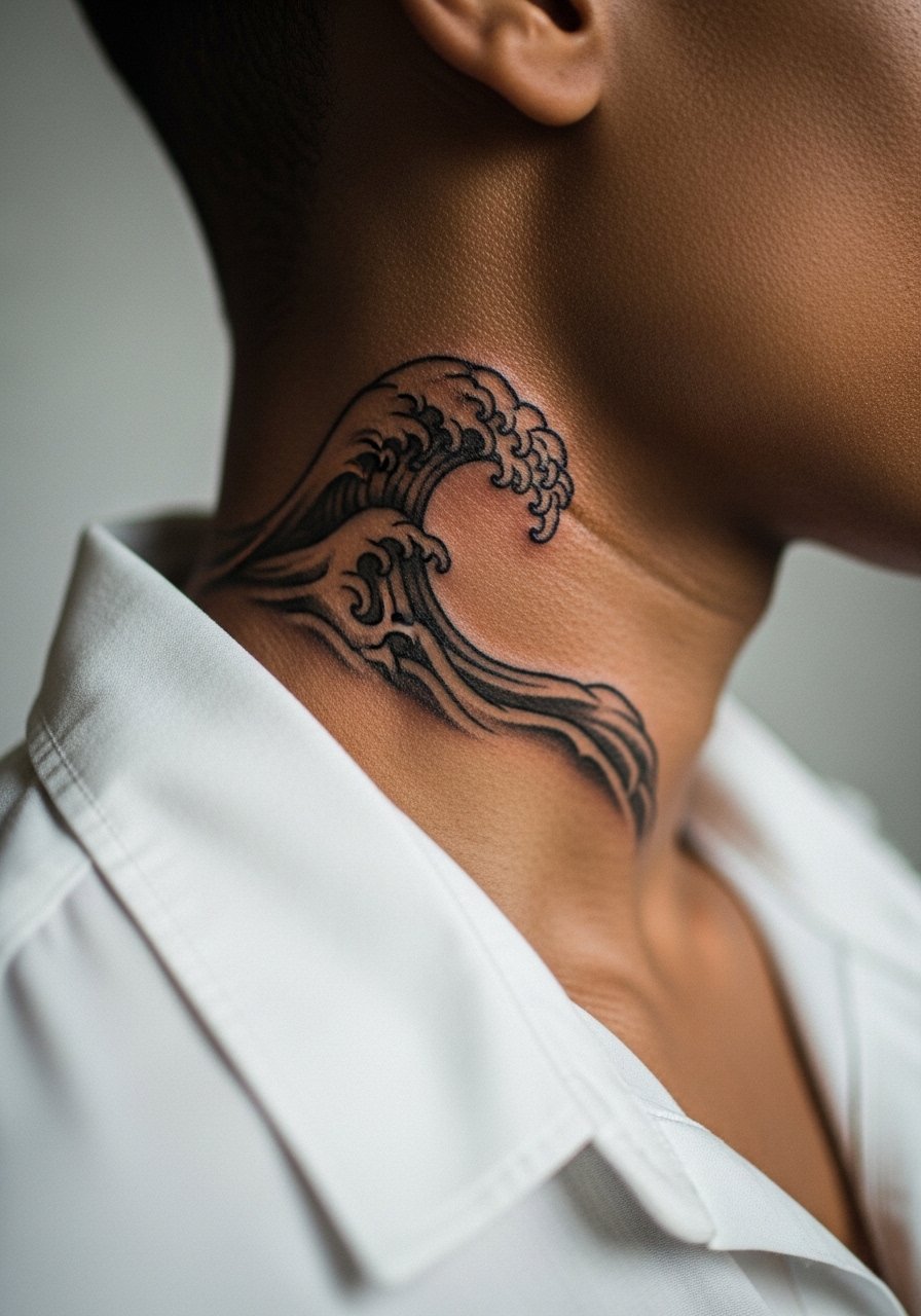
Encircling patterns must respect movement and breathing. A frequent error is wrapping too far so clothing rubs the design nightly. Ask your artist to stop the wrap where collar pressure would be highest. At two years expect gentle softening in the busiest points. Pain is medium. For show-off looks, wear an open button shirt so the wave is visible without constant collar friction.
19. Small Skull at the Side Neck Base
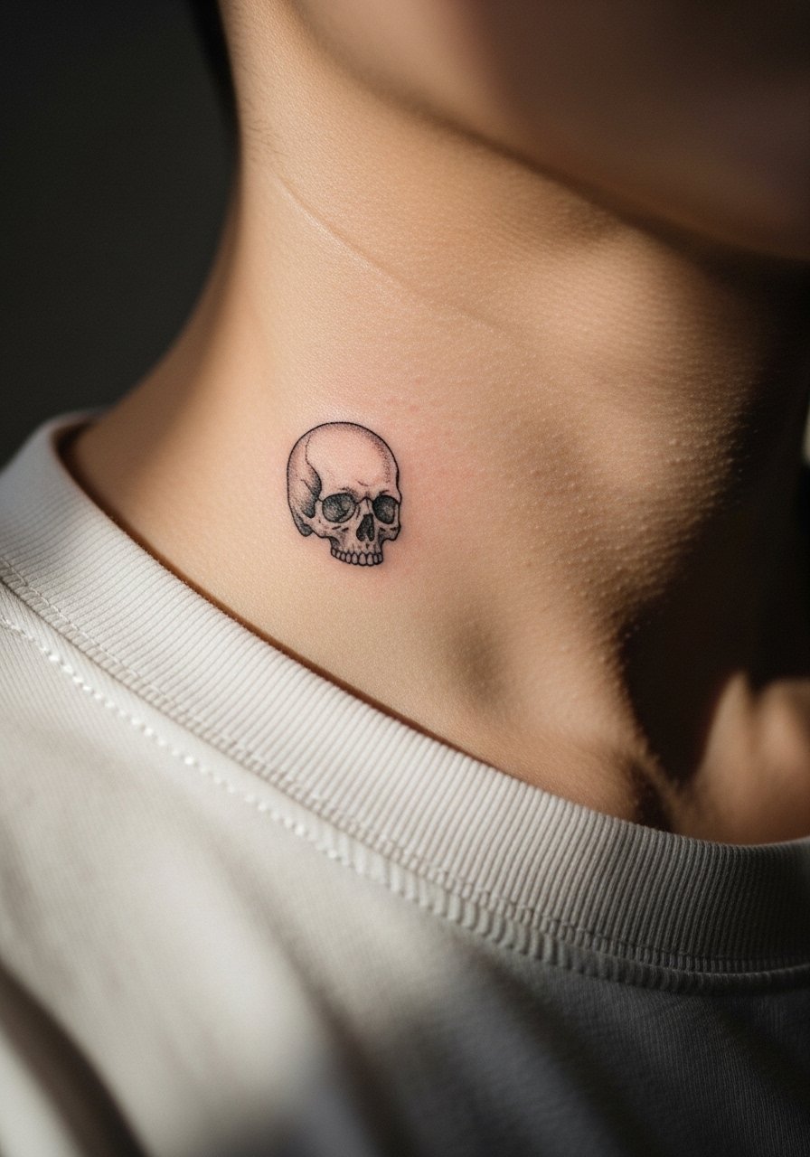
Micro skulls need clear contrast between eye sockets and jaw to stay legible. The mistake is packing too much tiny shading that later blends. Request dot work for texture and a bolder outline for contour. At six months texture is visible, at two years the micro shading will soften and may need refresh. Pain is moderate. Pair with a crew neck tee left slightly open to let the skull sit like a small badge.
20. Scripted Phrase Along the Side of the Throat
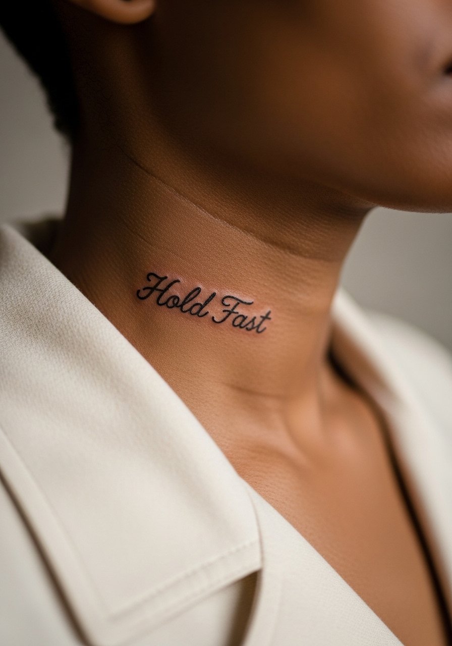
When text is visible, scale and spacing are everything. The common error is choosing flourished fonts that crowd together. Ask for a cleaner script and request the exact stencil of "Hold Fast" before the needle. Since this is visible and moves with speaking, expect minor softening by year two and plan a touch-up if clarity is important. Pain is medium. For accessorizing, a thin pendant positioned above the phrase helps frame it without overlapping.
21. Small Arrow Wrapped at the Base of the Neck
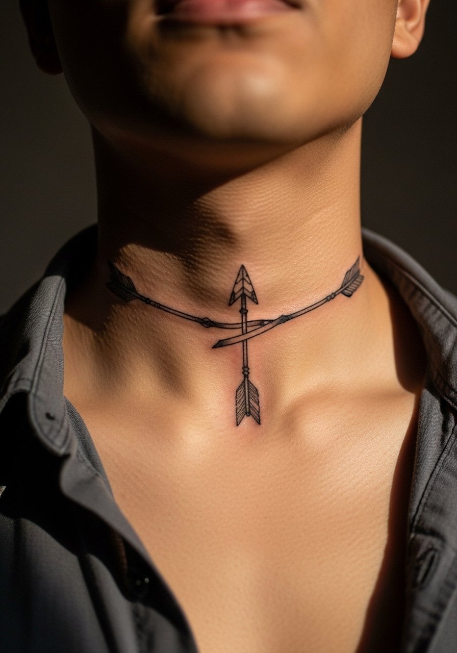
Arrows are simple but must align with body planes. A common mistake is angling the arrow without testing how it looks when the head turns or the chin drops. Ask your artist to check the stencil in multiple positions. Expect slow softening in thin sections by year three and plan for a touch-up if you want crispness. Pain is moderate. This piece looks clean with a simple chain necklace that sits above without touching the arrow.
Frequently Asked Questions
Q: Will fine line text on the side of the neck blur faster than a bolder script?
A: Fine line text tends to soften sooner because the needle channels are narrower and skin movement blends strokes over time. A slightly heavier line weight and more spacing will extend legibility. If longevity is a priority, ask your artist to show healed examples of similar placements.
Q: How should I dress for a front-neck or throat session so the artist has clean access?
A: Wear something with an open collar or a wide-neck shirt you can pull aside easily. For throat work, an open button-down or a loose tank is ideal so the artist does not tug clothing during the session. A wide-neck tee is a simple option that often works.
Q: Do neck tattoos affect professional opportunities more than other placements?
A: Visible neck tattoos still carry a stigma in some industries and workplaces. Some people cover them during interviews and events with collars or hair. Think through your career path and comfort level before committing to highly visible throat pieces.
Q: How often should I expect touch-ups for small dot-work mandalas on the neck?
A: Dot-work mandalas often need touch-ups earlier than bold blackwork because tight stippling can blur into wash on thin neck skin. From what I have seen, planning a touch-up around year two to three is realistic if you want the original contrast maintained.
Q: Are there design styles that generally hold up better on the neck?
A: Bold outlines and solid fills age more predictably than ultra-fine detail in the neck area. If you like delicate work, choose slightly bolder line weights and give the design more negative space so it can soften gracefully.
Q: What should I ask my artist about blowout risk for back-of-neck blackwork?
A: Ask how they control needle depth and whether they have healed portfolio shots of similar nape fills. There are two camps. One says solid fills with confident depth hold shape for years. The other worries about blowout on thin neck skin. Hearing which camp your artist prefers helps you decide the safest approach for your skin and placement.