
Fine line script and bold black banners both show up in saved boards every day, but they behave very differently on skin over time. Small script like "Born To Die" reads crisp for the first year and then either softens or needs a touch-up depending on placement, sun exposure, and needle depth. Below are 27 sketch-forward ways to wear the phrase and related motifs, with what to ask for in consults and how each idea ages.
1. Tiny Lowercase Script on the Side of a Finger
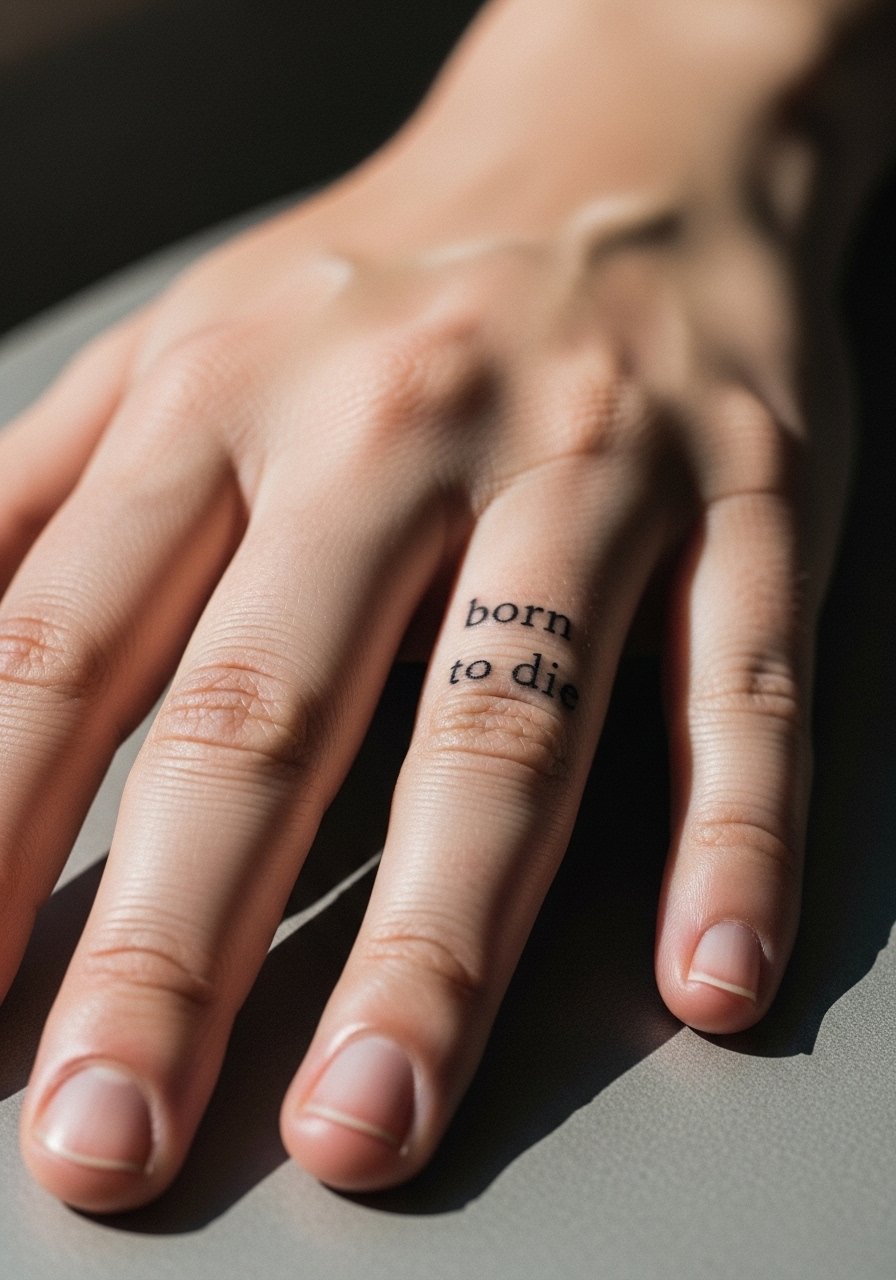
This is the most discreet way to wear the phrase. Fair warning, fingers are high-motion and low-skin-depth, so expect the ink to blur faster than forearm work and plan for touch-up at year one or two. In consultation, ask the artist for slightly heavier linework than a typical fine-line script and fewer tiny flourishes so the letters hold. Session feels quick but brisk because the area is bony. For showing it off, stack with a thin chain ring that leaves the lettered side visible.
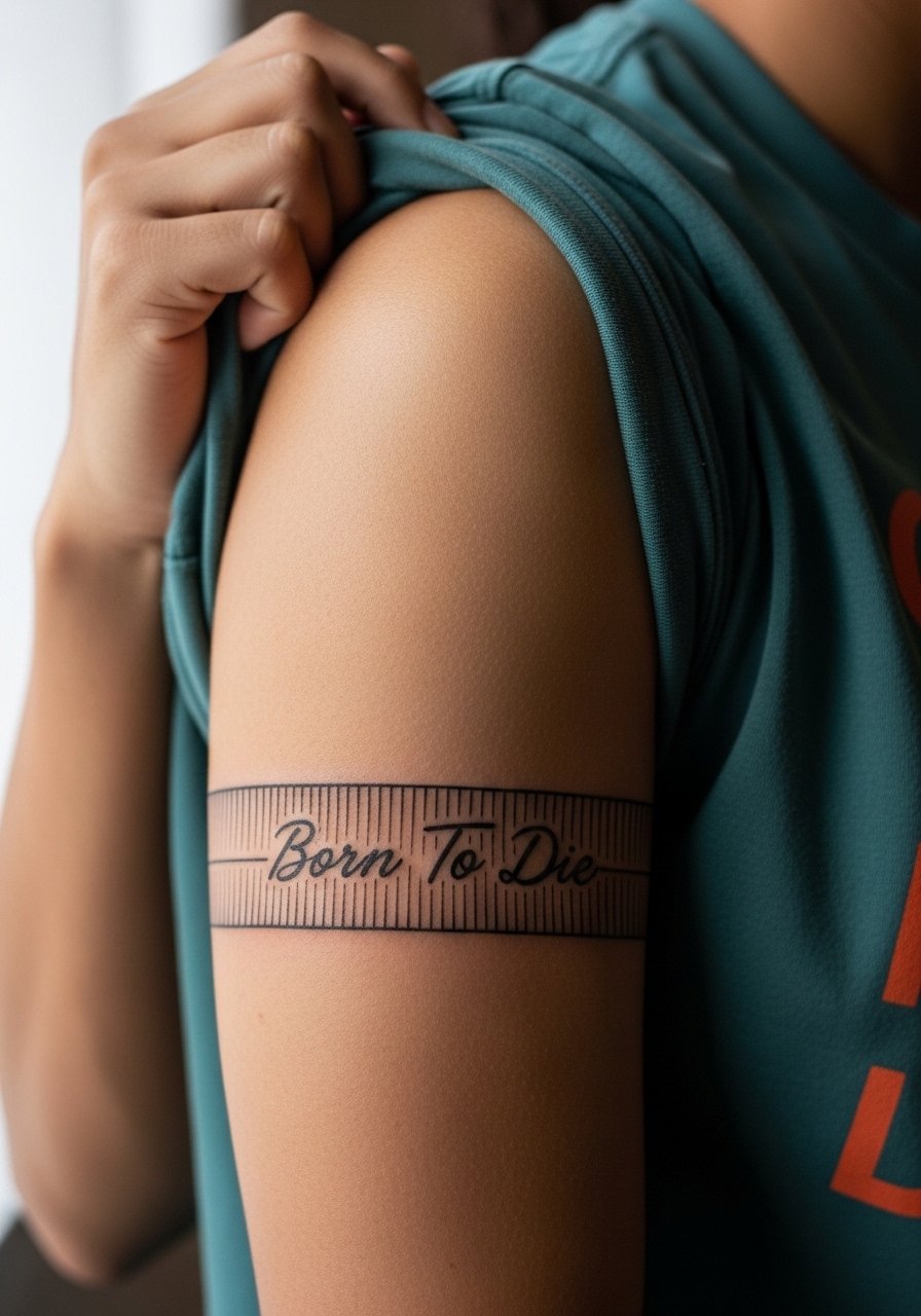
2. Classic Banner and Skull on Upper Arm
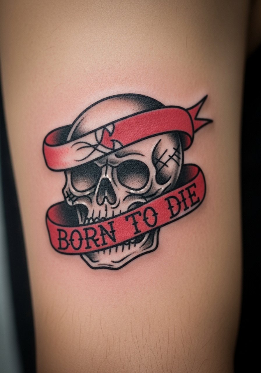
This nod to classic flash reads loud without relying on tiny type. I recommend a bolder banner with clean negative space inside the letters so they do not fill in as saturation settles. The upper arm tolerates saturation well and ages slowly. Common mistake is requesting micro lettering inside a narrow banner. During the consult, bring banner examples with the letter height you like. For wardrobe, pair with a rolled-sleeve tee to show the piece while keeping it casual.
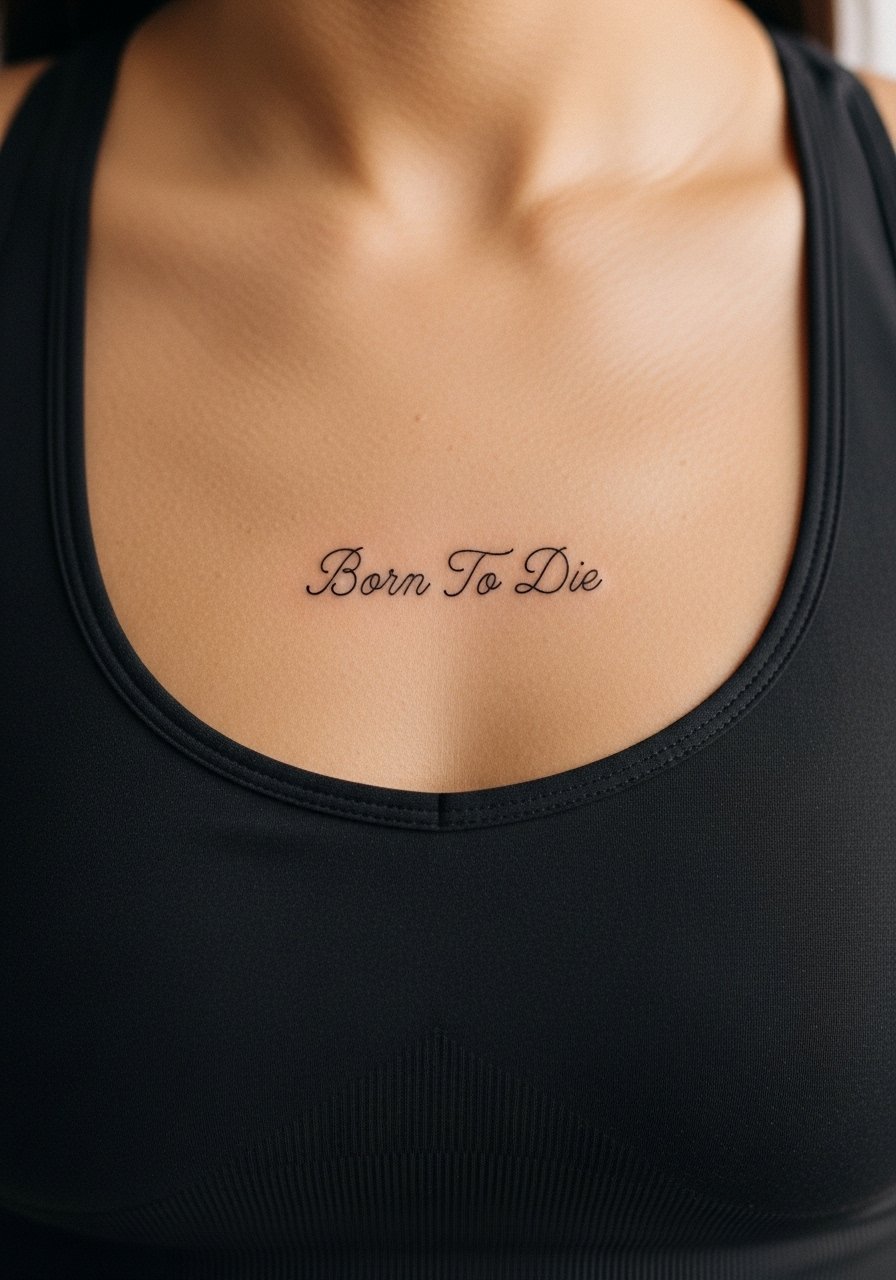
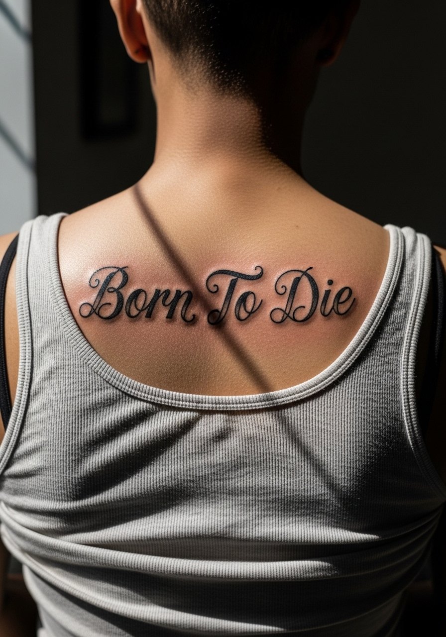
3. Fine Line Script Along the Collarbone
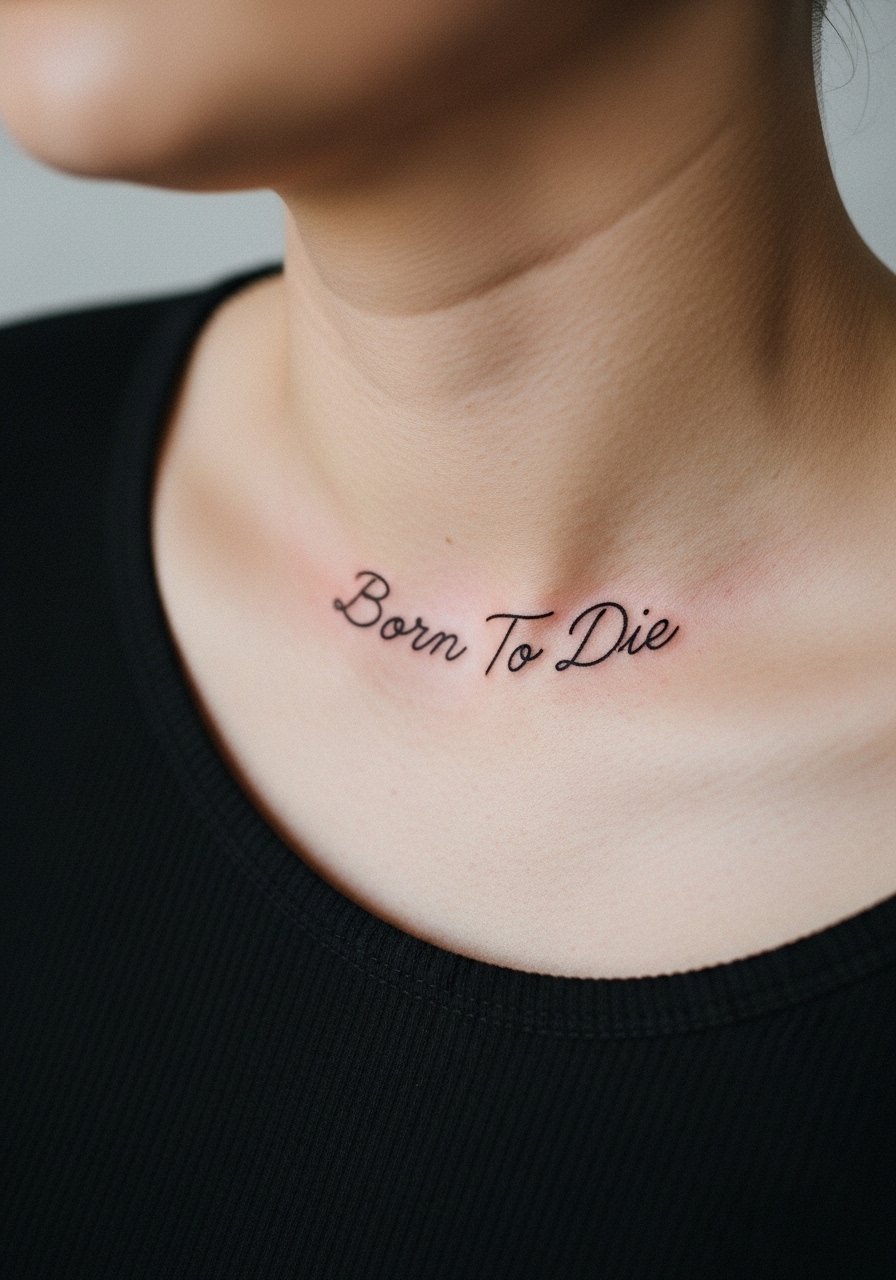
Collarbone scripts photograph beautifully and sit between face-forward and private. The area moves with breathing, so lines need small gaps and deliberate spacing. Pain is moderate because the bone is close to the surface. Tell your artist you want airy spacing and a touch more line weight so letters do not merge at year three. For nights out, a delicate chain pendant sits just above the script without competing.
4. Micro-Realism Portrait Behind a Baroque Frame on the Shoulder Blade
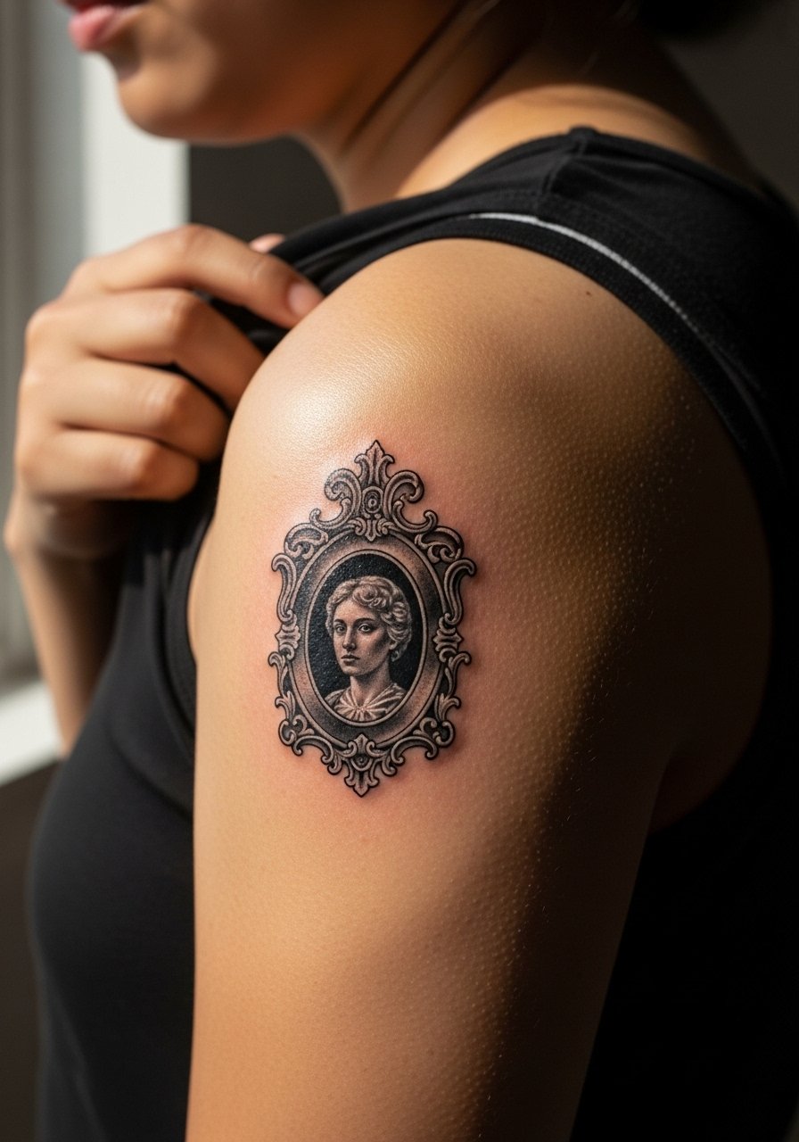
Combine the phrase with a tiny portrait or icon inside a frame for a personal touch. Shoulder blade placement gives room for detail and a longer session so the portrait stays crisp. A common mistake is cramming too much fine detail into a small frame. Ask for a mock stencil at size so you see negative space. For session comfort, wear a loose button-down shirt you can pull aside without pressure on the back.
5. Blackwork Coffin and Banner on the Calf
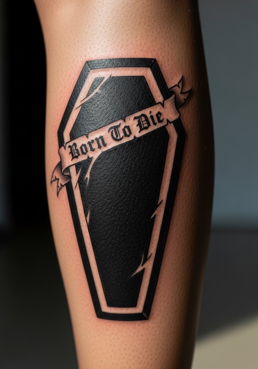
Calf skin holds saturated blackwork well and shows the piece from across a room. This placement tolerates larger blocks of black without blowout risk, which makes it ideal for stark silhouettes. Mention blowout risk to your artist and request crisp edgework rather than feathered fill near the edges. Pain is low to moderate and sessions last longer than a wrist sketch. For showing it off, wear cropped trousers or midi skirts that stop above the calf.
6. Script Wrapped Around the Sternum
Sternum scripts can be elegant but they demand respect for anatomy. Pain is higher and the skin stretches with breathing. Artists are split on whether delicate scripts hold on the sternum. One camp says breathing and movement blur lines within two years. The other camp says carefully placed spacing and correct needle depth keep scripts readable. Ask the artist where they stand and see healed photos of sternum work. For the session, bring a zip-up hoodie or sports bra you can wear or remove without fuss.
Studio Day Picks
The collarbone, shoulder blade, and calf pieces above need different prep than finger or wrist sketches. A few targeted items make the session smoother and the first week of healing less fussy.
-
Stencil transfer paper kit. Lets you preview the layout on skin, which matters for the collarbone and sternum placements where alignment is critical.
-
Topical numbing cream. Applied 45 minutes before can soften sternum and inner bicep sensitivity without changing the artist's linework.
-
Thin protective film roll. Useful for calf and shoulder blade pieces that rub against clothing during the first week.
-
Fragrance-free gentle body wash. Cleanses healing areas without stripping pigment on fine-line scripts.
-
Aquaphor healing ointment. Thin layers for the early days lock in moisture for small script work without clogging delicate channels.
7. Single-Word Caps on the Side Ribcage
Ribcage placement is dramatic but demands size. The biggest mistake is making letters too small. When text sits on ribs, the skin moves and letters can distort as you bend. Ask for larger letter height and clean spacing so the serif details do not fill. Pain is higher and sessions are stop-and-go for breath control. Expect touch-up later if sun exposure is heavy. For sessions, wear a cropped tee or sports bra so the artist has clear access.
8. Minimalist Lowercase Script Behind the Ear
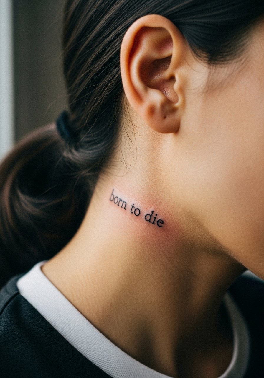
This placement is tiny and intimate. Behind-the-ear scripts need ultra-clean spacing to avoid merging into a smudge. The skin is thin so expect early fading. A specialist who works with small placements helps. Keep hair short or tucked to show it off. Hand a reference with exact letter size during consult. Note that visibility is subtle and career considerations may apply for face-area tattoos.
9. Gothic Script Across the Upper Back
Upper back gives room for dramatic letterforms. Blackletter needs strong negative space so the glyphs do not merge as the skin ages. A common error is requesting overly condensed blackletter in a small width. For a balanced result ask the artist for slightly wider letter spacing and bold counters. Session time is moderate and healing is straightforward. Pair with open-back dresses or a strappy top to show the line across your shoulders.
10. Small Script Half-Moon Over the Knee
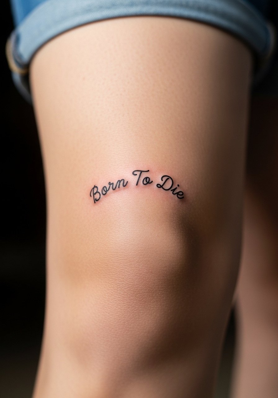
Knee-area scripts have to account for constant flexing. The skin folds and the ink can blur along creases if letters sit directly on the fold. I tell clients to curve the lettering slightly higher above the patella so the bulk of the letters lands on flatter skin. Pain is moderate and sessions can be a little jumpy as the artist works around the joint. For the session, wear loose shorts you can pull aside.
11. Fine Script Along the Spine
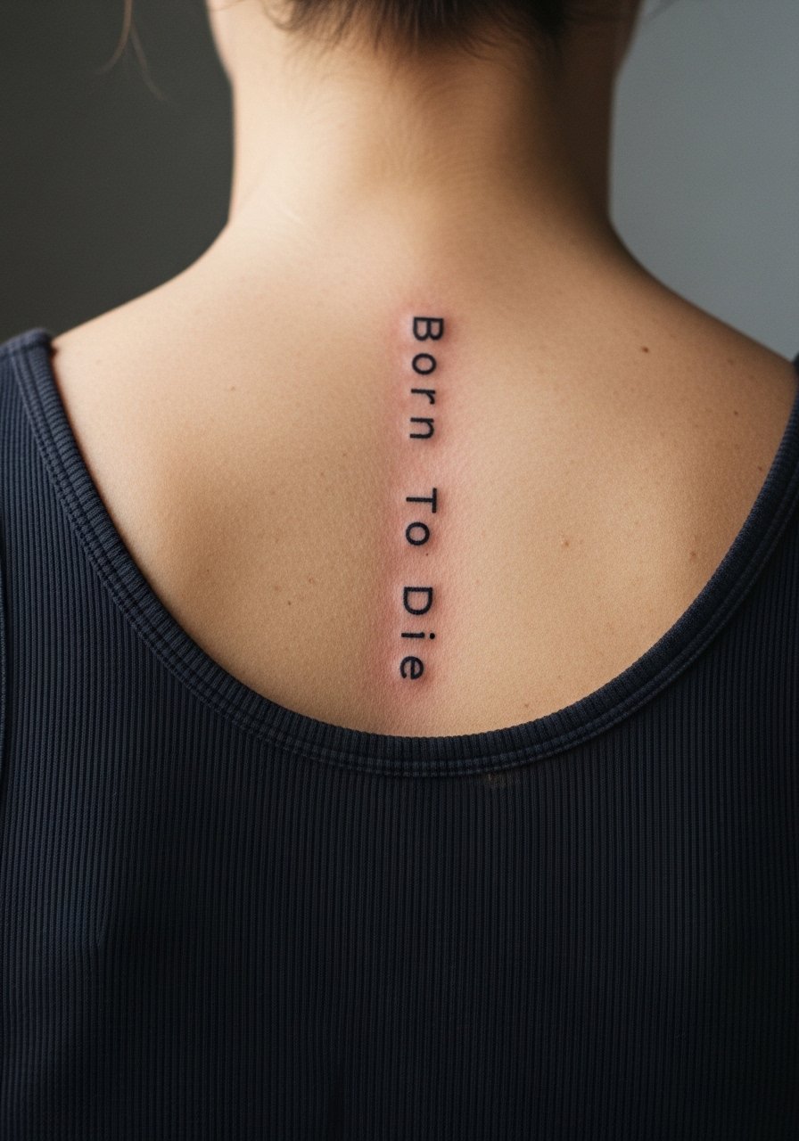
Spine scripts read like a statement and age predictably if linework is set at the right depth. A real mistake is centering text over vertebrae without enough letter spacing. Ask the artist for photos of healed spine scripts on similar skin tones. Pain can be high near the vertebrae so shorter sessions spaced over a few visits help. For showing it off, open-back garments or a low-back dress work well.
12. Script Encircled by a Wreath on the Forearm
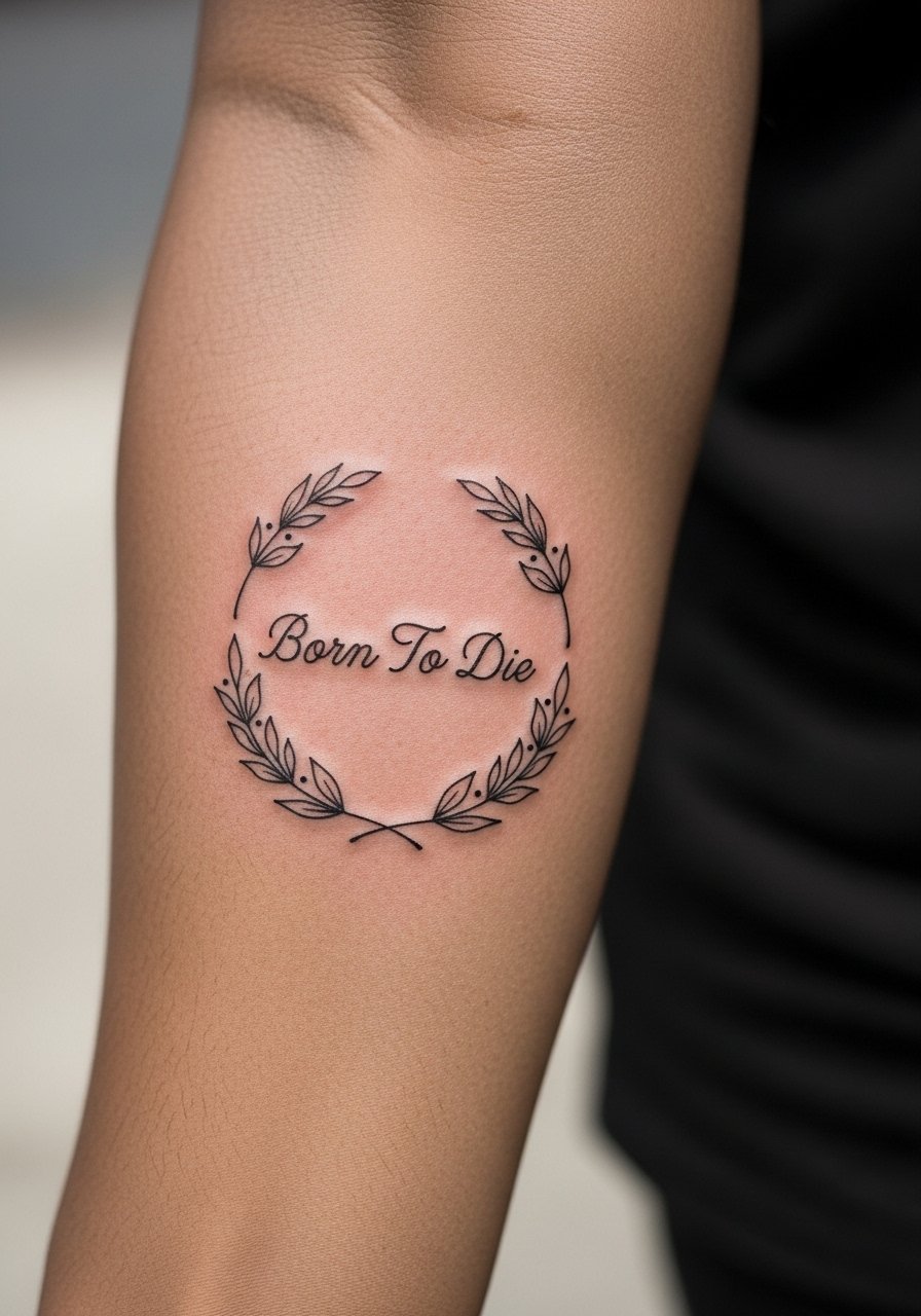
Inner forearm is forgiving for delicate scripts and wreath details. The skin is relatively stable and shows linework cleanly for years. A common mistake is overcrowding the wreath with tiny leaves that blend into the script. Ask for a test stencil and request slightly larger leaf spacing. Session pain is low to moderate and touch-ups are usually minimal. Pair with rolled sleeves and a linen shirt when you want the piece visible.
13. Hand Lettering Across the Knuckles
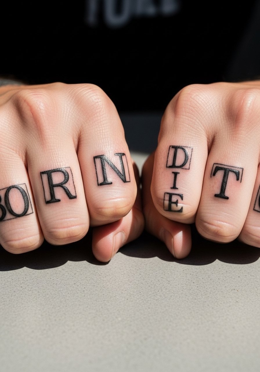
Knuckle tattoos are polarizing in the community. One camp sees them as bold and instantly readable. The other camp points out aggressive fading due to constant washing and friction. If you choose this route, keep letterforms simple and thick and accept a short touch-up timeline. The session is quick but the healing period is fussy because hands touch everything. For styling, stack with a minimalist bracelet rather than bulky jewelry so the knuckles remain the focus.
14. Watercolor Moth with Banner on the Thigh
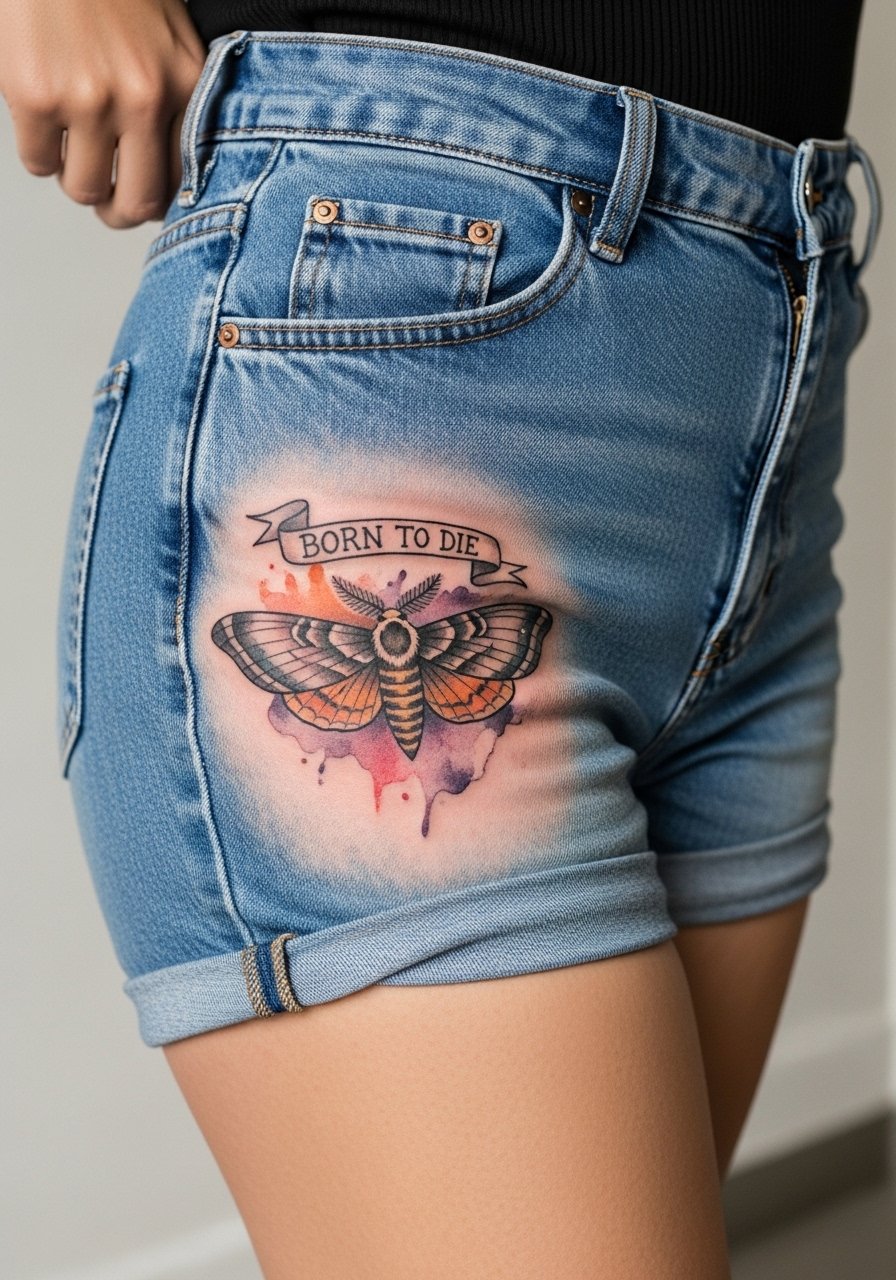
Watercolor effects are attractive but they fade differently than saturated black. The moth's soft color fields will need more touch-ups over the years than solid black banners. For longevity request a bold outline around critical shapes and lighter washes inside. Thigh skin tolerates both color and size well and sessions are comfortable for most. For the session, wear high-waisted shorts you can shift slightly for access.
15. Typewriter-Style Mini Tag on the Ankle
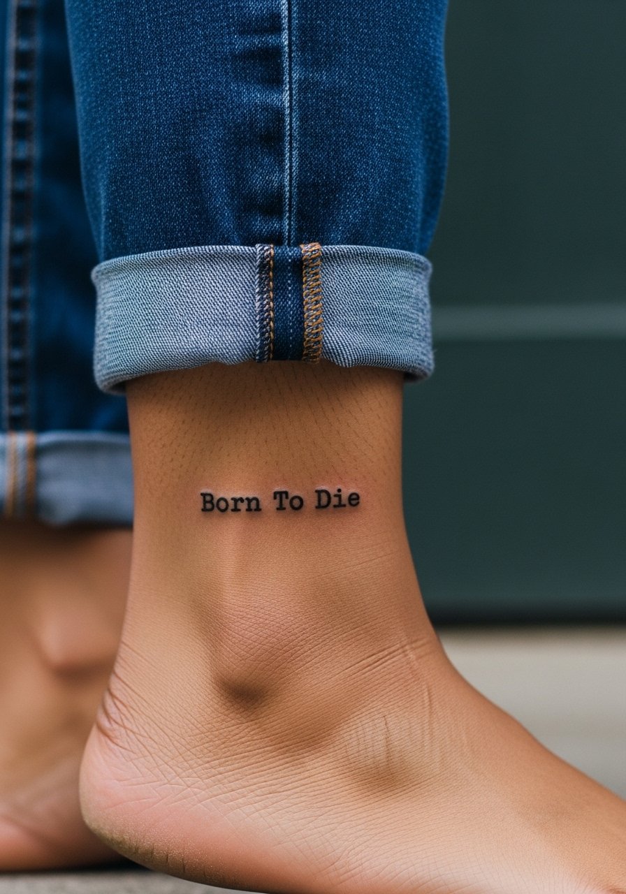
Ankle tags are subtle and age reasonably well if not placed on areas of heavy rubbing. The common mistake is placing text right where a shoe tongue or sock cuff constantly rubs. During consult, stand and move to identify friction points. Expect moderate pain and short session time. For showing it off, wear sandals or roll your jeans and pair with a simple anklet.
16. Gothic Cameo Frame with Script on the Inner Bicep
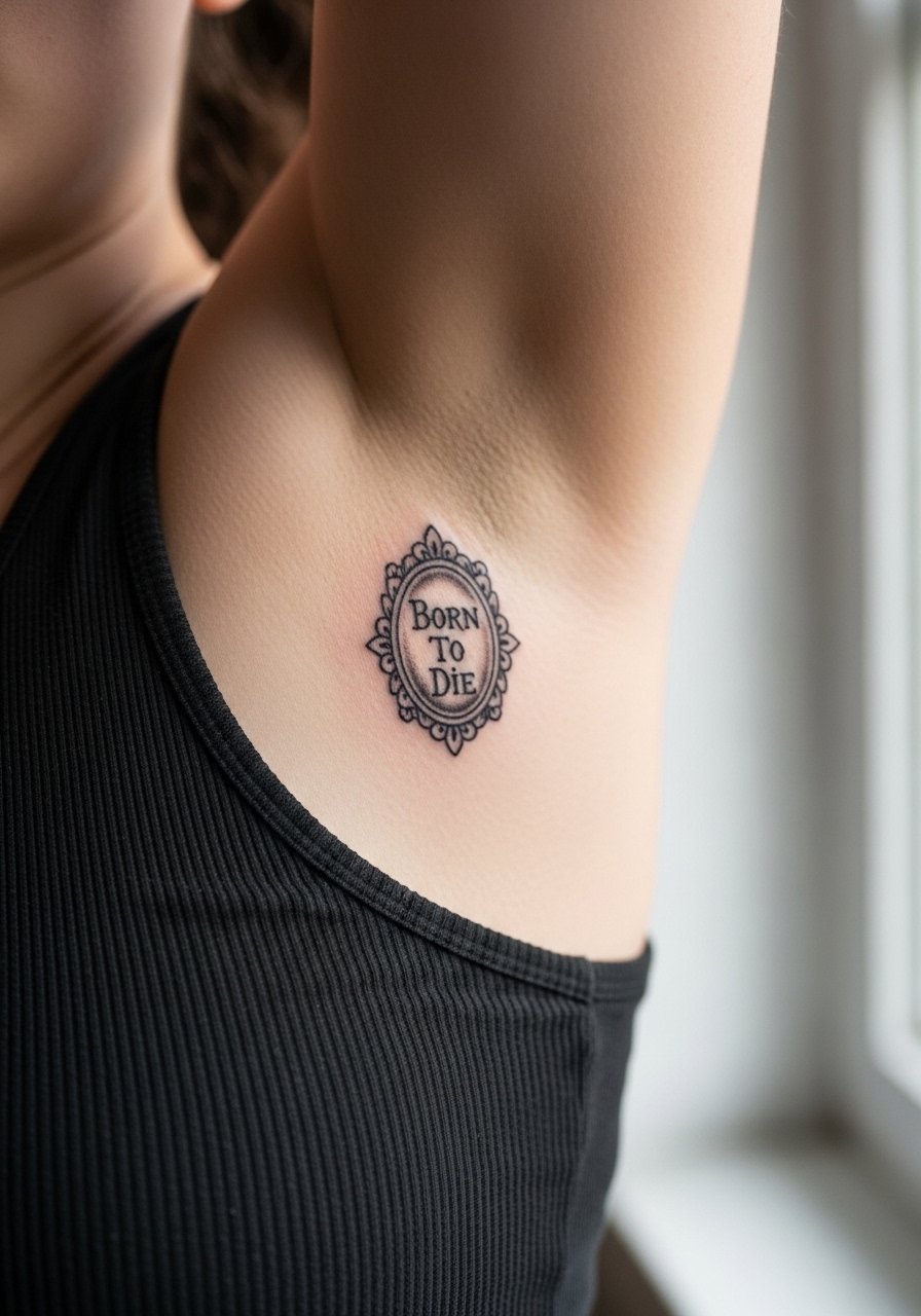
Inner bicep offers privacy and nice flat canvas for framed script. The area can smear if the artist works too deep or too shallow. Tell your artist you like soft contrast and request healed photos of their inner bicep work. Sessions can be ticklish with the arm raised, and the skin here sees less sun so the piece ages well. For the appointment, wear a sleeveless tank that you can pull aside.
17. Script within a Floral Heart on the Sternum Side
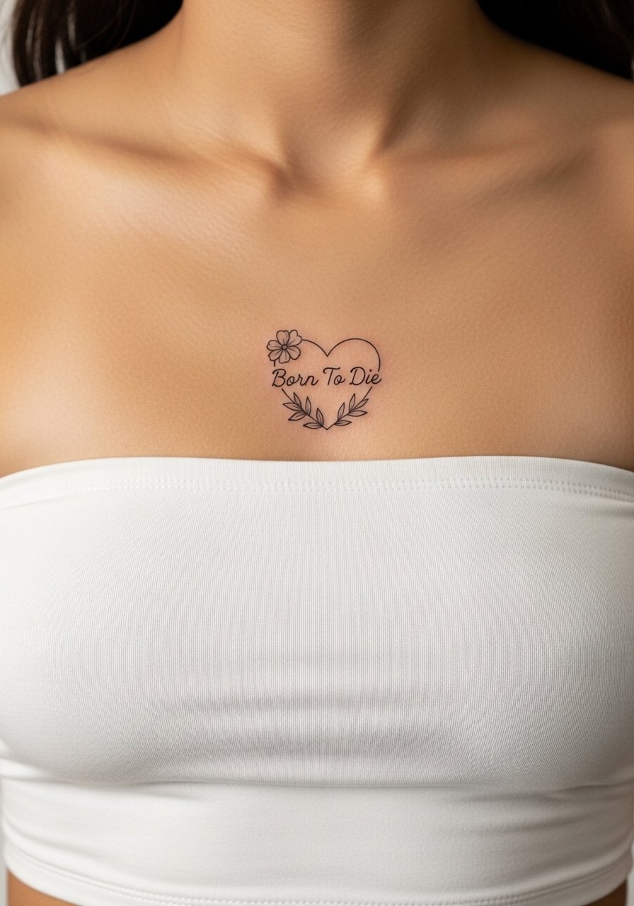
This placement is intimate and feminine but sensitive. Sternum work is prone to movement-based blurring, so the floral elements should be airy to avoid merging. Ask for shallow shading and clear negative space between petals and letters. Pain is higher and sessions may be split. Because the area is private, many people prefer a slightly larger scale to preserve readability. Consider a strapless or zip-front top for the session instead of slipping on a pullover.
18. Script over a Broken Mirror Shard on the Forefoot
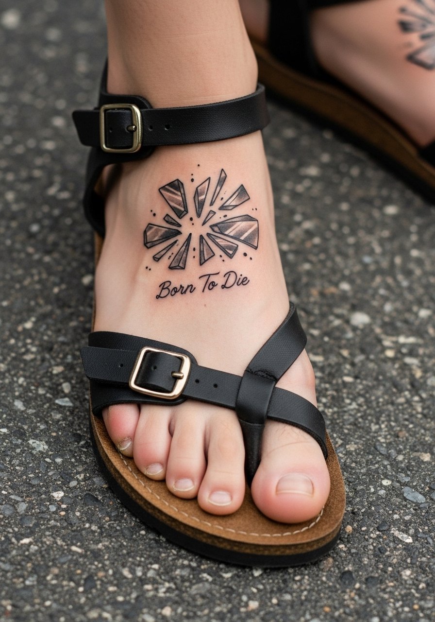
Top-of-foot tattoos face constant pressure from shoes and early sun exposure, which accelerates fading. The fix is larger, sturdier lines in the shard and slightly bolder script. Expect a fidgety session because the foot is sensitive. For the first week, low shoes and socks are best to reduce friction. For showing it off, pick open sandals or a simple leather sandal.
19. Blackwork Shield with Script on the Chest
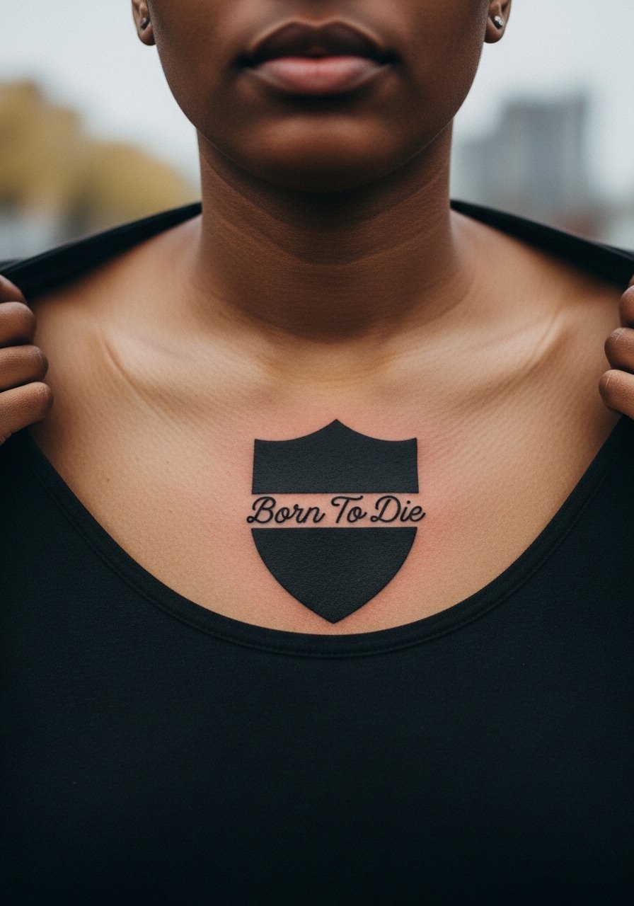
Chest pieces make a statement and handle saturation well, which suits shield motifs. The challenge is curvature of the chest and movement from breathing. Ask for a stencil check while upright so the artist can tweak alignment. There are two camps on chest scripts. One camp prefers heavy saturation and thicker letters for longevity. The other camp favors lighter lines with strategic spacing to keep the piece airy. Decide which direction you prefer and see healed photos before booking. For session comfort, wear a button-down shirt you can slide off easily.
20. Script Wrapped Around a Moth Thorax on the Nape
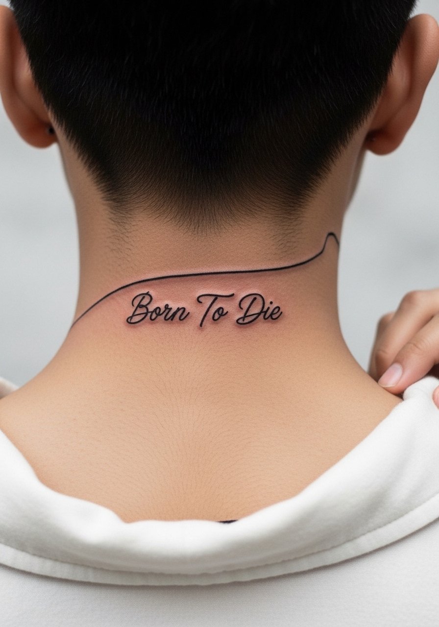
Nape scripts are subtle and often visible only with hair up or in a low bun. The area tolerates fine line well but beware of hairline irritation during healing. Mention you will wear your hair up sometimes so the artist can plan for placement just below the hairline. Sessions are quick and healing is straightforward if you avoid tight collars. For nights out, a low bun clip keeps the area visible.
21. Script Intertwined with a Crescent Moon on the Wrist
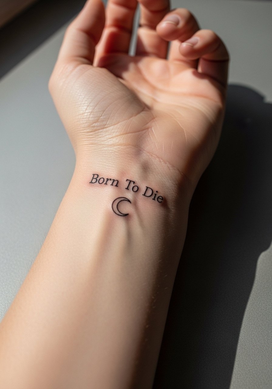
Inner wrist scripts are classic but sit in a high-sun and high-wash zone. Keep letter spacing generous to avoid softening. The common mistake is using extremely thin strokes that break apart with daily washing. Ask for a slightly thicker hairline and expect a touch-up around year two. The session is short and pain is low to moderate. Pair with a thin chain watch to frame the script without crowding it.
22. Vintage Type Plaque on the Rib Cage Below the Breast
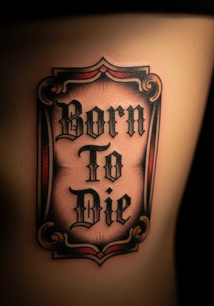
Ribcage plaques read cinematic but need size and spacing. The biggest error is asking for dense ornamentation that heals into a muddle. Request minimal ornamentation and wider counters. Pain is high and sessions must respect breathing. Because ribs move, schedule a follow-up touch-up window at six months. For the session, a cropped athletic top that can be shifted without irritation is ideal.
23. Script Framed by Thorns on the Upper Thigh
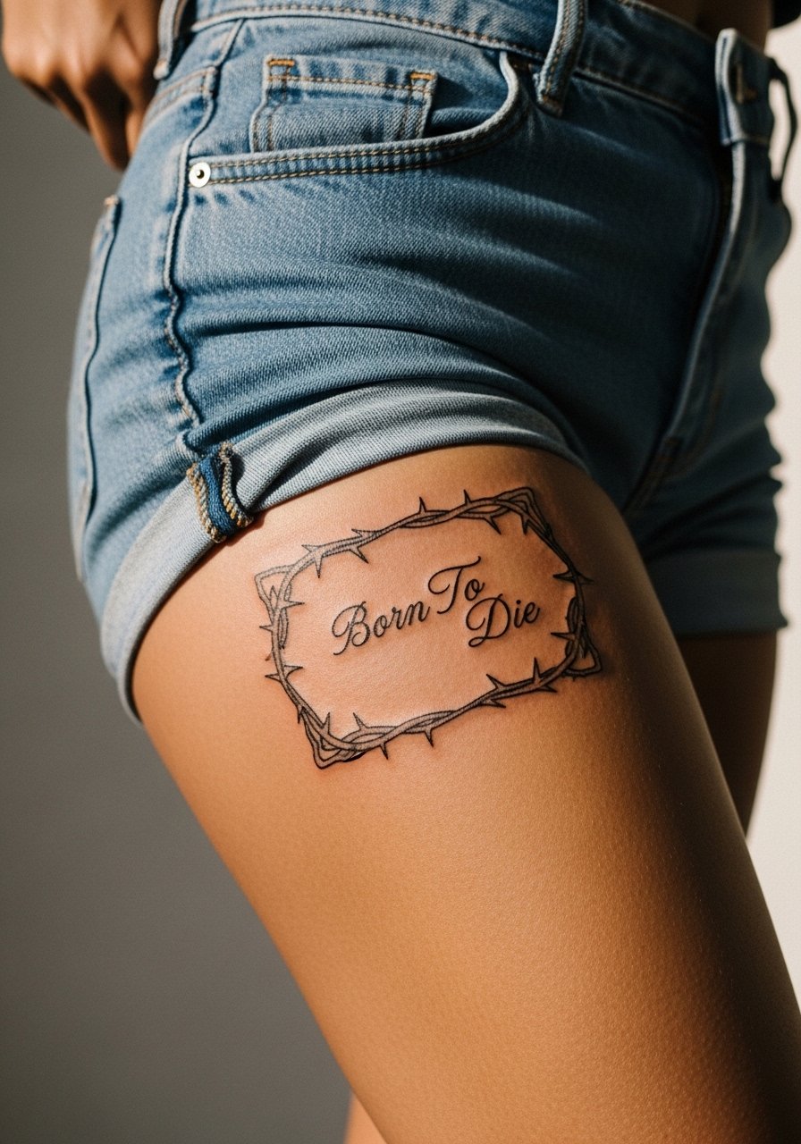
Upper thigh placements are forgiving for size and detail and usually age well. Thorns can create sharp contrast that protects the central script visually. The common mistake is too many tiny thorns close to the letters. Ask for spacing that keeps thorns as negative accents. Sessions are comfortable and healing is private. For the appointment wear high-waisted jeans that shift easily.
24. Micro Script Inside a Coin Motif on the Palm Edge
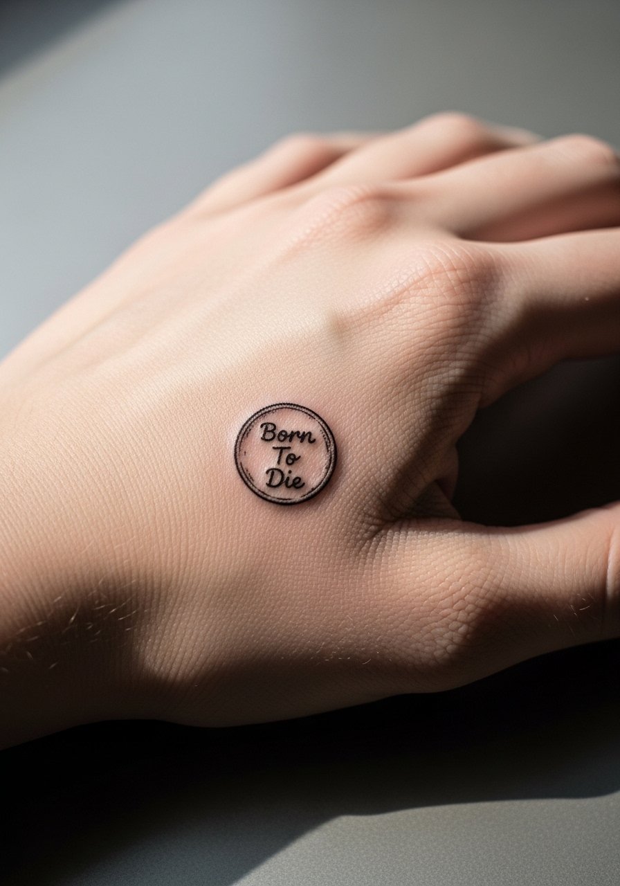
Palm-edge tattoos carry extreme fade due to constant use and thick skin layers. Expect frequent touch-ups and possibly a bolder redesign over time. If you choose this, make the coin rim bold so the circle holds its shape when the internal script softens. Sessions are short but the healing window is fussy. Wear gloves when needed and avoid heavy hand work for the first week.
25. Script on a Ribbed Band Around the Upper Arm
A band lets you combine type and pattern while avoiding overly small lettering. The arm tolerates this well but tight bands can look cramped as the skin settles. Request slightly looser spacing in the band and a preview of the band width on your arm. Sessions are moderate in time. For the session, a short sleeve tee you can roll works best.
26. Script Curved Inside a Crescent Moon on the Rib Side
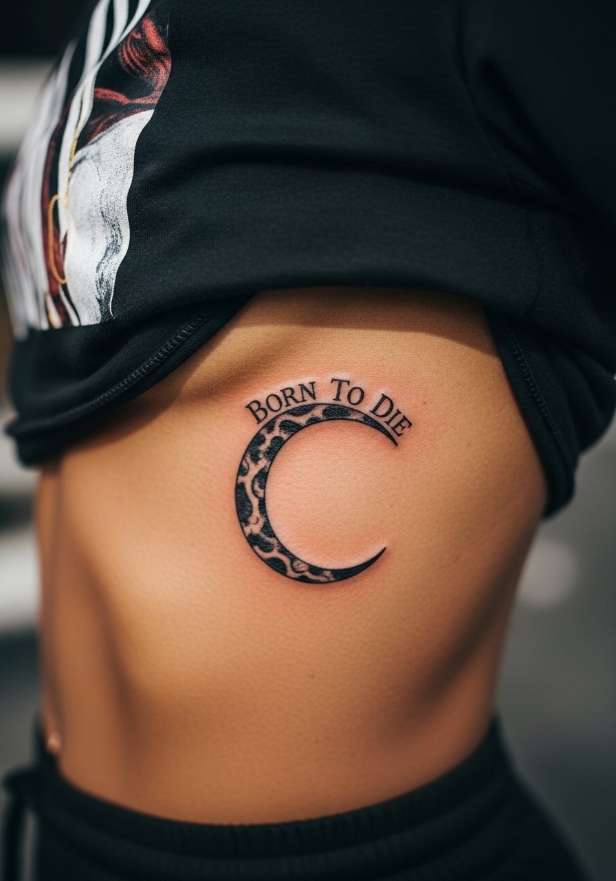
Curved scripts on the rib need breathing room. Small, tight curves will compress when the skin moves. Ask for a longer arc and test it on the sliced stencil in different breathing positions. Pain is high and sessions often split. If you want it visible occasionally, plan clothing that lifts or shifts without rubbing the fresh ink.
27. Script Below a Small Gramophone or Vintage Radio on the Chest Pocket Area
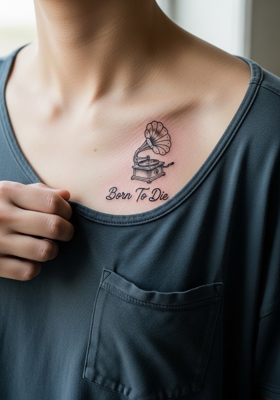
This retro pairing fits the chest pocket zone and wears well when scaled appropriately. Avoid tiny interconnected ornaments around the gramophone or the design will lose clarity. Request a clear negative space buffer between the image and the script. The chest heals predictably and tolerates black ink well. For showing it off, a button-up shirt left unbuttoned at the top frames the piece nicely.
Frequently Asked Questions
Q: How long will a fine line "Born To Die" script stay readable on my wrist or finger?
A: It depends on placement and daily habits. Fingers and wrists see constant washing and friction, so many fine scripts need touch-ups around year one to year three. To extend legibility, ask for slightly heavier hairlines and limit daily scrubbing or harsh exfoliation on the area.
Q: Is ribcage script worth the pain if the linework can blur?
A: Yes if you plan for size and spacing. Smaller, delicate scripts on the ribs often blur as the skin folds. A larger letter height and clear negative space reduce that risk. Also ask the artist to show healed rib photos so you know realistic outcomes.
Q: Can I get a "Born To Die" script in blackletter and still have it read after five years?
A: You can, if you scale it correctly. Blackletter demands bold counters and room between strokes. When done too small it fills in. If you want that style, request wider spacing and thicker strokes so the letterforms hold as pigmentation settles.
Q: My job limits visible tattoos. Which placements here are easiest to hide?
A: Inner bicep, thigh, sternum, and upper back are simple to conceal under standard work clothing. If you need to show occasionally, collarbone or nape pieces can be revealed strategically with necklines. For subtle coverage on the wrist, plan sleeves or a watch during work hours.
Q: What should I wear to the studio for a sternum, rib, or back session?
A: Pick clothing that gives clear access without pulling or undue pressure. For sternum and ribs try a fitted sports bra or cropped top you can shift. For back work bring a loose button-down you can slip off easily. A zip-up hoodie can be handy for cooling down after a long session.