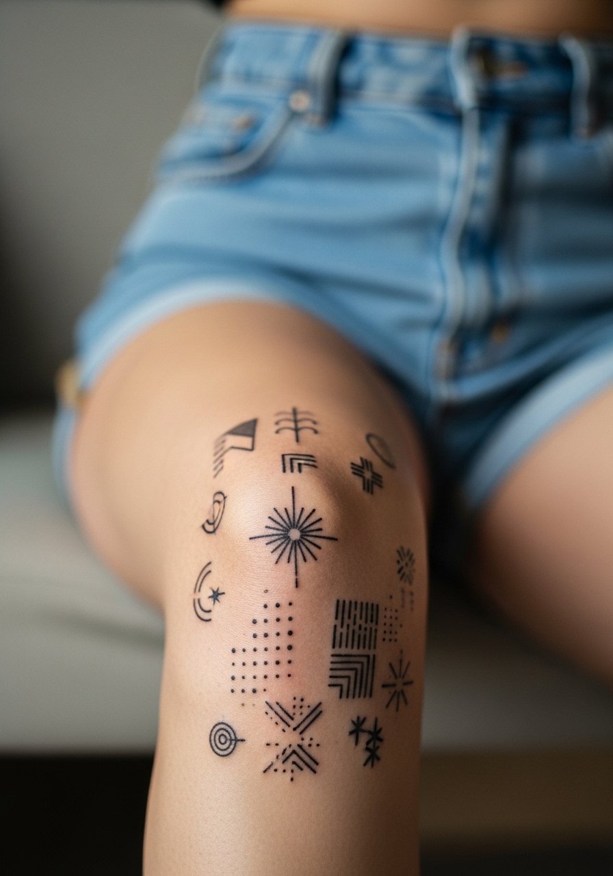
Sitting in the chair with the stencil over the kneecap is a commitment you feel immediately. The joint moves with every breath and a small change in placement can make the piece read off-center on motion. Abstract kneecap tattoos ask for this kind of minute decision making, so plan placement, ask about needle depth, and settle on a design that looks intentional when the leg is relaxed and when it bends.
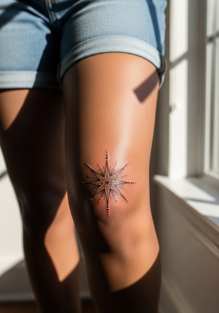
1. Minimal Radial Lines Centered on the Kneecap
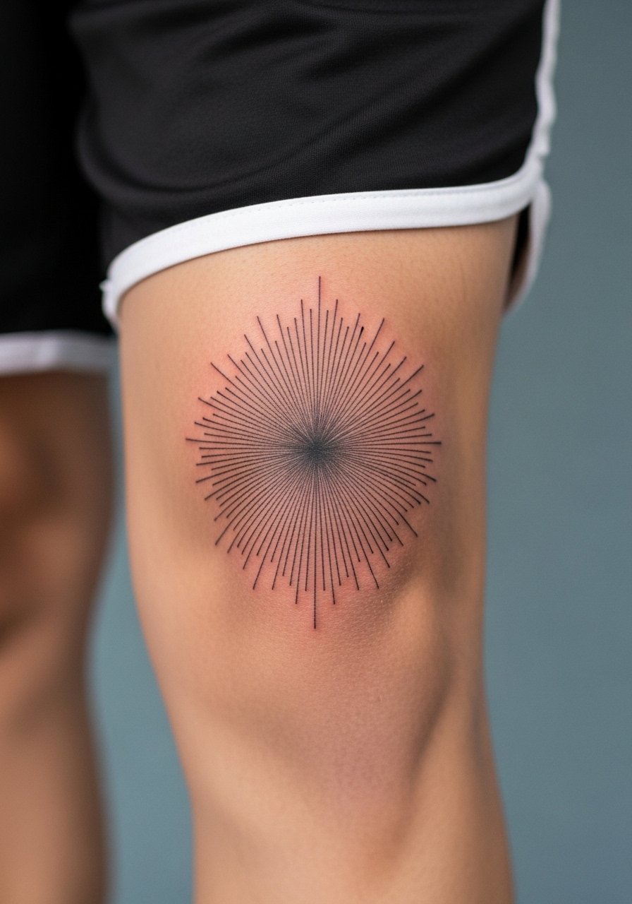
Start with a simple radial composition that follows the curve of the patella. I recommend this when you want an abstract mark that moves with the joint rather than fighting it. Tell your artist to map the stencil while the leg is both bent and straight so the main spokes align visually in both positions. The biggest mistake is making the rays too thin and too close together. Lines need spacing to avoid merging as the skin stretches. Expect a slightly brighter look at six months, gentle softening at two years, and a likely touch-up around year three for very thin rays. For the session wear a pair of loose athletic shorts you can roll up without pinching skin, so the artist can access the kneecap cleanly.
2. Asymmetrical Ink Splash That Reads in Motion
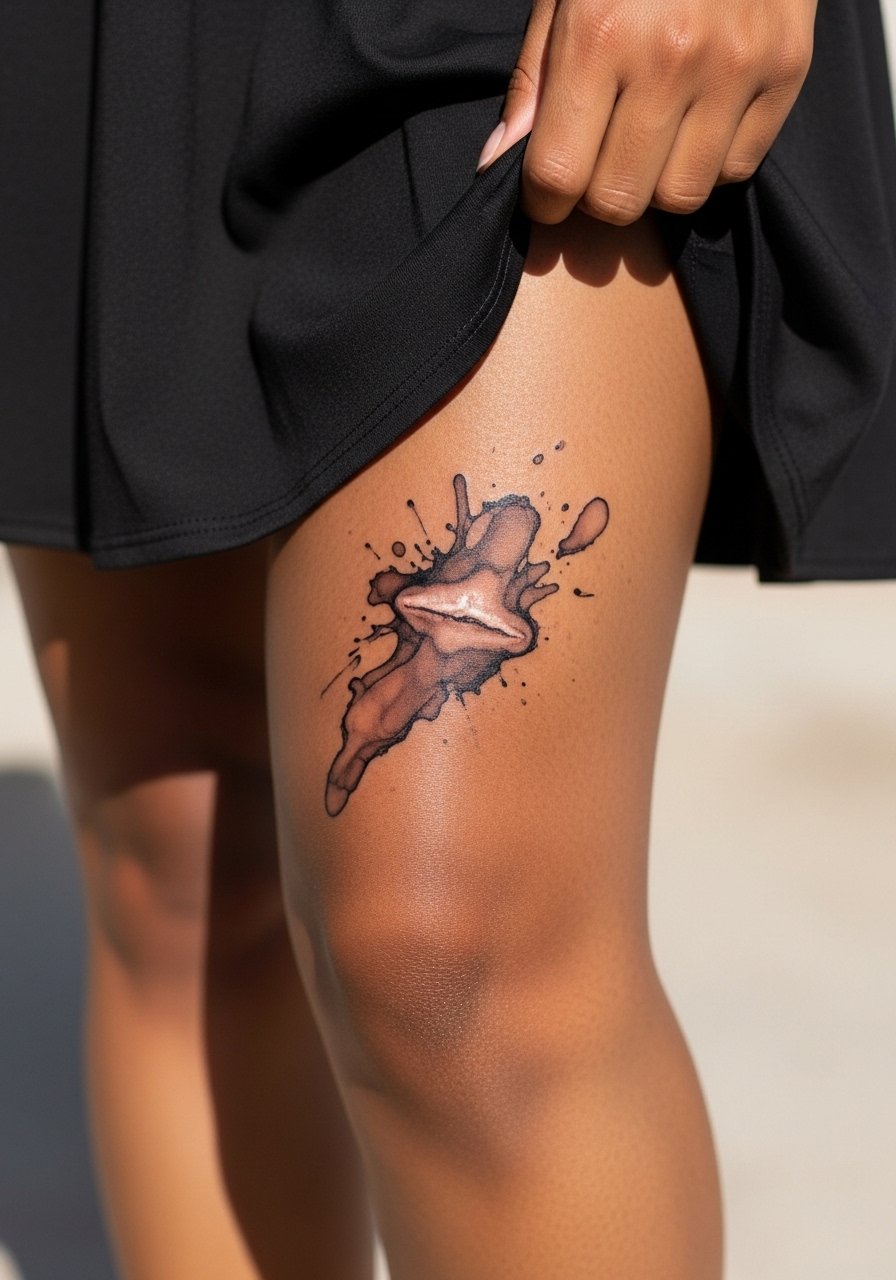
This one leans into movement by placing heavier marks on the outer side of the kneecap and lighter spatters toward the inner calf. Artists split on whether heavy saturation holds better on knees. One camp says bold black blocks age best because they keep contrast as the skin shifts. The other camp argues that too much density near joints can lead to scabbing and uneven settling. Ask your artist which approach they use for joints and why. During the session expect more pressure and longer passes where the ink pools. If you want to show it off at night, pair with a skater skirt that hits above the knee and frames the splash.
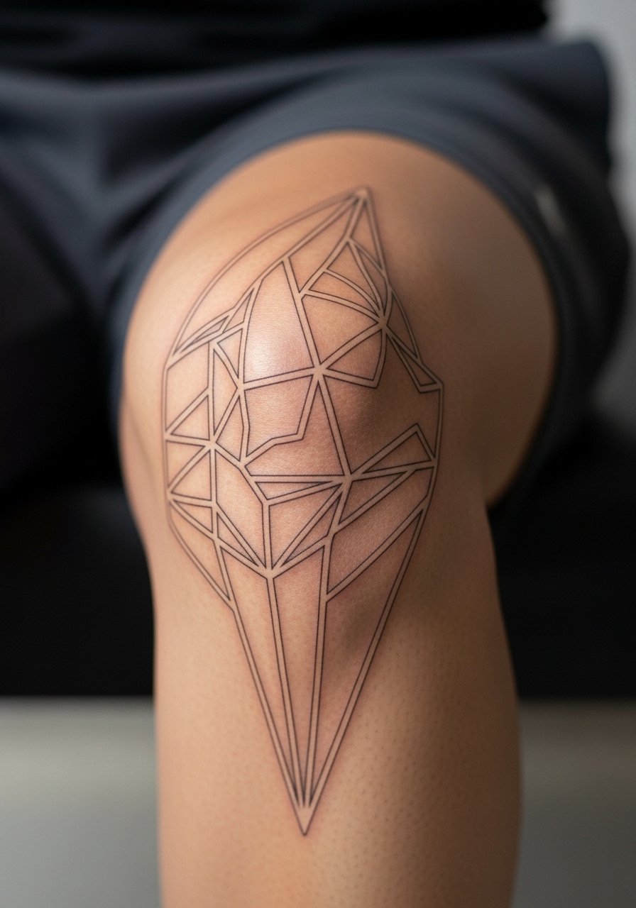
3. Geometric Ring Layers That Emphasize the Bone
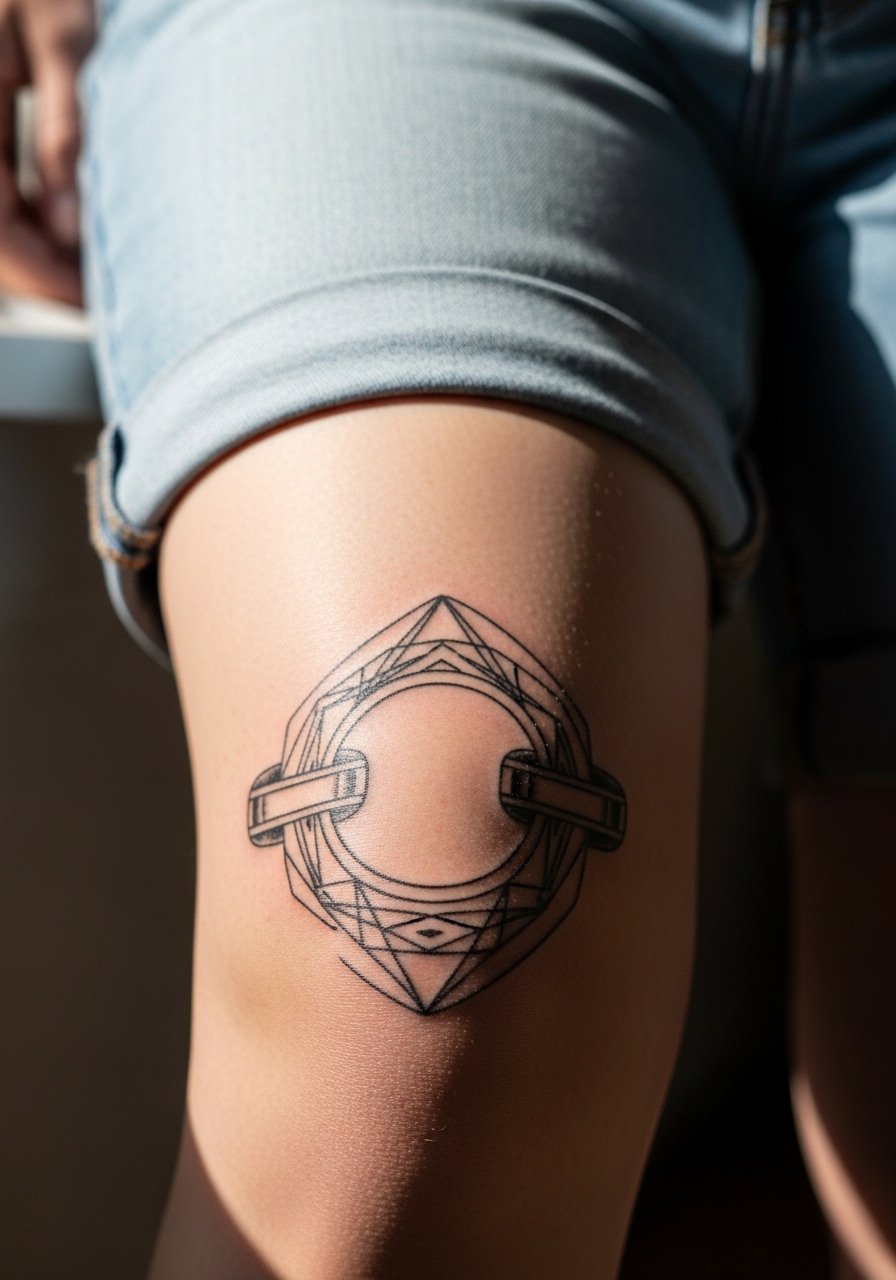
Rings that follow the kneecap contour can make the knee read like a sculptural element. I recommend this for people who like structure but want an abstract layout. During consultation ask for progressive ring spacing so inner rings are slightly bolder than outer ones. A common mistake is drawing rings too small, which causes crowding and blowout risk as lines blur over time. Plan for a session with steady linework and occasional touch-up at year two for very fine rings. For daytime looks, roll sleeves of shorts and pick a pair of denim cutoffs that let you sit cross-legged without rubbing the ink.
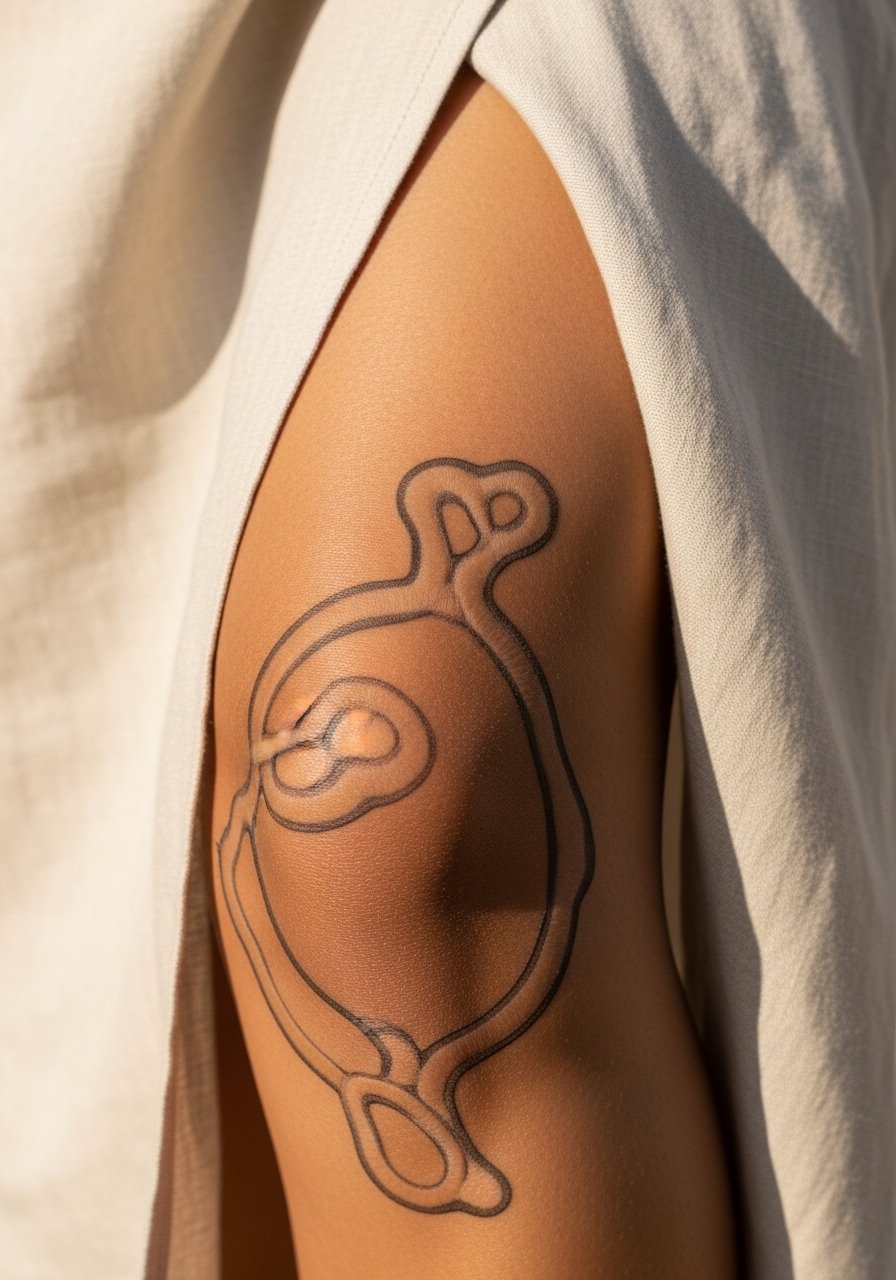
4. Stippled Negative-Space Halo Around the Patella
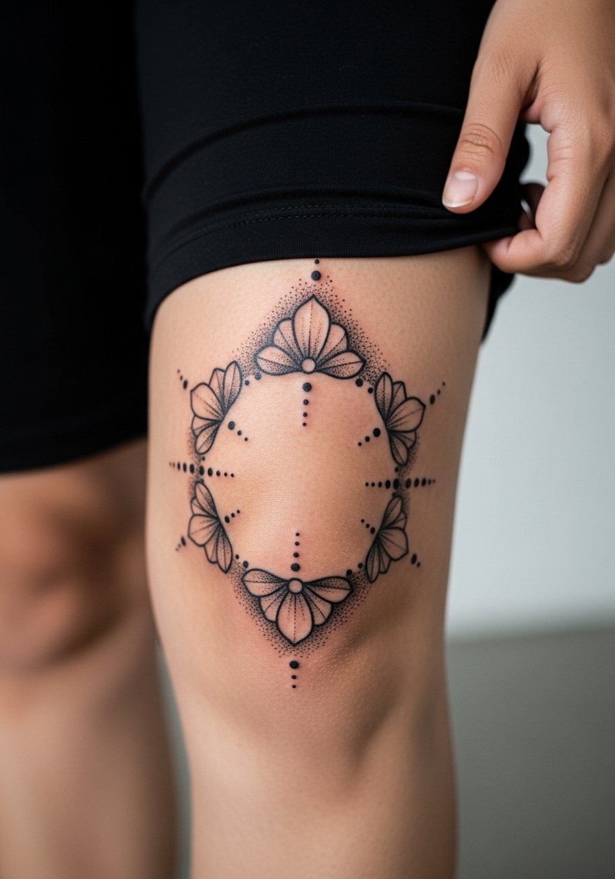
Dot work sits well around the knee because stipple shading adapts to curved surfaces. Ask your artist for shallower stipple passes near the bone so the dots remain crisp. The session feels like gentle tapping more than long line passes, but it takes time to layer stipple for depth. The mistake people make is asking for dense stipple too close to the patella, which can flatten as the skin stretches. Expect subtle softening at two years and plan a light touch-up rather than a full redo. Pair with bike shorts to show off the halo on casual days.
5. Abstract Chevron Flow That Follows Tendons
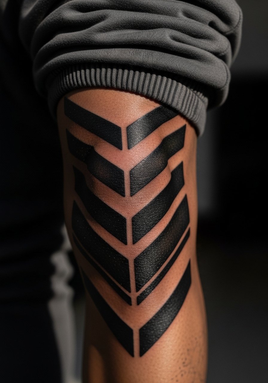
Chevrons that align with the tendon architecture read dynamic when you walk or squat. Recommend this when you want graphic motion rather than a static emblem. During consultation bring movement photos so the artist can place chevrons to sit on tension lines. The most common error is ignoring muscle shift and placing chevrons where they distort when you bend. Pain is moderate around the kneecap because the bone is shallow, so short breaks help. Expect the blackwork to keep contrast well, but thin chevrons might need a touch-up by year three. For sessions, wear loose jogger pants you can roll neatly above the knee.
6. Fragmented Mosaic Tiles Across the Patella
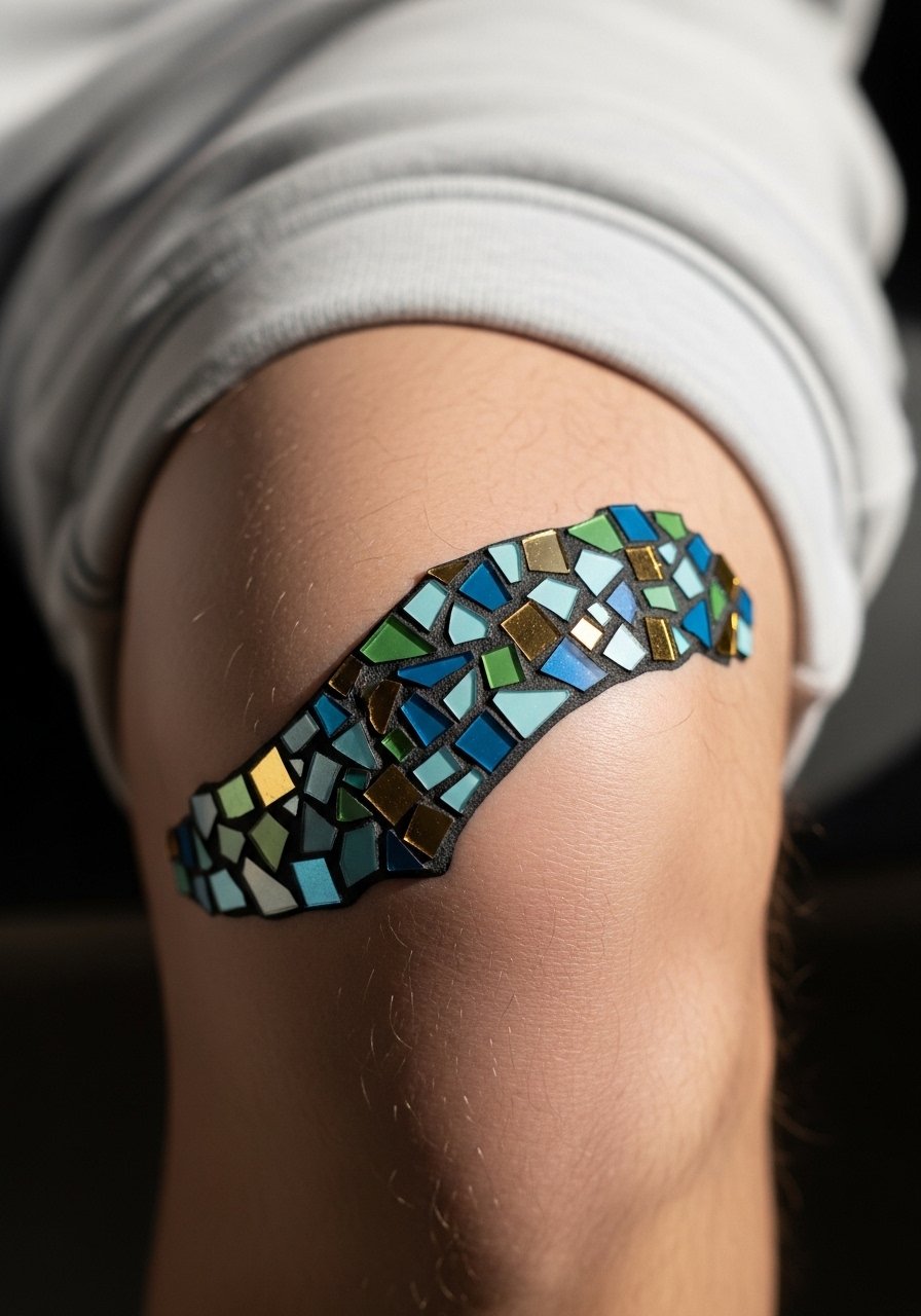
A mosaic grid broken around the kneecap plays with symmetry and imperfection. This is a good choice for someone who wants modular elements that can be extended into a larger leg piece later. Tell your artist to vary tile size so tiny tiles sit away from the exact bone area. The aging issue is that tiny enclosed shapes can blur at the edges, so give tiles breathing room. Sessions include many tiny placements which can feel repetitive and tingly rather than sharply painful. For session comfort pick a soft sweatshorts you can pull down slightly without stretching the skin.
Studio Day Picks
The kneecap pieces above need fast access and protection from friction, so a couple of specific items smooth out the session and the first week.
-
Stencil transfer paper kit. Lets you test placement while sitting and standing, which matters on a joint that changes shape.
-
Topical numbing cream. Applied before the session it eases the sharper passes around bone without changing how the ink holds.
-
Thin protective film roll. Keeps the kneecap clean during early movement and prevents rubbing from pants and socks.
-
Fragrance-free body wash. Gentle cleansing matters when the joint area scabs in odd folds.
-
Aquaphor healing ointment. A thin layer for the first days maintains moisture without clogging tiny needle channels.
7. Organic Brushstrokes That Curve With the Joint
Brushstroke designs read like motion captured on skin and are forgiving on the kneecap because they do not rely on pinpoint symmetry. I like this for people who want an expressive abstract that will soften gracefully. Tell the artist you want intentional breaks in the strokes so they do not become a single blob as the skin moves. The session feels like medium pressure with varied needle speeds to mimic brush texture. Mistakes happen when artists try to micro-detail each stroke; keep it bold enough to age into a softer impression. For nights out, an open-back midi dress that falls above the knee frames the area without rubbing.
8. Negative-Space Starburst That Pops on Motion
Negative-space work uses skin as part of the design which suits curved joints. Ask for slightly thicker surrounding linework so the contrast with bare skin stays readable as the area softens. A common mistake is placing too many tiny dots right next to the negative areas which makes the skin look patchy as it heals. Expect strong clarity at six months then gentle integration at two years. Wear high-waisted shorts during the session to avoid elastic digging over the area in the first 48 hours.
9. Angular Fragment with Staggered Edges
Angular fragments read modern and architectural but they demand precise placement because edges can skew when you bend. I recommend this for someone comfortable with bold geometry and a willingness to book a touch-up if edges soften. In consultation, mark key anchor points so the fragments line up in both motion and rest. The session includes focused linework and moments of higher sensation near the bone. The error is pushing angles too close to the bone where blowout risk is higher. For style, pair with tapered athletic shorts that keep the leg silhouette clean without constant rubbing.
10. Watercolor Wash Over and Around the Patella
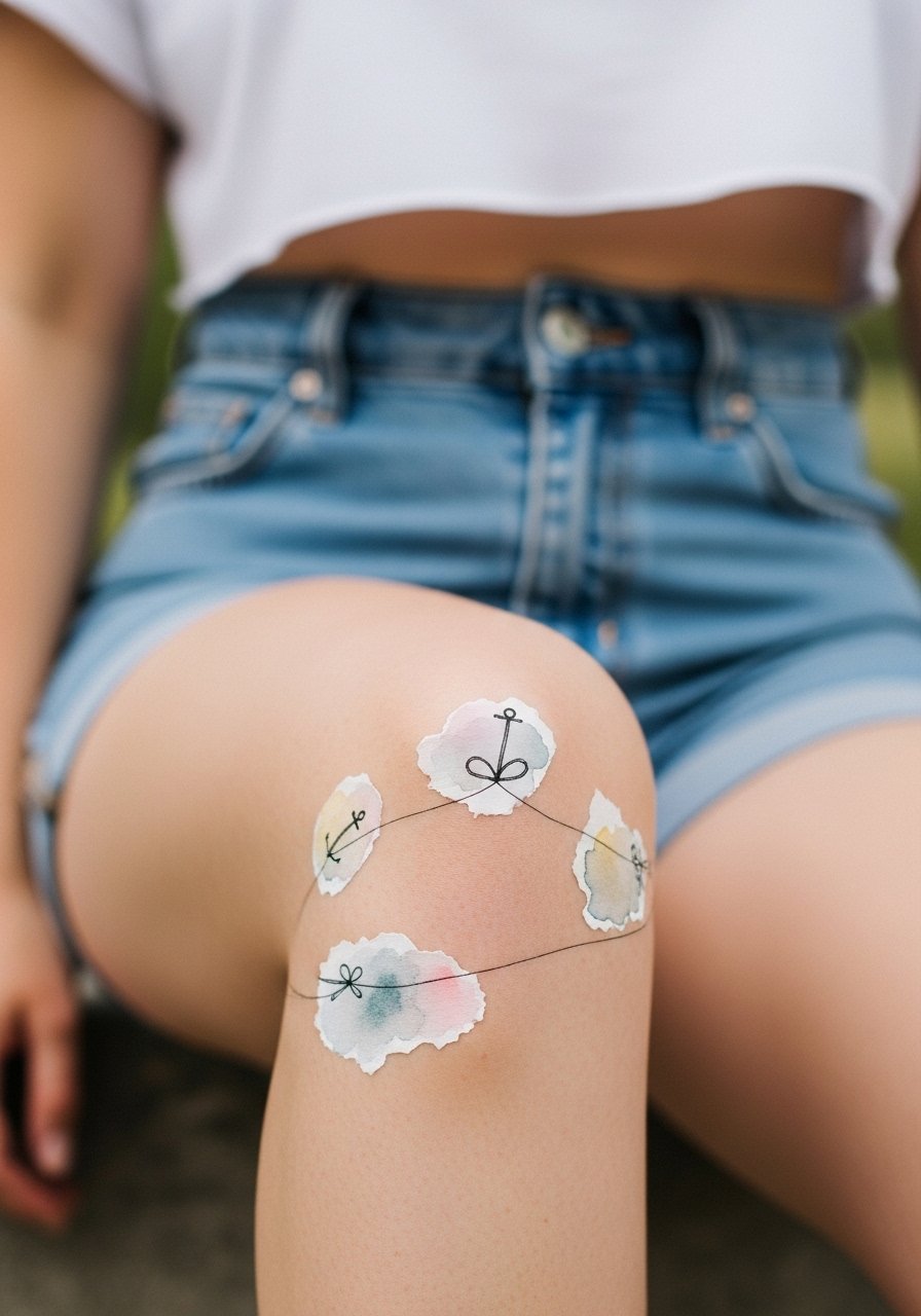
Watercolor effects on knees are atmospheric but tricky because pigment can spread unpredictably on jointed skin. One camp argues that soft washes will always blur on knees and that bolder outlines are necessary. Another camp has had success by using controlled saturation and larger grain shading farther from the bone. If you want watercolor, insist on controlled placement and a plan for color refreshes. Expect more frequent fade in color areas than in linework and a likely color touch-up within three years. For showing it off, pick a cropped tee and shorts combo that keeps attention on the knee area.
11. Broken Circle Motif That Lets Skin Breathe
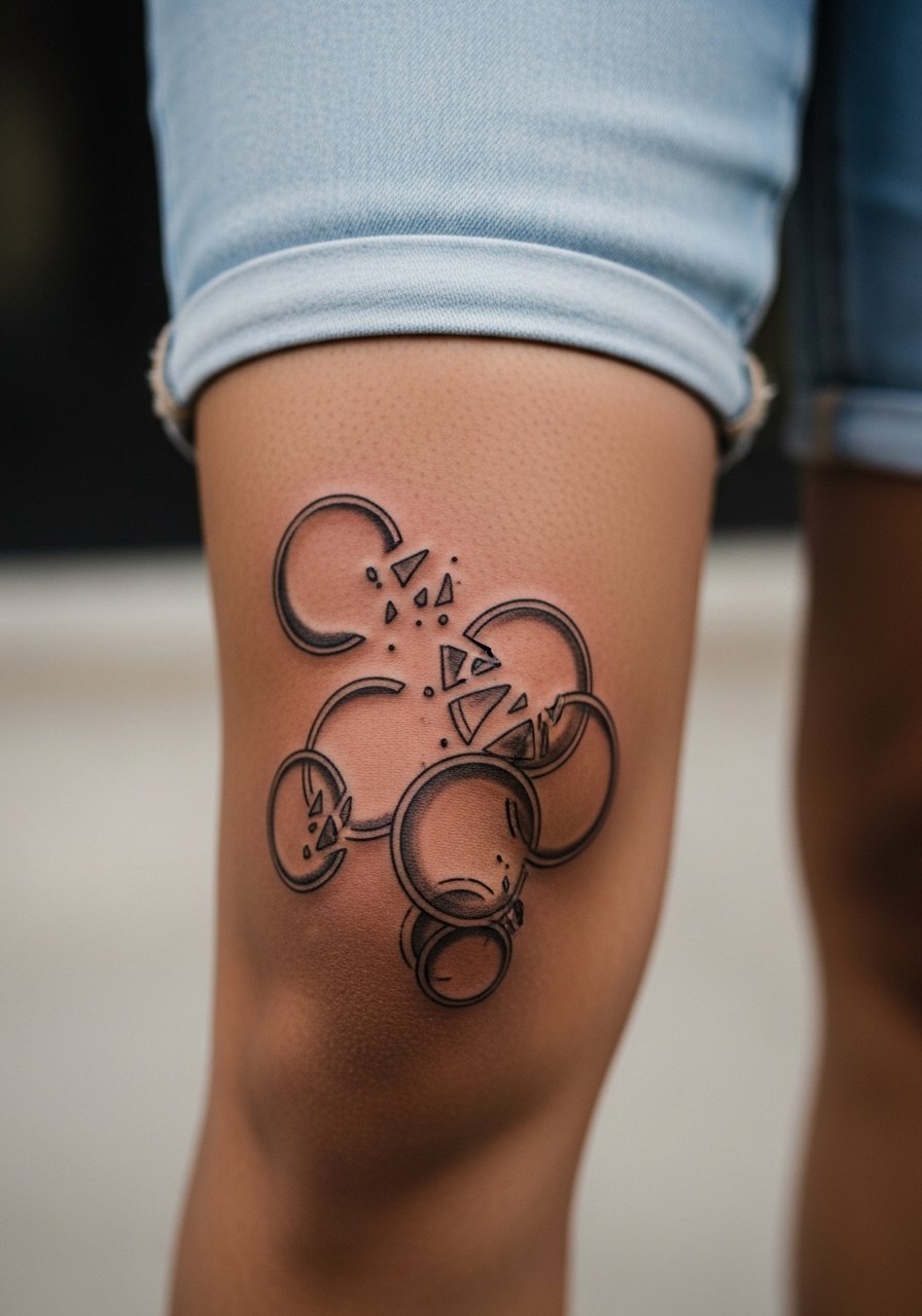
Broken circles create rhythm without demanding perfect symmetry, which suits the knee. Artists sometimes debate if continuous circles are better than broken forms. One position is that continuous rings maintain uniform tension and therefore settle neatly. The opposing view says broken forms allow for natural skin movement and reduce scabbing. I fall toward the latter for knees because breaks prevent dense scab formation directly over bony points. Tell your artist you want deliberate gaps and varied ring weight. Sessions feel like alternating quick lines and softer shading. Plan a light touch-up after a year for crispness.
12. Interlocking Organic Cells with Soft Borders
Cellular patterns mimic natural texture which makes them flattering on joints. Ask for softer outer borders and a stronger inner contrast so cells do not bleed together over time. The main mistake is tight packing of small cells directly on the bone. Sessions can be long because shading each cell takes layering. Expect initial clarity then a mellowed look at two years that still reads as pattern. For daytime styling, a linen wrap skirt keeps the area visible without friction.
13. Minimalist Script Arc Tracing the Knee Fold
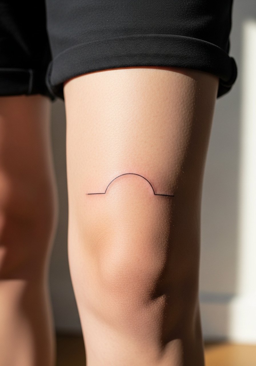
A single-line arc that follows the crease can read like a subtle signature when you walk. This is best for someone who wants discreet motion rather than bold mark-making. Tell the artist to map the arc in both bent and straight positions to prevent the line snapping off center. The error is choosing too fine a weight for the arc because thin script tends to spread at joints. Expect a touch-up around year two to maintain crispness. For session wear, a pair of athletic shorts that do not press into the crease is ideal.
14. Whip-Shaded Gradient That Wraps the Patella
Whip shading creates movement without harsh outlines and it adapts well to curved surfaces. I suggest this when you want a soft contrast that reads from a few feet away. Ask your artist for a lighter touch near the patella and deeper saturation at the outer band. The common mistake is overworking the same spot which can cause excess swelling and uneven settling. Sessions feel rhythmic and fast. Expect gentle fading in the first two years and plan for a light top-up to refresh gradients. Pair with denim cutoffs to show the wrap on casual days.
15. Constellation Map That Orbits the Knee
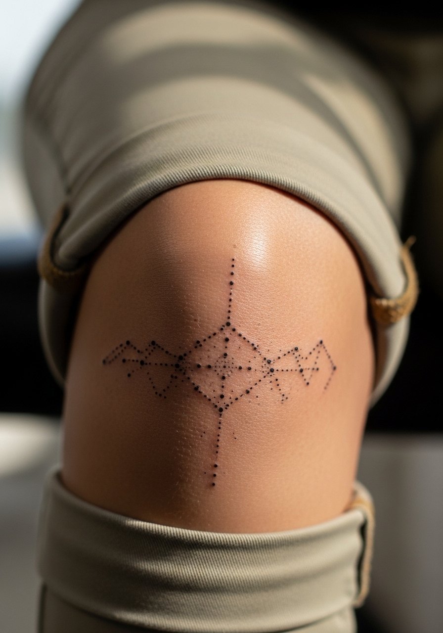
Constellation layouts work as an abstract map that can extend into leg pieces. They're best when dots have breathing room so you do not end up with a single smudged cluster. Tell the artist to stagger dot sizes and keep most micro-lines at a comfortable distance from the patella. Tiny dots feel sharp at the time and may need a touch-up sooner than larger marks. Plan for a possible touch-up at year two for the tightest dots. If you want to display it, try pairing with rolled-up chinos that stop above the knee.
16. Collage of Abstract Symbols in a Patchwork
A patchwork approach lets you combine different textures like stipple, linework, and small blackwork thumbnails. This suits anyone who likes variety and wants room to add later. Ask your artist to space pieces so each symbol can age independently. The typical mistake is packing too many micro-variants too close together, which creates merging over time. Sessions can be stop-and-go as the artist changes techniques between patches. Expect mixed touch-up needs across the patchwork depending on technique. For nights out, a high-waisted short frames the collage cleanly.
17. Sculptural Shadowing That Reads Like Relief
Sculptural shadowing uses subtle gradients to suggest depth around the knee and it ages into an understated sculpted look. Recommend it if you want dimension without heavy outlines. In consultation ask for shallow shading passes over the bone so the depth reads without dense pigment pooling. The session will include layered light passes that can feel like a long tapping sensation. The downside is gradients fade faster than solid black and may need a color-correct touch-up at year three. For session comfort wear a sports short you can adjust easily while seated.
Frequently Asked Questions
Q: How does skin movement around the knee affect fine line knee tattoos over time?
A: The constant flexing across the patella encourages lines to soften and sometimes feather. Fine line can hold if the artist spaces lines more generously and maps the stencil in both bent and straight positions. Expect touch-ups sooner than on flatter areas, and ask about long-term plans during consultation so the initial design gives the ink room to age.
Q: Are there styles I should avoid if I wear tight pants or leggings daily?
A: Designs with a lot of tiny enclosed shapes or fresh heavy scabbing are vulnerable to friction from tight pants. If you wear leggings often, choose bolder strokes or negative-space work rather than micro-dots placed directly over the bone. For showing off without rubbing, a skater skirt is an easy wardrobe option that keeps the area visible without constant pressure.
Q: Will a watercolor wash on the kneecap require more frequent color touch-ups than blackwork?
A: Yes, color washes generally fade faster on joints because pigments disperse differently in moving skin. Blackwork and solid saturation tend to keep contrast longer. If you prefer watercolor, plan periodic refresh sessions and accept that color re-saturation is normal for longevity.
Q: How long is a typical session for an abstract kneecap piece of medium complexity?
A: Most medium complexity kneecap pieces take between one and three hours depending on shading and dot work. Expect more pauses near the bone and occasional position adjustments. If you have low pain tolerance ask about breaking the session into shorter blocks.
Q: Can I extend a kneecap abstract into a full leg sleeve later on?
A: Absolutely. Many abstract kneecap motifs are designed as modular elements that connect into larger works. Tell your artist you want extension potential and avoid overly specific motifs that would clash with future directions.
Q: Is it hard to find an artist who works on joints specifically, and how should I search?
A: Not every artist takes joint work regularly, so look in portfolios for healed joint pieces and search local directories, tagged portfolios, and community threads for artists who list joint experience. When you message shops ask if they have recent kneecap examples and how they handle stencil testing on bent versus straight positions.