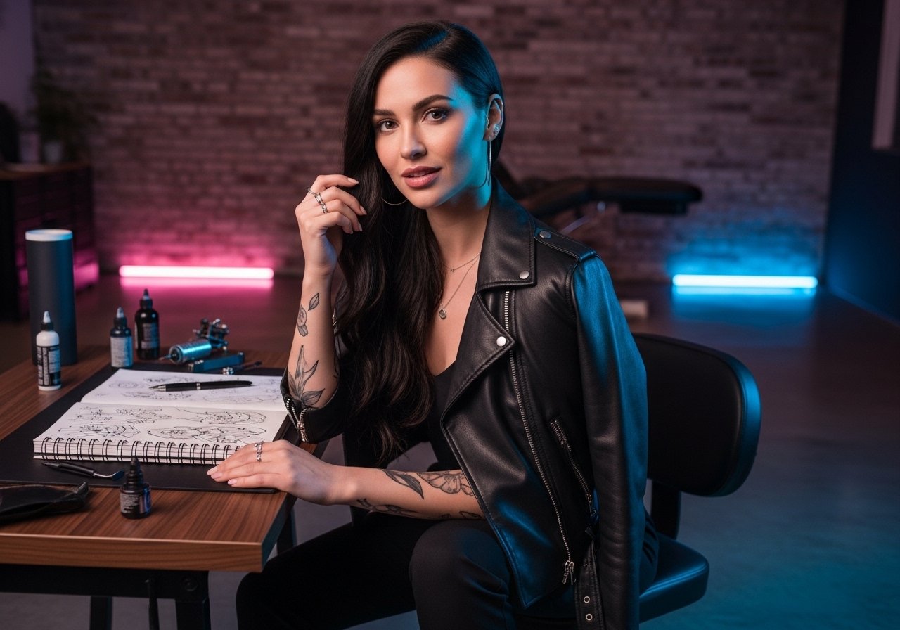
The way some Arabic script tattoos age surprises people who only see fresh photos. Fine line phrases often look crisp at first and then soften sooner than expected. Bold black calligraphy can read stronger over time, and placement decides most of the outcome. Read through practical phrasing and placement notes that favor longevity, what to ask your artist, and a few wardrobe moves that actually help show the work off.
1. Muqatil on the Outer Forearm for Daily Grit
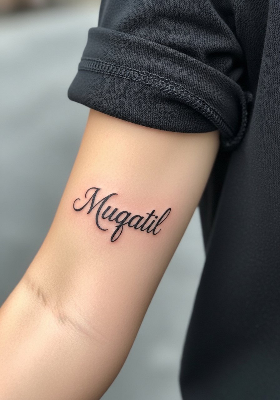
I have seen Muqatil on forearms held up by athletes and organizers who want a bold, readable statement. Ask your artist for slightly heavier linework than a pure fine-line script so the counters hold over years, and request solid black saturation rather than delicate hairlines. Common mistake is making it too small across the arm. Expect a one to two session appointment and moderate pain for the outer forearm. For the session wear a loose tank top you can roll or pull aside for clean access. Over time the thicker strokes keep their weight while ultra-thin tails can blur and need touch-up.
2. "Ibqa Qawian" on the Inner Wrist, Minimalist and Persistent
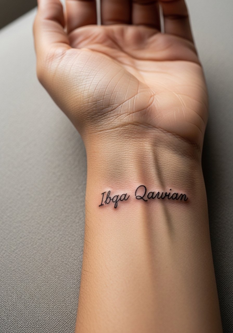
Fair warning, wrists face constant washing and friction. For a concise "Ibqa Qawian" wrist piece ask for slightly bolder primary strokes with delicate terminals so the phrase reads clean under daily wear. The wrist is a one-session, quick but sensitive placement. A common mistake is compressing the script into a tiny space. Expect touch-up maybe around year two or three for fine details. When showing it off, pair with a thin silver chain on the opposite wrist to balance attention, and wear a thin silver chain bracelet on non-tattooed arm while it heals.
3. Tumuh Flowing Across the Ribcage for Private Ambition
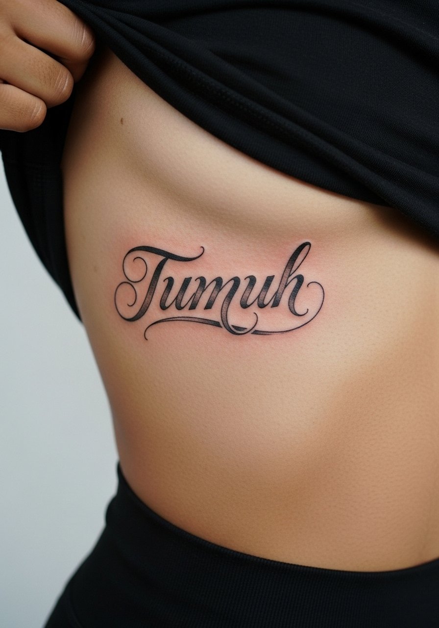
Most people cite the ribcage as a commitment zone because of the pain and the way skin stretches there. I tell people that Tumuh works beautifully as a curved line following the rib arc, but plan for a longer session and a possible second visit for touch-up. Artists are split on fine line on ribs. One camp argues the skin stretch blurs lines within two years. The other camp says with correct needle depth and spacing the lines settle fine. Ask your artist where they stand and request mockups that show spacing. For the session wear a sports bra you can lift and high-waisted bottoms so movement is minimal.
4. Ibtasim Lil-Hayat on the Shoulder Blade, Low-Visibility Cheer
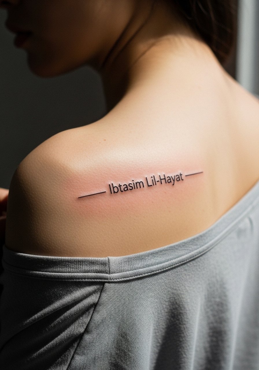
A shoulder blade placement gives a private reminder that shows when you want it to. Most artists recommend a thin but steady line weight for the phrase so the letters do not turn into a single shadow as the skin moves. Common mistake is over-styling the flourishes which complicate healing on that curved plane. Pain is moderate and a single session usually covers a 2 to 4 inch linear script. Pair this with an off-shoulder blouse for evenings and a delicate chain necklace that sits above the script when you want the phrase framed.
5. Uktub Qissatak Vertical on the Spine for Storytelling
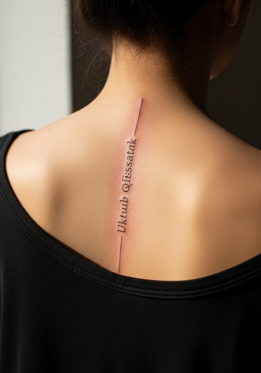
Spine pieces have a different session feel. The appointment can be longer and the area is sensitive near bone. For vertical text like Uktub Qissatak request slightly taller letterforms rather than compressed script so each word breathes. A common aging issue is letter compression from tight kerning. Tell your artist you want open counter spaces for longevity. Expect one to two sessions and a touch-up window around year two to maintain clarity if you spend a lot of time in the sun. For show-off outfits, open-back dresses or halter tops work best.
6. Kun Al-Taghyeer Block Letters on the Calf for Activist Energy
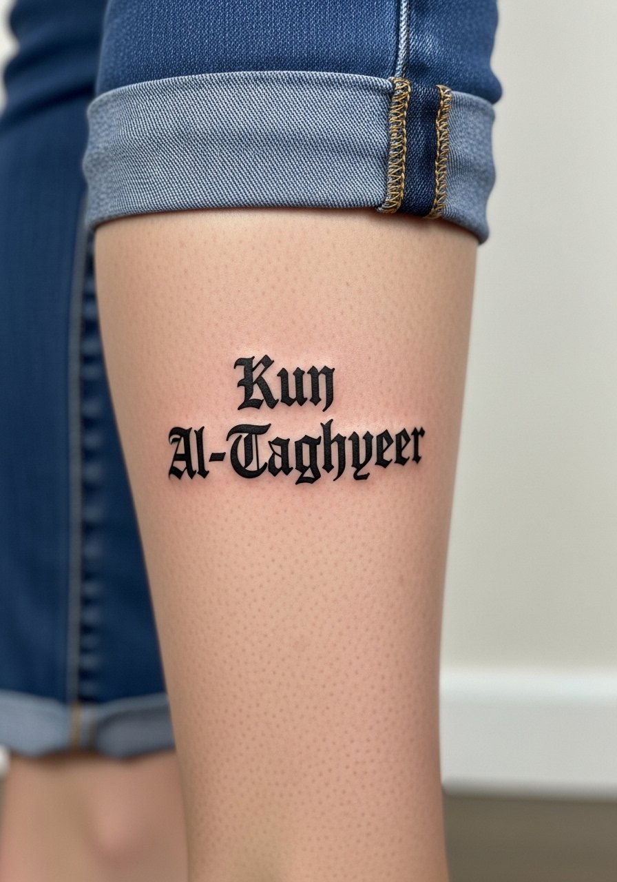
The calf is forgiving for blocky blackwork and it reads from distance. I recommend solid fills for the bigger strokes to avoid patchy fade in the first years. The biggest mistake is going too small with block letters which causes loss of form as the ink settles. Two sessions are common for consistent saturation. For showing it off, cuffed jeans or summer sandals make the piece obvious without forcing an entire outfit change. Wear a pair of cuffed slim jeans to frame the calf once healed.
Studio Day Picks
The forearm, wrist, and calf pieces above each ask for slightly different session prep, so pack a few items that match the placement and comfort needs.
-
Stencil transfer paper kit. Lets you preview the line placement on skin before the needle starts, which is useful for precise scripts like the wrist and spine pieces.
-
Topical numbing cream. Applied in advance can ease sensitivity for ribcage or sternum sessions without affecting linework when used properly.
-
Thin protective film roll. Helps protect wrist and finger scripts from friction and frequent hand washing in the first week.
-
Fragrance-free gentle body wash. Cleanses healing tattoos without irritating the skin or stripping the tiny channels that hold fine line ink.
-
Aquaphor healing ointment. A thin layer during the earliest days keeps fine lines hydrated and reduces scabbing that can pull ink from delicate strokes.
7. La Tatawaqqaf An Al-Hulm Across the Rib Wrap for Dreamers
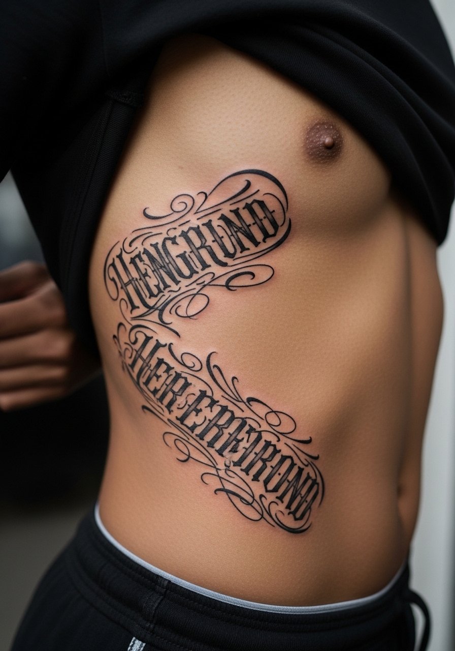
Longer lines across the ribs demand planning for curvature and breathing. I advise drafting the phrase in situ so the line follows the rib arc and does not fight the body's contours. The ribs are sensitive and the session can feel draining. Artists disagree on tiny script there. One camp says fine line blurs fast. The other camp says a practiced hand with deeper but precise needle placement keeps script readable. Ask what spacing they recommend and expect a larger initial layout so touch-ups are less frequent. For the appointment wear a cropped tank top you can lift without strain.
8. Al-Hub La Yamut Arched at the Collarbone for Romantic Proof
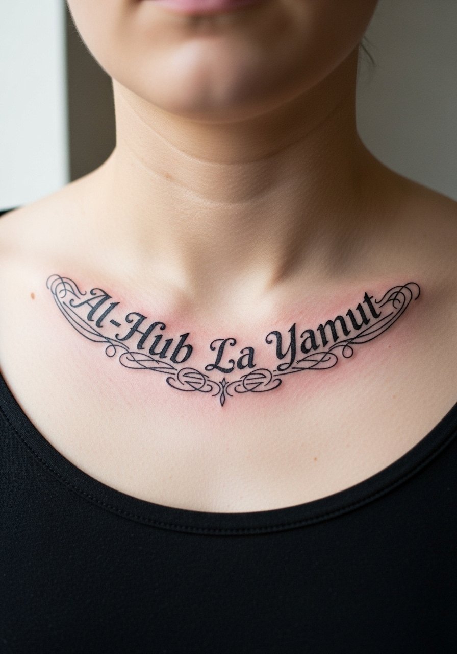
Collarbone scripts age depending on movement and sun exposure. For an arched "Al-Hub La Yamut" ask for slightly thicker primary strokes with delicate connectors so the arc reads from either side. The common mistake is too much ornamentation that overlaps necklaces. Expect light to moderate pain and usually a single session. To frame it, off-shoulder tops in dark hues help the calligraphy pop. Try pairing with a delicate chain necklace that sits above the arc and does not rest on the letters.
9. Al-Salam Yabda'a Min Ad-Dakhil Vertical Stack on the Side Neck
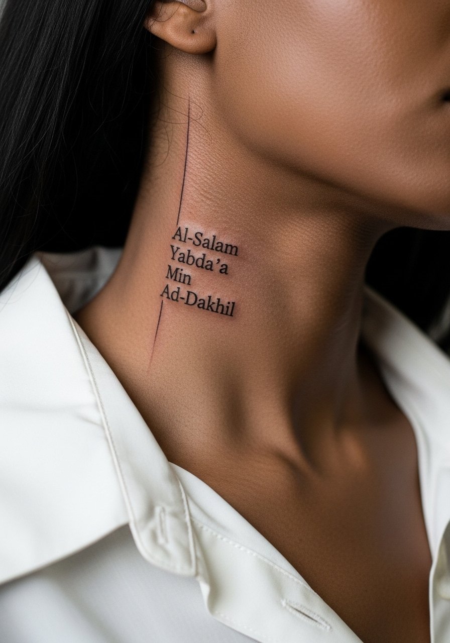
Neck stacks demand a frank conversation about visibility and career considerations. The vertical stack reads best with clean spacing between lines and slightly heavier primary strokes so the negative space remains legible. The neck heals differently than the arm because of movement and clothing contact. A common error is compressing too many words into a short vertical. Expect quicker sessions but higher touch-up likelihood depending on UV exposure. When styling, a loose V-neck or wide-neck shirt helps show the piece without crowding. Wear a v neck loose tee the day after healing for minimal friction.
10. Kun Qawiyyan on the Shoulder, Bold Outline for Strength
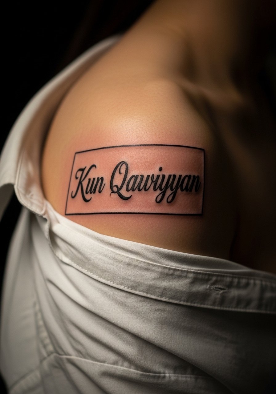
The shoulder is a forgiving canvas for bold letters. I recommend a thicker outline and moderate gray fill to preserve contrast as the piece ages. The biggest mistake is letting the fill be patchy in the first session. One session usually does it, but a follow-up may be needed for saturation. For the session wear a loose button down shirt you can pull aside easily. Over time the bold outline keeps the word legible even as minor fading happens inside fills.
11. Sabir on the Inner Bicep, Quiet Persistence
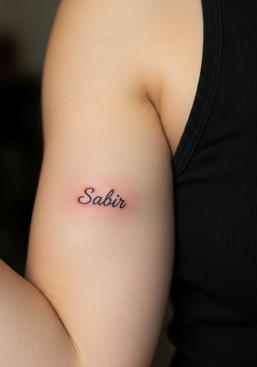
Inner bicep pieces can be sensitive due to thinner skin and movement. I often suggest a modest size with slightly reinforced main strokes to prevent early loss of fine detail. A common mistake is overcomplicating script there. Expect moderate pain and good healing when you keep the arm relaxed. For the appointment choose a loose tank top so the artist has access without you tugging at fabric. Touch-up is usually needed if the area sees a lot of friction from bags or straps.
12. Maktub on the Ankle, Micro Script That Travels
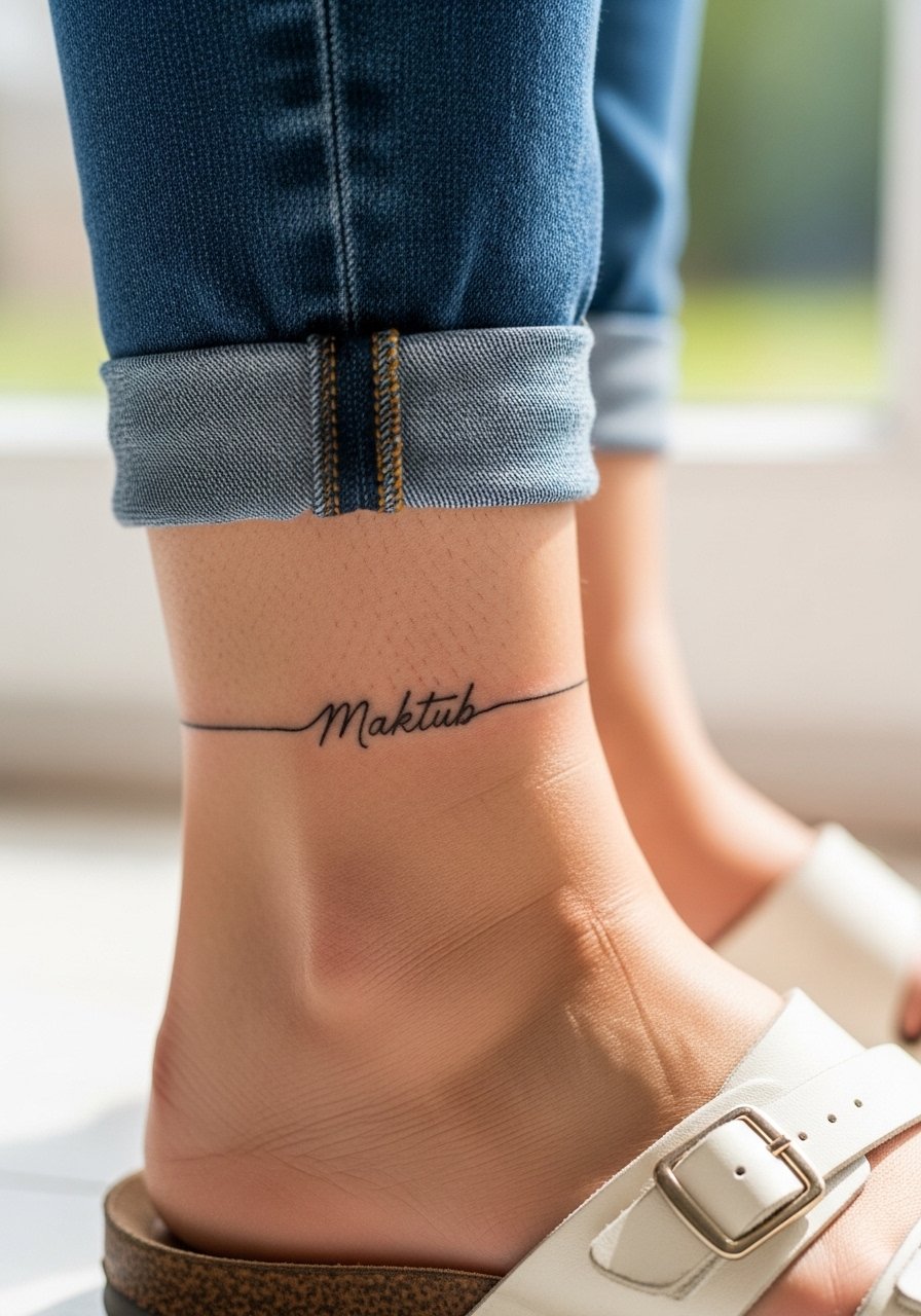
Ankle script is adorable but vulnerable to blowout if linework is too light. I tell clients to request slightly thicker single-pass lines rather than whisper-thin strokes. The ankle deals with rubbing from socks and shoes so thin protective dressing in the first week is vital. The session is quick but moderately painful. Pair with cuffed pants or sandals when you want it visible, and roll up a pair of cuffed slim jeans to frame the area during warm months.
13. Saqr on the Chest Near the Sternum for Quiet Power
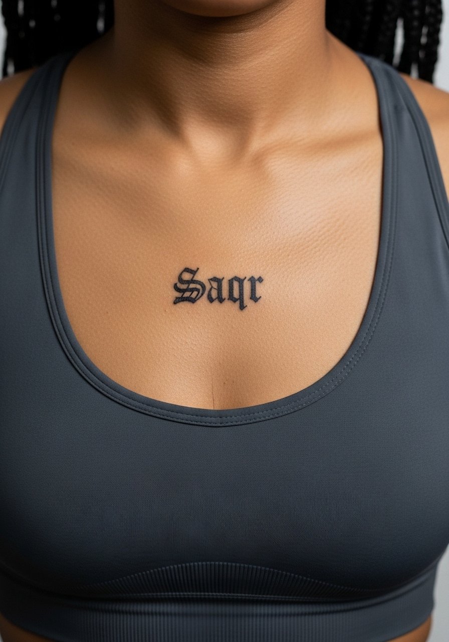
Sternum placements are high on the pain scale but rewarding visually when done right. Because the skin there moves with breathing, I recommend slightly wider letter spacing and bold strokes to prevent merging. The appointment can be intense and may need breaks. A common mistake is choosing extremely tight script that becomes illegible. Plan a session day with comfortable clothing, like a sports bra you can wear to keep the area supported afterward. Expect a touch-up if you are outdoors often.
14. Hurr on the Hand Side for an Edgy Accent
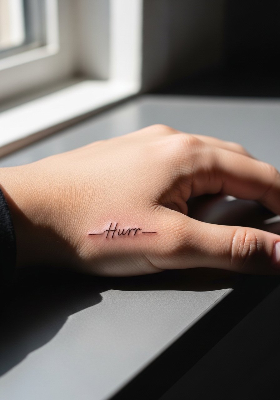
Hand placements are visible and subject to fading because of constant washing and sunlight. A common mistake is treating hand script like wrist script. For durability, ask for a slightly bolder outline and accept more frequent touch-ups. Pain is sharp but quick. Keep in mind hiring policies in some fields still frown on visible hand tattoos. For the session plan, avoid jewelry and wear short sleeves so the artist has clean access. Expect touch-ups sooner than for arm pieces.
15. Maktub Variant on the Thigh for Privacy with Scale
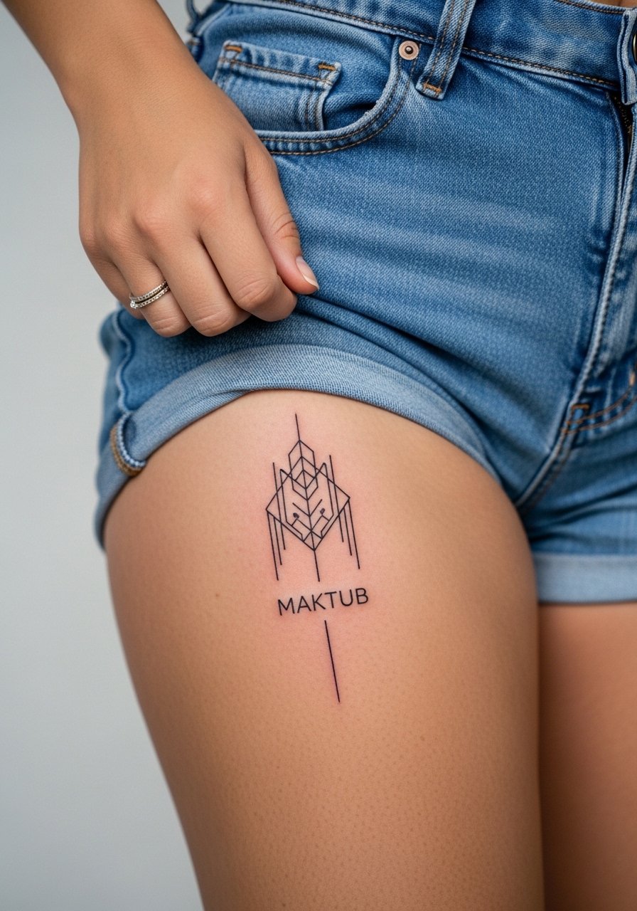
Thigh placements are forgiving and allow larger letterforms that age well. I advise scaling the letters up slightly and keeping counters open so the piece does not blur over time. The area is less exposed to UV, which helps longevity. A common mistake is too much filigree in a spot that will be compressed by clothing. For the session wear high-waisted shorts or jeans that you can loosen, like high waist loose pants. Expect comfortable healing and touch-ups rarely if you avoid friction from tight waistbands.
16. Intimacy Phrase Behind the Ear for Micro Secrets
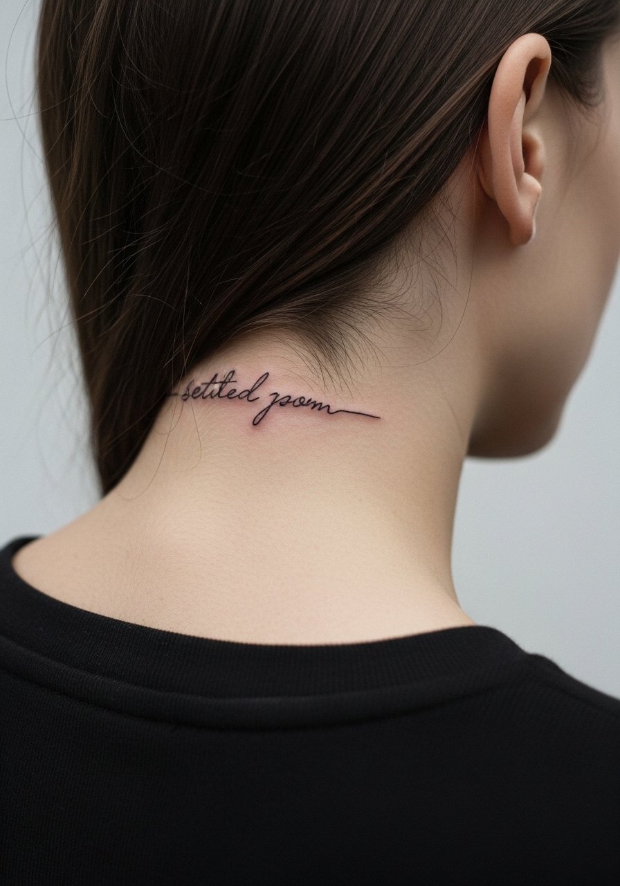
Behind-the-ear placements are subtle but need exact placement to avoid looking crowded by hair. Ask for compact, legible letterforms and a test stencil so you can see how it will sit under the hairline. Pain is mild, session quick. A common mistake is placing text too close to the hairline where it will be obscured as hair grows. Because of the intimate scale, show-off styling is mostly hair choices. For the appointment tuck hair back and wear a wide-neck shirt you can pull aside.
17. "Write Your Story" Arabic-English Mix on the Thigh for Narrative Layers
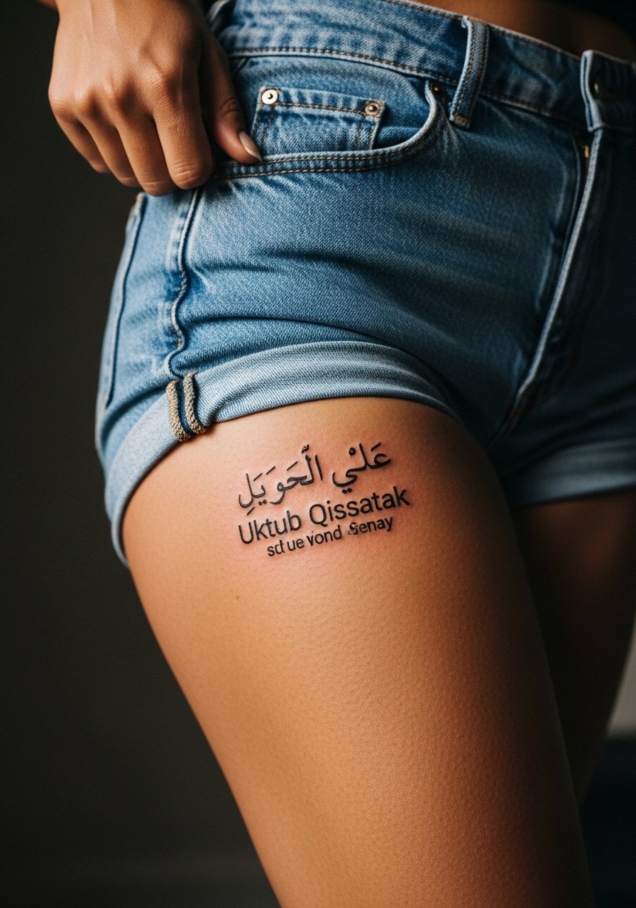
Blending Arabic script with a small English caption can personalize the piece but needs careful spacing so neither language overwhelms the other. In consultation, bring clear examples of the Arabic script you prefer and indicate which word pairs with the English line. A common mistake is mismatched proportions that make one line read as an afterthought. The thigh supports larger layouts and usually heals smoothly. For the session wear easily adjustable bottoms like high waist loose pants so the artist can access and you can leave comfortably.
18. Single-Word "Qawiy" on the Knuckles for Punchy Impact
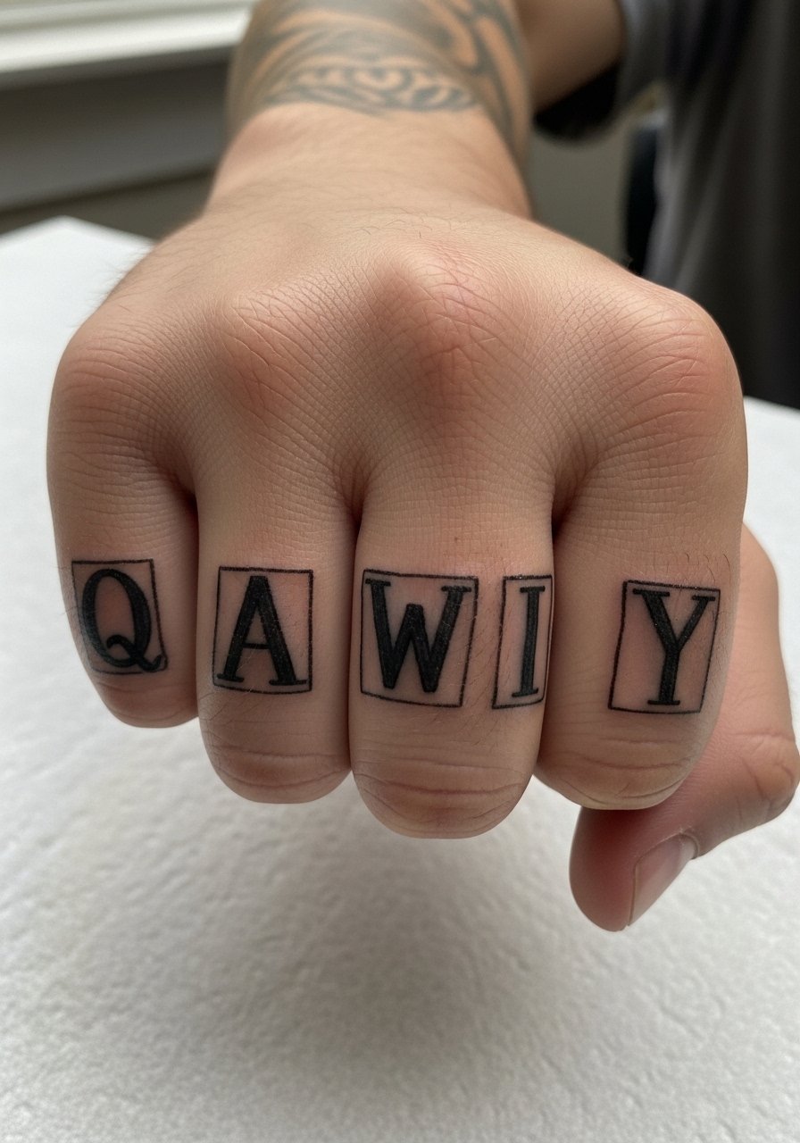
Knuckle tattoos are bold and age uniquely because of constant use. I suggest strong block letters spaced to account for skin movement and knuckle flex. The session is brief but painful. A common error is trying to cram longer words across four knuckles. Keep it punchy and accept that knuckles need touch-ups more often. Expect more frequent maintenance than forearm work. For the session avoid rings and wear short sleeves for easy access.
19. Stacked "Al-Salam" on the Upper Arm for Quiet Visibility
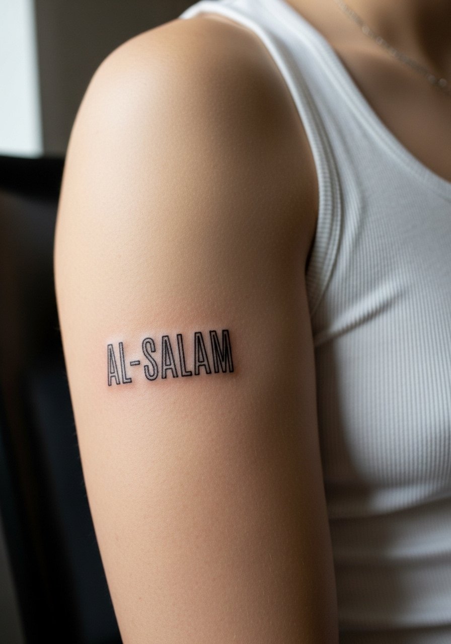
Upper arm stacks are easy to conceal and they age well thanks to lower sun exposure. Ask for clean spacing and slightly heavier primary strokes to maintain legibility in two to five years. The biggest mistake is making the stack too tight in vertical spacing. The session is comfortable and usually a one-off. For showing it off roll sleeves or wear a loose tank top that frames the piece. Touch-ups are uncommon unless you expose it heavily to the sun.
20. Small "Breathe" Arabic Script on the Ankle Inner Side, Subtle Reminder
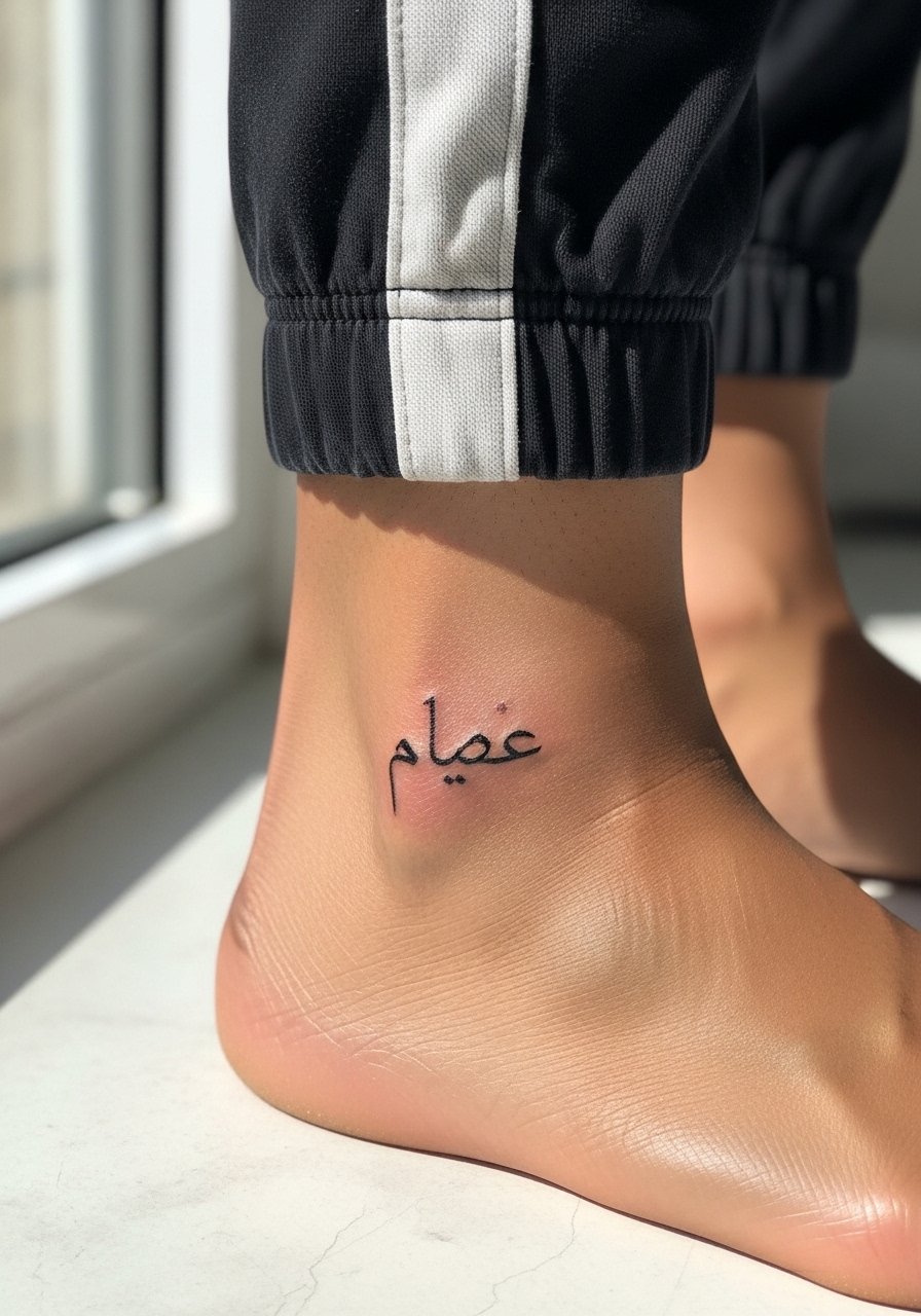
Inner ankle placements are intimate and low profile. For a small "Breathe" script keep the linework deliberate with modest stroke weight so the letters do not fade into a single smudge. A common mistake is placing it on a spot that rubs against shoes. For the session wear loose joggers you can roll up, and avoid long-term friction while healing. Expect a quick session and touch-up by year two in some cases if you are on your feet a lot.
21. "Maktub" Bold on the Outer Thigh Near Hip for Statement with Privacy
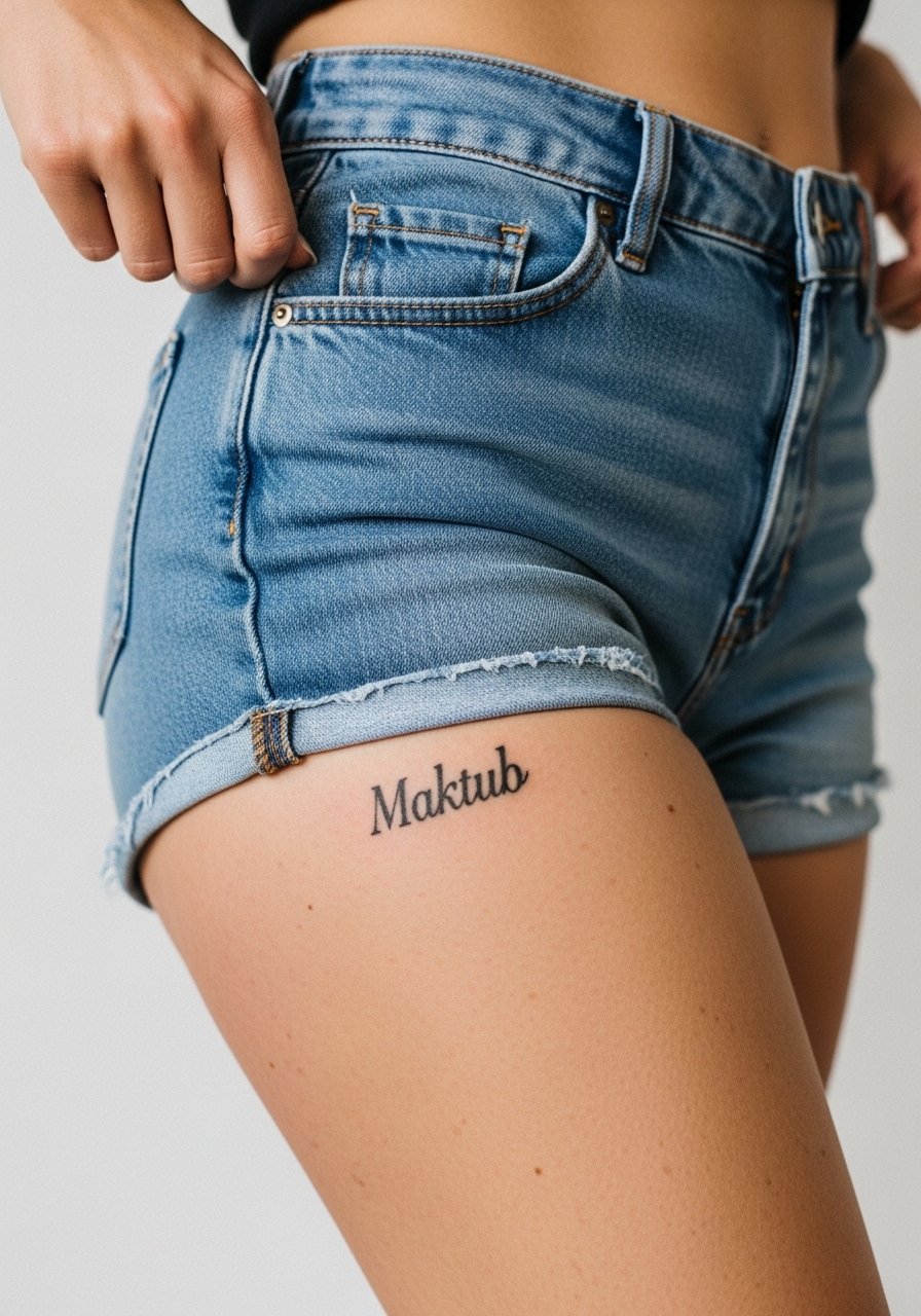
Outer thigh pieces combine scale and concealment. For a bold Maktub choose strong primary strokes and open counters so the word carries even in movement. A common error is over-detailing in a place meant to be glanced at rather than examined up close. The session is comfortable and heals well away from sun exposure. For the appointment wear high-waisted shorts you can lower slightly and keep pressure off the area afterward. Expect low maintenance unless you wear very tight waistbands regularly.
Frequently Asked Questions
Q: Will fine line Arabic script blur faster than bold calligraphy on the ribs and why?
A: Fine line tends to blur faster on the ribs because the area flexes with breathing and is often skinned thin. Bold strokes preserve letter shapes as the ink spreads. A clean compromise is modest line weight with open spacing, which keeps form longer while retaining a delicate look.
Q: How should I ask an artist about accurate Arabic spelling and script for my chosen phrase?
A: Bring a clear reference and request that the artist confirm spacing and letterforms before any needle hits skin. Ask for the stencil to be applied and worn around a bit so you can see how it sits. If you are unsure about translation, use language resources or community forums to double check before booking.
Q: Do wrist and finger Arabic quotes require different aftercare than forearm pieces?
A: The initial aftercare steps are similar but wrists and fingers face more washing and friction, so follow a protective dressing schedule and be ready for earlier touch-ups. The protective film in the product block above is particularly useful for wrist and finger work.
Q: Can mixing Arabic script with English text look cohesive, and what should I request in consultation?
A: Yes, mixing languages can look cohesive if both scripts get matched for visual weight and spacing. Ask your artist to balance scale and to mock up both lines together so one does not dwarf the other. Mention you want consistent negative space around each language.
Q: If I work in a conservative industry, which placements are safest for Arabic quotes that I might need to hide?
A: Upper arm, thigh, and shoulder blade are easiest to conceal with standard work attire. Neck, hand, and face placements are most visible and might be problematic in some offices. Think through your career needs when picking placement.
Q: How often should I expect touch-ups for a tiny wrist phrase compared with a calf block word?
A: Tiny wrist phrases often need a touch-up around year two to three because of friction and washing. Calf block words, with solid saturation and lower sun exposure, may go much longer between touch-ups, sometimes five years or more depending on care and exposure.