
Fine line is trending everywhere, but the pieces that still read sharp after years are not always the ones that looked best fresh. Hand and wrist placements fade faster from daily washing, shop minimums and last-minute cancellations strain plans, and darker skin tones sometimes need thicker linework to keep script legible. Read these 27 ideas with placement notes, what to tell your artist, and the wardrobe moves that actually show the ink off the way you want.
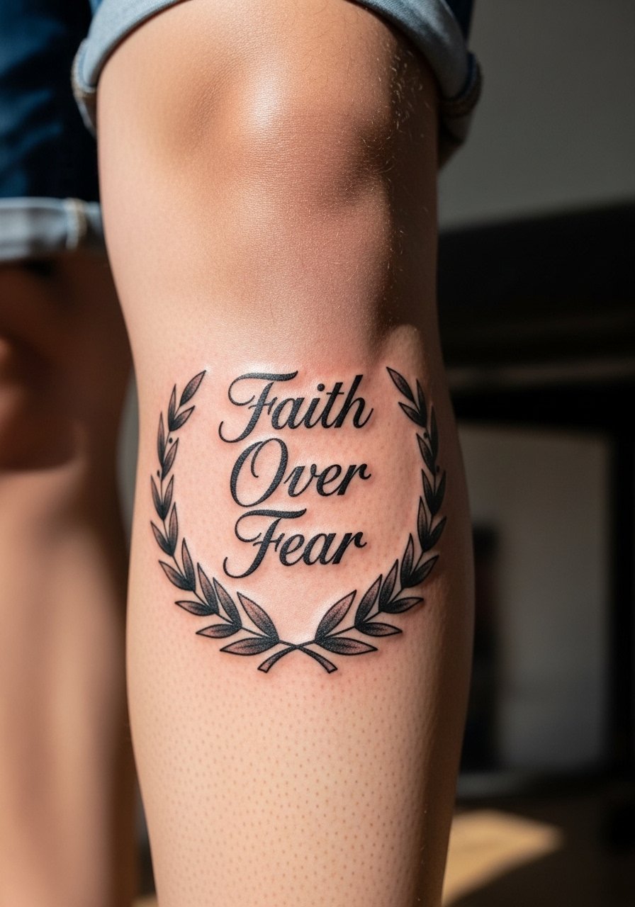
1. Fine-Line Forearm Script with Birds
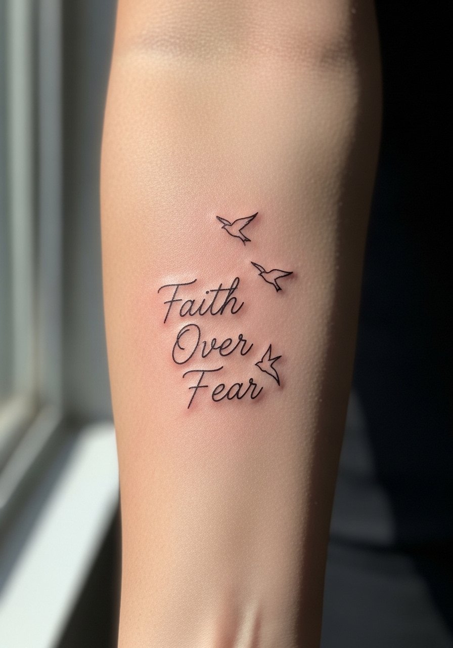
I’ve seen this on a dozen forearms and it works when the script is given breathing room. Tell your artist to scale each letter so the counters do not touch, and add a single bird per word instead of a flock so the negative space can settle. Fair warning, fine line on forearms can soften at two to three years if the letters are too tight, so plan a touch-up at year two. For showing it off, roll your sleeves and wear a rolled sleeve chambray shirt, or throw on a sleeveless chambray tank to keep the arm visible during warmer months.
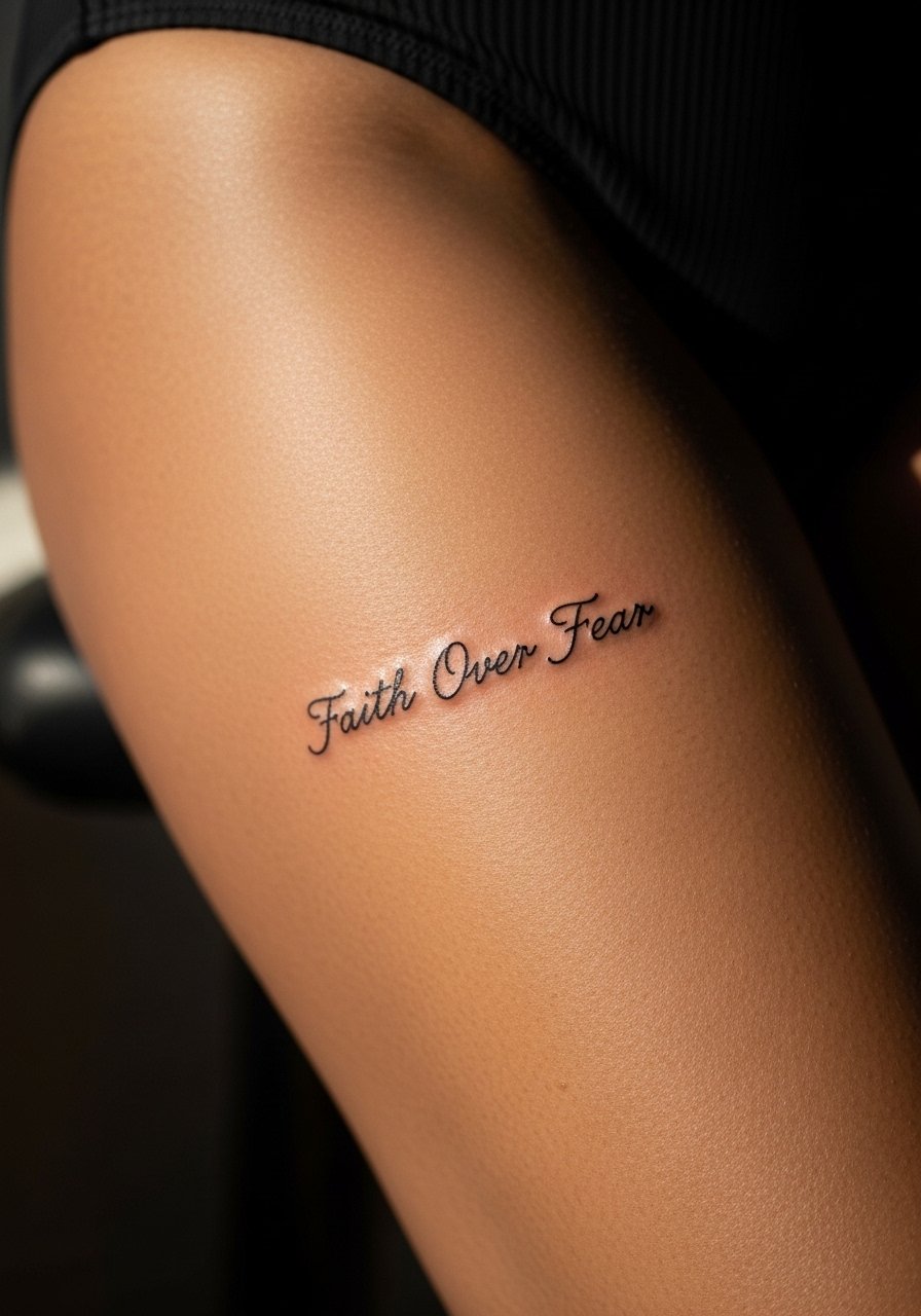
2. Neo-Traditional Cross and Script on the Upper Arm
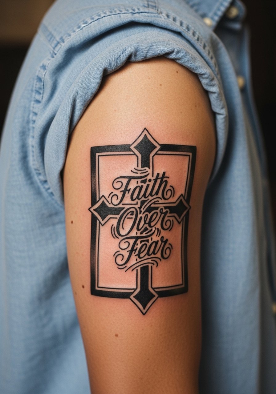
When clients ask for religious imagery combined with lettering, I advise a neo-traditional approach with heavier outlines around the cross and more airy script for the words. Ask the artist to anchor the script below the cross so the composition reads from top to bottom. Expect one single session of about an hour to an hour and a half for a 4-inch piece, and moderate pain on the shoulder cap. For sessions and when you want the piece to stand out, a fitted muscle tee or an open denim jacket frames the work without crowding the lines.
3. Calligraphy Back-of-Hand Script
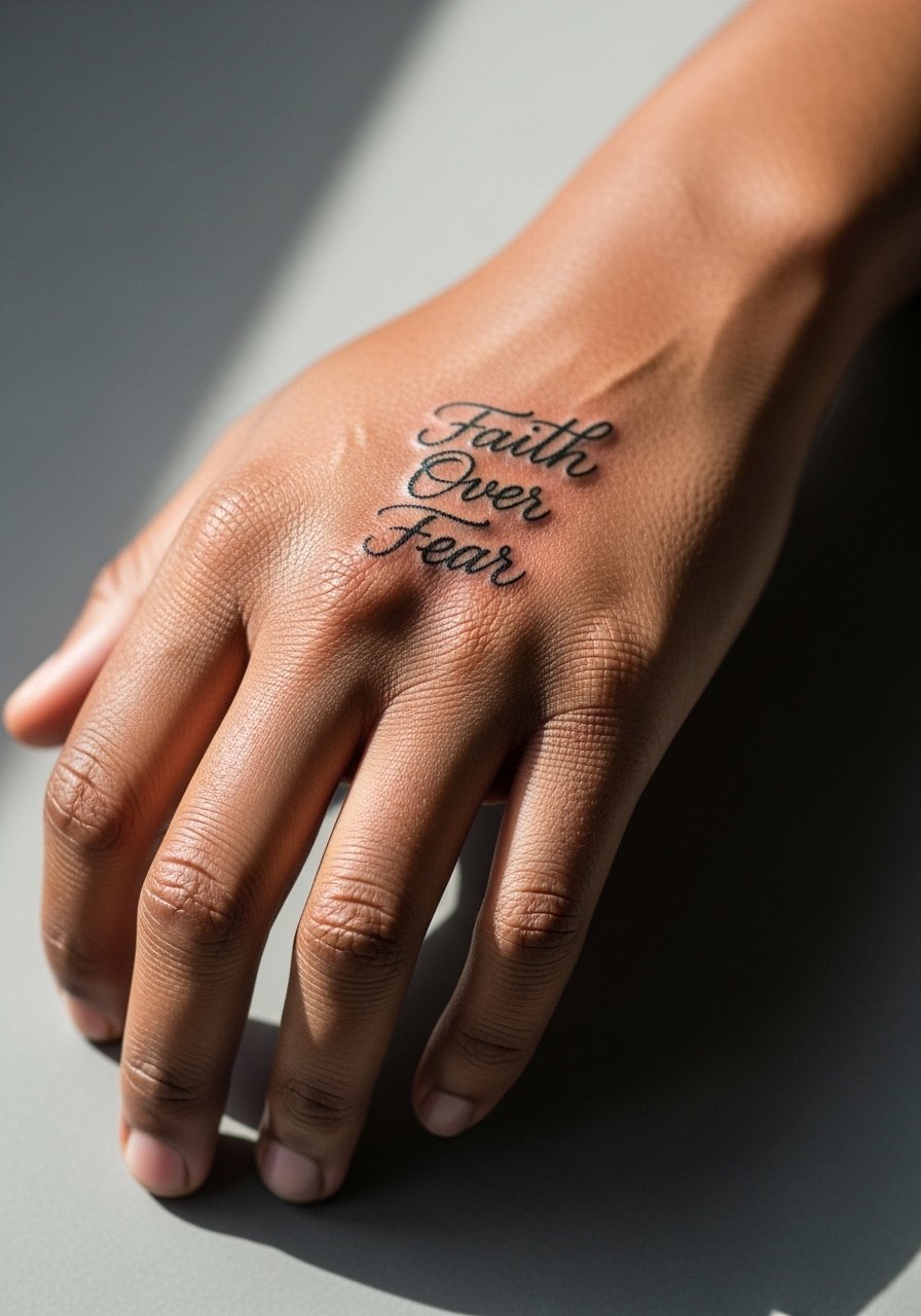
A back-of-hand calligraphy piece looks personal but ages fast from washing and friction. I tell clients the trade-off up front. If you still want it, request slightly thicker downstrokes so the script keeps contrast on darker skin. Expect the sharpest look at six months and a noticeably softer edge by year two without touch-up. For styling, show it off with stacked ring sets on the opposite hand or slip on fingerless leather gloves for a photoshoot. Pain here is a five to seven on many scales, and plan for touch-up options in the consultation.
4. Intertwined Words with Birds on the Outer Forearm
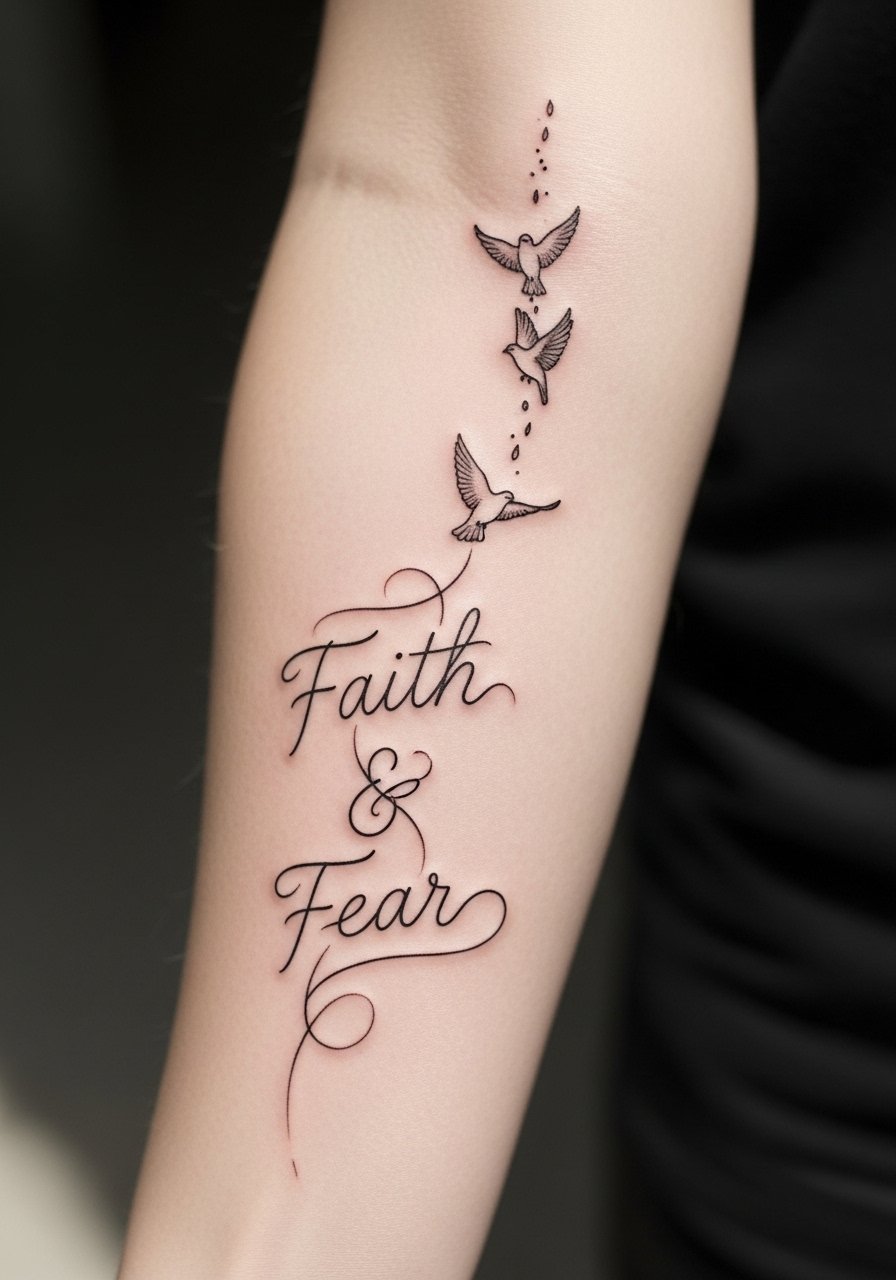
Most versions that age poorly are cramped and try to fit both words into one tight band. Instead, ask for staggered baseline placements so each word breathes, and have the birds act as visual separators. There is a controversy on fine line longevity. One camp says fine line settles beautifully if the artist spaces letters and uses shallow passes. The other camp warns that thin script blurs on active areas like forearms by year two. The deciding factor is needle depth, spacing, and whether you plan touch-ups. Expect two sessions if you want perfect spacing and an extra pass for the birds.
5. Floral Surround on Upper Arm with Script
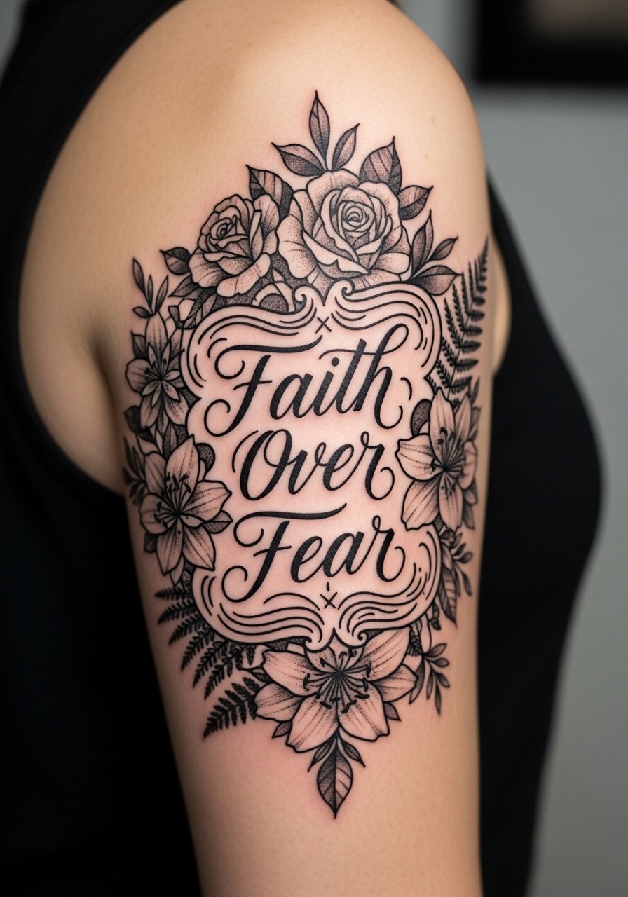
I recommend floral frames for anyone who wants a softer presentation of the phrase without losing legibility. During consultation, ask the artist to keep flower petals simplified and to use stipple shading rather than muddy color fills. Color blooms can fade into dullness on some pigments, so pick saturated black outlines with controlled color accents. For outfits, a fitted muscle tee or an open denim jacket helps the upper arm artwork read cleanly from across a room. Session time is usually one to two hours and pain is moderate.
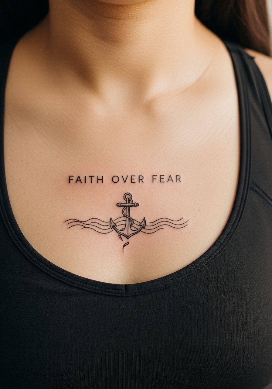
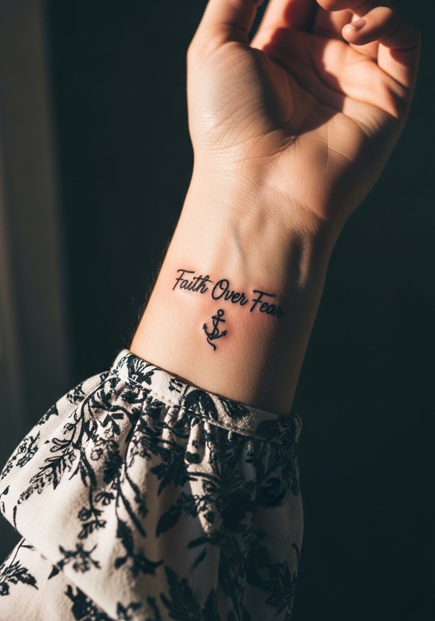
6. Minimalist Anchor and Script on the Chest
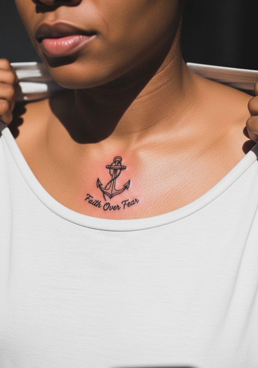
Fair warning, chest sessions can hurt more than arm work, often rated seven to eight on many scales. For chest anchors, keep the anchor lines thick enough so the script beneath does not fight for contrast. There is debate on Saniderm versus dry healing for chest work. One camp favors Saniderm for cleaner early healing and reduced scabbing. The other camp says dry healing avoids trapped moisture and works better in humid climates. Ask your artist which side they use and why before booking. Wear a loose button-down you can pull aside so the artist has access without you getting chilled.
Pre-Session Essentials
The chest, rib, and forearm pieces above demand different prep, so these items smooth the session and the first week.
-
Tea tree tattoo balm. A breathable balm some people use for hot, humid healing days to avoid heavy grease, useful for hand and wrist pieces that need less shine.
-
Australian matte aftercare spray. Dries to a matte finish so healed photos of upper chest and forearm work look less shiny during the first week.
-
Japanese rice-based ointment for tattoos. Gentle on sensitive skin after fine line sessions on wrists and ribs that often sting with thicker balms.
-
Salt soak pods for hand tattoos. Useful for finger and palm-area work where washing alone may not reach all creases, but use only if your artist approves.
-
Hustle Butter. Thinner than heavier ointments for humid seasons and re-applies cleanly, handy for color accents around floral wraps.
7. Watercolor Mountain Silhouette on the Ribs
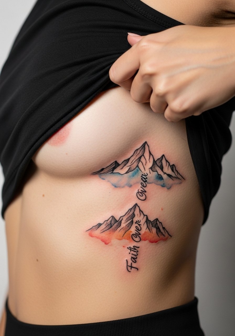
Fair warning: ribs are one of the higher-pain placements, and many people rate it an eight. Watercolor on ribs can look stunning when fresh and risk muddying if the ink pools. One common mistake is making the gradients too tight against the script. Ask for the silhouette to be slightly muted behind the letters so the script stays legible. Ribs change with weight fluctuation more than arms, so choose a vertical layout that moves with the body. Bring a strapless bralette or a sports bra for session comfort.
8. Lion-Integrated Shoulder Cap Composition
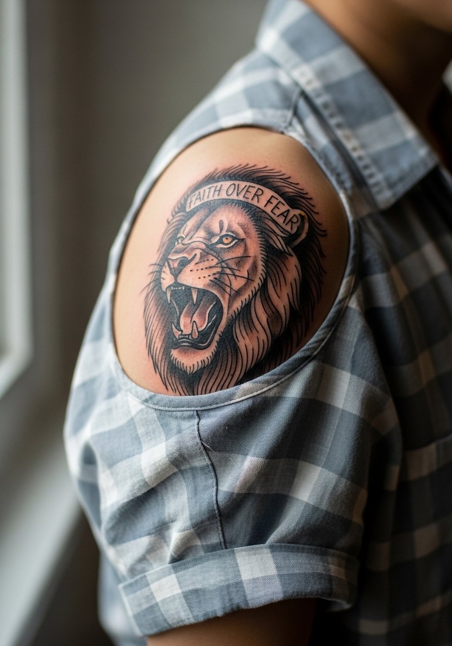
There is something about a lion motif that reads as strength without being literal. For shoulder caps, keep the mane texture with stipple shading and bold linework so the design reads at arm distance. The common mistake is cramming too much script into the mane, which reduces legibility. A single-session five-inch piece will have moderate pain and looks best when paired with a slightly open shirt during reveal. For the session wear a loose short-sleeve button-up the artist can roll or remove easily.
9. Tiny Wrist Script for First-Timers
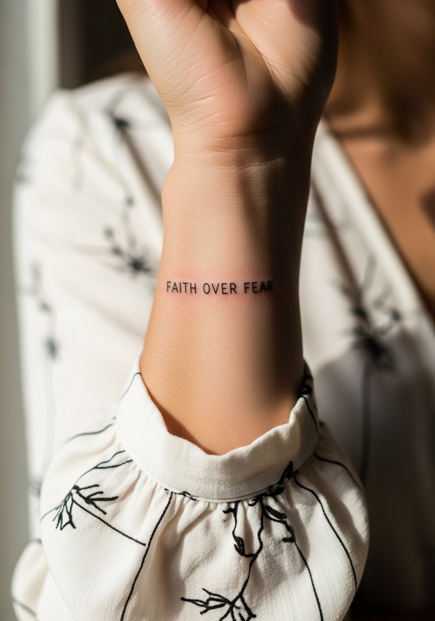
Wrist scripts are ideal for anyone testing a first piece, but know they live in a high-wear zone. The most common error is going too small and expecting the letters to stay crisp. Ask the artist to widen letter spacing and offer a slightly heavier downstroke. For showing it off, pair the wrist with a thin silver chain bracelet, and for the session wear a sleeveless blouse so sleeves do not rub the fresh ink. Plan for a touch-up around the six- to twelve-month mark for fine line pieces.
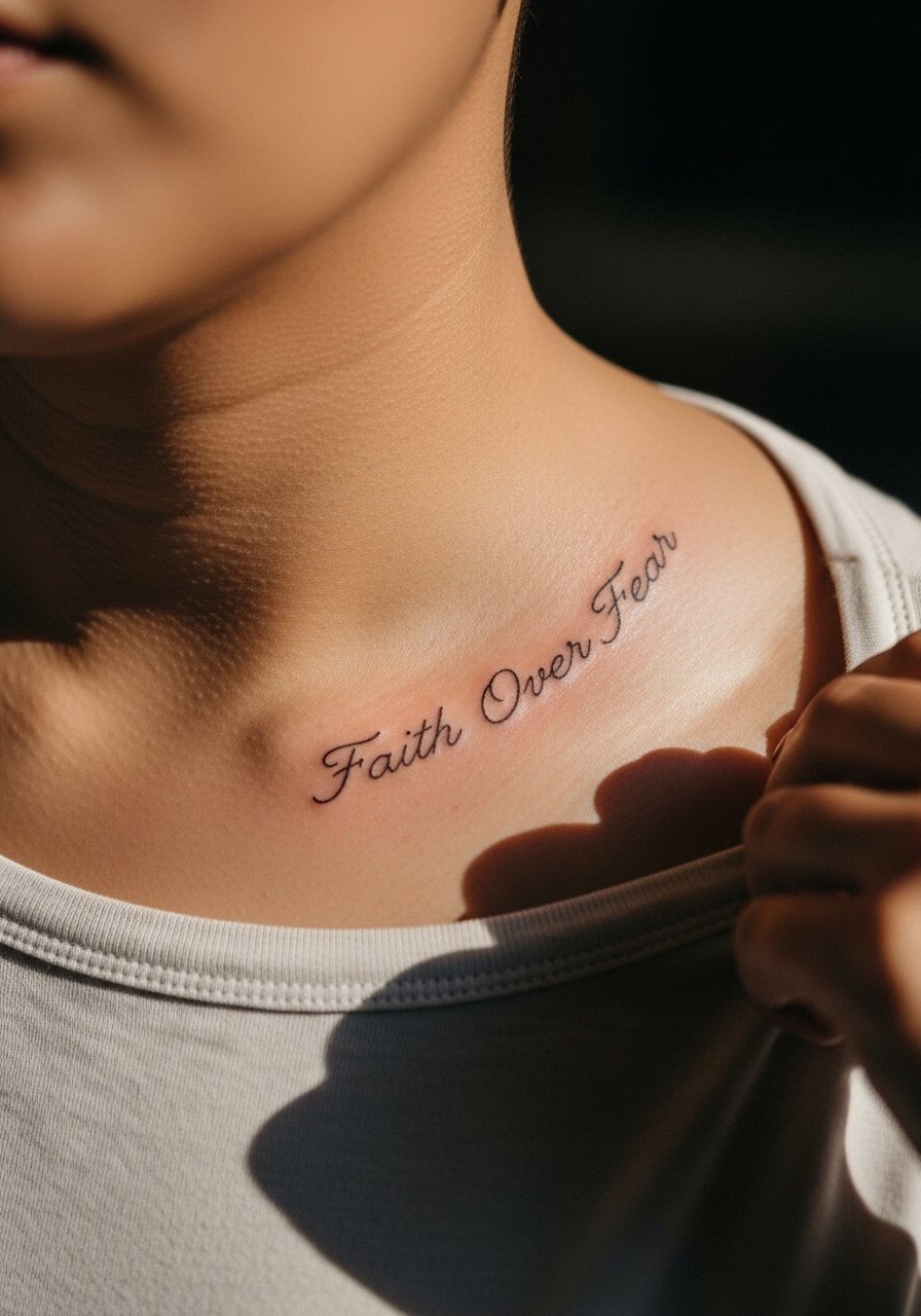
10. Anchor with Subtle Wave Patterns Under Script on the Sternum
Sternum placements need careful composition because the chest expands and contracts with breath. Many people try to center script too low and end up cutting letters with clothing seams. Ask the artist to position the phrase just above the anchor where fabric lines will not interfere. Sternum sessions are painful for many but the visual payoff is strong when you wear V-neck or open-neck shirts. Use a fitted sports bra for session access and to keep the area modest during healing.
11. Upper Back Wings Framing Private Script
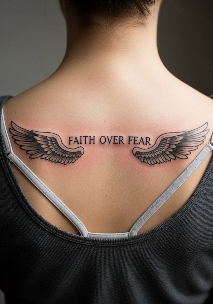
Upper back pieces are a good choice if you want the phrase private most days. A common mistake is placing wings too low where bra straps interfere during both session and healing. Tell your artist to stay above typical strap lines and to use solid outlines for wings so the silhouette ages cleanly. For showing it off, pair with open-back dresses or a halter top. Session comfort is high because you can lie face down, and the pain is usually moderate.
12. Micro-Realism Compass with Script on the Inner Bicep
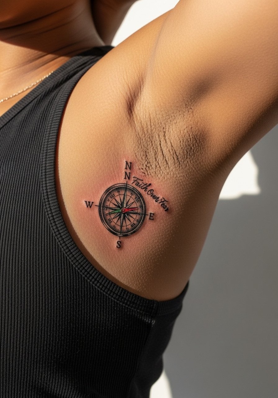
Inner bicep work is sensitive and often requires careful needle depth. Artists are split on fine line here. One camp says thin lines hold when the artist spaces them and controls depth. The other camp warns the inner arm shift causes thin lines to blur. The truth is this placement needs slightly bolder anchors and softer script strokes to balance movement and skin texture. Wear a tank top and raise your arm during the session for access. Plan a touch-up if you want micro-realism details to read at year two.
13. Minimalist Mountain Range on Collarbone
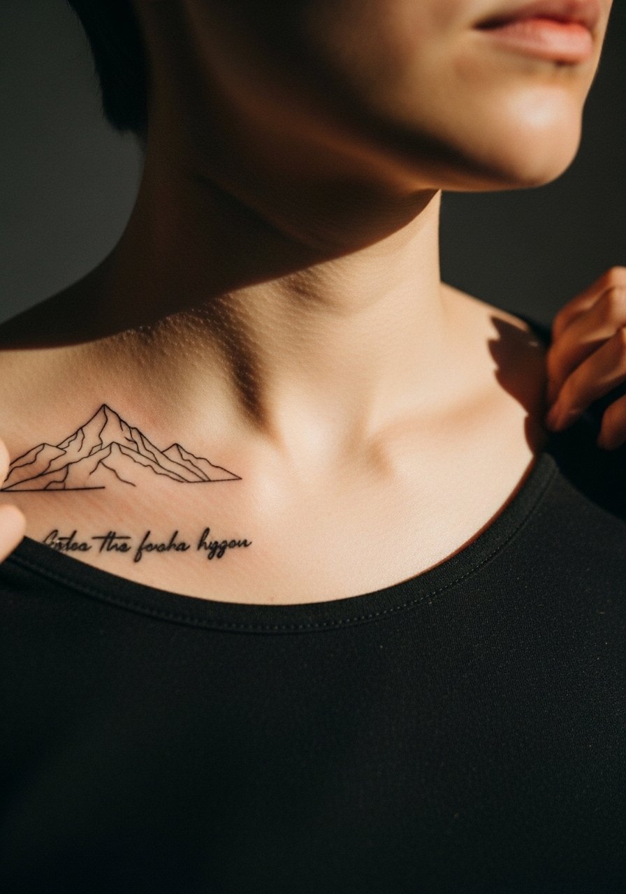
Collarbone pieces read well with linear motifs because the bone creates a natural frame. Keep the mountain range thin but not pinprick fine to avoid early fading where sun exposure is higher. For showing the tattoo, a v-neck tee or a loose henley that unbuttons keeps the piece visible without exposing too much skin. The session is brief for a small linear piece and pain is sharp over bone but short-lived.
14. Script Wrapped into a Floral Ankle Band
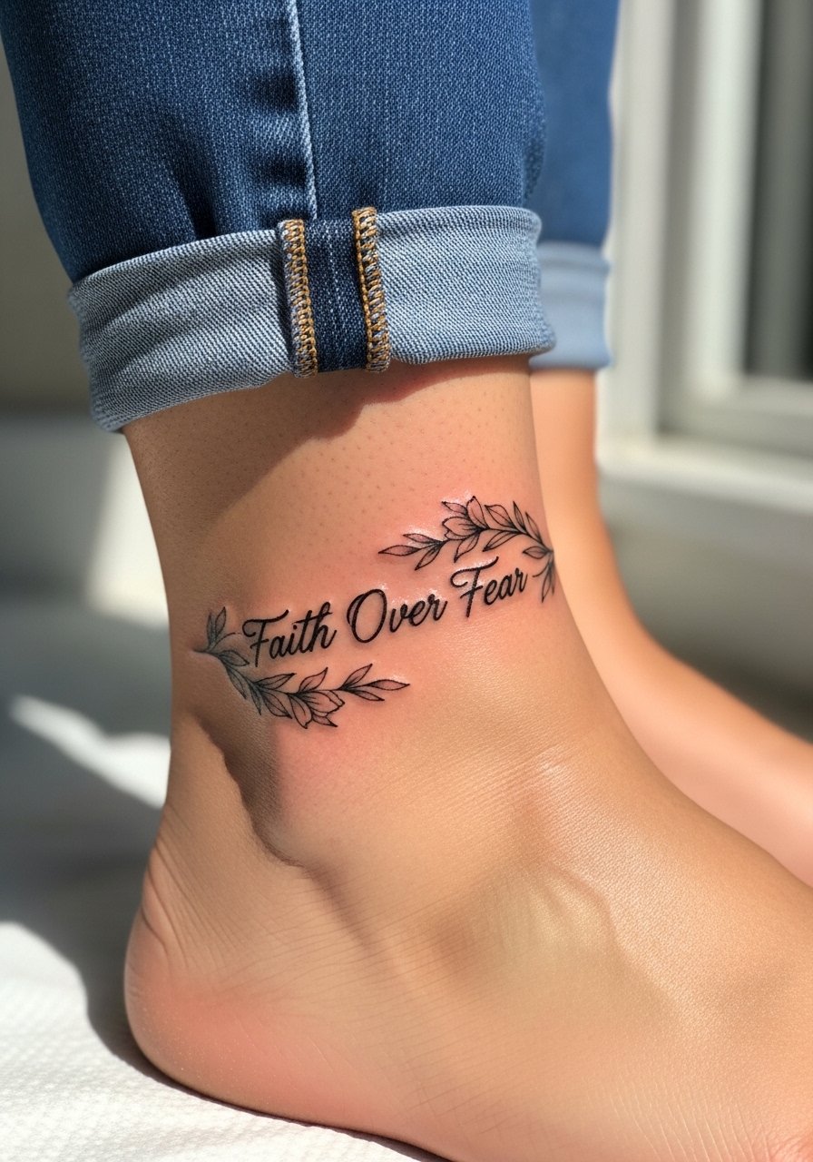
Ankle bands sit in high-friction zones from socks and shoes. The mistake is placing tiny letters where boots will rub. Ask for slightly bolder contrast and plan to keep sandals or low-cut shoes for the first two weeks while healing. Pain is moderate to low, and session time is short. The piece pairs well visually with cropped pants or sandals when you want to show it off.
15. Hand-Palm Interactive Script
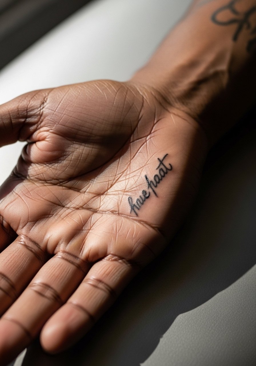
Palm placements are interactive but have some of the highest fade and retention issues because skin regenerates faster there. A common mistake is expecting long-term definition from fine line work in the palm. If you accept regular touch-ups, request thicker strokes and limited text length. Artists often recommend a staged plan: smaller flash now and refreshes later. Be aware that job considerations apply for some careers. Session pain varies and healing needs careful hygiene.
16. Vertical Rib Script with Mountain Silhouette
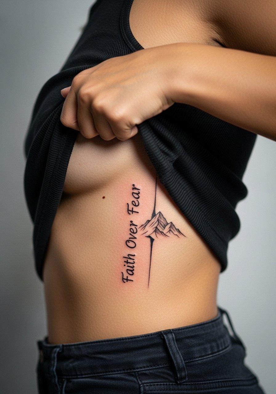
Rib placements stretch and compress with movement and weight changes. Many tattoos fade unevenly if the lettering is too close to busy shading. Choose vertical orientation and ask the artist to space letters more generously than the reference photo. Ribs are painful, and sessions can take longer if you ask for color washes. Consider booking off-season so healing avoids hot, sweaty months.
17. Neo-Classical Script with Laurel on the Calf
Calf pieces are lower on the pain chart and work well for slightly longer scripts. A mistake is packing too many elements into a narrow calf. Ask your artist to mock up the laurel at life size so the leaves do not crowd the type. For showing it off, wear shorts or a crop tank in summer, and for sessions bring loose pants you can pull up easily.
18. Coordinate Script on the Side of the Neck
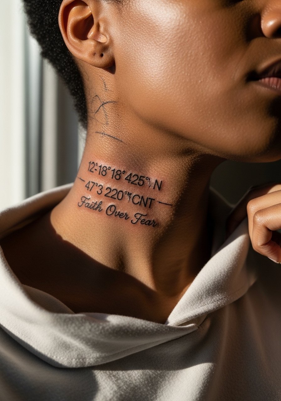
Neck placements require extra portfolio checks because visibility is high. When placing text here, ask the artist for slightly more open letterforms and an option to hide the piece under collars if you change jobs. Pain is moderate, and healing requires caution around clothing. Keep in mind that dense shading near the neck can migrate if you have low contrast skin tones, so prioritize a clean script with measured spacing.
19. Tiny Sternum Script with Botanical Accents
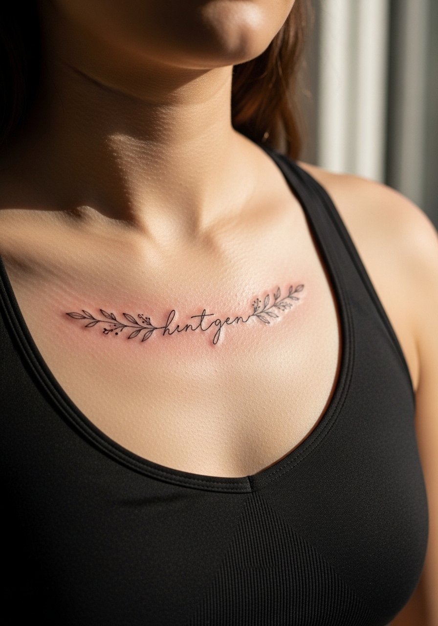
Sternum pieces read best when the botanical accents do not crowd the center line. Ask for a narrow vertical composition and avoid heavy color that can look muddy in the crease. The session is typically painful for most people but short if the piece is small. A fitted sports bra makes the session more comfortable and keeps the area modest during early healing.
20. Scripted Quote Across the Collarbone
Curved scripts along the collarbone must follow your bone structure. The common mistake is copying a straight line design onto a curved collar without distortion. Ask the artist to stencil the piece on and have you check it in a mirror before any needle touches skin. Pain is sharp over bone but brief, and the piece shows well paired with open-neck shirts.
21. Small Quote Behind the Ear with Floral Accent
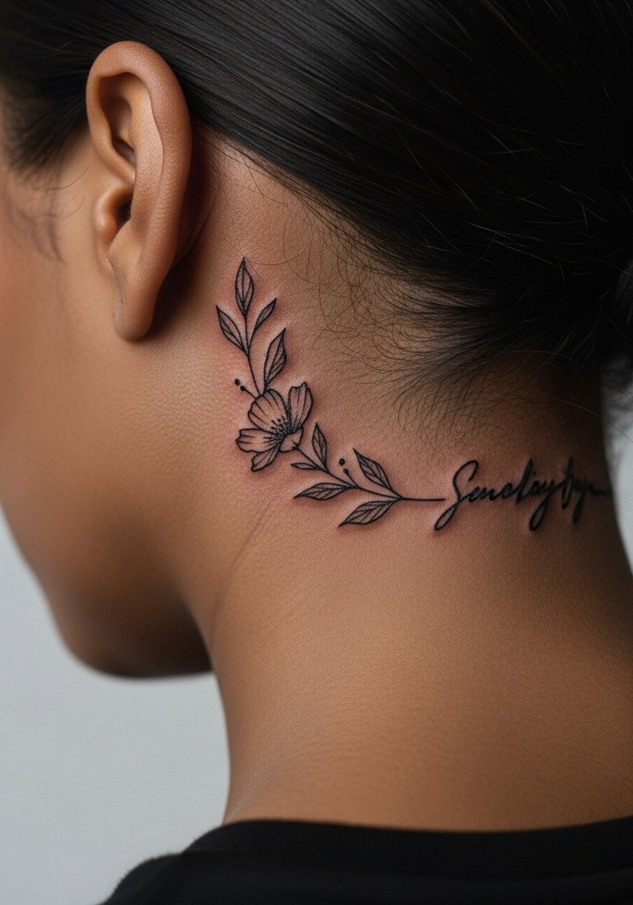
Behind-the-ear placements read quiet and intimate when done right. The safety rule is to place the script on the skin below the hairline so the tattoo is visible without exposing the ear itself. Keep the text minimal and opt for a single small flower to balance. Pain is low to moderate and heals quickly when kept out of hair products. For sessions, plan a hairstyle that keeps the area accessible.
22. Bold Block Lettering on the Outer Thigh
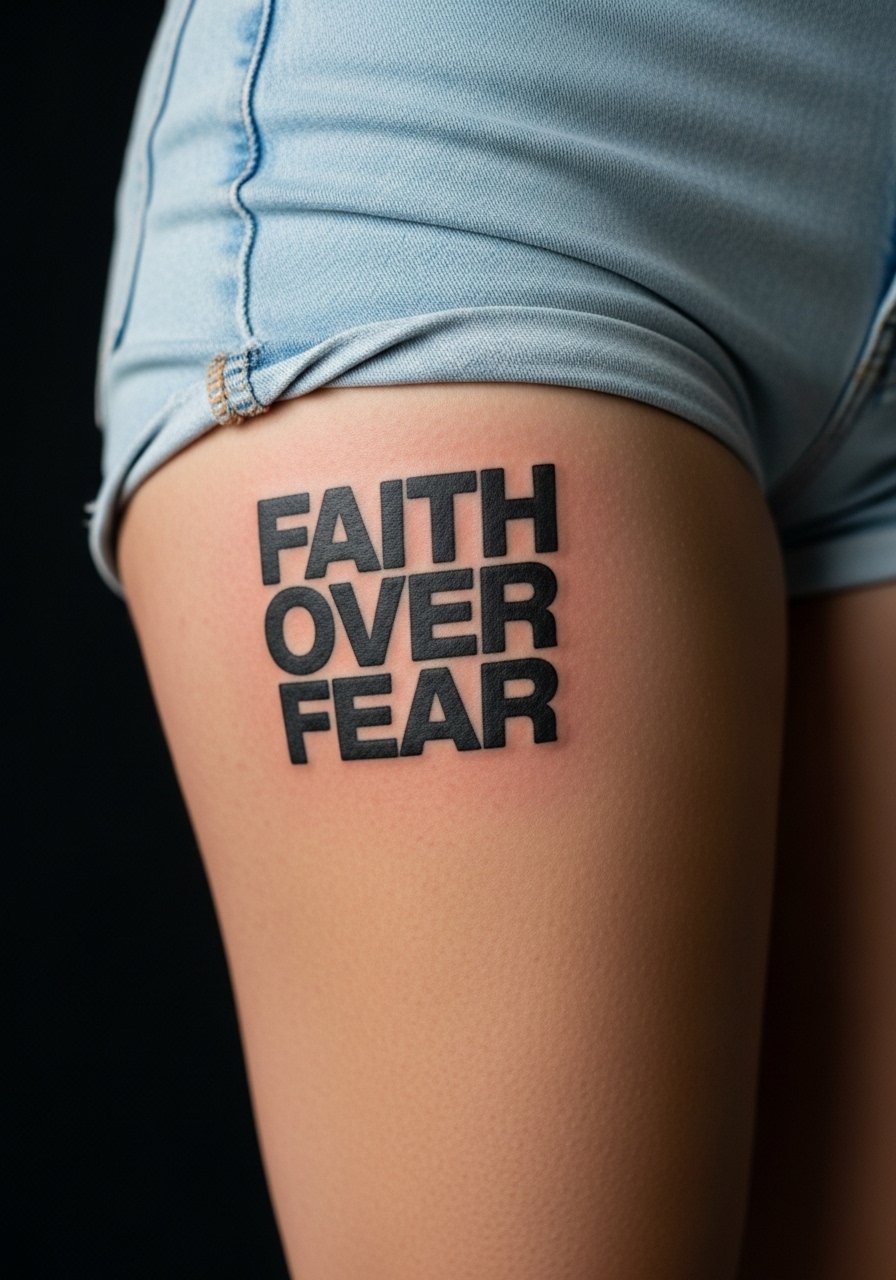
Outer thigh placements are forgiving because skin shifts less and there is room for larger lettering. A common mistake is going too narrow with block letters on this broad canvas. Choose slightly taller letterforms and ask the artist to preview sizing on a life-sized stencil. Pain is low to moderate and sessions are comfortable sitting or lying down. Wear loose shorts for the session so the artist can access the area with ease.
23. Micro Script on the Side of the Finger
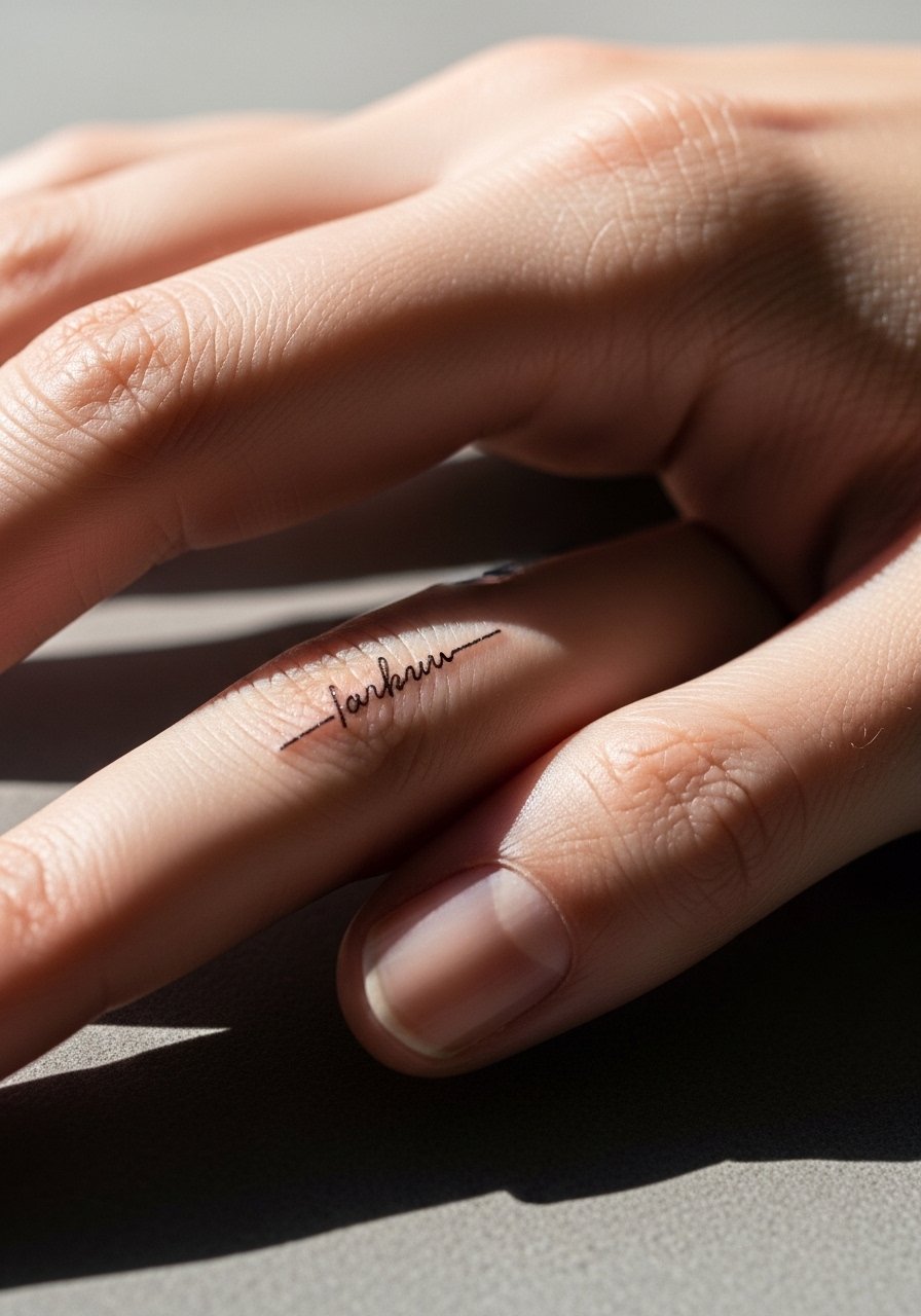
Finger-side scripts are discreet but fade fastest of almost any placement. The mistake is expecting longevity without maintenance. If you want this, accept the refresh timeline and request thicker primary strokes. For showing it off without glare, wear minimal rings on adjacent fingers. Healing can be tricky because of constant hand use, so plan sessions around low-activity weeks.
24. Blackwork Script Wrapped into a Rose on the Shoulder Blade
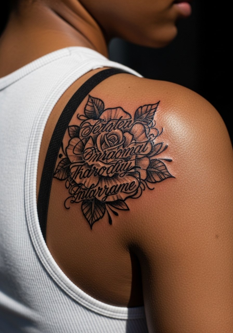
Shoulder blade pieces sit well under clothing and allow for larger blackwork elements that age predictably. Avoid cramming small script into dense petals, which often looks messy after healing. For best longevity, the script should ride the petal edge and use bolder linework where necessary. Sessions are moderate in pain and comfortable because you can lie face down during the appointment.
25. Script with Tiny Anchor on the Inner Wrist
Inner wrist pieces are visible but live in a high-motion area. The most common mistake is going microscopic on the anchor. Ask for a tiny but solid anchor, not an open-line glyph, so the symbol retains contrast on darker skin. Pair it at reveal with a thin silver chain bracelet on the opposite wrist to balance attention. Sessions are short and pain is manageable.
26. Scripted Date with Floral Micro-Realism on the Ankle
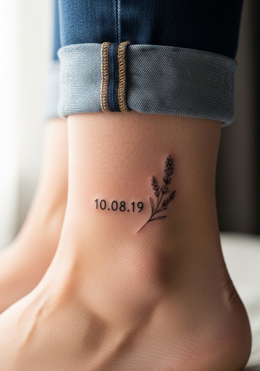
Ankle dates are small and elegant but sit in friction zones. The error is placing the date where shoe straps will rub constantly. Ask for the numerals to be slightly raised in weight and a tiny floral accent to live above the shoe line. Sessions are quick and pain is moderate because of thin skin. Wear sandals after the session for at least the first week.
27. Upper Thigh Script Hidden by Swimwear
Upper thigh placements are forgiving and private. The most common mistake is putting the script too close to pant seams where rubbing can cause scabbing. Ask for placement slightly higher and an option to show it with high-waisted swimwear or lowered jeans for photos. Healing is straightforward with minimal friction if you wear loose bottoms during the first week. Sessions are low on the pain chart for many people.
Frequently Asked Questions
Q: Will fine line scripts blur faster on darker skin tones, and what can I do about it?
A: Fine line tends to show softer on deeper skin tones if the lines are too thin. Ask for slightly heavier downstrokes and good contrast in the stencil stage so the artist can gauge saturation. Booking a touch-up at six to twelve months is common for retention.
Q: How should I prepare for a chest or rib session to reduce discomfort and healing problems?
A: For chest and ribs, book during a cooler season if possible, bring layers that are easy to pull aside like a loose button-down, and eat beforehand. Avoid heavy workouts for a week after so swelling and sweat do not interfere with early healing.
Q: Artists disagree on Saniderm versus dry healing. Which camp should I pick for hand and wrist pieces?
A: Both camps have valid points. One group likes Saniderm for hands because it keeps contaminants out during repeated washes. The other group prefers dry healing for humid climates to avoid trapped moisture. Ask your artist what they use on hands and why, and follow that protocol for consistent results.
Q: My shop quoted a low price but surprised me with a shop minimum. How do I avoid that?
A: Ask for a full pricing breakdown before you pay any deposit. Tell the studio you want the session time, shop minimum, and any expected touch-up costs written down. That prevents surprises and protects your deposit.
Q: Do watercolor and blackwork need different aftercare routines?
A: Watercolor pieces often use lighter saturation and may benefit from more careful sun avoidance until fully healed. Blackwork tolerates touch-ups better because the saturation is higher. Follow the studio's aftercare plan and check in at six months for any necessary touch-ups.