
Fine line Still I Rise tattoos look delicate on first glance and bold in meaning when you live with them. Trends push micro script and airy florals, and the reality is that longevity depends on placement, spacing, and how you plan to show the piece off. These ideas keep the lines thin without losing impact, and the first one is a forearm option that shows what to ask for at your consultation.
1. Micro Script Still I Rise on the Inner Forearm
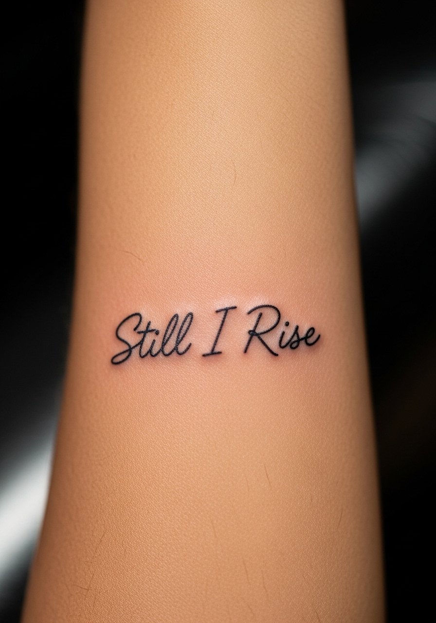
A tiny script on the inner forearm reads intimate when your sleeve rolls up and public when you want it to be. I recommend asking the artist for slightly increased spacing between letters and a one-point heavier start stroke so the thin script maintains legibility through touch-up cycles. Common mistakes include requesting the thinnest possible line and placing it too near wrist creases. Expect the area to feel like a 4 out of 10 on pain, and plan for a short session under an hour. At six months the letters will look crisp, and by year three some softening is normal. For showing it off wear a loose button-down shirt with sleeves rolled.
2. Tiny Still I Rise Behind the Ear, Neck Framing
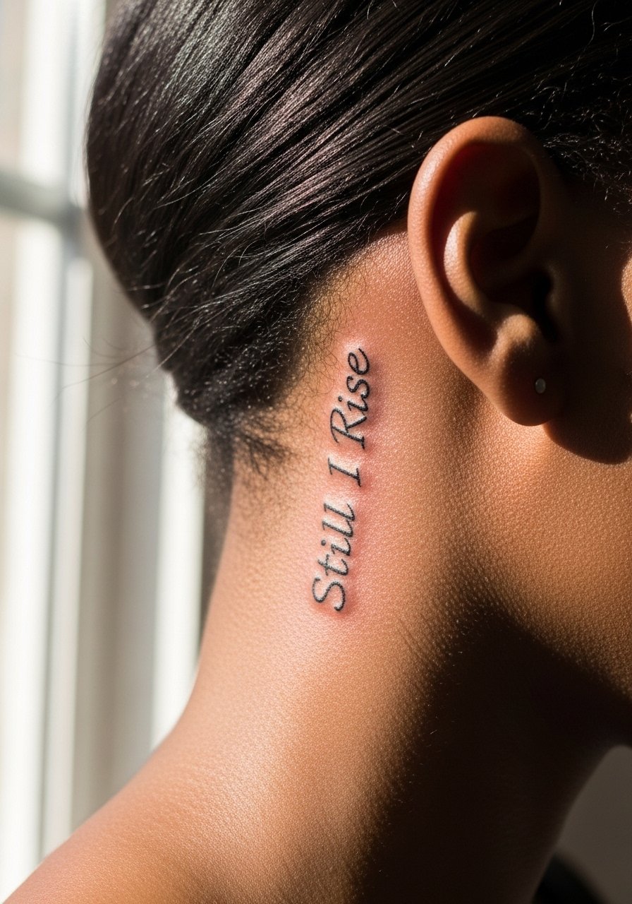
This placement feels private yet lovely when hair is swept up. Because the area sits below the hairline you need a steady hand and a stencil that conforms to the curve. The split in opinion about fine line in this zone is clear. One camp says the skin there moves too much and lines blur, the other argues that with proper depth and a spaced script it holds up. Tell your artist you want light lineweight with slightly more internal spacing, and expect a short, sharp session lasting 20 to 40 minutes. For work-sensitive contexts keep hair down or choose a position that stays hidden.
3. Minimalist Still I Rise Along the Ribcage

Ribcage pieces read beautifully but sting more during the session. Fair warning about the pain, it leans toward 7 out of 10 for many people, and sessions can stretch if the artist needs to reposition the stencil multiple times. The most common error is compressing a long script into a narrow rib panel. Instead ask for a slightly arced layout that follows the rib line and a touch more spacing between letters. Expect visible crispness at six months and a need for a touch-up around year two if you are active or sun-exposed. For the appointment wear a zip-front sports bra so the artist has clear access.
4. Single-Needle Script on the Side of a Finger

Finger placements look great fresh but carry a high wear factor from washing and friction. The biggest mistake is expecting finger text to last like forearm work. I advise a slightly bolder micro line and placing the word on the fingernail side rather than the pad side to slow edge loss. Sessions are quick yet the touch-up timeline is sooner, often within 12 to 18 months for most people. Fingers also split artists into camps about whether single-needle fine line belongs here. One group will refuse small script because of constant wear. The other will do it with clear expectations about touch-ups. Think about jewelry choices that won't rub the area during healing.
5. Delicate Still I Rise Over the Collarbone
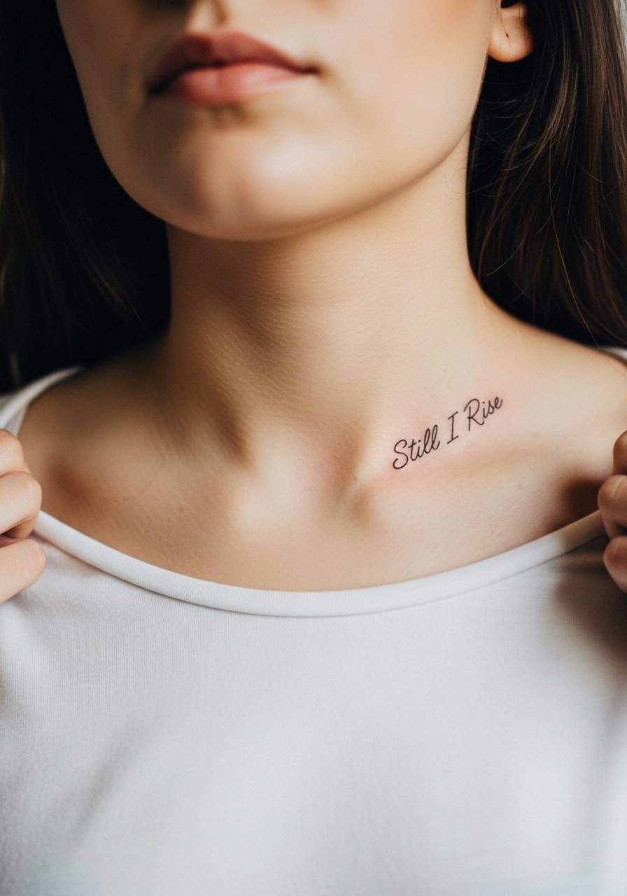
A collarbone script sits at a sweet spot between visibility and subtlety. The skin is thin so ask for shallow, confident strokes and avoid tiny flourishes that will merge over time. The session tends to be a 30 to 60 minute job with a 3 out of 10 pain rating for most. The common aging issue is sun exposure washing out contrast. Plan for annual sunscreen habits to preserve the fine line. For evenings the piece pairs well with open-back midi dresses that let the script peek without competing with heavy necklaces.
6. Micro-Stipple Still I Rise on the Inner Bicep

The inner bicep takes detail well because the skin stays relatively stable. I like combining thin script with a faint stipple halo to make the letters read from a short distance. Tell the artist you want stippling kept airy and not dense so the lines breathe. The inner bicep is often a 3 out of 10 on pain and sessions can be comfortable if you wear loose sleeves. Mistakes include packing too much detail into a narrow band. Expect crispness at six months and a gentle softening by year three. For the session wear a racerback tank so the artist can access the area cleanly.
Studio Day Picks
The collarbone, inner forearm, and inner bicep pieces above need different prep than finger and rib work, so these studio day items smooth the session and early healing.
-
Stencil transfer paper kit. Lets you preview spacing on curved areas like the rib or collarbone before the needle touches skin.
-
Topical numbing cream. Applied per instructions before rib sessions reduces the initial sting and helps you stay still during fine detail work.
-
Thin protective film roll. Useful for finger and wrist pieces to limit friction while you go about daily tasks.
-
Fragrance-free gentle body wash. Cleanses healing fine line areas without stripping the tiny channels the ink sits in.
-
Aquaphor healing ointment. Thin applications in the first few days lock in moisture for delicate script without smothering the skin.
7. Small Script Curve Along the Rib Edge, Lace-Friendly

When the script follows the rib curve it becomes a wearable accent with lingerie and lace. The session will be sensitive but short for a small piece. A common error is curving the text too sharply which shortens the letterforms. Ask for a gentle arc and to see the stencil while you move to ensure it sits where clothing will reveal it. Aging issues include creasing where the body flexes, so leave a bit of spacing between letters near the sternum. For appointment day wear a bandeau or cropped top that the artist can lift slightly without you exposing more skin than necessary.
8. Ankle Script That Hugs the Bone Line

Ankle text looks elegant with sandals and cropped pants but faces rubbing from socks and shoes. The biggest mistake is placing the script where shoe straps will hit. Ask the artist to position the text slightly higher or along the outer ankle bone to reduce friction. Sessions are quick yet healing requires mindful footwear for two weeks. At six months the lines are usually intact, but expect a touch-up at year two if you wear tight shoes often. Pair this piece with low-profile sandals or cropped linen trousers for casual showing off, and bring a pair to the session you can slip on afterward.
9. Subtle Sternum Script Under a Bandeau

Sternum placements require a specialist touch because the skin moves with breathing and clothing. One practical mistake is asking for a long phrase that crosses muscle lines. Keep the script short and centered, and tell the artist you want the letterforms adjusted for expansion during inhalation. Sessions feel like a 6 out of 10 on many people because of sensitivity. The two camps on fine line here argue about longevity, with one group recommending heavier linework and the other advising extra spacing. Expect touch-ups sooner than forearm work. For the appointment a strapless or bandeau top makes access smooth.
10. Micro-Realism Script With a Tiny Sun Motif on the Wrist
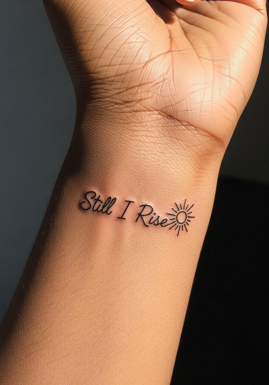
A wrist script combined with a micro sun gives the phrase an emblematic feel without bulk. The wrist faces daily washes and friction, so plan for touch-ups around year one to two. Ask your artist for slightly reinforced anchor points at the start and end of the word to prevent feathering. Sessions are brief and usually manageable. When the sun motif sits just above the script it frames the piece and wears well with bracelets. For showing it off try a minimalist watch strap, but avoid tight bands during the first week of healing.
11. Fine Line Mirror Script Across the Near-Shoulder Blade

A near-shoulder blade script is easy to conceal and flattering in open-back tops. The area is forgiving for fine detail because it does not see heavy friction. Common errors include running the text too low where jeans or straps rub. Tell the artist you want the placement high enough to stay clear of clothing and to use a slightly heavier starting point for each letter. Sessions are a relaxed 30 to 60 minutes and pain rate is usually a 3 out of 10. For evenings the tattoo looks great with open-back tops.
12. Negative Space Script Interlocking With a Tiny Rose on the Forearm

Combining script with negative space floral work gives the phrase visual breathing room. Ask for the rose to be suggested with open areas rather than filled dots to preserve the thin script next to it. The outer forearm holds fine line well and sessions are moderate in length. The common mistake is putting heavy shading too close to the letters which invites softening. At two years the contrast will depend on sun exposure, so plan for SPF and occasional touch-ups. For daily wear rolled sleeves or a simple linen shirt keeps attention on the forearm without overshadowing the delicate motif.
13. Stacked Tiny Scripts Along the Spine

A vertical stack of micro scripts down the spine reads like lines of a poem when seen through an open-back top. The tricky part is alignment. Tell your artist you want sightlines checked in a mirror while you move so the stack reads straight when you stand naturally. Sessions may take longer if the artist spaces each line by hand. The area is less exposed to friction but sees movement. Expect a touch-up at year two if lines start to blur from posture-related skin shifts. For showing it off choose open-back dresses that let the stack be a central element.
14. Micro Coordinates With Still I Rise Script on the Hip

Pairing coordinates with the phrase personalizes the sentiment while keeping the design tiny and private. Hip placements are intimate so wear high-cut shorts to the appointment so the artist can access the area without excess exposure. A common mistake is asking for too-small numerals that blur; ask for legible numeric spacing and slightly larger type than you think you need. Healing takes a few weeks and friction from waistbands matters, so choose soft fabrics during that window. This piece pairs well with high-waisted swimsuits and cropped tops when you want the tattoo to peek out.
15. Fine Line Script Curving Around the Ankle Bone

A wrap-around ankle script behaves like jewelry and looks deliberate with cropped pants. The error to avoid is placing text where shoe straps sit. Request the artist mark the exact strap lines and place the script just above them. Sessions are short and pain low for most. Because the ankle sees constant movement, expect touch-ups in two years if you wear snug footwear. For styling pair it with strappy sandals or cropped trousers that let the lettering breathe.
16. Subtle Under-Collar Script Hidden by Hairline

A nape script is a nice secret that shows when your hair is up. The neck area is sensitive and thin, so talk to the artist about slightly stronger anchor strokes at points that receive tension from collars or necklaces. Sessions are quick but require steady breathing to avoid line wobble. Some artists decline very fine work here because of movement. If you keep your hair up often, this spot ages well. For the session wear a shirt with a wide neck that you can pull aside without removing layers.
17. Still I Rise in Tiny Roman Numerals on the Wrist Edge

Using Roman numerals or symbolic micromarks to stand in for the phrase is a discreet alternative when public settings demand subtlety. The wrist edge takes abuse, so ask the artist to place numerals where friction from watchbands is minimal. A common mistake is compressing numbers into too small a block. Expect a touch-up within 12 to 24 months depending on daily wear. This option works well with stacking bracelets once healed, and a slim chain bracelet can frame the piece without rubbing.
Frequently Asked Questions
Q: Will a fine line Still I Rise script blur faster on the ribs than on the forearm?
A: Yes, rib skin moves more with breathing and can cause softening faster than the forearm. The solution is spacing and slightly reinforced anchor points in the lettering. If longevity matters choose a position with less motion or plan for touch-ups around year two to three.
Q: Can I get a micro finger or wrist script and expect it to look the same at year five?
A: Expect change. Fingers and wrists face daily friction and washing which fade fine lines faster. Many people need touch-ups by year one to two. Placement adjustments and slightly stronger line starts help, but plan for maintenance.
Q: How do I find an artist who understands fine line script without naming anyone?
A: Look for portfolios on local shop websites, hashtag searches in your city, and recent convention flash pages. Read notes on healed work in community threads and ask for healed photos during consultation. This discovery pathway shows real healed results that studio galleries sometimes omit.
Q: What should I wear to a rib or sternum session to keep access and modesty handled?
A: Pick a cropped top, bandeau, or zip-front sports bra that the artist can lift or unzip slightly. I recommend a zip-front sports bra for comfort and quick access without full exposure.
Q: Are negative space and stipple details safe to combine with thin script?
A: Yes when they are kept airy and separated by breathing room. Dense shading next to script is the usual mistake. Ask for open stipple and a clear margin between motifs so the letters remain legible long term.
Q: Should I worry about career or hiring implications with hand or neck placements?
A: Hand and neck tattoos are still visible in many professions. Think about how often you want the piece to be hidden and pick placement accordingly. If you need discretion choose inner forearm, rib, or hip where you control visibility.