
Fine line Game of Thrones references flood boards and saved pins, and the pieces that still look crisp after five years are not always the ones that got the most likes on day one. Placement and spacing matter more than extra detail, and color choices change the maintenance timeline. Start here for ideas that balance fandom, longevity, and wardrobe-friendly showing-off.
1. Minimalist Direwolf on the Inner Forearm
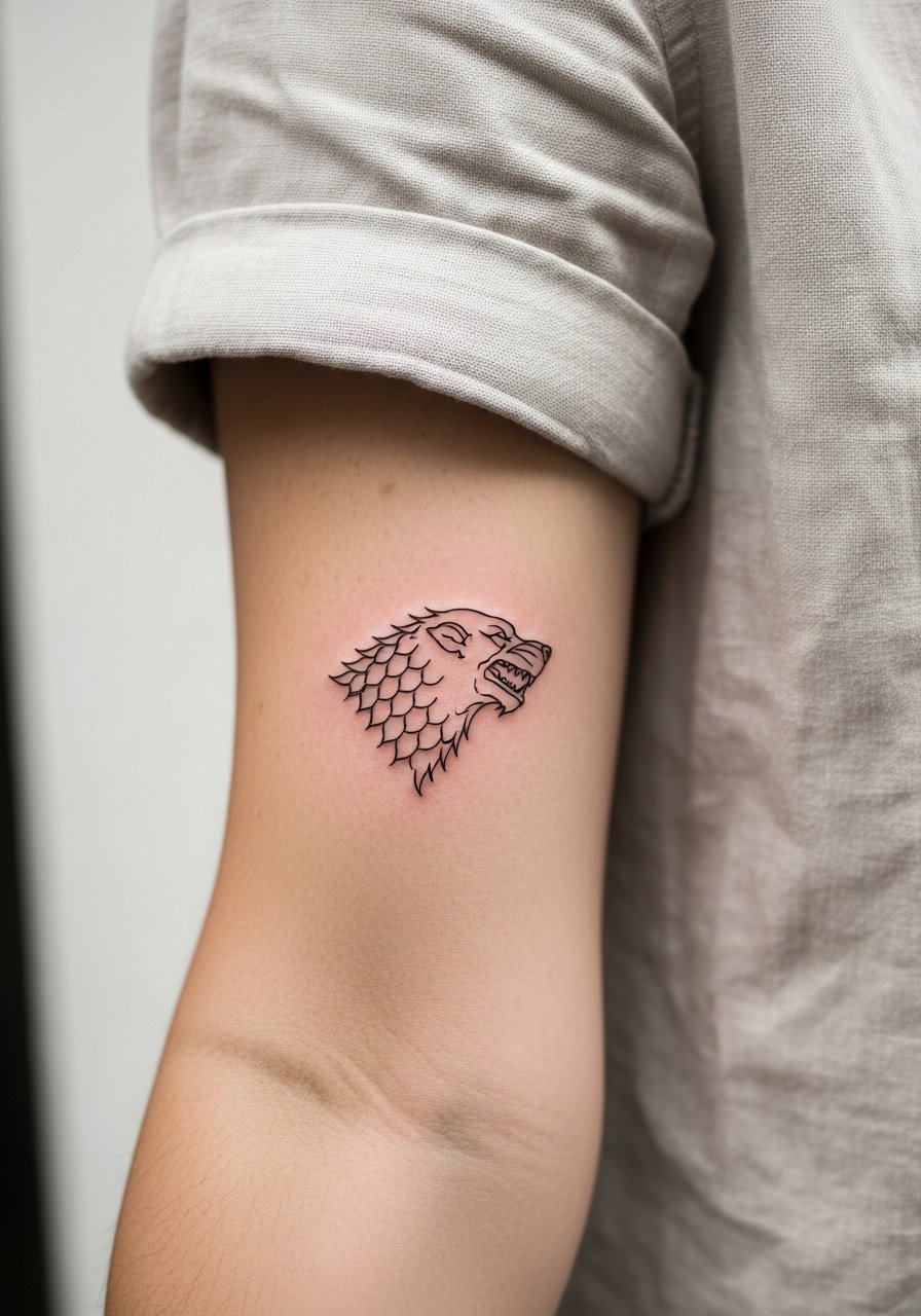
I recommend a small fine line direwolf when you want a discreet Stark nod that still reads in casual sleeves. Fair warning, the inner forearm shows detail well but is exposed to sun and wrist friction, so ask for slightly bolder linework than a micro tattoo to preserve shape at year three. A common mistake is asking for hair-fine lines that vanish with time. For the session wear, pull on a loose button-down shirt so the artist has clean access and you leave with minimal rubbing on the fresh ink.
2. Micro-Realism Direwolf on the Bicep
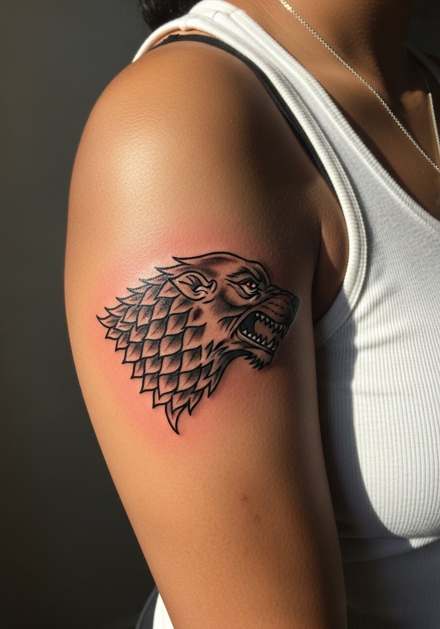
The bicep gives room for micro-realism without crowding details. Expect moderate pain and a session that can run into two hours depending on saturation. Tell your artist you want contrast in the highlights, not extra tiny lines, because too many micro-strokes can blur into a patch by year five. People often request extreme detail at small scale and then need a touch-up later. For showing this off, a fitted racerback tank elevates the portrait without hiding it.
3. Tiny House Sigil on a Finger
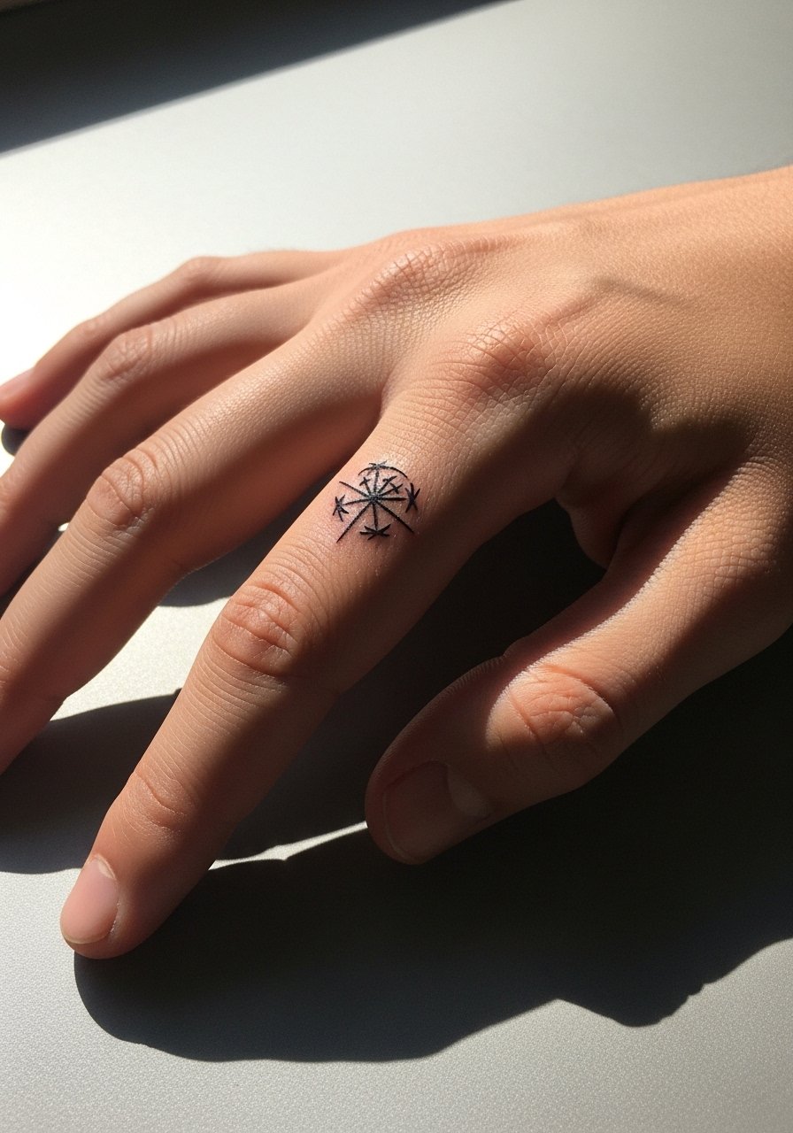
Finger tattoos are bold for their visibility but fragile for longevity. Fine house sigils there will likely need touch-ups sooner than the same piece on the forearm because of constant washing and skin turnover. The session is short but uncomfortable and healing involves daily movement. The usual mistake is asking for too much detail in too small a footprint. For appointments, wear a shirt with sleeves you can roll up and bring no bracelets that might rub the area during healing.
4. Script Quote Across the Collarbone
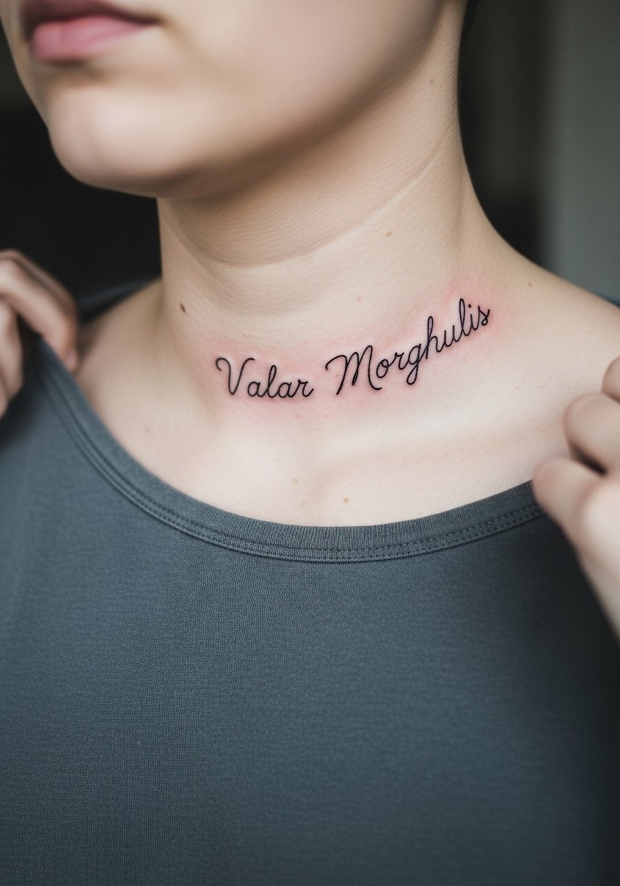
Script across the collarbone reads elegant but is sensitive to placement and font choice. If you want a High Valyrian phrase, bring the exact wording and a reference for font weight since thinner scripts on collarbone can break where the skin moves. A common error is choosing ultra-tight cursive that merges into a single stroke after a year. Pain is above average for collarbone work, but a single session usually suffices. Pair this with a thin chain pendant necklace when showing it off so the jewelry frames the line without crowding the letters.
5. Blackwork Dragon Egg on the Sternum
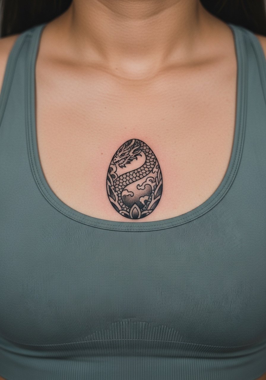
Sternum work is a commitment because the area moves and breathes with the body. Heavy blackwork eggs hold up well, but fine stipple inside the egg can soften over time. Expect a painful session and longer healing, especially where the tattoo meets fabric. One camp of artists avoids fine detail on sternum and prefers bold shapes. The opposing camp will do precise stippling if spacing is increased. Ask your artist where they land and plan for a touch-up at year two. For the session, a strapless or fitted sports bra makes access clean and keeps friction minimal.
6. Watercolor-Style Dragon Over the Back
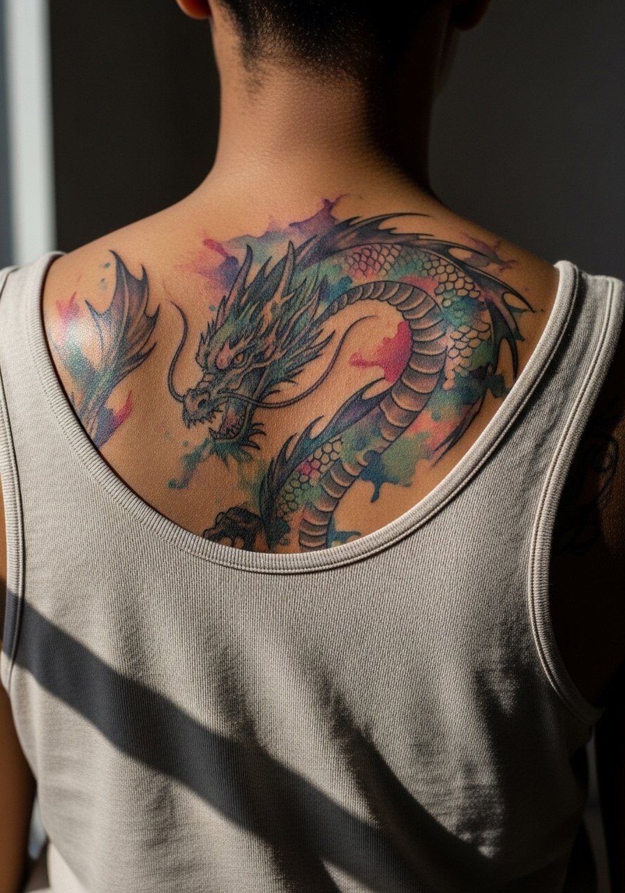
Watercolor texture can give a dramatic dragon without heavy outlines, but this style tends to fade faster under sun exposure. The compromise is to mix light washes with some anchoring linework so color ages more gracefully. Expect multiple sessions for saturation and layering. Artists split on watercolor longevity. One group says it is a beautiful, short-term statement. The other group argues that with planned touch-ups and UV care it can remain vibrant. For a showing-off look, an open-back dress or a loose drawstring linen pant when you want casual coverage keeps attention on the upper back.
Studio Day Picks
The collarbone script, sternum egg, and back dragon above need different prep than wrist or finger pieces, so a small kit smooths the session and the first two weeks.
-
Stencil transfer paper kit. Lets you preview placement on skin before committing, which is especially useful for collarbone and wrist pieces in ideas above.
-
Topical numbing cream. Applied 45 minutes before can reduce edge pain for sternum and ribcage sessions without affecting the artist's work.
-
Thin protective film roll. Keeps finger and wrist tattoos shielded from friction during the first week of heavy hand use.
-
Fragrance-free body wash. Cleanses the healing area without stripping oils that fine line and watercolor pieces need.
-
Aquaphor healing ointment. Thin layers in the immediate days after the session protect newly tattooed skin and support fine line retention on forearms and collarbones.
7. Minimal Map Fragment on the Side Rib
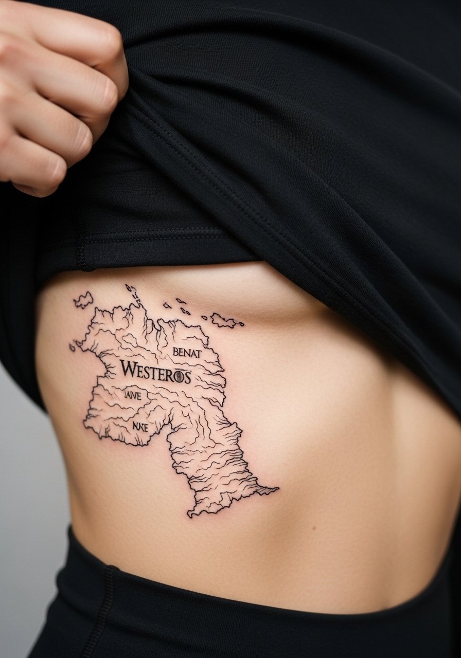
Rib tattoos are classic for readers who want a private nod to favorite locations. Pain is high and sessions may be split across visits. Fine line maps can look delicate but they risk blurring if drawn too tight. The common mistake is packing tiny coastlines into a small patch. One camp of artists will refuse minute maps on ribs because of skin stretch. The other camp will accept them with increased spacing and stronger line weight. Tell your artist you prefer simplified coastlines and offer to scale up details to a nearby panel if you want more geography later. For the session, a cropped top makes access easy and keeps the area covered afterward.
8. Stylized Iron Throne Silhouette on the Calf
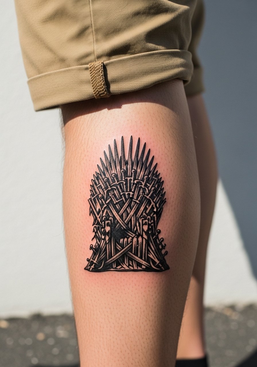
Calf placements let you scale iconic motifs without sacrificing detail. Solid black silhouettes age very well on legs because of lower sun exposure and less constant abrasion. Sessions are tolerable and healing is straightforward. Avoid asking for overstated micro-detail within the silhouette if you want longevity; the simpler the block shape the better it reads at distance. Pair this with ankle boots or shorts for nights out. For the session, wear loose pants that pull down or shorts you can step into easily.
9. Three-Eyed Raven Behind the Ear
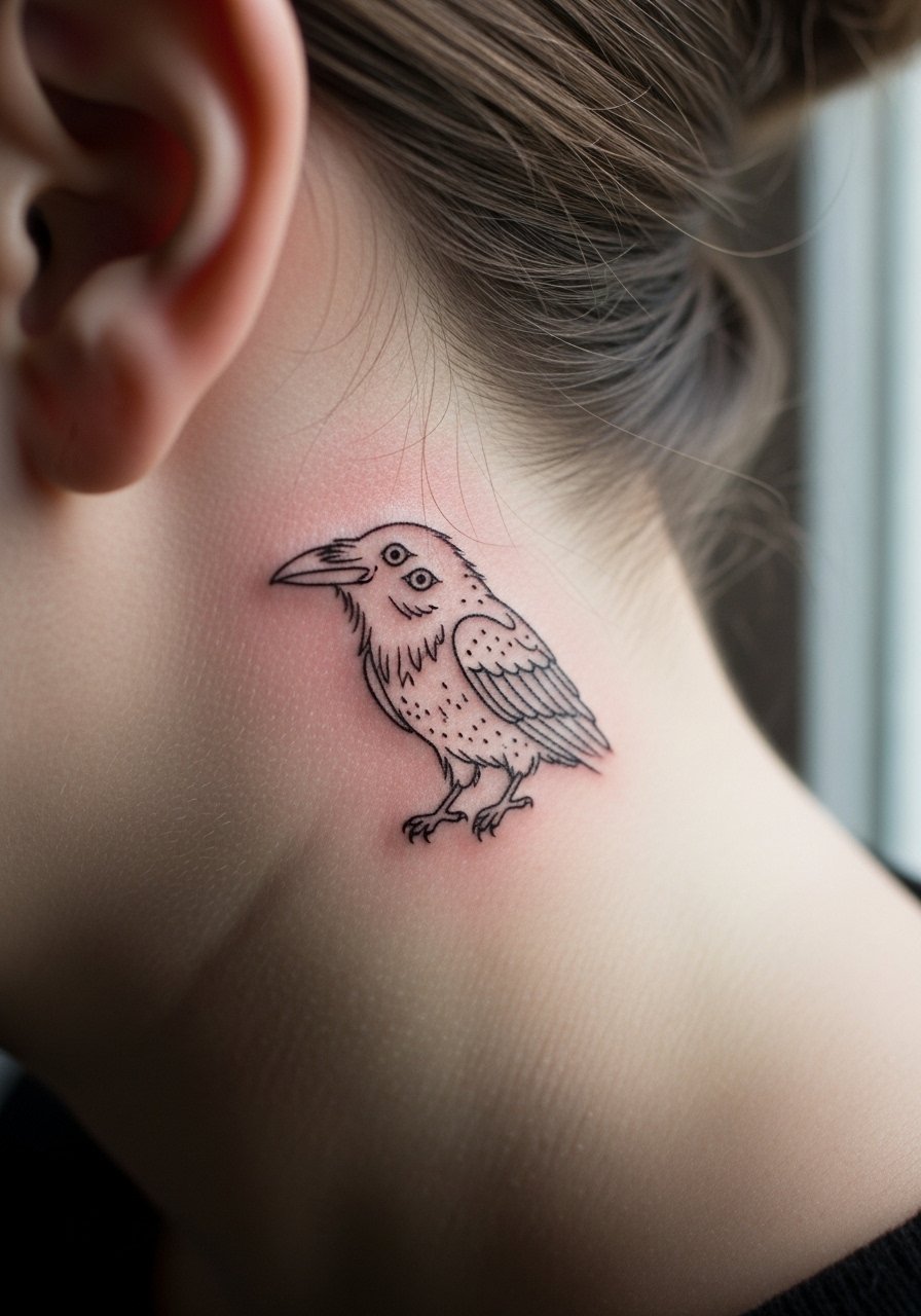
Behind-the-ear pieces are intimate and subtle, and they age differently because of hair coverage and neck movement. The area is sensitive and the session is short. The biggest mistake is asking for dense fill near the hairline where ink can migrate under stubble. Ask for clear spacing and ask your artist about touch-up plans. For showing off briefly, pull hair back and pair with a thin chain pendant necklace rather than heavy collars that hide the area.
10. Sleeve Patch of Sigils in Traditional Style
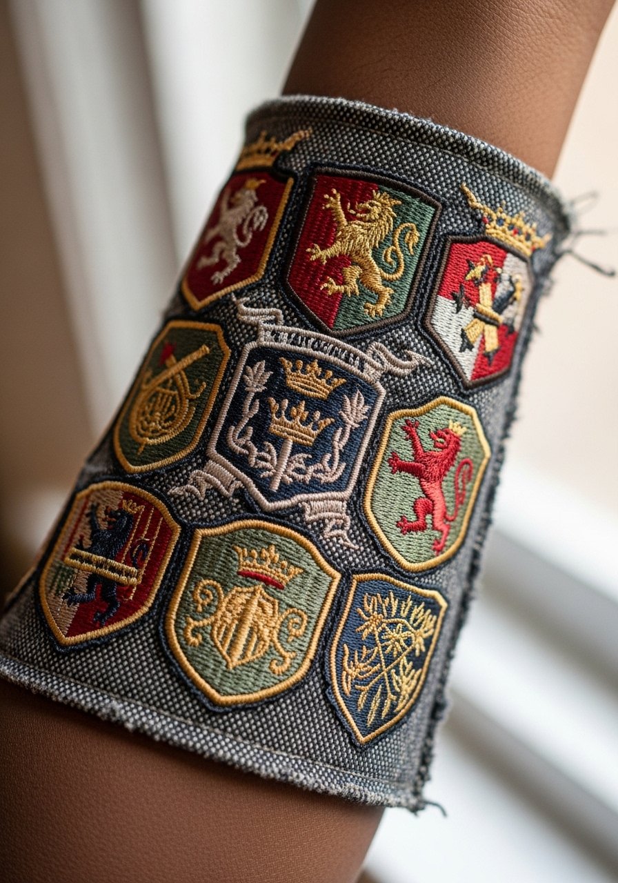
A sleeve patch lets you combine several house sigils in a cohesive composition, and American traditional saturation resists fading better than whisper-thin work. This approach needs careful negative space planning so sigils do not run into each other at year five. During consultation, map how each sigil will breathe on the forearm and pick bold linework for separation. The session time can be several hours over multiple sittings. For showing it off, roll up sleeves of a short-sleeve linen shirt to frame the pieces without overwhelming them.
11. Micro Constellation of Dragons on the Ankle
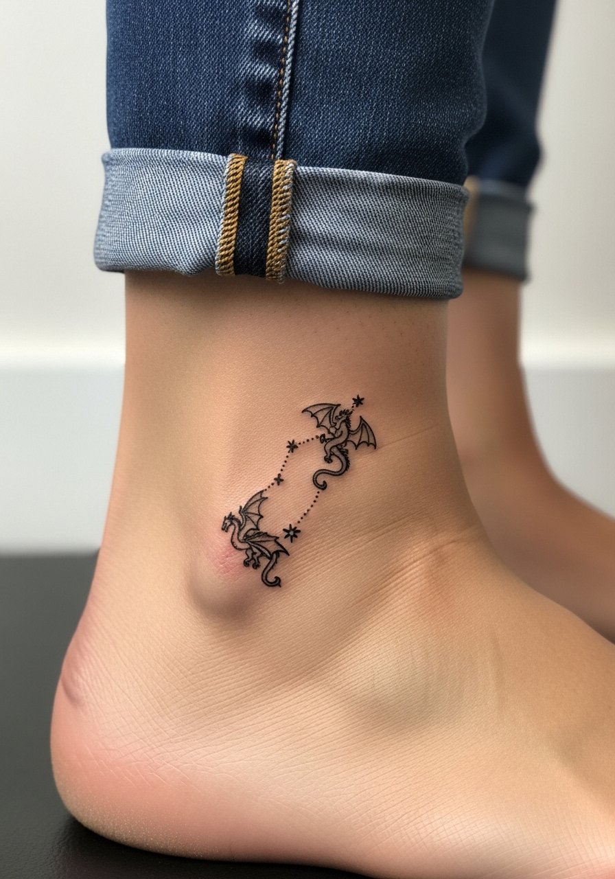
Ankle constellations are playful and small but vulnerable to blurring from shoes and socks. The session is quick and healing needs mindful sock choices. The main error is placing details where shoe rubbing will erase them. Ask for a simple, airy layout that spaces the stars and dragons apart. For showing, sandals or cropped pants work best. Bring a pair of loose socks for the trip home to avoid early scabbing rubbing against tight footwear.
12. Full Back Scene in Micro-Realism
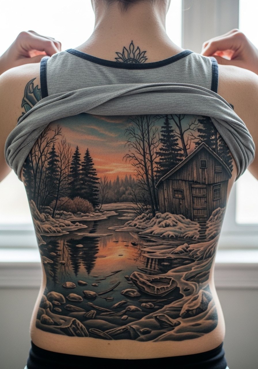
Full back pieces give narrative space to render a winter scene with depth. Micro-realism here requires planning for how the scene will age across the large canvas. Small details hold longer when given breathing room and anchored with mid-tone contrast. Sessions will be multiple and healing needs patience. The common mistake is cramming too much tiny storytelling into one pass. For show-off wear, open-back tops or halter styles let you display the scene selectively while protecting it most of the time.
13. Simple Sigil Ring Around the Finger
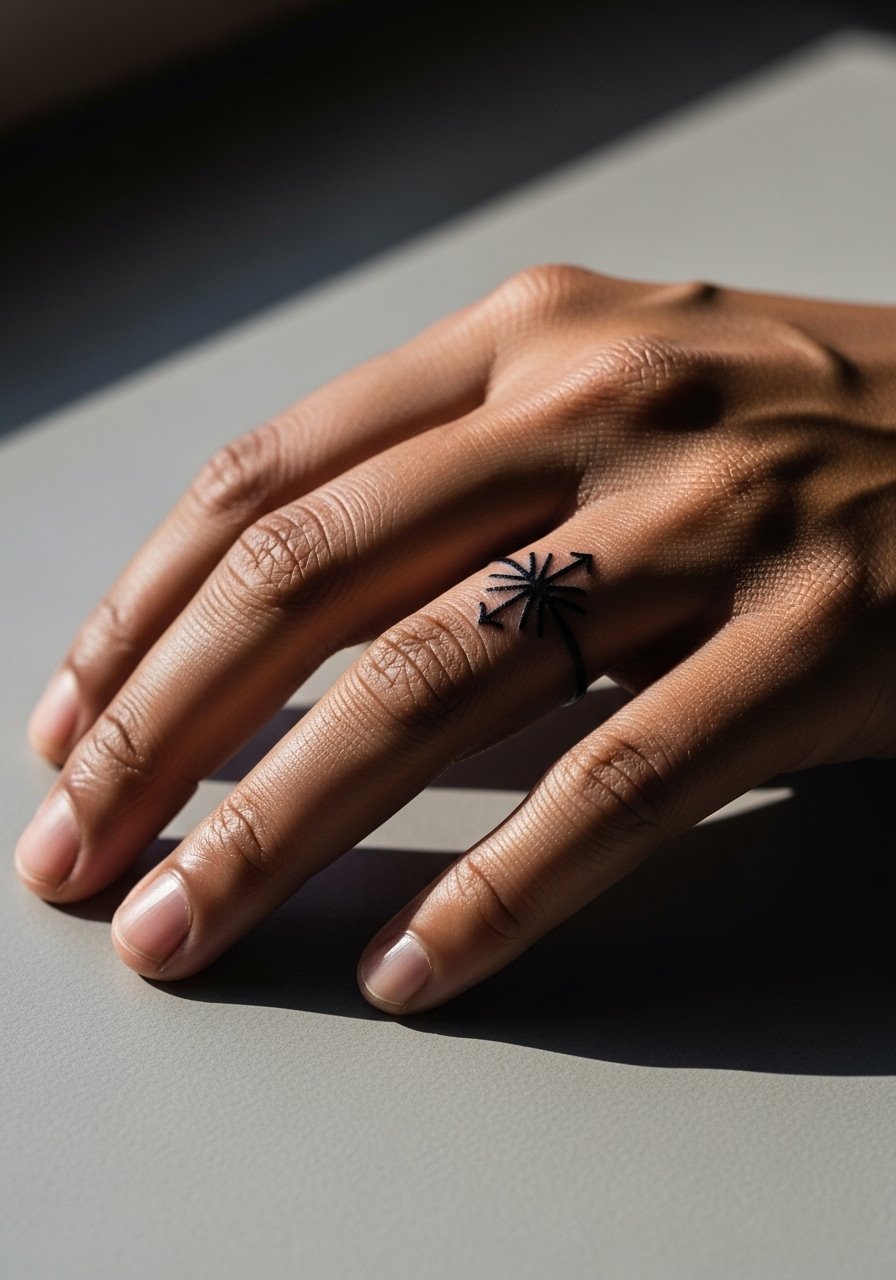
Ring tattoos are symbolic but face heavy wear from hand washing and jewelry. A thin band with a simplified sigil reads better than a tiny ornate crest. Expect touch-ups at year one or two. A real mistake is matching ring width to an actual metal band without accounting for skin movement. For the session, skip metal rings and wear a loose long-sleeve shirt that can roll up without scraping the fresh ink.
14. Arm Band of Runic Valyrian Script
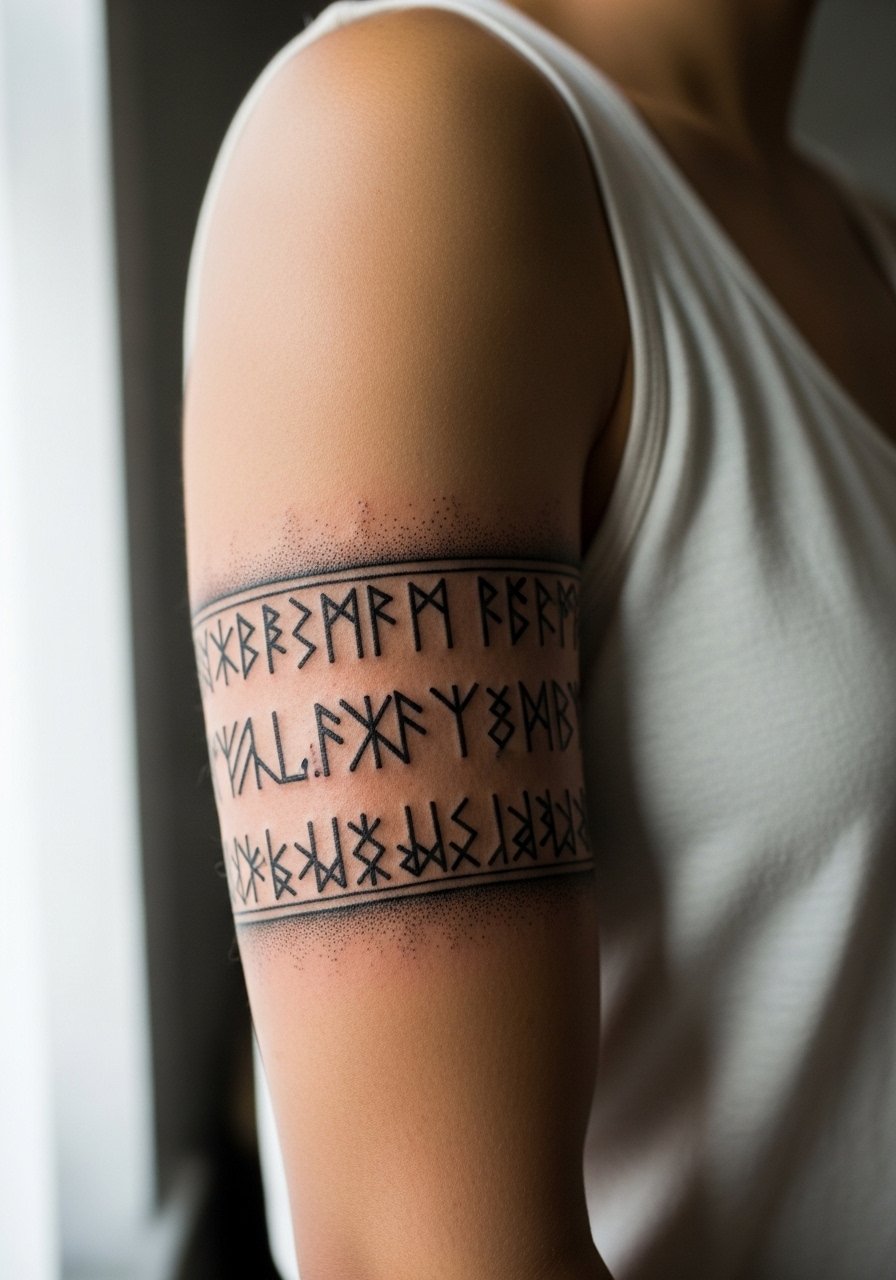
An armband of script feels ceremonial. Keep the script spacing generous because tight lettering in a wrap tends to compress over time. The session is moderate and feels like many short passes. One common mishap is allowing the text to wrap at a place where the arm creases, which creates unreadable joins. During consultation, mark the arm in the intended position and roll your sleeve to confirm placement matches how you want to show it off. For showing, short sleeves that hit just above the band frame the piece.
15. Small Direwolf Paw on the Chest
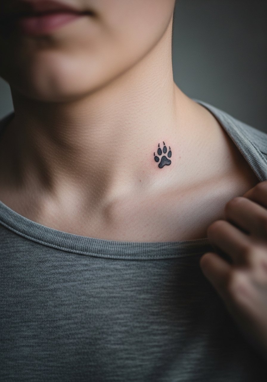
Chest-adjacent small marks are personal and easy to hide. The upper chest moves with breathing and can blur small dots if packed too close. The usual mistake is crowding dot work and expecting it to remain crisp. For the session, a wide-neck shirt makes access clean. Pair this with a simple open-back midi dress for evenings when you want to show the spot without full exposure.
16. Blackwork Wolf Head on the Thigh
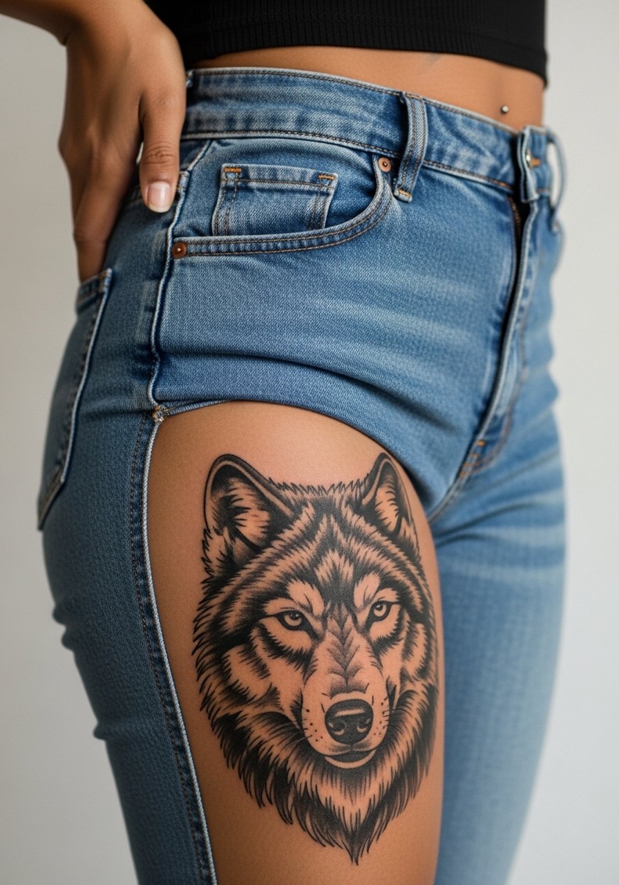
Thigh pieces let you push saturation for dramatic contrast and longevity. Blackwork wears well here because it gets less sun and less daily abrasion. Pain is lower than ribs and sessions can be comfortably longer. The slip is over-detailing within the black field, which can read as a single patch later. For sessions, wear shorts or bottoms you can step out of. For showing, high-waisted skirts or shorts that sit low enough for a peek look intentional and flattering.
17. Minimalist Crown on the Wrist
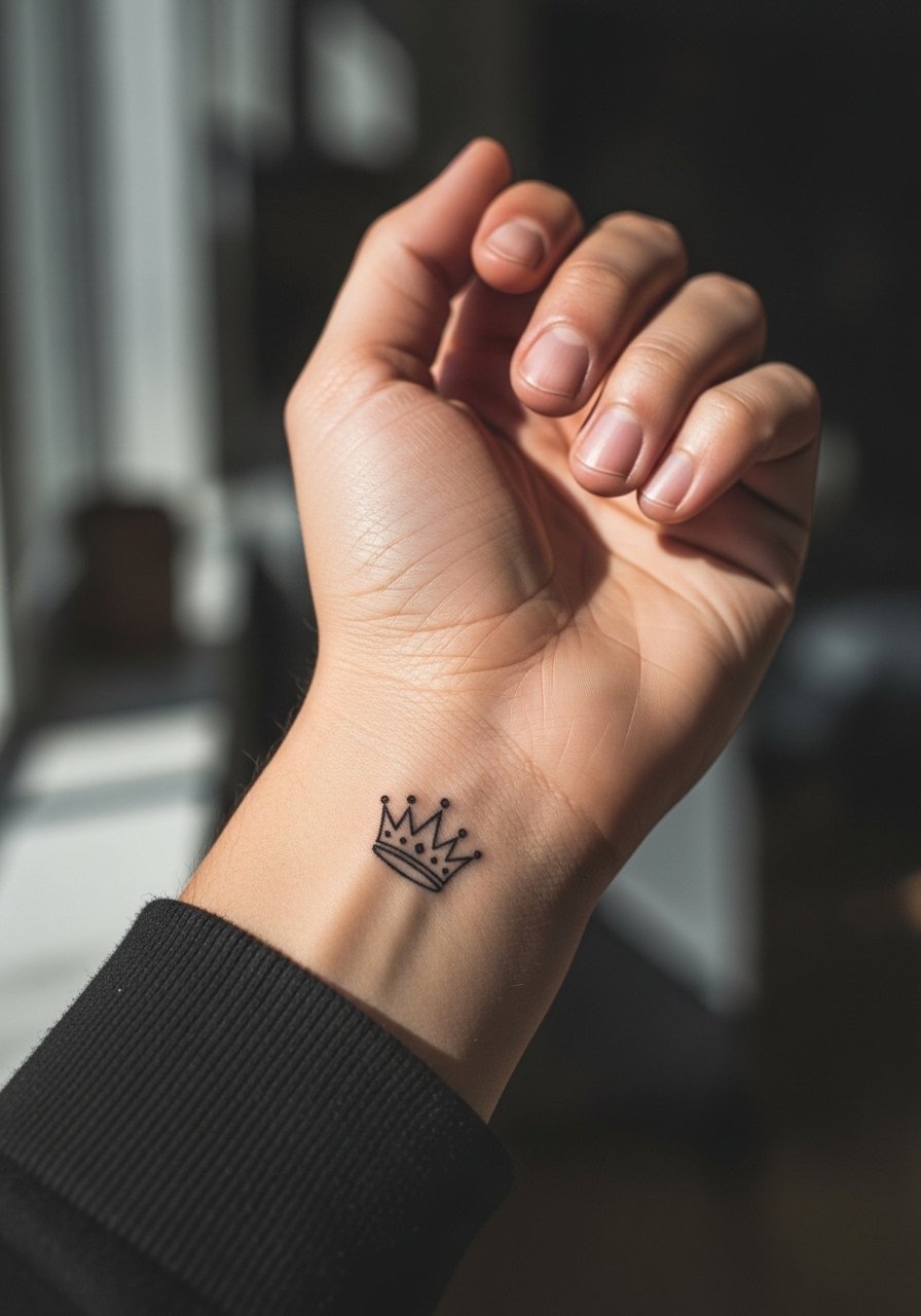
Wrist crowns are visible and speak to subtle fandom. The wrist is a high-motion area, so fine details can fade fast. The mistake is asking for a delicate crown with tiny gaps that fill in. Ask for a slight increase in line weight and plan on a touch-up around year two. For showing, stack with a minimalist watch or slim bracelet to balance attention. For the session, a sleeve you can roll or a short-sleeve top is best.
18. Map Coordinates in Roman Numerals on the Side Neck
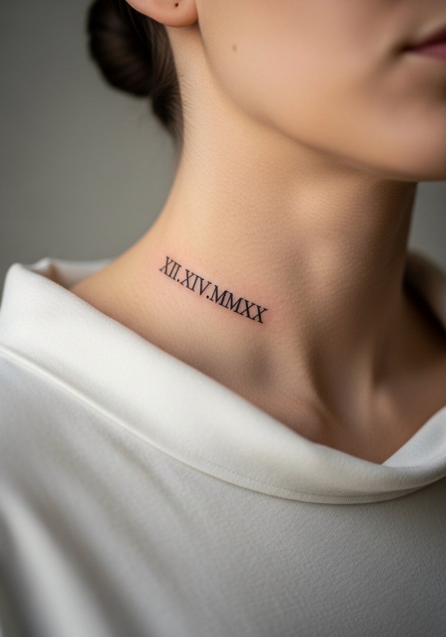
Neck script is bold and career-considerate depending on industry, so think placement and visibility carefully. The side neck sees a lot of motion and sun, and thin serif numerals can blur if too small. One common error is matching font size from print references without scaling for skin. For the session, wear a wide-neck shirt so the artist can work cleanly. When showing, high collars or scarves hide the piece if needed.
19. Tiny House Banner on the Shoulder Blade
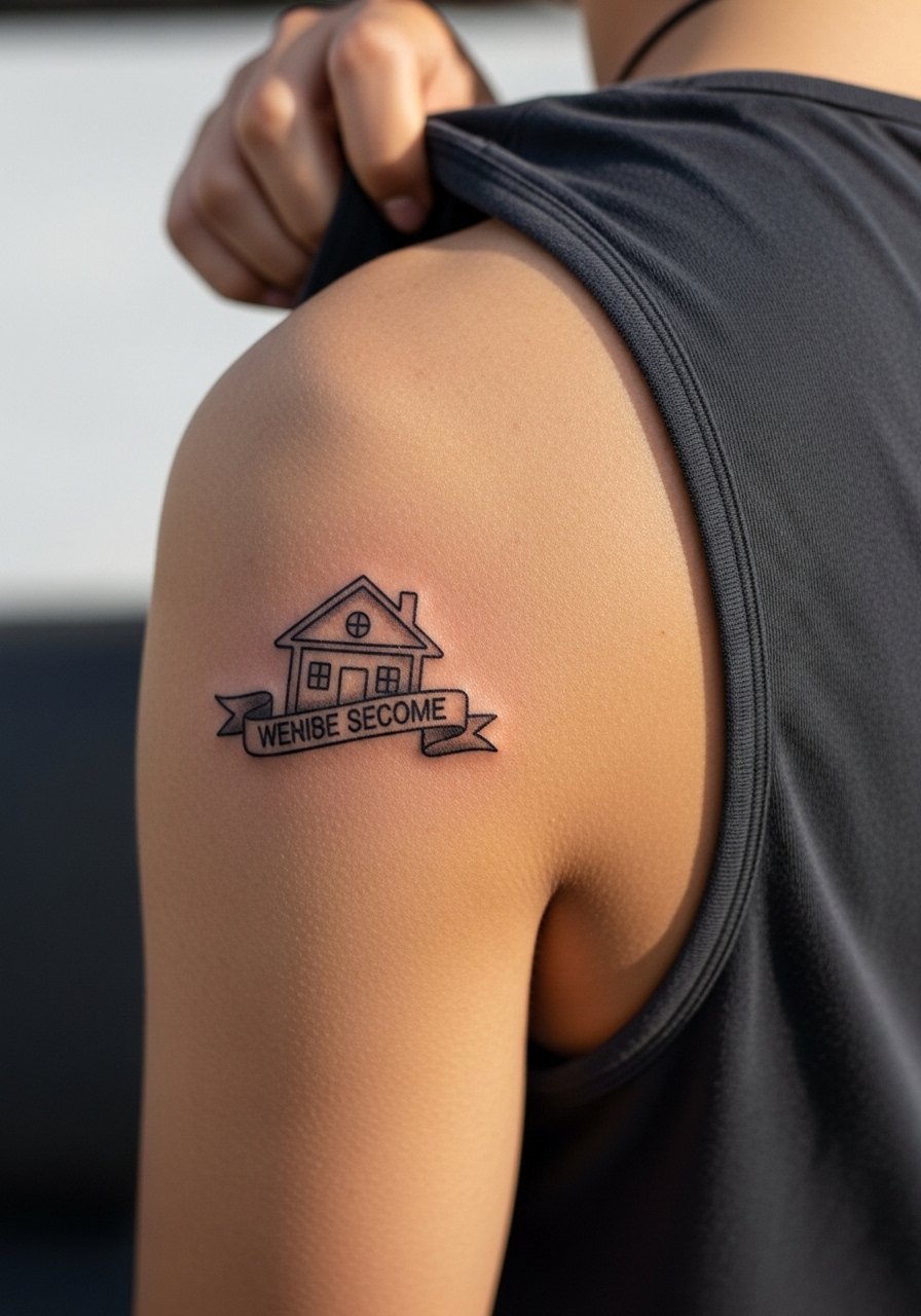
Shoulder blade placements move less and handle detail reasonably well for modest sizes. Banners with text need clear spacing so letters do not merge when the skin shifts. A common mistake is insisting on tiny script within the banner. The session is low to moderate pain. For showing, a tank or off-shoulder top draws attention without needing constant display. Consider larger negative space around the banner so it breathes across the blade.
20. Forearm Burning Sword in Black and Red
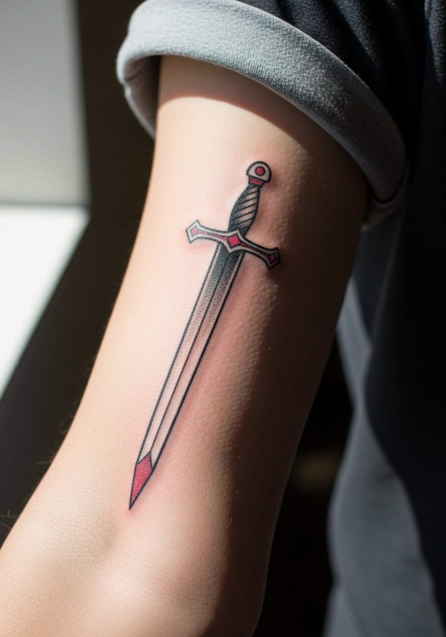
A sword motif reads well in vertical placements on the forearm. Using a limited color palette of black and muted red helps the piece remain readable as saturation softens. Expect the session to be a couple hours for clean color packing. The error is asking for neon or overly thin red lines that disappear. For showing, roll sleeves and pair with a minimalist watch so wrist accessories do not clutter the blade.
21. Small Dragon Scale Pattern on the Inner Wrist
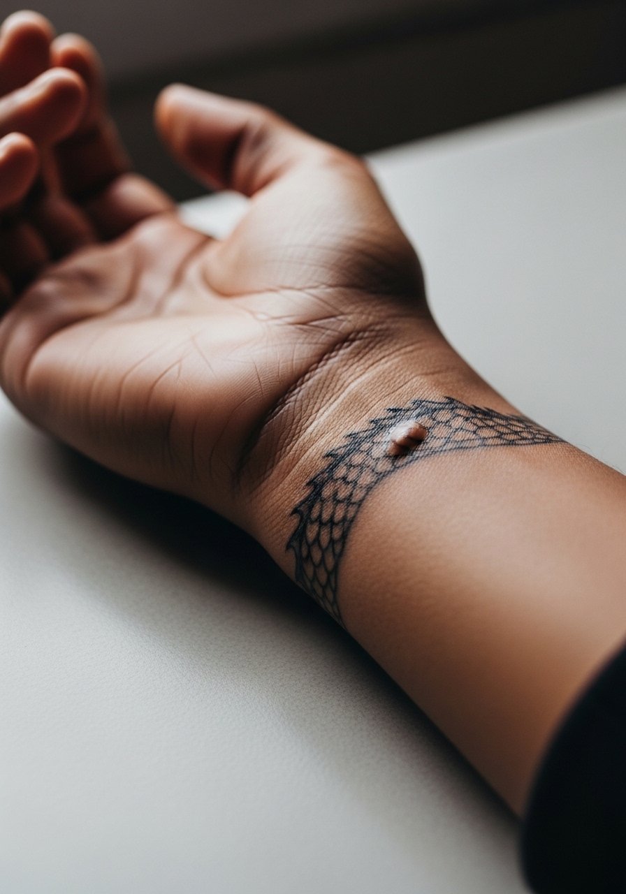
Inner wrist scale clusters are delicate and interact with veins and movement. The main pitfall is placing dense dot work over a high-motion crease where the pattern won’t hold. Ask for a slightly sparser layout with negative space between scales to keep the motif readable at one and three years. For the session, wear short sleeves or a sleeve you can roll easily. Keep in mind that wrist tattoos are visible in professional settings and plan placement accordingly.
Frequently Asked Questions
Q: Will fine line Game of Thrones tattoos blur faster than bold blackwork?
A: From what I have noticed, fine line tends to blur sooner simply because the lines are closer together and thinner. Bold blackwork and saturated color often age into a cleaner shape. If you want fine detail, ask for slightly heavier line weight and more spacing during consultation so the piece keeps its definition longer.
Q: Are script and phrases like High Valyrian risky on collarbone or ribs?
A: Script on the collarbone can hold if spacing and font weight are chosen with movement in mind. Ribs are a higher-risk spot for thin scripts because skin stretches with breathing. One practical approach is to pick a bolder font or increase letter spacing and plan for a touch-up at year two if clarity matters.
Q: How do I find an artist who understands Game of Thrones iconography without naming specific artists?
A: Use discovery routes like dedicated tattoo directories, convention portfolios, and subreddit threads. Search hashtags for style plus city, check shops that list micro-realism or blackwork in their portfolios, and browse convention lineups to find artists who post healed photos rather than just fresh work. Ask to see healed shots in your consultation.
Q: What should I wear to the studio for a sternum or ribcage tattoo session?
A: Wear a fitted sports bra, bandeau, or a cropped top you can lift so the artist has clean access without full exposure. This keeps the rest of your torso covered and reduces friction on the fresh tattoo during travel home.
Q: Do watercolor dragons need different upkeep than traditional black silhouettes?
A: Yes, watercolor textures usually need more UV vigilance and occasional touch-ups because the softer edges and lighter washes lose contrast faster. Anchoring watercolor with subtle linework at design points helps the image remain legible longer.
Q: Will small GoT finger or ring tattoos affect my job prospects?
A: It depends on your industry and workplace. Finger and visible wrist tattoos are still viewed differently across fields. If career visibility is a concern, place the design on the inner finger or wrist underside, or choose a smaller, more discreet placement that you can cover with sleeves or jewelry when needed.