
Fine line geometric work looks fragile in photos but it can read clean for years if you plan spacing, line weight, and placement from the start. Trends push ever-smaller details, and the gap between what looks good on a screen and what holds up on skin is wider than most people expect. Read on for concrete inner forearm geometric ideas, what to ask for in consultation, and which looks actually age well.
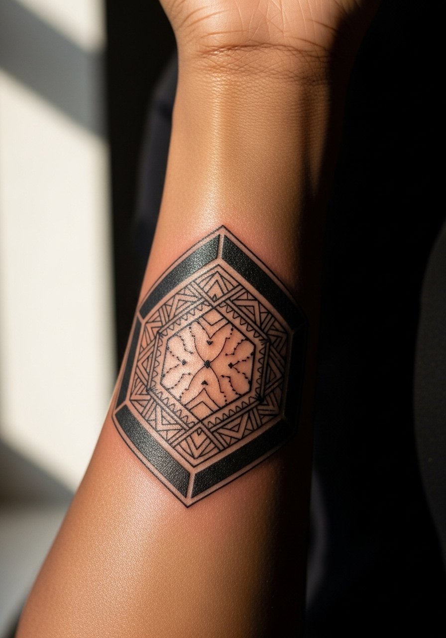
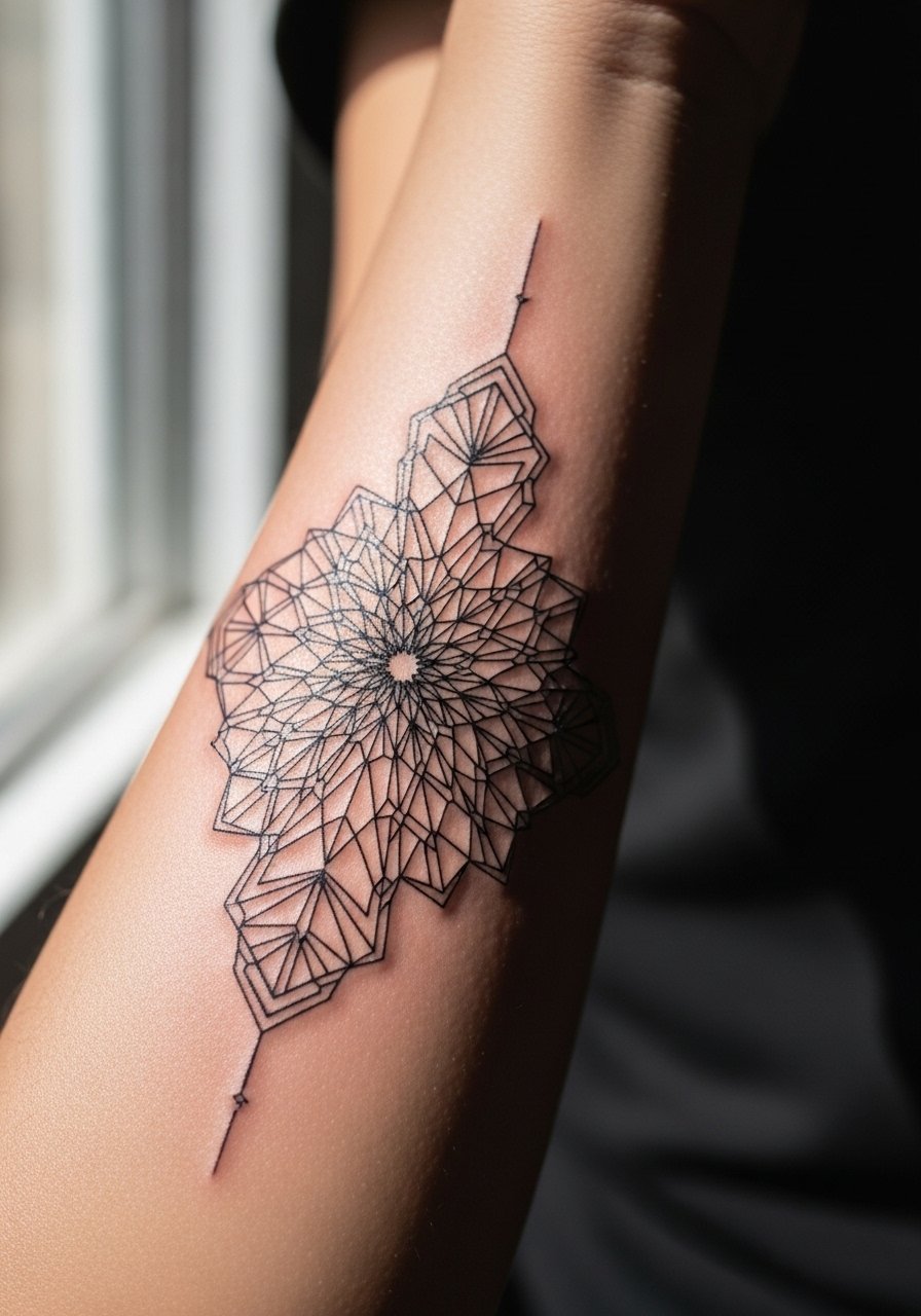
1. Micro Mandala Runner on Inner Forearm
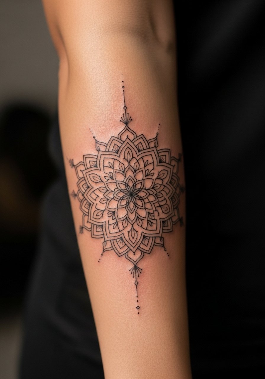
I recommend a micro mandala when you want dense geometry without turning into a blur, provided you give the design breathing room. Tell your artist to increase negative space between concentric rings and use slightly heavier outer linework so the rings read at arm's length. The common mistake is asking for maximum detail at a tiny scale, which often merges into a muddled patch by year two. Expect sharp contrast at six months, softer edges at two years, and a likely touch-up window around year three for tighter inner rings. For showing it off, roll sleeves and try a loose button-down shirt that frames the forearm without crowding the design.
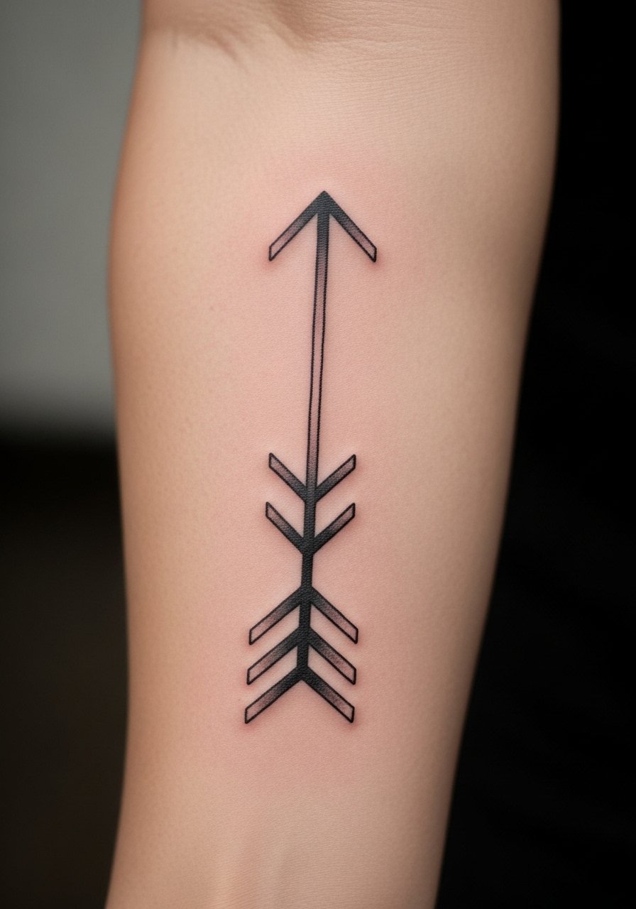
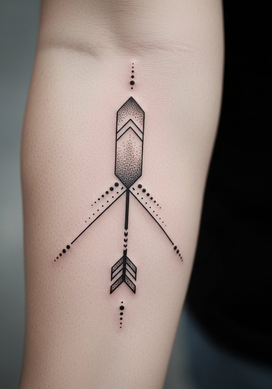
2. Single-Line Geometric Arrow
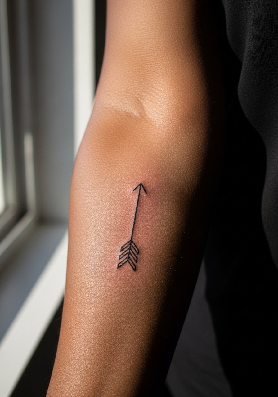
This pared-back arrow relies on confident linework more than heavy shading. I suggest asking for continuous linework with clean termination points and to avoid tiny crosshatching inside the shaft. Pain is mild to moderate on the inner forearm and most sessions finish in under an hour. The rookie error is asking for micro details along the shaft that age into speckled texture. At two years a simple arrow still reads well if touch-ups happen every three to five years. If you want a low-key way to show it off, pair the arm with a minimalist watch that sits a finger or two away so the tattoo breathes.
3. Stipple-Shaded Geometric Skull Panel
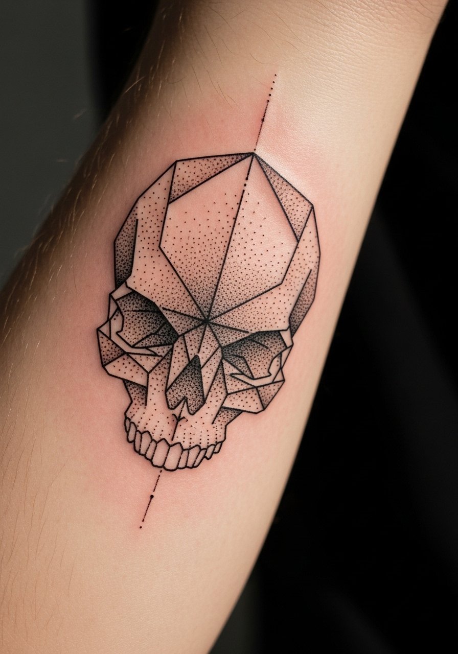
This version combines geometric framing with stipple shading for texture without heavy saturation. Tell your artist to favor dot work over saturated fill in midtones so the piece holds instead of turning into a flat grey block. The session feels like steady buzzing along the inner forearm with some tender spots near the wrist. Artists often debate whether stipple at close density lasts; one camp argues dot work spreads less than solid fill, the other says too-tight dots can merge under certain skin types. Name which camp your artist follows during consultation. Expect strong definition at six months and softening by year three that may need light touch-up to restore contrast.
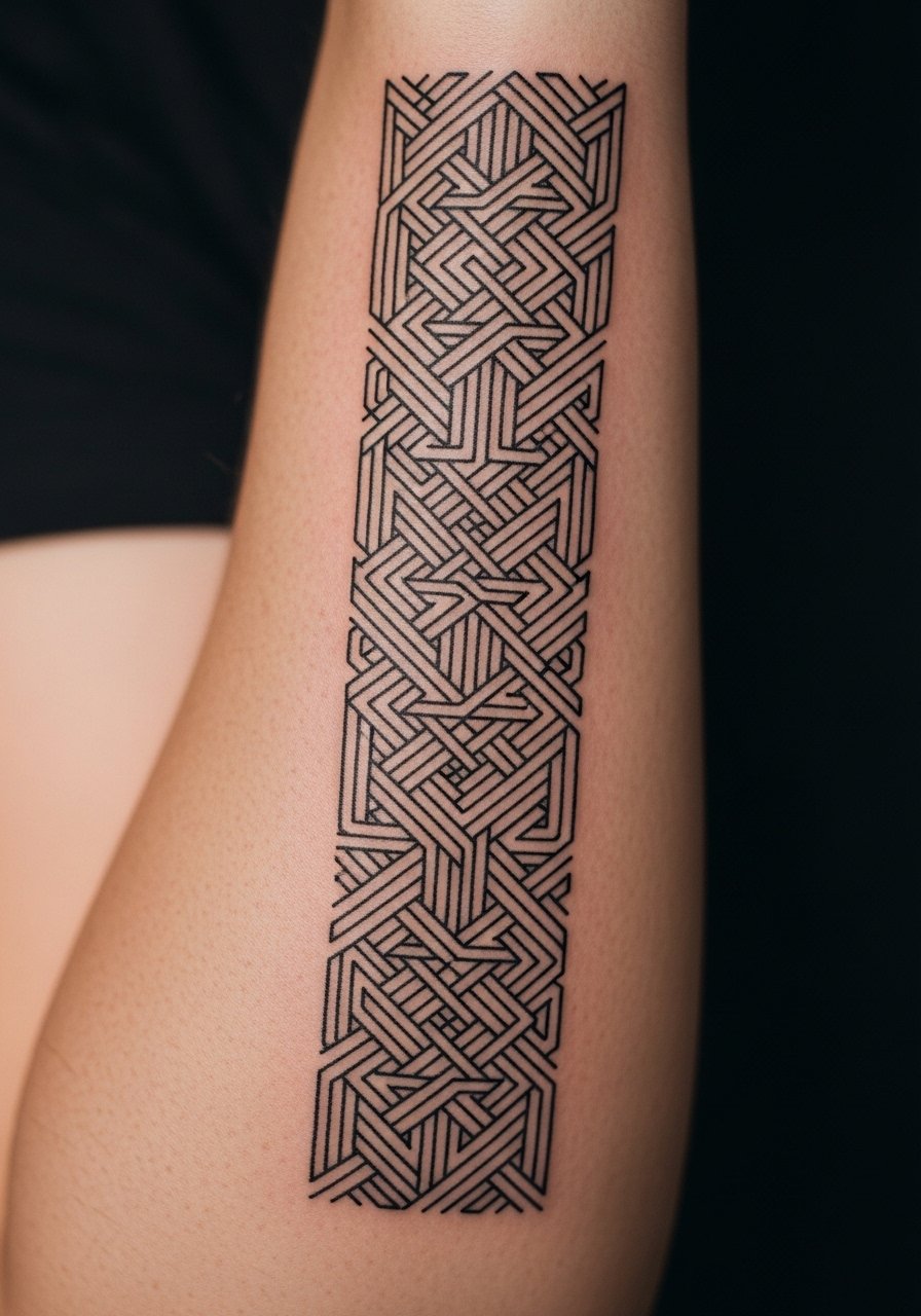
4. Interlocking Triangles Sleeve Accent
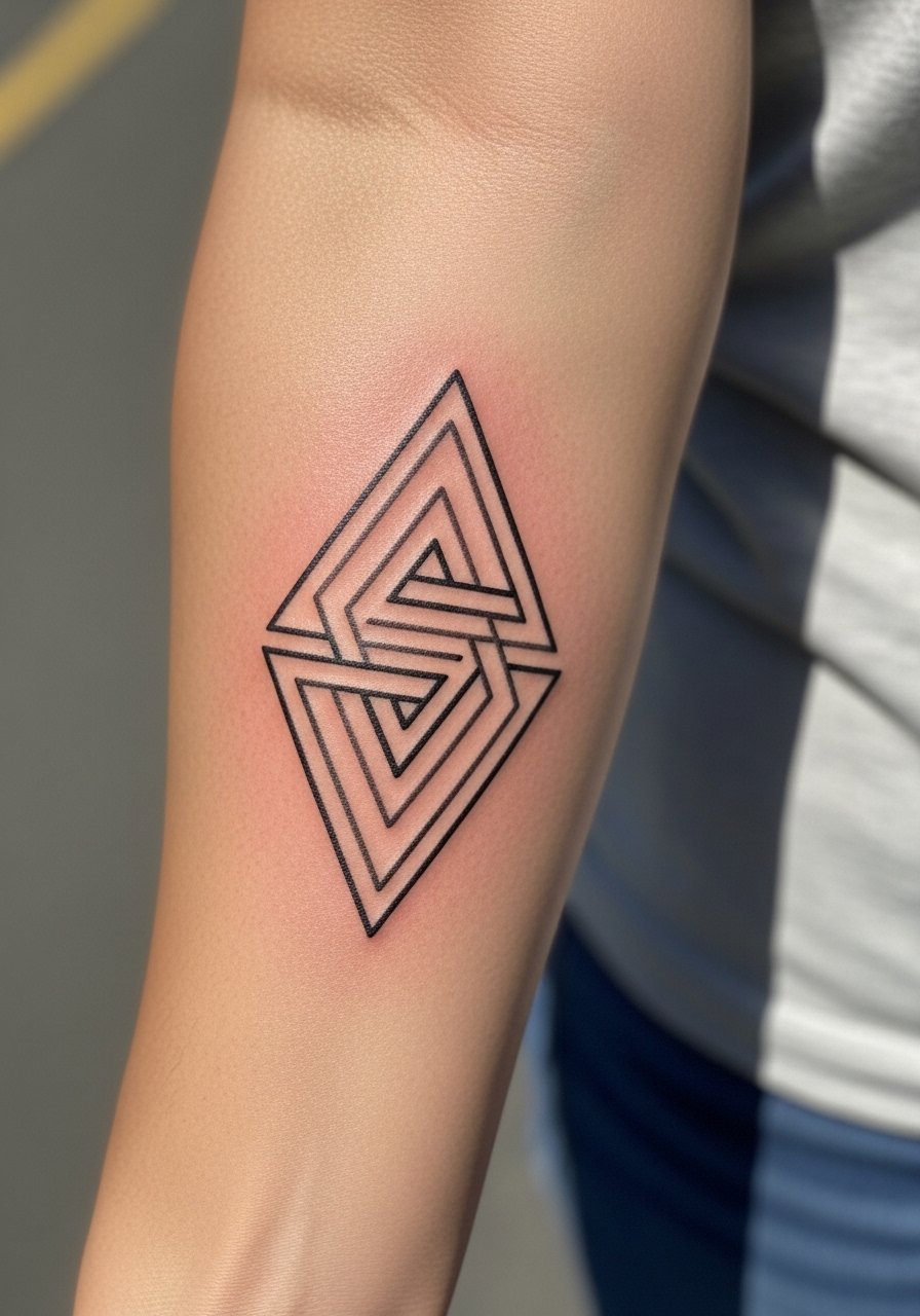
This vertical chain works when you want clean rhythm along the arm without committing to a full sleeve. Ask for alternating line weights so the pattern reads from a distance. The main mistake people make is shrinking the pattern too small to fit more repeats. Smaller repeats merge and create the appearance of a shaded band. Session time is usually two to three hours for a well-measured run. For the appointment, wear a short-sleeve linen shirt you can roll up easily so the artist has unobstructed access.
5. Constellation Grid with Negative Space
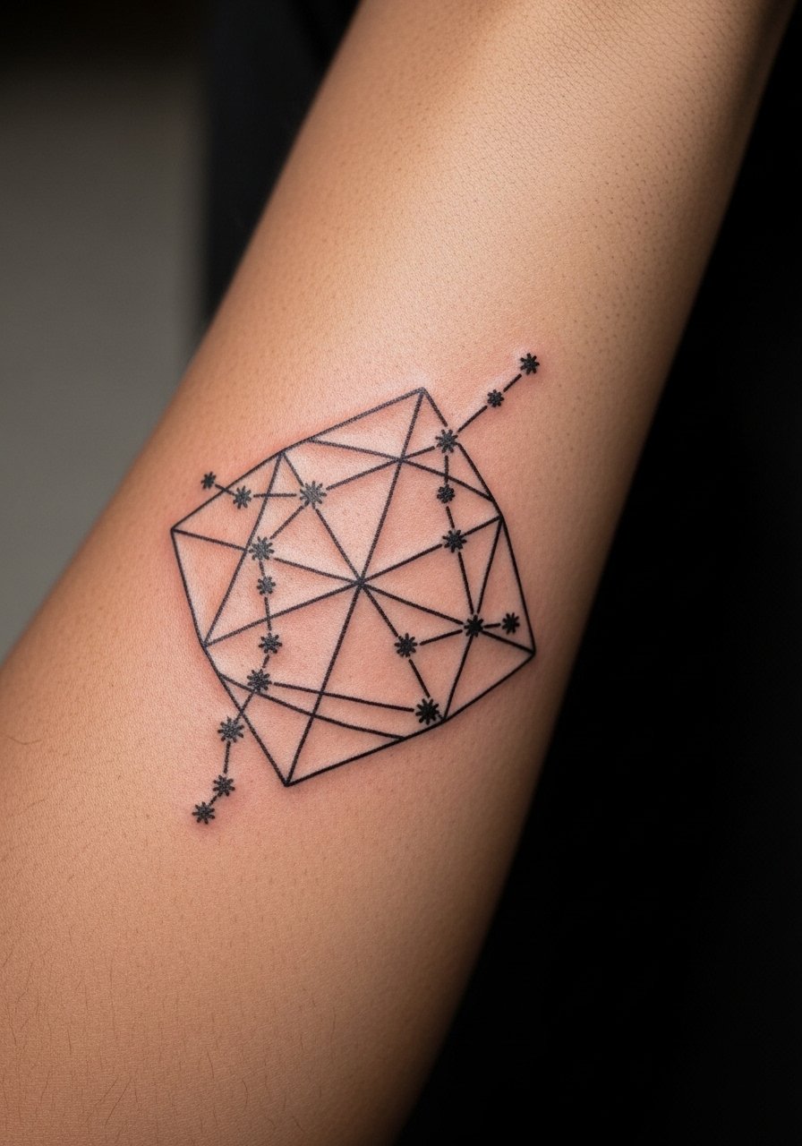
This grid looks clean because it uses skin as a compositional element rather than trying to ink everything. During consultation say you want intentional uninked corridors between nodes to prevent visual merging. A common aging problem is over-inking the connectors, which turns a delicate layout into a block. Expect crisp points at six months and slower softening because much of the design relies on contrast with untouched skin. For dressing up the look, a thin chain bracelet sits above the grid without covering the focal area.
6. Minimal Dot-Work Line Band
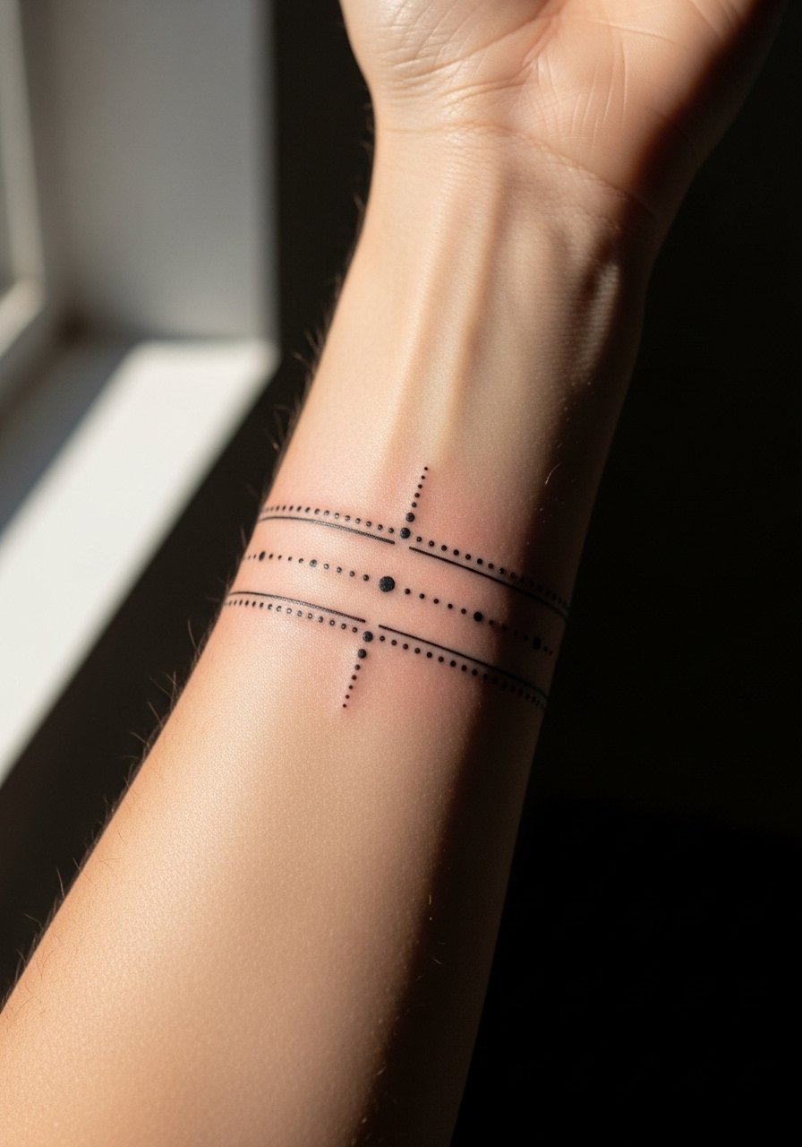
A dot-work band is subtle and low-saturation, and it ages better when the spacing between dots is deliberate. Tell the artist to map the band across the arm and check visibility at arm's length under normal light. The error I see most is asking for ultra-tight dot density to mimic shading, which often becomes a smudge. Expect the band to read clean for the first two years with potential soft edges after that and a simple touch-up restoring the dot clarity. Pair this with a canvas cuff bracelet when you want to show the repeat pattern.
Studio Day Picks
The inner forearm pieces above benefit from a few session-day items that make the experience smoother and protect fine line work afterward.
-
Stencil transfer paper kit. Lets you preview exact placement on the forearm before the needle touches skin, which is crucial for vertical and centered designs.
-
Topical numbing cream. Applied 45 minutes before reduces edge sensitivity around the wrist and inner elbow while keeping the artist working cleanly.
-
Thin protective film roll. Helps protect wrist and inner forearm tattoos from friction during the first few days when fine line is most vulnerable.
-
Fragrance-free gentle body wash. Cleanses the area without irritating delicate linework in the first week.
-
Aquaphor healing ointment. A thin layer in the initial days keeps moisture balance for tight needle channels without over-saturating the tattoo.
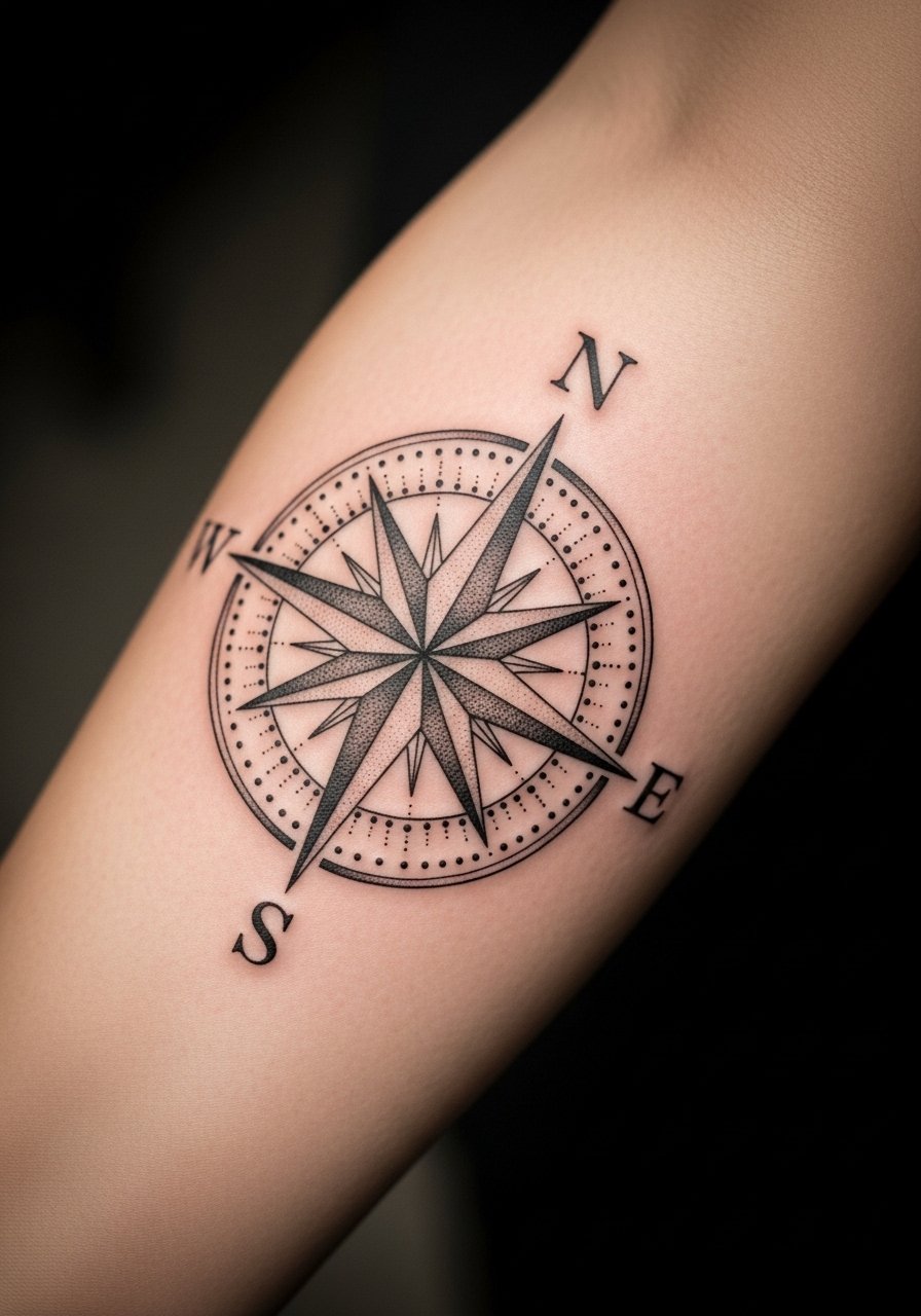
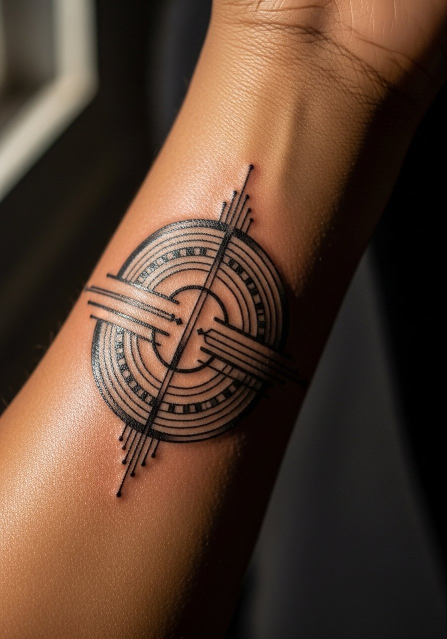
7. Linear Compass with Negative Space
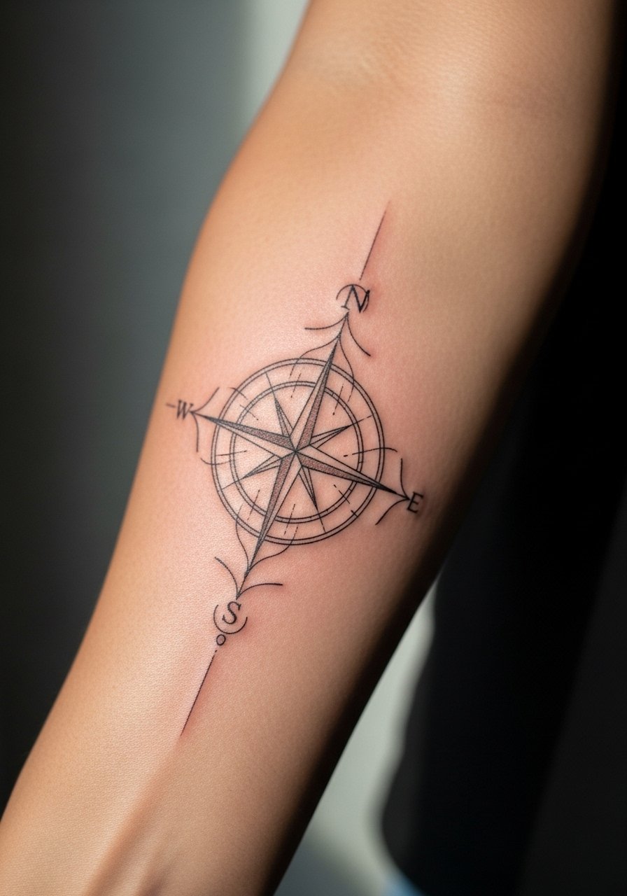
A compass design reads crisp when the points get slightly more weight than inner filigree. Ask for bold outer points and restrained inner geometry to avoid mid-area merge. The inner forearm is forgiving, but the section near the wrist carries more motion and friction from clothing. The session feels steady with a few sensitive minutes near the crease. Expect six-month clarity and slower softening into year three. For discovery of artists who specialize in precise linework, check regional directories and relevant hashtags rather than relying only on portfolios.
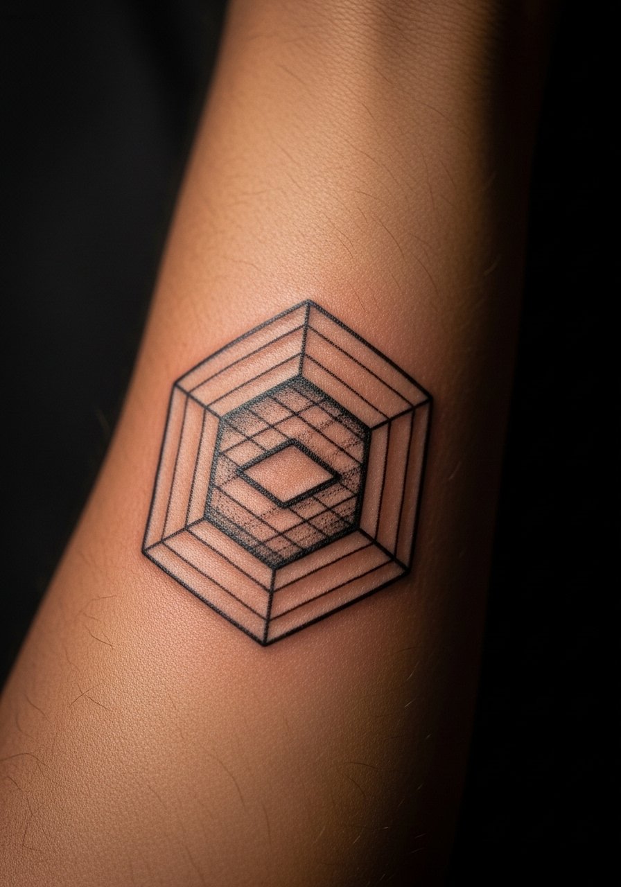
8. Hexagonal Honeycomb Panel
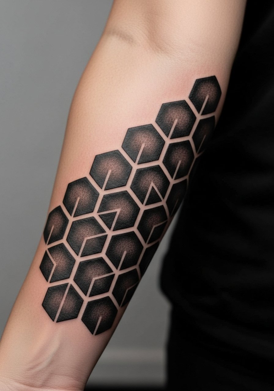
Hex patterns hinge on consistent angles and equal spacing. During consultation bring photos that show exact grid spacing and ask the artist to map it on your arm before inking. The frequent mistake is letting the grid twist with muscle contours, which warps symmetry as you move. At six months grid edges remain crisp, but uneven spacing can show by year two. For outfits that show this panel, try a rolled-sleeve chambray shirt that frames the forearm while keeping visual attention on the pattern.
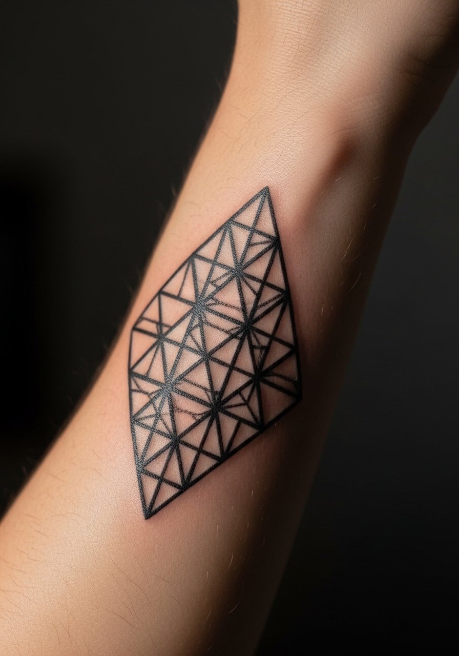
9. Optical Illusion Folded Cube
This cube relies on exact line intersections to sell depth. Tell your artist you want crisp termination points and avoid added shading that can flatten the illusion. The common aging issue is tiny line blur at intersections that collapses the three-dimensional effect. Plan for touch-up at year three if you want the illusion to remain sharp. The session often requires pauses for stencil checks because any slight rotation on the forearm affects perspective.
10. Arrowed Fibonacci Spiral
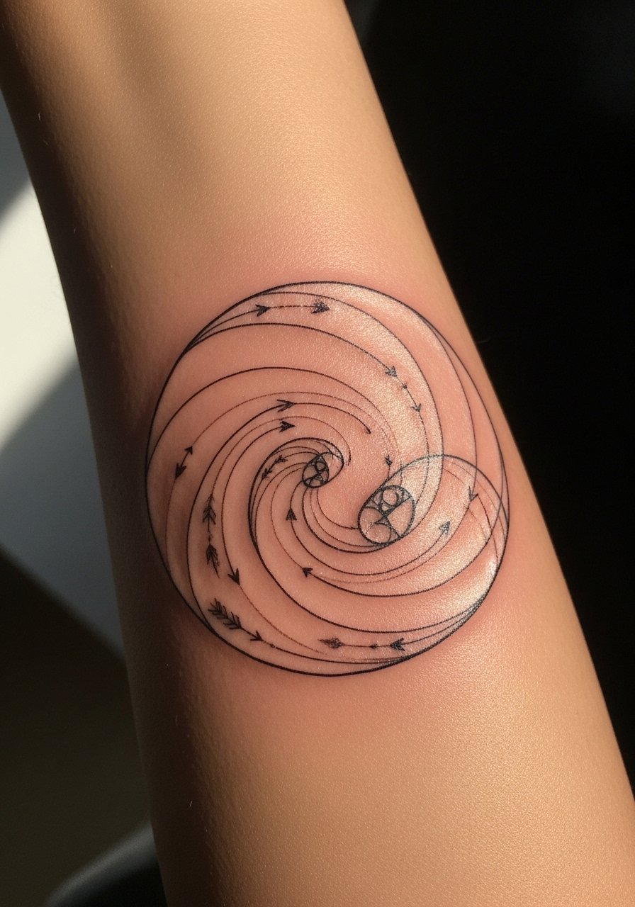
A spiral that nods to Fibonacci proportions reads organized rather than decorative when the spacing increases with each turn. Ask for increasing line weight toward the center to prevent inner compression. Many people try to cram too many turns into a small area, which causes the center to blur over time. At two years the outer coils keep shape while inner coils need touch-up. For pairing, a racerback tank during warmer months lets the forearm show without distraction.
11. Intersecting Circles Chain
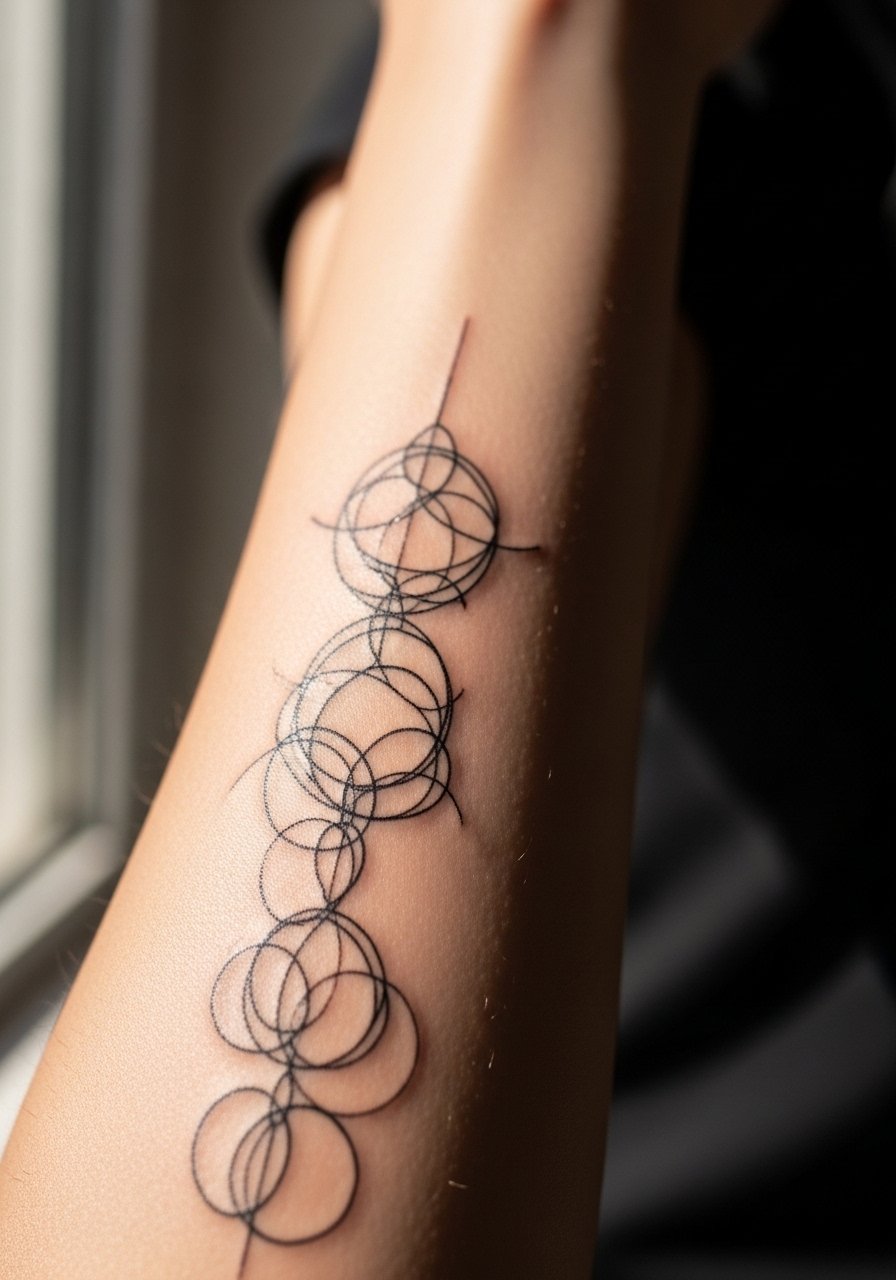
Intersecting circles create interesting negative spaces that mature well if scaled properly. Tell your artist to mark overlaps clearly on the stencil so you can confirm the rhythm. A common mistake is asking for micro overlaps which fade into indistinct blobs. Expect clean overlaps at six months and gradual softening by year three that can be corrected with careful touch-ups. The forearm's skin holds these shapes well because it is relatively flat compared to ribs or stomach.
12. Minimalist Sacred Geometry Panel
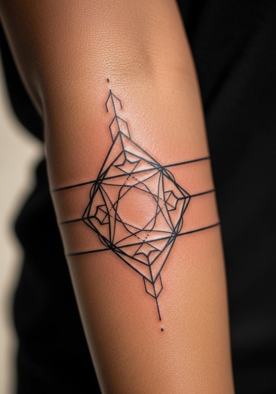
Sacred geometry can look busy quickly, so opt for a panel that leans on symmetry and negative space. During consultation request simplified nodes rather than ornate connectors. Artists are split on how much ornamentation keeps versus removes. One camp favors maximal detail and believes crisp technique preserves it. The other camp says simplify from the start to avoid early blur. Ask your artist which approach they prefer and why. For evenings out, wear a long-sleeve shirt with cuffs rolled to frame the top of the panel.
13. Geometric Script Integration
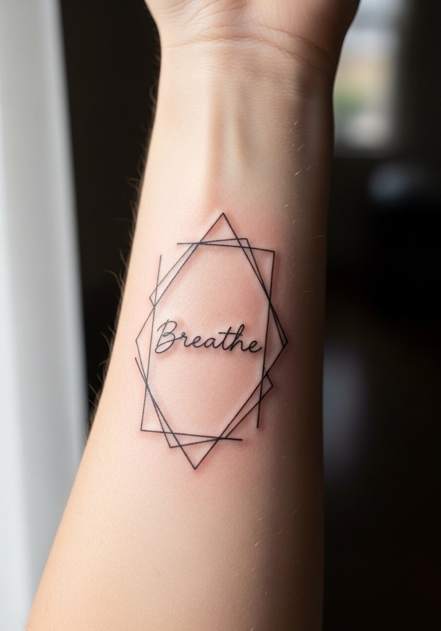
When text meets geometry, legibility is the priority. Specify the exact word and font during the stencil stage so the artist sets spacing for healing. Text works best when the surrounding geometry gives it breathing room. The mistake I see is shrinking letters to fit an ornate frame, which blurs first. Expect the script to remain readable longer than micro ornamental fills. For the session, avoid tight shirt collars and wear a loose crew-neck tee so the arm is easy to access.
14. Repeating Chevron Stack
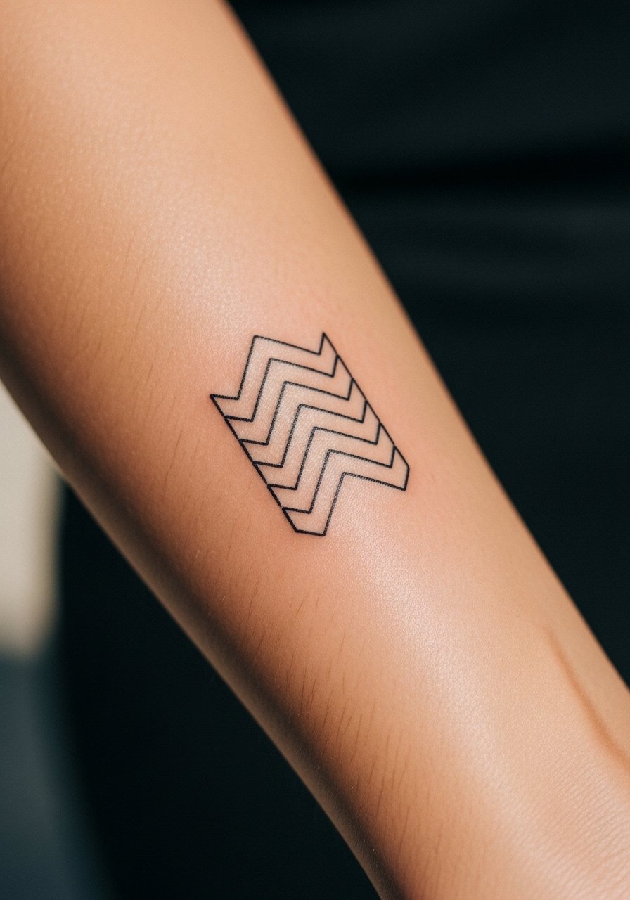
Chevrons are bold when spaced and measured. Ask your artist to stencil each peak across the arm and inspect symmetry standing and seated. A common mistake is letting the pattern drift toward the wrist where skin folds change the visual rhythm. The inner forearm tolerates this pattern well because it is relatively flat. Expect minor softening in the creased areas and plan a touch-up around the three to five year mark. For a casual look try pairing with a woven leather bracelet.
15. Geometric Rose with Linework Backdrop
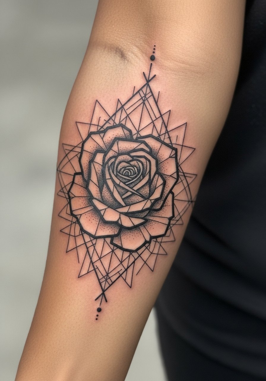
This combines botanical form and geometry, which works when the petals are simplified into planes. During consultation ask the artist to map where organic curves meet straight edges so the composition reads clean. The biggest error is over-detailing petals inside a small frame, which ages into a patch. Expect a strong silhouette at six months and softened interior lines at year two. When you want a cleaner presentation, cuff sleeves or a rolled-up denim jacket keep attention on the angular petals.
16. Micro Hexagram Cluster
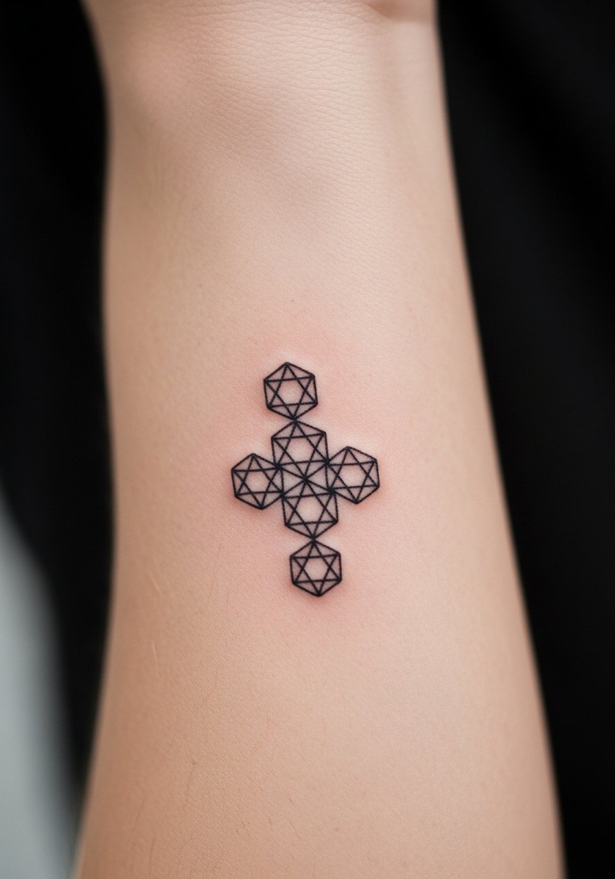
Micro symbols read clean when each glyph is allowed space. Tell the artist to increase spacing between symbols rather than squeeze more into the same patch. The common mistake is packing for density, which creates an indistinct field after a few years. The session is short but meticulous. Expect crisp points at six months and gradual softening where skin flexes. For daily wear, a thin leather band watch keeps accessory weight off the symbol area.
17. Negative Space Arrow Grid
Using skin as part of the design is a longevity trick. Ask the artist to mark exact uninked corridors on the stencil so spacing is confirmed. The mistake is filling those corridors in with micro fillers, which destroys the intended lightness. This layout tends to age slowly since it uses less saturation. Expect the negative channels to maintain the design's clarity longer if you avoid heavy sun exposure. For showing it off, wear a rolled short-sleeve shirt that reveals the grid cleanly.
18. Geometric Wave Band
A wave band that follows natural arm curvature looks deliberate when the artist maps the path over a range of motion. Tell them to test the stencil while you flex so the rhythm stays consistent when you move. The error people make is assuming a straight grid will sit well over muscle movement. Expect steady visual flow at six months and slight softening at points where the arm bends frequently. Pair it with a short sleeve v-neck shirt that keeps the band visible.
19. Layered Triangle Mesh
Layered meshes need hierarchical line weights so foreground triangles read over background ones. Ask for a plan that designates three weight levels from the start. The common aging problem is equal weight across layers, which flattens the depth. Sessions can run longer to nail line consistency. Expect defined layers at six months and blending of midtones by year three. For a clean evening look, roll sleeves and let the mesh peek out from under a fitted blazer sleeve.
20. Compass Rose with Dot Anchors
Dot anchors give breathing points that age more gracefully than dense fills. Tell the artist you want dot clusters at cardinal points and lighter connections between them. The mistake is over-concentrating dots near the center, which can spread. Expect a clean look at six months and more blended dots by year three, with touch-ups restoring crisp anchors. For travel-ready style try a thin passport leather wrist strap that complements the compass without covering it.
21. Symmetrical Polygon Block
A polygon block needs strong outer lines to survive years of wear. Ask for heavier perimeter lines and restrained inner filigree. The common error is matching inner detail weight to the perimeter, which causes the interior to vanish first. Expect a bold silhouette at six months and internal softening by year three. The inner forearm's flat surface helps maintain symmetry compared to curved areas.
22. Tessellated Linework Strip
Tessellations read best with consistent spacing and matched node angles. During consultation have the artist draw the repeat in ink on the arm so you can check alignment. The error is tiny misalignments that become obvious as the pattern repeats. Expect clean repeats at six months and subtle drift in spots where the arm flexes. For a simple show-off option pair the strip with a classic white short sleeve tee.
23. Geometric Arrow Sleeve Accent with Stippling
Combining arrow geometry with stipple fills increases texture without heavy saturation. Ask for stipple density notes on the stencil so dots are spaced to avoid early merge. A common mistake is asking for dense stippling near folds, which blurs there first. Sessions are a bit longer due to dot work. Expect clear texture at six months and gentle softening by year three. For an accessory that complements this texture try a woven fabric cuff.
24. Concentric Ring Stack with Spacer Lines
Spacer lines are the unsung heroes for concentric work because they prevent ring collapse. Tell your artist you want consistent spacer widths and slightly heavier outer rings. The mistake is minimizing spacers to fit more rings, which accelerates merging. Expect a tidy look at six months and gradual soft blending across rings by year three. For a tidy presentation, cuff sleeves or a lightweight knit sweater keep the arm framed.
25. Minimal Polygonal Animal Silhouette
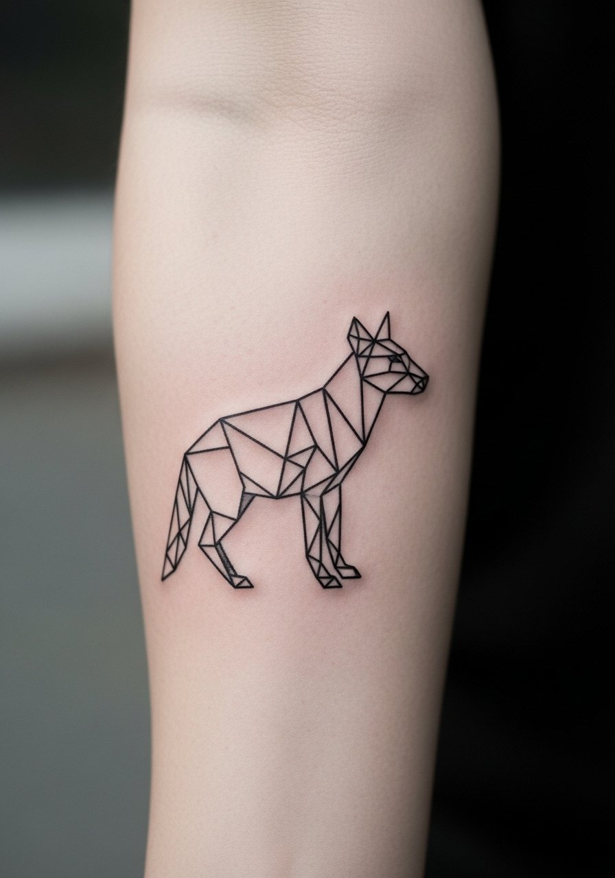
Turning an animal into polygon planes reads modern and holds better than micro realism at a small scale. During the stencil stage confirm the silhouette's negative spaces and ask the artist to avoid tiny interior facets. The common mistake is requesting too many facets inside the silhouette, which fades into a grey patch. Expect clear planes at six months and softened interior edges by year three. For showing it off, a short-sleeve henley frames the forearm without covering the piece.
26. Fractal Line Cascade
Fractals depend on predictable scaling. Ask the artist to test the cascade at multiple distances to ensure it reads as intended both close up and at arm's length. The usual error is compressing the cascade too small. Sessions can be detail-heavy because each repeat must be precise. Expect vibrant structure at six months and gradual soft focus by year three that benefits from a micro touch-up.
27. Symmetric Bar and Dot Composition
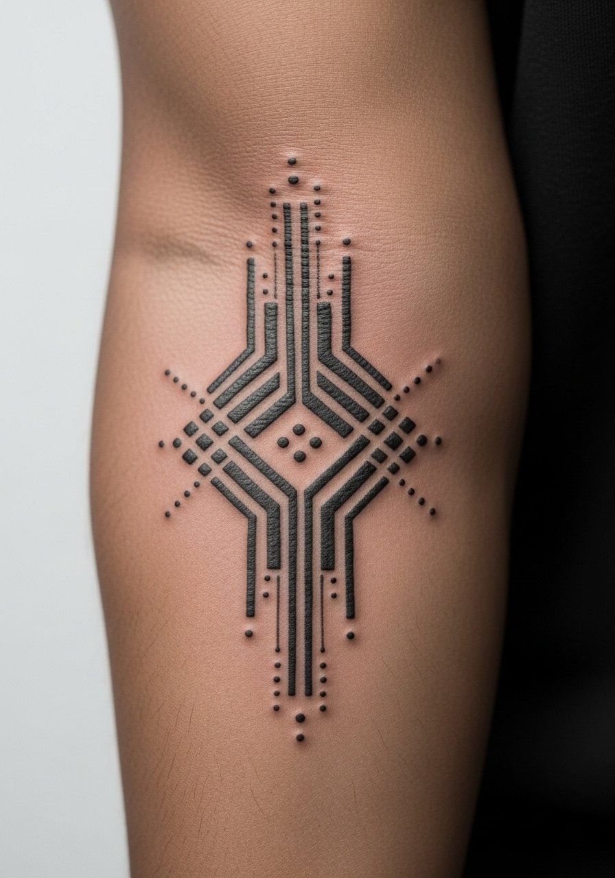
A bar-and-dot layout is deceptively simple and durable when spacing is respected. Tell the artist you want the bars slightly thicker than the dots so the elements do not compete. The common aging problem is equal width across elements which makes dots vanish into the bars. Expect stable readability at six months and potential softening of dots by year three. For a subtle accessory pairing, a thin silver band bracelet sits above the composition without distracting from it.
Frequently Asked Questions
Q: How small can a geometric inner forearm tattoo be before it starts to blur?
A: In my experience you want at least a few millimeters between the tightest lines so the ink has room to settle. If the design packs micro details inside a one-inch circle it will likely need touch-ups sooner. Ask your artist for a scaled stencil and view it from arm's length before the needle starts.
Q: Do fine line geometric tattoos need different aftercare than bolder blackwork?
A: They need gentler first-week handling because fine channels close faster and can trap scabbing. Use a light touch when washing and avoid friction from tight sleeves. The healing timeline is similar but the risk of early loss is higher for ultra-fine work. For clothing that minimizes rubbing try a loose button-down shirt in the first week.
Q: Will a geometric design on the inner forearm show blowout more than one on the outer forearm?
A: The inner forearm is relatively flat and usually shows less blowout than high-movement or thin-skinned areas, but skin type matters. If you have very thin or elastic skin the risk increases. Talk to the artist about needle depth and request test strokes on similar skin during consultation.
Q: When should I expect to need a touch-up for these styles?
A: From what I've seen, simple geometric work often needs a light touch-up around year three to restore lost contrast. More complex micro details can require attention as early as year two. Plan touch-ups based on how often your arm sees sun and friction.
Q: How do I find an artist who understands geometric placement and spacing?
A: Search local directories and relevant hashtags, and spend time in tattoo forums comparing healed photos rather than just fresh shots. Look for healed portfolio images and mention you want stencil previews and spacing mock-ups during consultation. Trust your artist only after you see multiple healed examples of the exact style you want.