
Fine line Japanese words look delicate on the thigh, and the way they age surprises people who only see fresh photos. What trends the saved boards push and what actually lasts are often two different things. These 17 Japanese words work on the thigh when sized and spaced with longevity in mind, and the notes below tell you what to ask for at the consult.
1. Ikigai (生き甲斐) on Upper Inner Thigh

I've seen ikigai tattooed small and centered on the inner thigh and it can feel private and steady. Fair warning, inner thigh skin moves and stretches, so keep the characters slightly larger than you think to avoid blurring by year three. In consultation ask for moderate line weight and a touch-up plan at year two. Session feel is on the tender side, expect a firm but manageable discomfort and bring loose shorts like a loose drawstring linen short so the artist can access the area without crowding.
2. Mono no Aware (物の哀れ) along the Thigh Side

This phrase about gentle sorrow reads poetic across the thigh. The common mistake is going too compact with the kanji, which makes the strokes merge as the skin settles. Ask your artist to expand spacing between characters and to use deliberate linework rather than feathered strokes. At six months the edges will soften slightly, and at two years expect moderate softening. For showing it off, pair with an open-back midi skirt that lets the side placement peek without overexposure.
3. Wabi-Sabi (侘寂) on Upper Thigh Near Hip
People pick wabi-sabi for its nod to imperfect beauty. Controversy exists around using Japanese philosophical terms on other bodies. One camp sees cultural appreciation, the other warns against casual appropriation. If you choose this word, mention in the consult that you want the characters rendered respectfully and not stylized into another script. Expect the hip area to be less prone to blowout than inner thigh, but still plan for a touch-up at year three if you want crisp edges.
4. Yūgen (幽玄) in Flowing Script Mid-Thigh

There is something about yūgen that reads like a private sentence when placed diagonally. The visual impact comes from airy spacing and careful stroke endings. The mistake is using hairline strokes that vanish by year two. Tell the artist you want a slightly heavier line on key strokes and ask for reference shots showing healed kanji. For the session, wear a loose drawstring pant you can roll up easily so pressure on the area is minimal.
5. Kokoro (心) centered on the Thigh
A single-character kokoro reads compact and strong on the thigh. The common error is choosing too thin a stroke for such a bold concept. For longevity ask for balanced saturation in the main strokes and avoid tiny decorative flares. Touch-ups are often needed at year two for single-character pieces if lines were kept too delicate. This placement can pair with a thin chain anklet for a subtle jewelry accent when wearing swimwear or shorts.
6. Kintsugi (金継ぎ) curved along the Hip Bone
Kintsugi as a word carries the visual metaphor of repair and gold. The mistake is trying to illustrate the technique with tiny decorative flecks inside characters. Keep the kanji clean and let the design symbolize rather than mimic pottery. Rib and hip movement means lines need room. Ask for slightly wider character spacing and plan a touch-up check after six months. For the session, wear something easy to adjust like a bikini bottom with ties so the artist can access the hip without full exposure.
Studio Day Picks
These upper thigh and hip placements above need little prep but different support than arm work, so a couple of items smooth the session and early healing.
- Stencil transfer paper kit. Lets you preview spacing on the curved thigh surface so the characters sit naturally with movement.
- Topical numbing cream. Helpful for the inner thigh or long sessions that hit multiple kanji without changing ink characteristics.
- Thin protective film roll. Keeps thigh pieces cleaner during the first days when clothing rubs the area.
- Fragrance-free body wash. Gentle wash reduces irritation around delicate strokes during showers.
- Aquaphor healing ointment. A thin layer in the first 48 hours helps protect fine line kanji without suffocating the skin.
7. Gaman (我慢) low on the Thigh Near Knee
Gaman, endurance, reads grit when placed low and visible. The lower thigh sees more abrasion from clothing and movement, so expect some early scabbing in that friction zone. Ask the artist to keep characters slightly inset from areas where jeans or seams will rub. A common mistake is placing kanji too close to the knee crease where stretching changes line shape. Session pain is moderate and brief since muscles cushion the area. Plan for a touch-up at year two if you wear tight pants often.
8. Omoiyari (思いやり) flowing along Inner Upper Thigh
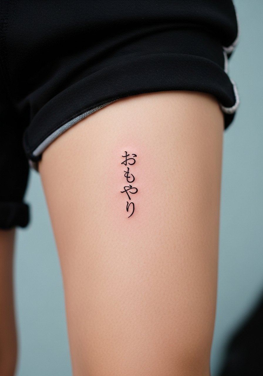
This empathy word feels intimate when inked on the inner thigh. The inner thigh skin is softer and more prone to blur, so the best version uses moderate line weight and open spacing. In consult say you want the script legible from a short distance and ask to see healed examples. For the session wear loose drawstring shorts so the artist can move the fabric without stretching the skin. Remember that placements with private meaning can still spark conversation about cultural use, so choose intentionally.
9. Seishin (精神) vertical on the Outer Thigh

Seishin reads like a steady column of intent. The visual impact depends on stroke contrast. A common version that ages poorly uses ultra-fine lines which can fade into smudged strokes. Ask for balanced saturation and for the artist to demonstrate how the kanji settle on healed skin. Outer thigh is forgiving for heavier strokes but still benefits from a touch-up at year three if you prefer razor-sharp edges. The session is comfortable compared with inner thigh work.
10. Heiwa (平和) across the Upper Thigh

Heiwa, peace, translates cleanly into a horizontal band on the thigh. Mistake to avoid is compressing the characters into a narrow strip that makes each stroke compete. In consult ask for even spacing and for the letters to breathe. At six months colors and edges settle, and at two years thin strokes may need reinforcement. For showing this off, a high-waisted bikini or a skirt with a high slit frames the wording without overexposure.
11. Nukumori (温もり) tucked near the Hip Crease

Nukumori, warmth, feels cozy when inked near the hip crease. That zone shifts with movement, and the most common mistake is placing thin strokes directly on a crease. Ask for the artist to map the characters on the body while you move so the placement reads correctly during different poses. Touch-ups at year two are common if the initial work hugged the crease too closely. Session wear should be loose and adjustable, like a wrap skirt you can shift to expose only the area needed.
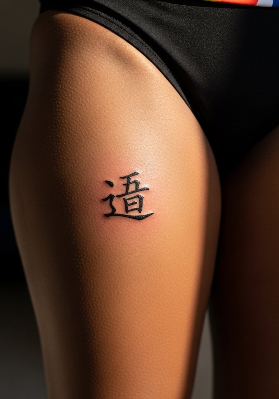
12. Hakanai (儚い) vertical mid-thigh

Hakanai, ephemeral, reads fragile which is part of its appeal. The pitfall is making the strokes so thin that the word disappears after a couple of years. Tell your artist you want the sense of delicacy but with durable linework. Expect the edges to soften by year two and to need a gentle touch-up if you want the same initial crispness. The placement pairs well with a racerback tank when layering looks that reveal the thigh at certain angles.
13. Shinrai (信頼) slanted across the Thigh

Shinrai, trust, carries a linear authority that works when slanted with muscle lines. The visual impact relies on consistent stroke weight. A mistake I see is uneven application where some strokes are dense and others barely visible. Ask for even saturation and for a healed photo example from the artist. Slanted placements can hide well under jeans but show with skirts. For the session wear a loose button-down shirt so you can pull aside fabric easily without tugging at the thigh.
14. Tsuki (月) crescent beside the Word

Tsuki, moon, combined with a tiny crescent reads like a quiet emblem. Small additions can age poorly if placed directly on high-friction spots. Ask for placement slightly away from clothing seams to reduce abrasion. The session is quick and low-pain, and touch-ups are usually only needed if the moon detail is extremely fine. For evenings out pair the piece with an open-back midi dress so the subtle symbol shows without shouting.
15. Namida (涙) tucked along the Inner Thigh Fold

Namida, tears, feels private and contemplative on the inner thigh. The inner thigh demands a slightly heavier hand to avoid the kanji bleeding into a spotty line. Tell your artist you want readable strokes even after settling. This placement is the most sensitive for pain and needs breaks if the session runs long. If your wardrobe includes tight pants, expect some early irritation from seams. Consider a loose pair of linen pants to keep the area breathing during the first week.
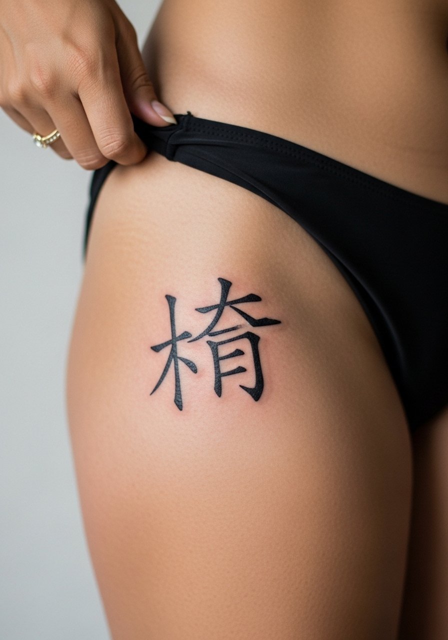
16. Koi (恋) bold on the Side Thigh
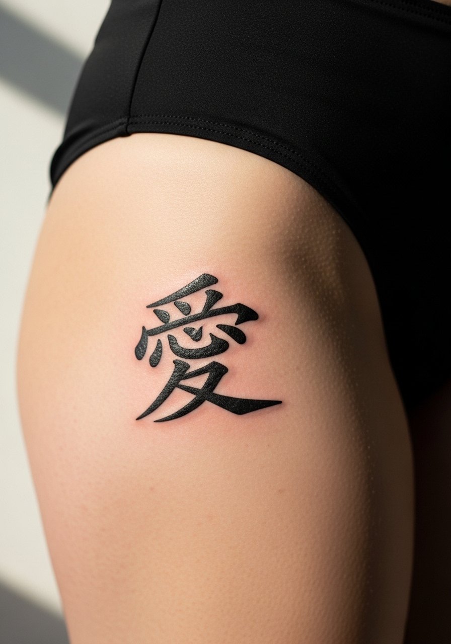
Koi, deep love, reads emphatic when rendered as a single stronger kanji. The error is using too much decorative shading around the character which can date the piece. I recommend clean outline and subtle saturation so the kanji remains distinct. Side thigh sees less constant friction than lower zones, so it tends to age well with only occasional touch-ups. For showing it off at the beach, a high-cut swimsuit bottom frames the placement without overexposure.
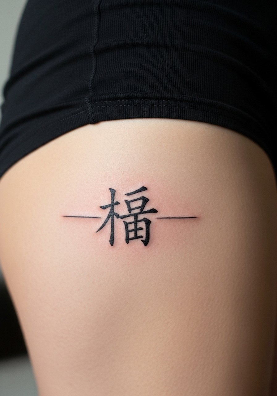
17. Sakura (桜) small cluster near the Upper Thigh

Sakura as a word and small motif taps into seasonal imagery. If you want the floral element, avoid tiny petals inside the kanji that will merge over time. Request distinct separation between the character and floral dots so each element heals cleanly. Upper thigh placement balances visibility and longevity, with touch-ups usually only required if the petal accents were near-seam thin. Be mindful of cultural resonance and choose a design that honors the imagery rather than mimics iconography without context.
Frequently Asked Questions
Q: Will kanji on the thigh blur faster than on the forearm?
A: It depends on placement and line weight. Thigh skin is thicker and often handles moderate line weight well, but inner thigh movement and friction can speed softening. Ask for slightly heavier strokes and a follow-up touch-up plan to keep characters legible.
Q: How big should Japanese characters be on the thigh to age well?
A: For the thigh, each character usually benefits from a little extra breathing room. Tiny kanji that look delicate fresh can lose definition in two to three years. During the consult mention you want longevity and ask to see healed kanji photos at comparable sizes.
Q: Are there cultural concerns with getting Japanese words as tattoos?
A: Yes. Two camps often appear. One views it as appreciation and meaningful use. The other cautions against casual appropriation or using religious phrases without context. A respectful approach is to research meaning, keep designs accurate, and be ready to explain the choice if asked.
Q: What should I wear to a thigh tattoo session for comfort and access?
A: Wear loose, adjustable clothing so the artist can expose only the area being worked on. I recommend something like a high-waisted denim short or loose drawstring short that you can shift without stretching the skin. Comfortable, easy-to-remove layers make long sessions simpler.
Q: How soon after a thigh tattoo can I return to activities like running or cycling?
A: Gentle movement is fine once scabs have formed and the area no longer bleeds, but high-friction activities that rub the tattoo should be avoided for at least two weeks. Listen to your body and keep garments loose. If you notice increased irritation, pause and let the area calm before resuming intense workouts.