
Fine line henna sketches are everywhere right now, but the trend versus reality matters. The designs that still read crisp after a week are usually the ones that account for skin type, daily friction, and the natural oils on the palm. These hand-focused sketches look effortless when planned, and a quick consultation note about placement and paste quality changes everything. Start with small experiments and the first idea below shows an easy spot to test the look.
1. Single-Line Dainty Finger Doodle
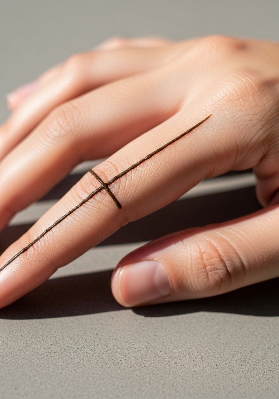
This single-line doodle reads like a minimalist sketch and is ideal for someone trying henna for the first time. Fair warning, fingers see a lot of washing and friction so expect the darkest stain in the first 3–5 days and significant fade by week two. Tell your artist you want the line slightly thicker than a drawn pen line so the paste leaves enough pigment. A common mistake is requesting ultra-thin filigree on the fingers, which disappears quickly. For session wear, roll your sleeves up and bring a loose button-down shirt so the artist has clear access without tugging the sleeve.
2. Back-of-Hand Quick Sketch Blossom
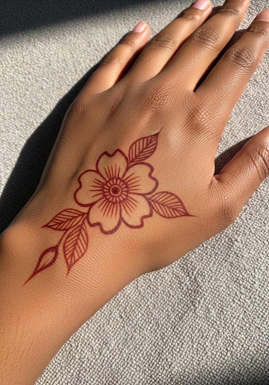
A centered blossom on the back of the hand feels like an effortless focal point when you want something visible but not crowded. Expect moderate pain, mostly from holding the wrist still for 15 to 30 minutes. The back-of-hand retains stain longer than fingertips but fades faster than the inner forearm. Ask for slightly open negative space around dense lines so the sketch keeps clarity as it ages into a softer stain. A common mistake is packing the area full of tiny details, which blurs into a muddled patch within a week. Pair this with stacked dainty rings and a thin chain bracelet that won't rub the design.
3. Minimal Mandala Accent at the Wrist
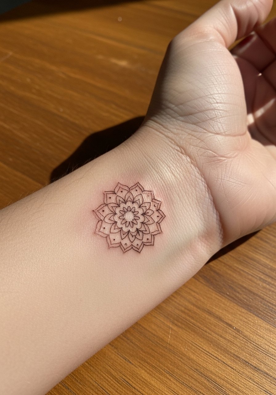
A tiny mandala just above the wrist gives a nod to tradition while keeping a sketchy, hand-drawn feel. The wrist sees more friction than the back of the hand so expect the central dots to hold a bit longer than the outer filigree. Tell your artist to keep the outer rings open with spaced dots rather than dense ringwork. That spacing is the difference between a mandala that reads two days in and one that still looks cohesive on day seven. If you want to show it off, wear a rolled-up linen sleeve or a delicate watch band that sits above the design.
4. Sketch-Chain Linking Across Knuckles
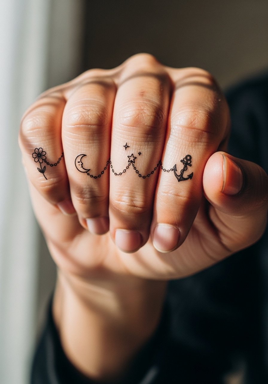
Knuckle chains are a popular sketch-style option when you want something linear that moves with the hand. Expect more abrasion here, especially if you type or play instruments. The stain often darkens in the creases and lightens on the tops, so ask the artist to reinforce the segments that will face the most wear. A mistake I see is trying to pack tiny dots into each knuckle; simple anchors hold up better. For session day, wear a short-sleeve tee so sleeves do not brush the fresh paste while it sets.
5. Palm-Centered Sketch Sunburst
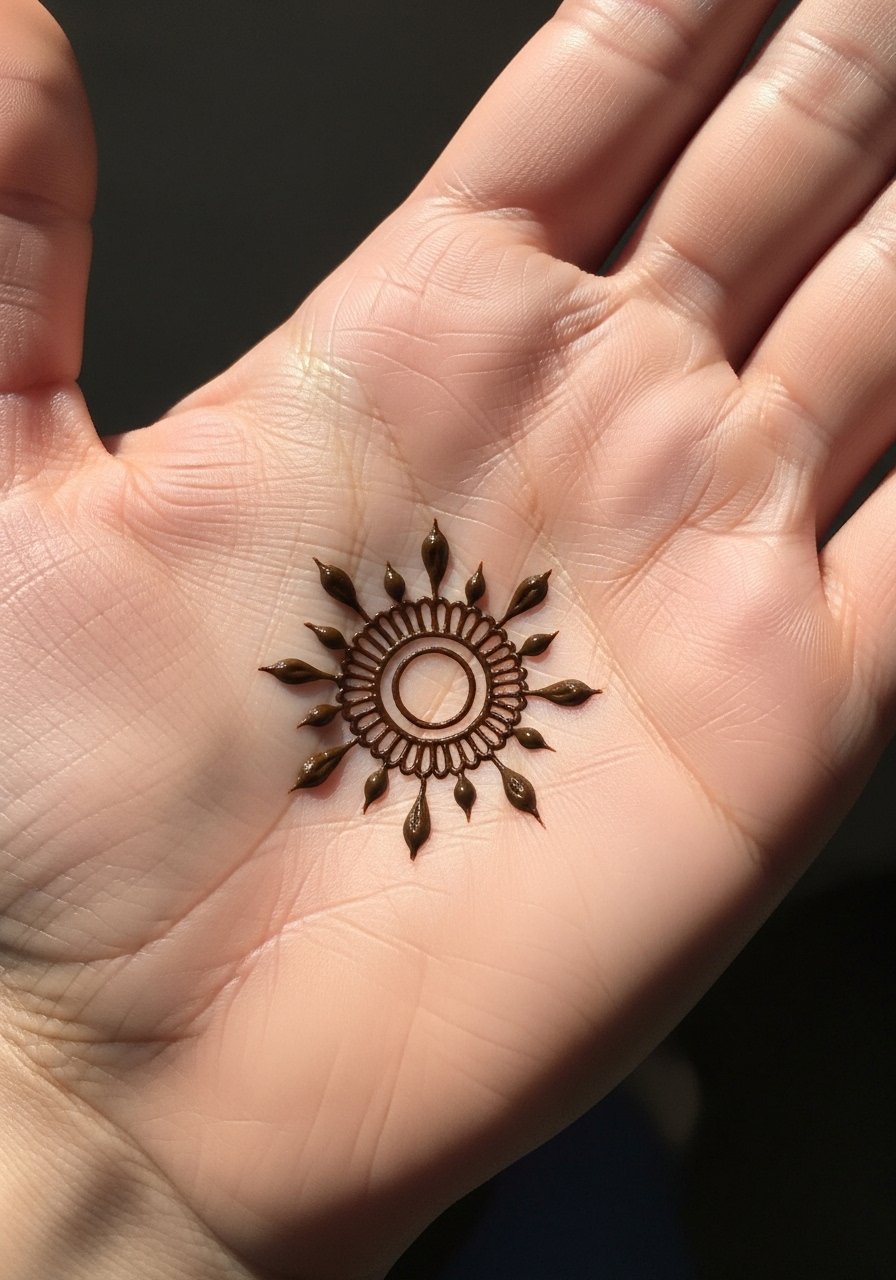
Palm placements give the deepest, most intense initial stain because the skin absorbs paste differently there. Expect the darkest result in the first 48 hours and then a rapid fade from frequent washing and natural exfoliation. There is a real controversy about palm henna for long-term visibility. One camp says palms always fade quickly and are best for short events. The other camp notes smart placement and thicker paste can extend visibility a bit longer. Tell your artist you want a bold center with minimal fine fill so the main shape survives the first week. For practical reasons bring a soft microfiber towel to pat the area dry after gentle cleaning.
6. Cursive Script Line that Wraps the Thumb

A tiny script that curves around the thumb reads very personal and sketch-like when done in a flowing single-stroke style. Palmar curves can smudge while the paste is wet so plan for a 20 to 30 minute application with careful drying. The biggest mistake is expecting intricate lettering on a curved zone with thin strokes, which fragments into faint blobs. Ask for slightly bolder strokes and clear spacing between letters to keep legibility as it fades. For showing this off, a minimalist ring worn on a different finger keeps attention on the script without rubbing the fresh paste.
Pre-Session Essentials
The wrist and finger pieces above react differently to washing and friction, so a few small items smooth the session and the first day of wear.
-
Stencil transfer paper kit. Lets you preview scale and placement on the hand before the paste touches skin, which helps avoid surprises for finger and wrist motifs.
-
Topical numbing cream. A light application eases sensitivity around knuckles and the thumb base so you can sit through a longer, steadier session.
-
Thin protective film roll. Useful to shield a palm or back-of-hand paste patch from accidental smudging while it sets.
-
Fragrance-free gentle wash. Cleans the hands gently without stripping the developing color in the first 24 to 48 hours.
-
Aquaphor healing ointment. A thin dab after the paste is removed helps keep the skin from drying out and reduces flaking that can take pigment with it.
7. Freehand Vine Trail Along the Side of the Hand
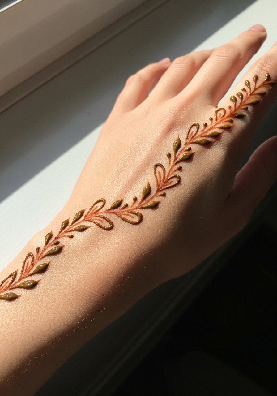
A vine trail feels organic and moves with hand gestures so it looks intentional instead of stuck-on. The side of the hand sees moderate rubbing from bags and pockets, so plan for the edges to soften faster. I advise asking for slightly bolder terminals on the vine leaves so they hold pigment through light wear. A frequent mistake is wrapping small tendrils too tightly against the wrist crease where they blur. For an outfit pairing, try a sleeveless blouse that keeps the forearm uncovered and lets the vine read clearly.
8. Tiny Doodle Constellation on the Lower Thumb
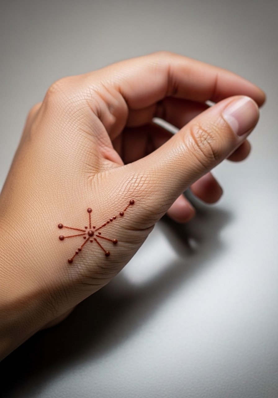
Constellation clusters are playful and hand-friendly because they use negative space to stay readable. The thumb base can lose dots fast through friction, so tell the artist to space the stars and make the central dot a touch larger. A common mistake is packing too many tiny stars into a small area, which fades into a smudgy patch by day three. This design pairs well with a thin leather bracelet or a minimal wrist cuff that sits above the composition and does not rub it.
9. Sketch Arrow That Points Toward the Wrist
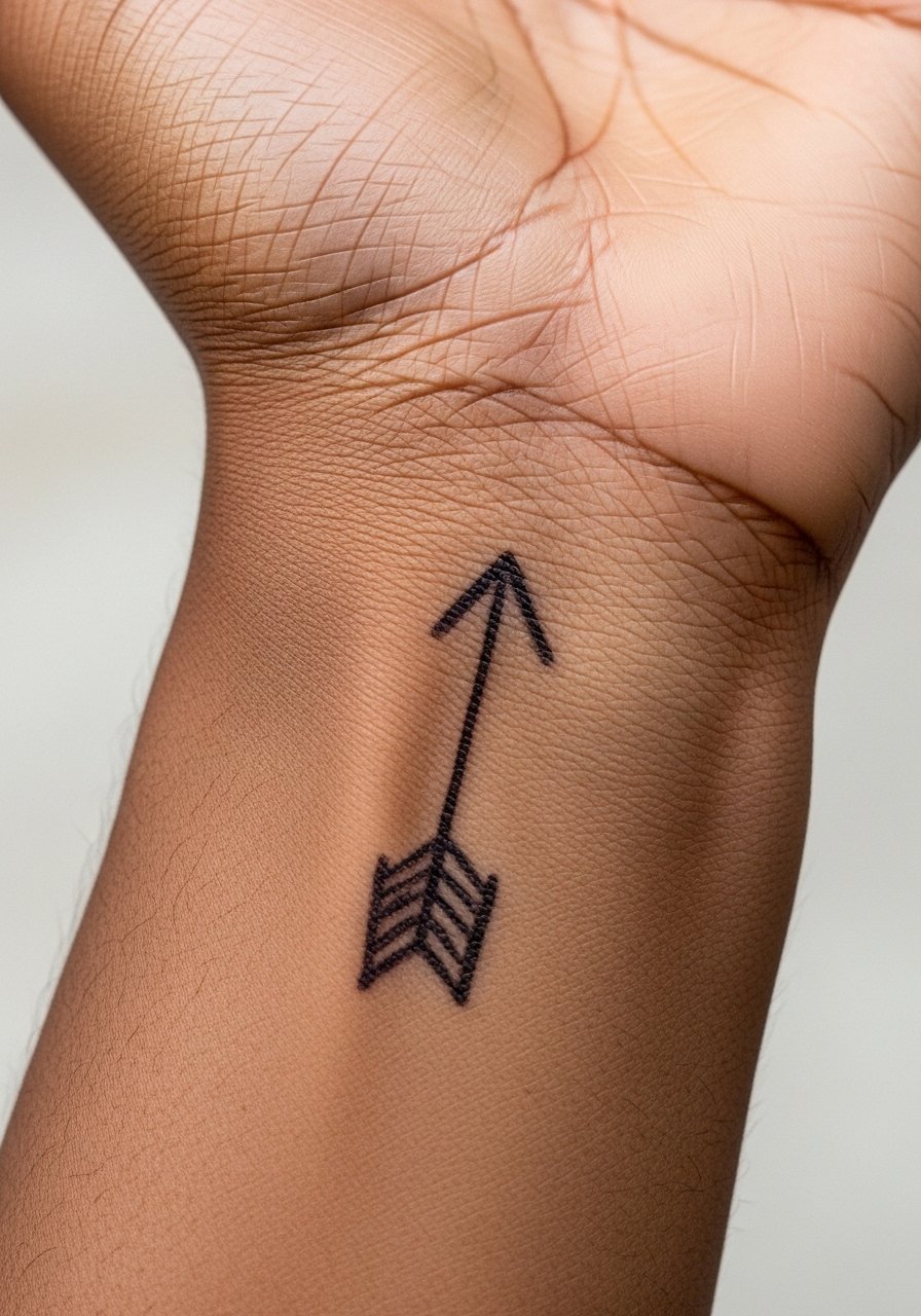
An arrow has a crisp linear quality that suits sketch-style paste. Expect the shaft to hold better than the tiny feather details unless the paste is slightly thicker. I recommend asking for a single bold shaft and simplified fletching so the motif keeps direction as it fades. People often request tiny feathers that disappear into faint smudges, which is avoidable with cleaner negative space. Show this off with a rolled cuff shirt or a bracelet worn below the arrow so it frames rather than covers the line.
10. Sketch-Style Floral Garland Across the Back
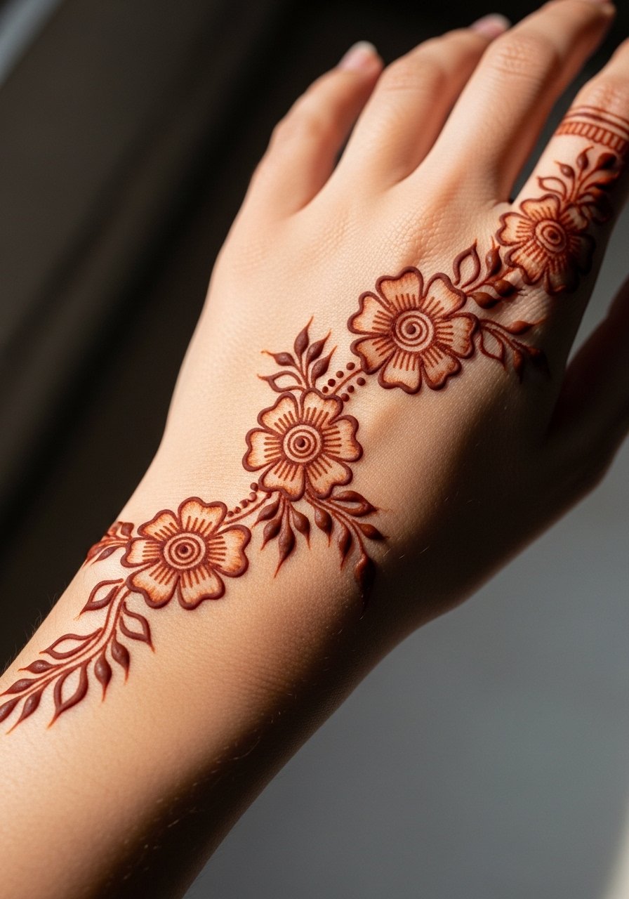
A garland balances small blossoms and open stems which gives it longevity in the sketch style. Dense floral fill fades into a gray smudge more quickly, so I advise keeping interior shading to spaced stipples instead of continuous fill. Tell your artist you want stipple shading and that they should prioritize clear outer contours. The session feels like a steady, patient stroke rhythm rather than quick dots. For evenings, a cropped sleeve dress with bare hands shows the garland without distraction.
11. Whimsical Line Portrait Accent
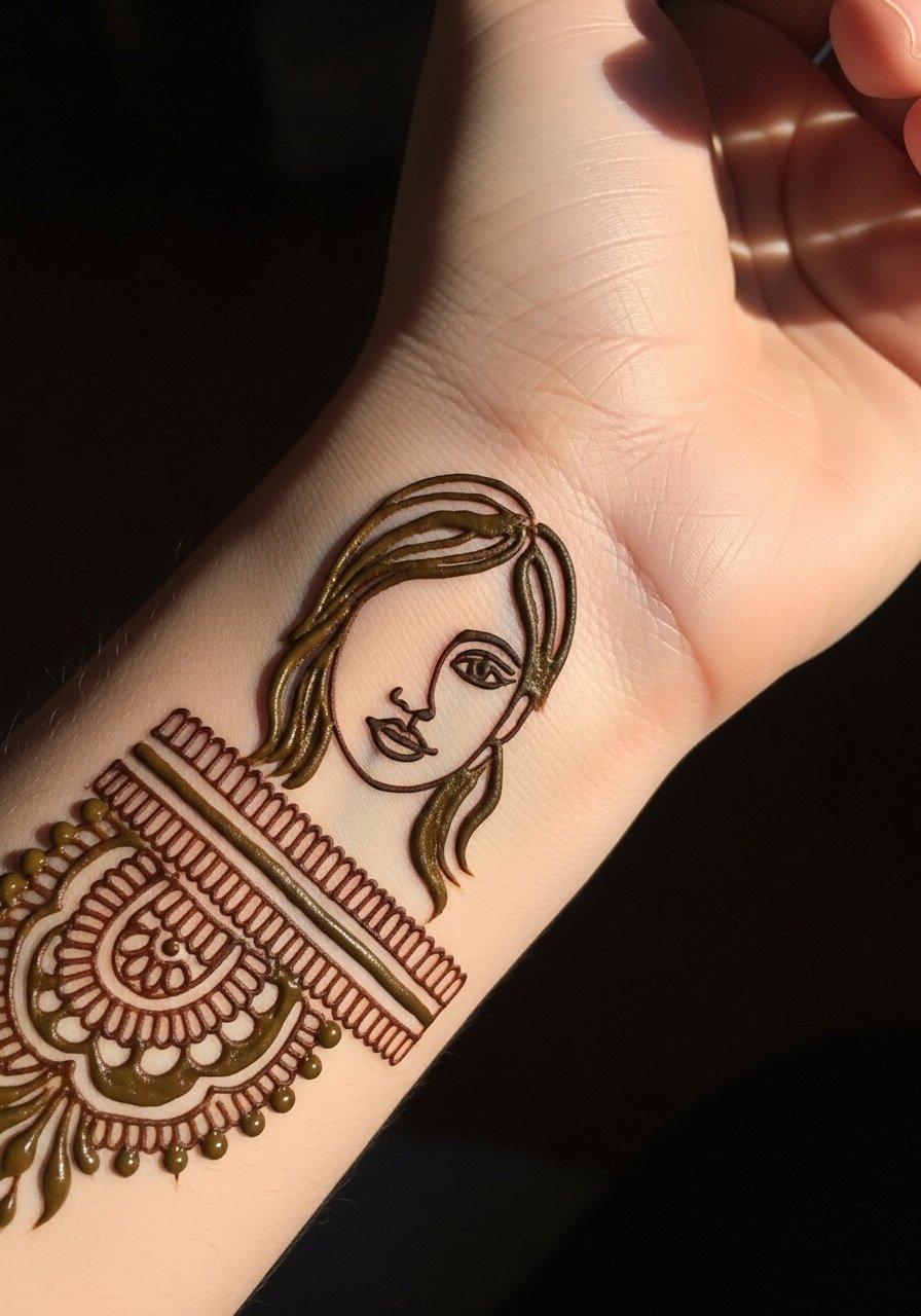
Mini portrait accents are a very sketch-like choice and read as an artful detail when kept tiny. Hands move a lot so facial features will blur faster than other placements, making simplified contours far more reliable than detailed shading. The right approach is an economy of line with one or two anchor points so the viewer perceives a face even as it softens. A mistake is asking for facial detail the size of a fingertip. During the session wear a loose tee so you do not brush the wet paste.
12. Negative Space Chevron Band

Negative space bands are smart because the skin becomes part of the design and there is less pigment to fade into a smear. Chevrons across the hand age into softer shapes rather than losing definition completely. Discuss spacing and width with your artist so the negative channels stay visible as the stain lightens. A mistake is making the band too thin which makes the pattern vanish under soap and movement. Pair this with a thin cuff bracelet above the band in metal tones to highlight the negative shapes.
13. Tiny Geometric Cluster Near the Wrist Crease
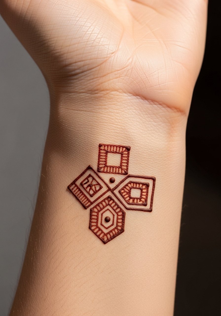
Geometric clusters read clean when each element has breathing room. The wrist crease is a high-movement area so central shapes keep pigment better than those in the fold. Ask to place primary shapes slightly away from the crease for longevity. The common mistake is compressing many shapes into the crease area which blurs with normal wrist flexion. For the session wear a zip-up hoodie you can pull aside without lifting your whole arm.
14. Tiny Script Word Along the Side of a Finger
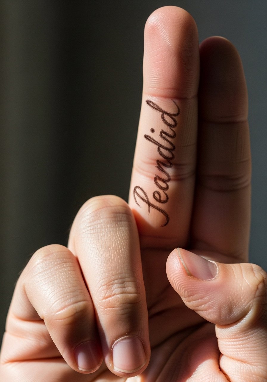
Lettering on a finger reads intimate but fades fast from constant contact. I suggest choosing a single short word and asking for slightly bolder strokes at the letter terminals so the form remains readable beyond the first two days. A mistake is cramming long phrases into the finger span. If you want to protect it while paste sets, wear a fingerless glove briefly but remove it before the artist finishes to avoid smudging.
15. Sketch Dotted Frame Around a Central Motif
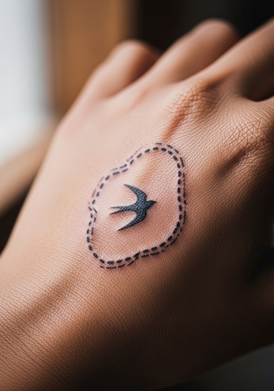
A dotted frame makes a compact motif read like a sketch composition without dense fill. Dots are prone to lightening faster than lines, so ask for the outermost dots to be slightly larger to act as anchors. The visual impact stays even as interior dots fade into softer halos. The mistake is relying on microdots alone for structure. This design pairs well with a stack of slim rings that sit away from the frame.
16. Asymmetric Sketch Bloom that Follows Vein Lines
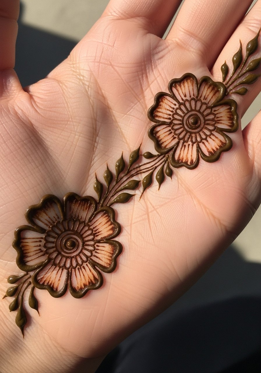
Placing a bloom along natural hand contours lets the design move with the hand which helps it look intentional as it shifts. Vein and tendon areas absorb paste differently and can produce darker accents. Tell your artist you want the bloom offset so the darkest points sit on low-friction planes. The mistake I see is forcing symmetry that fights the hand's natural lines. For a casual look, push up a sleeve and wear a rolled linen cuff to frame the bloom without covering it.
17. Simple Arrow-and-Dot Accent for the Pinky Side
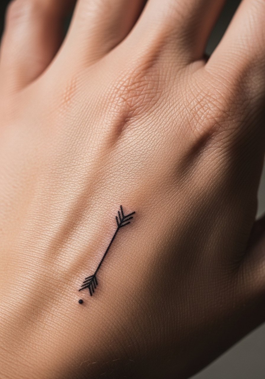
Placing a minimalist arrow along the pinky side is subtle and sketchy by design. That edge of the hand sees friction when holding items, so expect edge dots to fade first. Ask the artist to add a slightly larger anchor dot where the arrowhead meets the skin so a recognizable point remains. The common mistake is over-detailing the tiny arrowhead. Try pairing with a slim leather band kept above the design to draw the eye without rubbing it.
18. Single Stipple Shaded Leaf Near the Wrist
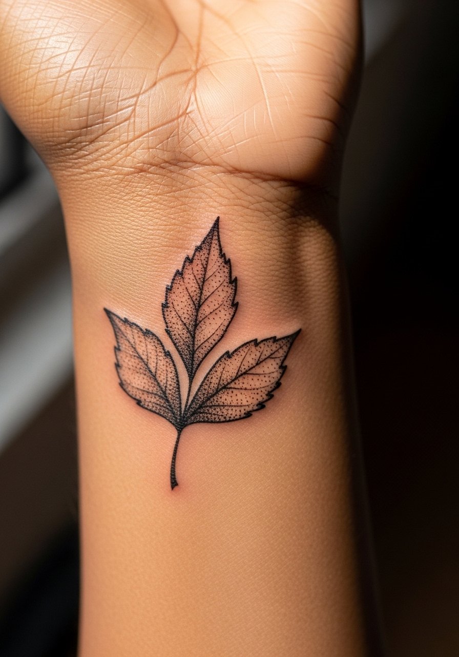
Stipple shading in henna reads softer and tends to age into a delicate wash rather than a muddle if spaced properly. The wrist can flatten stipple into a gray veil when dots are too dense, so request spaced stippling and defined outer contours. A frequent mistake is filling the interior too tightly to mimic continuous shading. For session comfort wear a loose tank top so you can stabilize the arm without interference.
19. Tiny Floral Chain for Between Fingers

Interdigital placements are delicate and see a lot of movement, especially with hand washing. Expect rapid fade in those spots and plan the chain with larger connecting anchors to preserve the overall rhythm. The mistake is relying on tiny connecting lines that dissolve into faint smudges. For practical reasons avoid tight rings directly over these links and try a simple open ring on a different finger to balance the look.
20. Sketch-Style Compass Dot on the Back
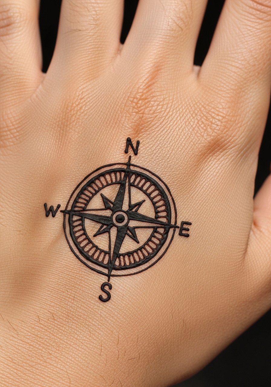
A compact compass feels intentional without many lines and holds its visual point longer than a clustered motif. The central dot will darken more than peripheral hash marks, which is fine since the composition reads even with faded arms. Tell the artist to keep the outer marks sparse and the center slightly denser. The mistake is packing in micro directional lines that blur. Show it off with a rolled sleeve shirt to keep attention on the hand.
21. Miniature Floral Motif at the Nail Base
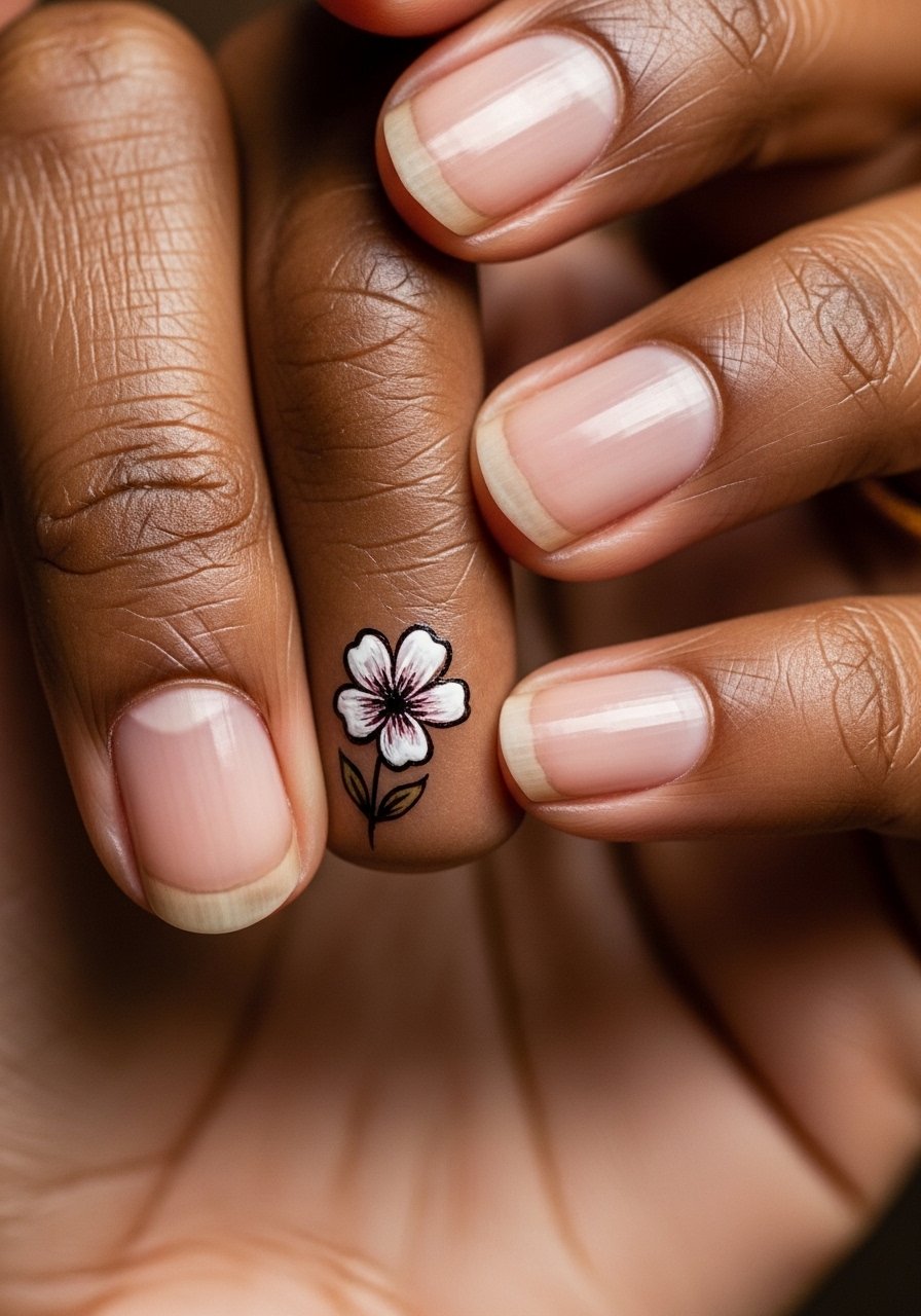
Placing motifs at the nail base creates a neat frame for rings and manicures, but nails are often touched with polish removal and cleaning so the stain dims quickly. Ask for a slightly larger motif relative to the nail to ensure longevity. A common error is making the design too close to the nail edge where acetone and water take pigment fastest. For a polished look, pair with a minimal manicure tool to keep polish from smudging near the motif.
22. Sketch Dotwork Trail from Back to Wrist
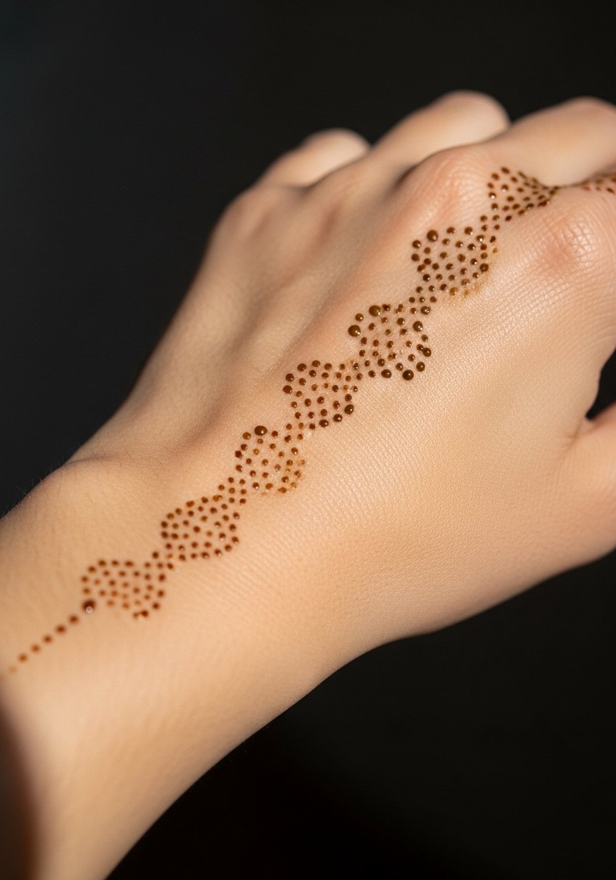
Dotwork trails give a hand-drawn feel and can be adjusted in density to anticipate fading. Heavier dots near the wrist anchor the composition while lighter dots toward the back create movement. Avoid using microdots across the whole trail because repeated washing turns them into a faint haze. I suggest discussing anchor points with your artist so the trail reads even as the outer dots fade. Wear a delicate watch above the wrist anchor to frame the trail without rubbing the dots.
23. Tiny Feather Sketch Down the Side
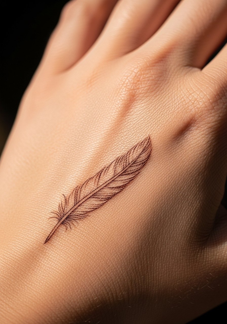
Feather motifs can keep a sketch charm if the barbs are spaced and not overly detailed. Side placements face rubbing from pockets and straps so the feather should be simplified with a bolder spine and airy barbs. The mistake is too many tiny barbs that merge into a patch. For the session wear a wrap top that allows the arm to rest comfortably and keeps fabric from touching the fresh paste.
24. Micro Botanical Sprig at the Wrist Edge
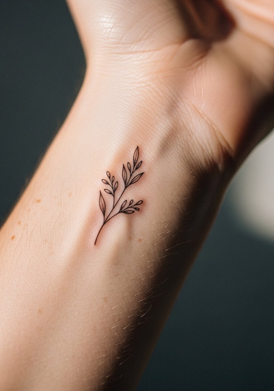
A micro sprig works as a low-key accent and ages into a soft vignette rather than a smear when left airy. Wrist edge placements shift with bracelets and watch bands so plan to place the sprig just below accessory areas. People often ask for dense leaf fills that fade into an indistinct blob. Instead request open stems with small leaf anchors. Pair this with a thin cuff bracelet that sits above the sprig to show it off without rubbing.
25. Mini Aztec-Inspired Sketch Motif
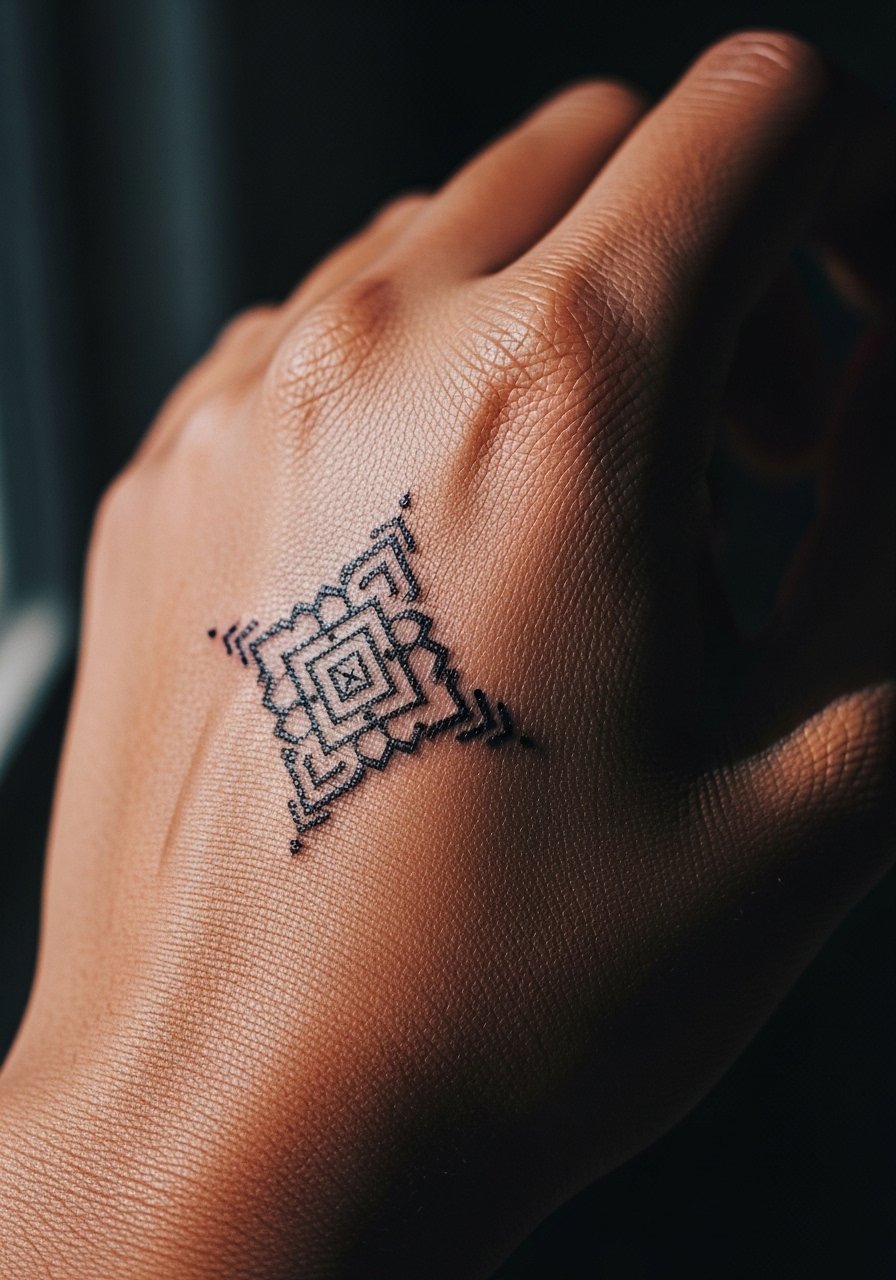
Geometric tribal nods can read modern when simplified and spaced. There is a cultural sensitivity to consider. One camp feels modern sketches honor the visual language when credit is given. The other camp argues borrowing sacred or specific cultural patterns without context can feel disrespectful. I recommend adapting motifs rather than copying exact traditional designs and ask your artist about respectful variations. Keep the shapes open rather than dense to avoid early blurring and show it with neutral sleeves.
26. Tiny Sketch Wave Along the Thumb Webbing

Webbing placements create an interesting peek-a-boo effect but lose pigment fast due to constant stretching. Expect the darkest color the first two days and noticeable fade after that. Ask for a simplified curve with an anchor dot so the wave reads even as it softens. The common mistake is trying to pack in curling foam details that do not survive the area's movement. For session comfort, bring a small hand towel to rest your hand on while the paste sets.
27. Sketch Pocket Motif That Peeks from a Glove Opening
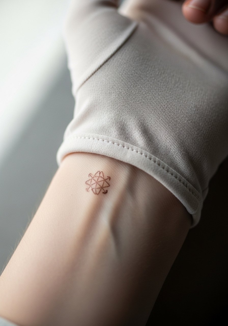
Designing a motif to peek from clothing or gloves is a clever way to control visibility. This approach considers how you actually wear the hand in daily life, which helps preserve the most visible parts. Ask your artist to place the focal point where the cuff naturally lifts so the motif is revealed without rubbing. Avoid overfilling the hidden area with fine detail since that never gets seen and only risks fading. A styling trick is to use a pair of fingerless gloves that show the motif without exposing the whole hand.
Frequently Asked Questions
Q: How long do sketch-style henna hand designs typically last, and does placement change that?
A: In my experience sketch-style henna usually lasts about seven to fourteen days, with the first three to five days showing the richest color. Placement makes a big difference. Fingers and webbing fade fastest because of washing and flexing. The back of the hand and wrist hold pigment a bit longer. If you want longevity, choose placements that see less direct friction and ask for slightly bolder anchor points.
Q: Is "black henna" safe for sketch-style hand work?
A: The black henna debate splits into two camps. One group uses it for a darker, tattoo-like stain. The other warns it often contains PPD, which can cause severe allergic reactions. In my view it is safer to stick with natural henna mixtures or to ask about the exact ingredients before booking, especially if you have sensitive skin or a history of reactions.
Q: How should I prep my hands before a henna appointment for best stain results?
A: Clean, exfoliated skin without lotions gives the paste the best chance to bind. Wash your hands with a gentle, fragrance-free wash and avoid heavy moisturizers that day. If you want to protect clothing, bring a loose sleeve or a loose button-down shirt you can pull aside during application.
Q: Are there professional considerations for visible hand henna designs?
A: Henna is temporary but still visible during its peak. Some workplaces are fine with decorative hands while others prefer no visible hand designs. If this matters, choose a location that can be covered by gloves or a cuff for a few days, or pick a motif designed to peek out only occasionally.
Q: How do I photograph sketch-style henna on my hand so the lines read well?
A: Natural window light and a neutral background help linework pop without harsh shadows. Rest your hand relaxed on a flat surface and shoot a close crop of the tattooed area. Highlight the negative space and angles rather than shooting from far away so the sketch quality comes through.