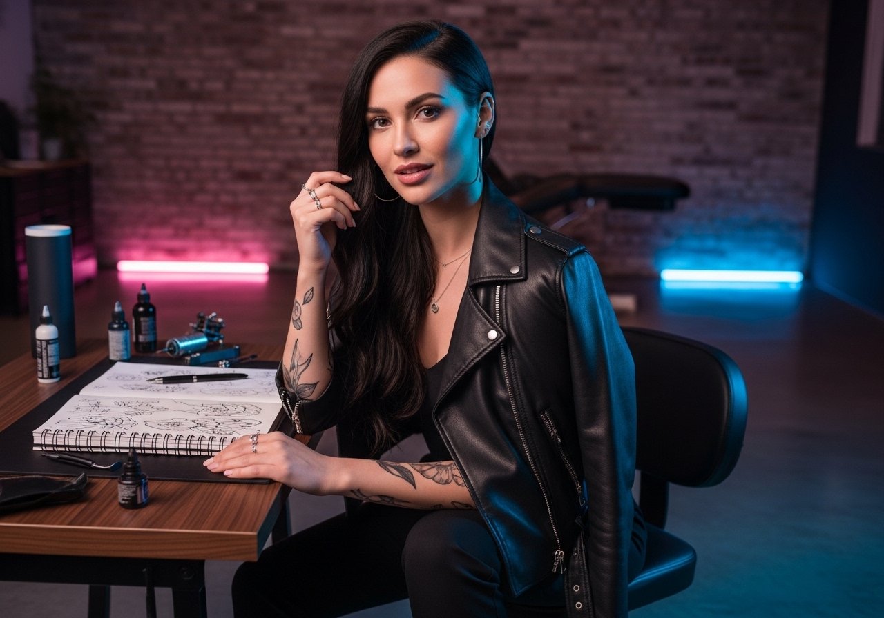
The stencil peeled away, the artist paused, and the client saw how a one-inch script would sit along the inner bicep curve. That tiny moment decides whether the letters follow the muscle and read clean or tilt awkwardly when the arm moves. Small work on the inner arm rewards patience in consultation, a steady hand in the chair, and a clear plan for wardrobe on session day. Below are 21 tiny inner bicep ideas for men that read sharp now and age with intention.
1. Fine Line Script Quote Along the Curve

I’ve seen tiny script read best when it follows the muscle curve rather than trying to be perfectly straight. For this, tell your artist you want the baseline to follow the bicep’s natural arc and that letters stay 1 to 2 inches tall so they keep legibility over time. Fair warning, fine line fades faster on arms than bold scripts, so expect a possible touch-up around year two to three. The session feels quicker than realism, usually a single short appointment, but inner bicep sensitivity is higher than outer arm. For showing it off, pair with a rolled-sleeve henley in gray or navy, the sleeve frames the script without covering it.
2. Minimalist Geometric Symbol Centered on Inner Bicep

Fair warning: the biggest mistake with minimalist geometrics is going too small. Lines need breathing room to avoid merge over time. Ask your artist for single-needle linework but with slightly increased spacing between parallel lines. The session is quick, often under an hour, and the pain is a sharp, brief nuisance toward the center of the inner arm. Blowout risk exists if the needle goes too deep near the curve. To show it off, wear a sleeveless athletic tee and balance the look with a leather cuff bracelet on the opposite wrist so the geometry reads intentional.
3. Black and Gray Realism Eye, Midline Placement
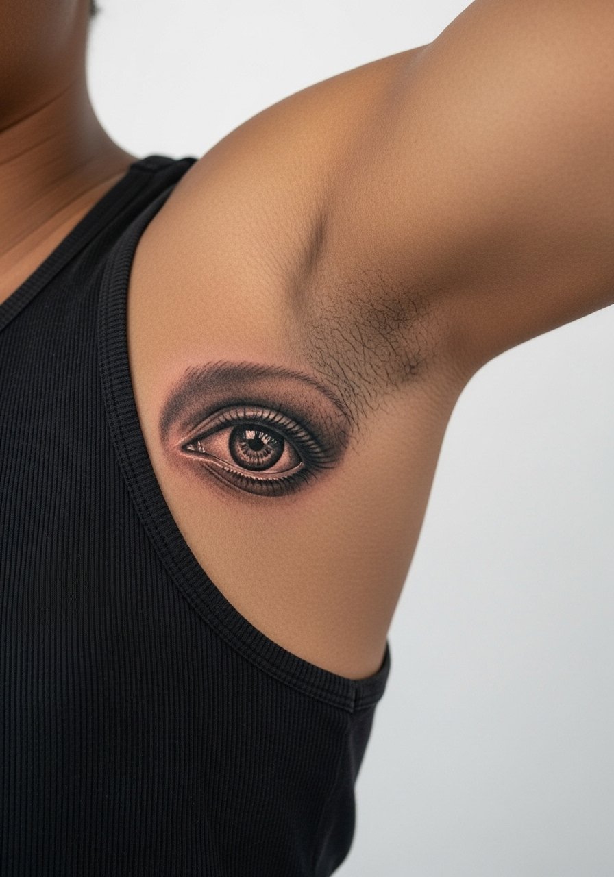
Most realism thrives on the relatively flat canvas of the inner arm, but tiny realism pushes technique limits. Expect two short sessions for crisp shading and contrast. Aging will show softer edges at two to five years depending on sun exposure and skin type. A common mistake is asking for too much tiny detail in a one-inch space. Tell the artist which focal point you want, for example the iris, so they prioritize contrast. Session feeling is steady vibration and shading that can sting more than linework. For a clean, understated show-off, half-unbutton a white button-up shirt and let the arm peek when you move.
4. Cursive Roman Numerals Running Vertical
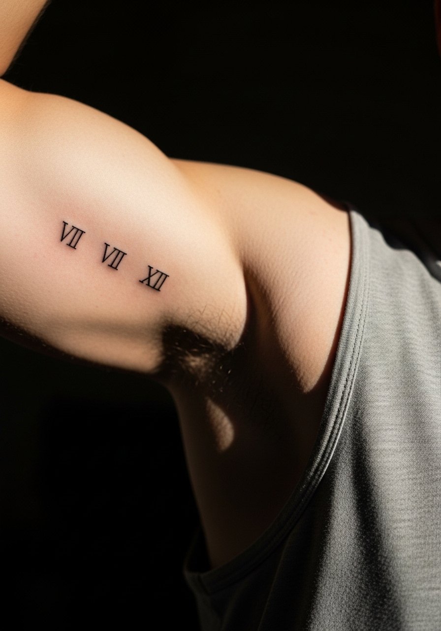
The inner bicep is ideal for vertical Roman numerals because the curve disguises small spacing shifts. Most of these read best at 2 to 3 inches long. In consultation, ask for slightly heavier stroke on numerals that sit at the top and bottom to prevent early fade where fabric rubs. Pain is sharper toward the armpit end, so schedule short breaks. One mistake is choosing ornate scripts that become illegible when reduced in size. If you want to reveal the numerals casually, a loose tank top you can slip the sleeve out of during warm weather works well.
5. Delicate Fine Line Floral Nestled Near the Lower Curve

When florals are tiny on the inner bicep, the trick is negative space. I recommend single-stem designs with stipple shading rather than dense petals. Tell the artist to leave small gaps between petals so the piece keeps its silhouette at six months and at five years. People often ask for dense black fills at this scale and then regret the early loss of petal separation. Session time is short but expect a ticklish sensation near the inner fold. For showing the design, a linen short-sleeve shirt in earth tones lets the linework pop while keeping the overall look relaxed.
6. Bold Script Name or Initials High on the Inner Bicep
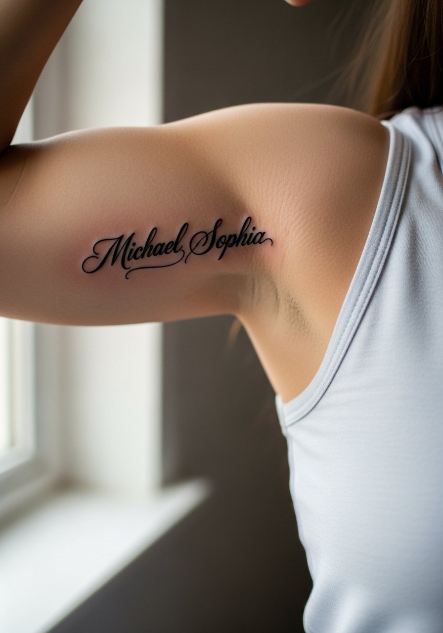
When you want a masculine edge, thicker script holds up better than ultra-thin cursive in this placement. The session is usually a single focused pass, with a little soreness afterward because the needle sits closer to the muscle. A frequent mistake is picking a trendy script that loses personality in small scale. Ask for letter spacing adjustments rather than shrinking the font. For a casual reveal, pair it with a slim gold chain necklace and a rolled sleeve, the chain draws the eye upward without overlapping the ink.
Studio Day Picks
Those first six inner bicep ideas cover fine line, geometric, realism, numerals, florals, and bold script, so a few small items smooth the session and the first week.
-
Stencil transfer paper kit. Lets you preview placement and baseline flow on your skin before the needle touches down, which matters for curved script and vertical numerals above.
-
Topical numbing cream. Applied per instructions before the appointment eases the inner bicep sensitivity common with small detailed pieces.
-
Thin protective film roll. Keeps fine line and minimalist pieces clean through the first week of friction from shirts and arm movement.
-
Fragrance free gentle body wash. Cleans the area without irritating delicate linework during healing.
-
Aquaphor healing ointment. Thin application in the first days helps maintain moisture for fine line work without clogging channels.
7. Micro-Realism Skull Outline in a Pocket Spot
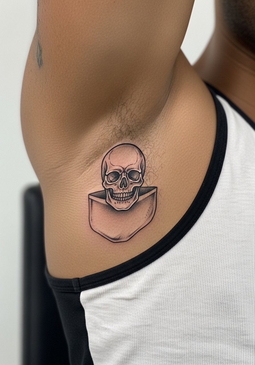
Artists split on whether tiny skull outlines on flexible skin hold up best with heavier outlines or with meticulous dot work. One camp says a bold outline keeps the shape as it ages. The other camp argues that fine stippling renders depth without risking early line merge. The truth depends on needle depth and spacing. For a guarded approach, ask for slightly larger negative space between features and expect a touch-up at year two if you prefer the ultra-fine look. Session sensation is a steady sting during shading, and hand placement matters to keep the skin steady for the tiny details.
8. Minimalist Line Art Arrow Running Horizontally

There is a simple visual payoff to a horizontal arrow on the inner arm. It reads as direction without being loud and the session time is minimal. The common error is a wobbly reference image. Bring a crisp photo with a straight baseline and tell your artist you want the shaft parallel to the muscle when the arm is at rest. Expect brief sharp pain at the center and slight soreness afterward. To wear it casually, a fitted athletic tee keeps the arm silhouette clean and highlights the arrow when you move.
9. Fine Line Cultural Motif on the Inner Side

When choosing a cultural motif, honor the origin. Consider slight redesigns rather than direct replication so the piece reflects personal context while respecting tradition. In consultation, ask the artist how they would adapt motifs to a 2.5-inch inner bicep space. The mistake is shrinking complex patterns into too small an area. Pain is variable near the fold. For the session wear a loose tank top so the artist has clean access and nothing presses on the fresh ink.
10. Blackwork Geometric Triangle Cluster
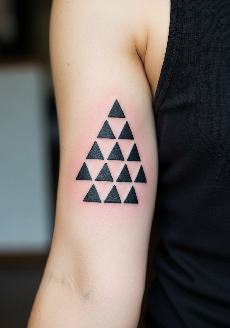
Bold blackwork hides fading differently than fine line. Solid fills age into a consistent tone and often require less frequent touch-ups than thin strokes. That said, avoid packing too many dense shapes in a 3-inch cluster or the piece can feel heavy as it heals. Tell the artist you want spacing to preserve each triangle's edge. Expect a heavier vibration during fill work and a longer session than a single line piece. For show-off pairing, a half-unbuttoned white shirt or a minimalist watch on the opposite wrist keeps the contrast clean.
11. Script Affirmation Phrase Curved With the Arm

When a phrase curves with the arm it looks natural in motion. In consultation, specify the arc and request a stencil preview while standing. A frequent mistake is committing to a phrase that’s visually long which forces the letters too small. Session feels quicker than realism but more sensitive because the needle travels along the inner fold. Expect touch-up needs if you want ultra-thin weight. For casual wear, a loose short-sleeve tee with one sleeve rolled shows the curve cleanly.
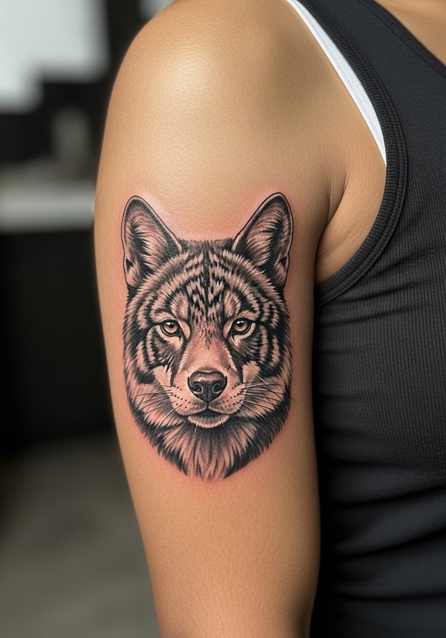
12. Micro-Realism Animal Portrait Along the Inner Bicep

Realism fans split whether to use color or black and gray for small animal portraits. Color offers impact but needs more maintenance. Black and gray maximizes contrast for a smooth look over years. Plan for two sessions if you want crisp fur texture. A mistake is shrinking a full portrait into too narrow a vertical; pick one focal element such as the eye or snout. Expect heavier staining and localized soreness during shading passes. For showing it off, a V-neck tee in solid black frames the portrait without visual noise.
13. Tiny Botanical Stem That Doubles as Sleeve Starter
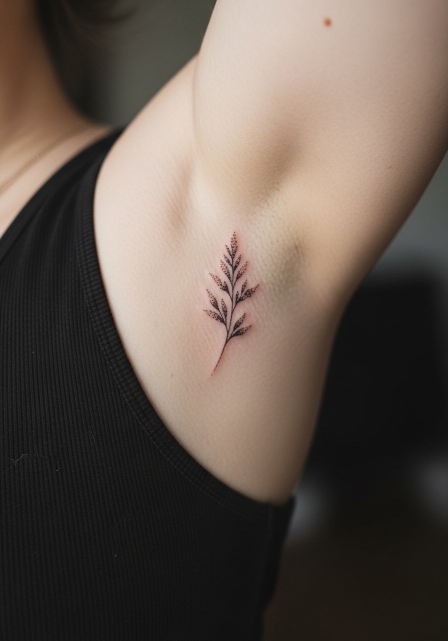
I've noticed many men like a small botanical as a sleeve anchor later on. If you plan to expand, ask the artist to leave open margins and predictable flow so future pieces can connect. A common misstep is filling the stem with solid black that limits future shading transitions. The session is short and the pain is tolerable but the inner fold creates a ticklish feeling for some. Wear a loose vest or tank on session day so the artist can roll fabric away without rubbing the fresh work.
14. Minimalist Coordinate Line in Fine Monospace
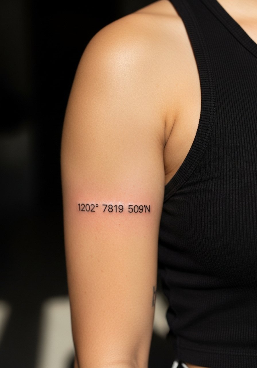
There is a clear advantage to specifying exact text for coordinate tattoos in the stencil. Tell the artist the precise numbers so the template is exact and legible. The mistake is picking tiny type that blurs into dots over time. Expect a short session and a small sharp discomfort near the crease. For wearable styling, a slim pendant that sits above the bicep helps frame the coordinates. Consider a thin chain pendant necklace if you want subtle balance without competing with the text.
15. Micro-Realism Animal Portrait With Color Accents
There is a debate about color in realism at this scale. One camp prefers black and gray for longevity and contrast. The other camp uses selective color accents for pop and character. Ask your artist for a compromise, like muted color in the eye only, and plan for potential touch-ups sooner than with black and gray. Sessions run longer and can be more painful because color layering requires extra passes. If you choose color, sun protection becomes more important to keep the highlights crisp.
16. Single Glyph or Zodiac Symbol in Minimal Outline

There is a visual economy to a single glyph. The mistake is using a heavy font that reads clunky at one inch. Ask for thin, confident strokes and a little spacing around the symbol so it breathes. The session is short and the pain is a quick sting. Over five years, ultra-thin glyphs may soften, so anticipate a small refresh if you want the original crispness. For session wear, a loose short-sleeve shirt allows the artist to access the area without fabric pressure.
17. Chain-Link Minimal Band That Follows the Bicep
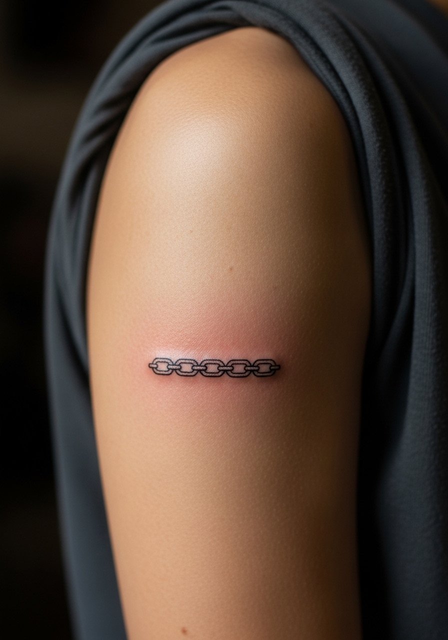
Personal observation: repeating elements like a chain link age best when each link keeps slight separation. The common error is welding the links too close so they blur into a bar. During consultation, request consistent negative space and ask to see a mock stencil while standing. Expect a steady buzzing sensation as the needle traces the repeated pattern. Pair the band with a leather cuff on the opposite arm for visual balance when you wear short sleeves.
18. Small Compass Rose With Dot Work

When you pick a compass rose, dot work helps suggest shadow without overworking tiny lines. Tell the artist you want stipple shading rather than solid gray fills so the piece keeps texture over time. A common mistake is pushing too much black into the center which flattens the layout. The session includes tedious dot shading that can be more tiring than a single pass line piece. For showing it off, a fitted henley or rolled sleeve keeps attention on the directional detail.
19. Minimalist Mountain Range in Continuous Line
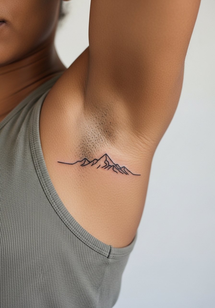
Fair warning: continuous-line designs demand steady hand placement. The mistake is asking for a single unbroken stroke when small wobbles will show. Ask for a visible start and end point that feels intentional rather than forcing impossible continuity at tiny scale. Session time is short but the inner bicep’s skin gives a slightly different resistance than the forearm. For a simple reveal, a v-neck tee keeps the look understated and modern.
20. Tiny Arrowhead or Rune Near the Armpit

Most people underestimate the sensitivity near the armpit. Pain here is higher and sessions are brief for a reason. The upside is concealment; the downside is a higher chance of movement affecting line placement. Tell your artist you want a shallow stencil placement and agree on small directional adjustments before the first pass. Expect a touch-up if the initial lines settle unevenly. For session wear, a zip-up hoodie you can pull aside or a loose tank makes access easier while keeping the area covered between passes.
21. Tiny Lock or Keyhole That Anchors Future Work
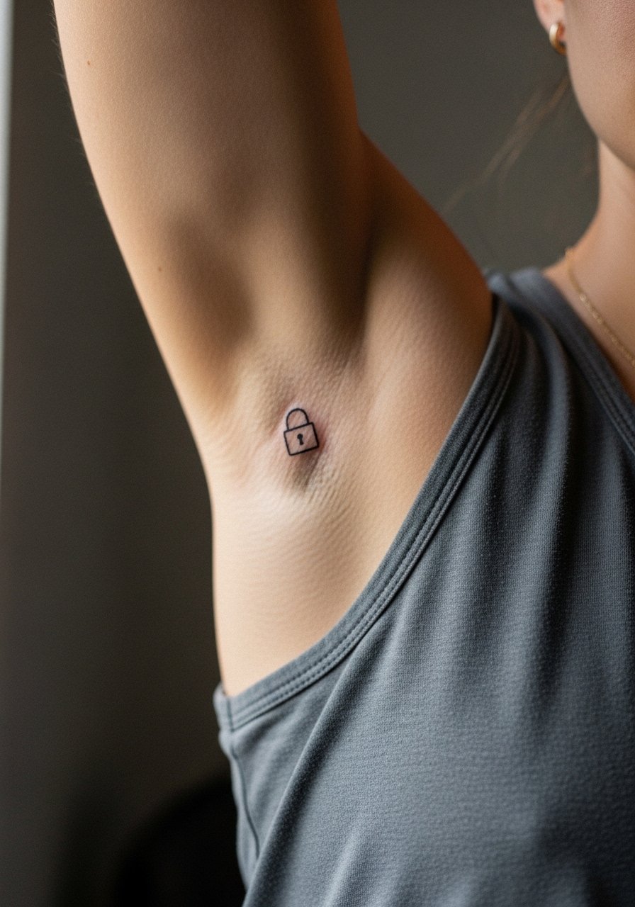
This small lock can serve as an anchor point if you plan to expand into a sleeve later. Tell your artist you want the lock to sit in predictable negative space for future connections. A common error is placing it too close to existing lines that would make future transitions awkward. The session is quick and the inner fold creates minor discomfort. If you plan to show it occasionally, a rolled sleeve henley or short-sleeve button shirt frames the small icon without covering it.
Frequently Asked Questions
Q: Will fine line script on the inner bicep fade faster than bold script and need touch-ups sooner?
A: From what I’ve seen, fine line on the inner arm generally needs touch-ups earlier than bold scripts because thinner strokes have less pigment density. Expect the possibility of a minor refresh around two to four years, depending on sun exposure, friction from clothing, and skin type. Discuss line weight options with your artist so you get the aesthetic you want without surprising fade.
Q: How painful is inner bicep work for realistic portraits compared with simple linework?
A: Inner bicep realism usually hurts more because shading involves longer machine passes near soft tissue. Simple linework is quicker and feels like short stings. If pain is a big concern, consider breaking realism into two short sessions or using a topical numbing cream applied as advised before the appointment.
Q: Should I pick black and gray or color for a tiny animal portrait on the inner arm?
A: Both options are valid. Black and gray maximizes contrast and often needs fewer touch-ups. Color adds character but typically requires maintenance sooner. If you want color, request muted accents rather than full saturation to balance longevity and visual impact.
Q: How should I dress to make an inner bicep session easier for the artist?
A: Wear something that gives unobstructed access to the upper arm without being tight. A loose tank top or a button-down you can pull aside usually works best. Avoid tight sleeves that press on fresh ink and pick something you can move comfortably during the session.
Q: Are there styles I should avoid on the inner bicep because of blowout risk?
A: Dense, tiny parallel lines packed closely together increase blowout risk on the inner arm. Also, ultra-thin single-needle work along curved folds can soften into fuzziness. If you prefer delicate detail, ask for increased spacing or slightly heavier line weight and plan for a touch-up consultation.