
Fine line watercolor on the hip looks effortless online, but the reality is more complicated. Pelvic skin bruises more easily, sessions can be surprisingly sensitive, and watercolor fades faster without careful placement and spacing. Plan for touch-ups, pick a design that gives pigment room, and think about how clothing will rub during the first month. The first idea below shows a gentle way to get that painterly look on the hip.
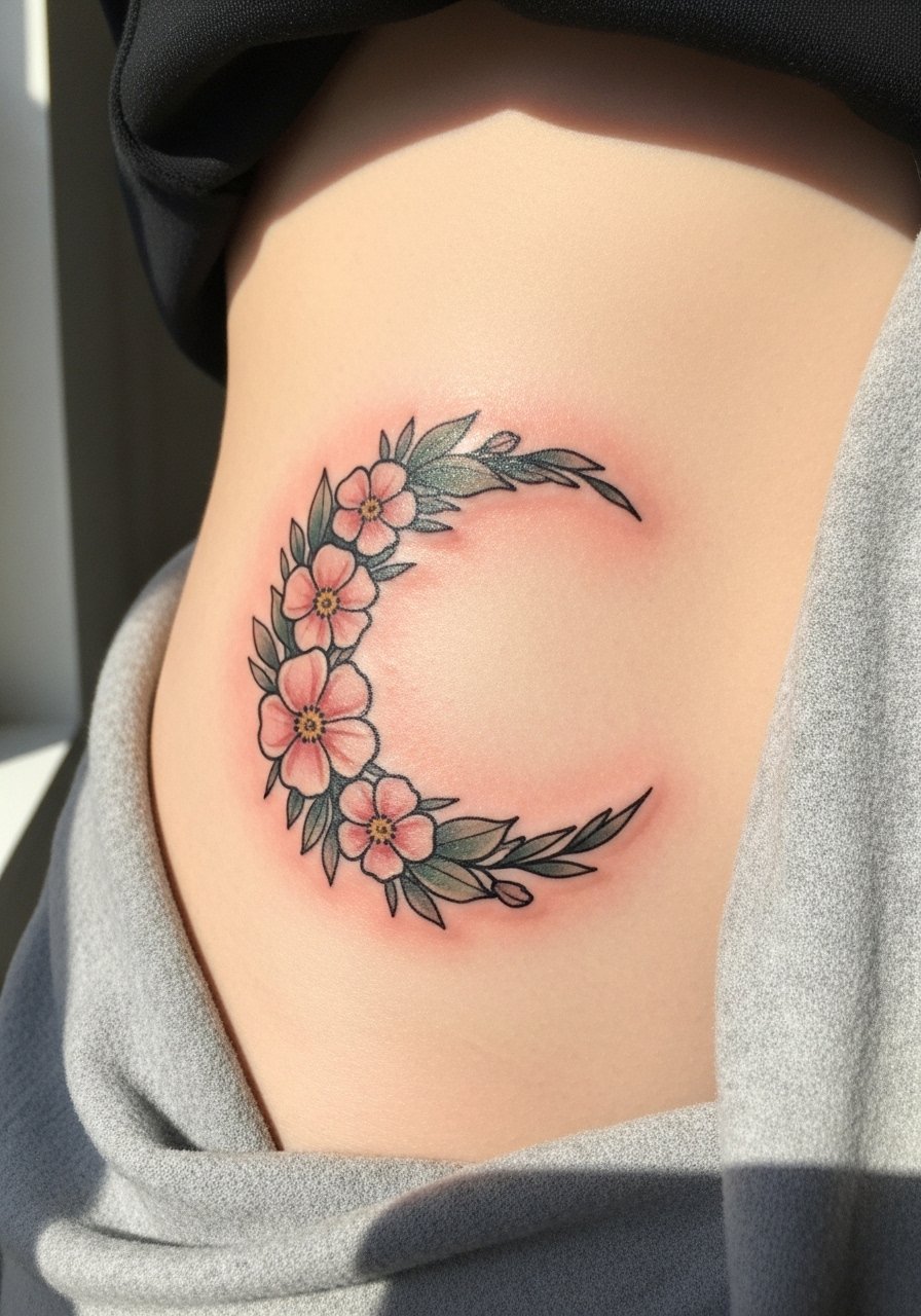
1. Crescent Moon Watercolor Over the Hip Bone
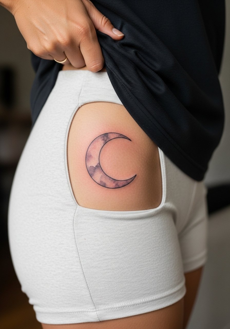
Start with a small crescent moon if you want a low-commitment watercolor that still reads from a short distance. Fair warning, the hip bone area is thin and can feel like a 6 out of 10 on the pain scale. Tell your artist you want the color diluted and layered rather than one saturated pass so it heals like layered paint instead of a bruise. Common mistakes are asking for too many overlapping washes in a tight space, which causes early muddiness. Expect a touch-up window around year two for color refresh. For the session wear, pull on high-waisted denim that you can shift slightly without discomfort.
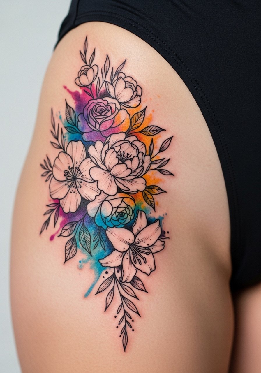
2. Watercolor Floral Wreath Along the Hip Curve
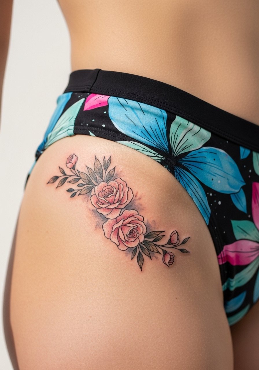
There is something about a wreath that frames the hip and moves with clothing. I recommend slightly bolder linework around petals so the shapes remain readable as the washes fade. During consultation, ask the artist to map the wreath to your natural curve and avoid packing color right into the crease where friction will accelerate loss. The session feels like long, patient passes as the artist layers washes, so expect two short breaks. Blowout risk is low if spacing is respected, but dense washes too close to the groin crease age poorly. For showing it off, an off-shoulder crop top and high-rise bottoms make the curve visible without exposing more than you want.
3. Abstract Brushstroke Splash on Upper Thigh
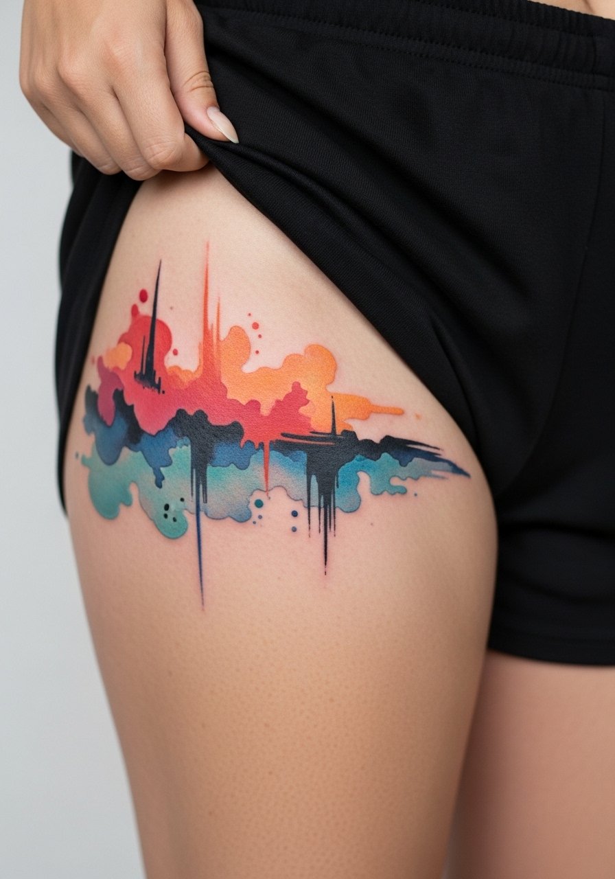
Most watercolor pieces that looked best fresh start to read like faded patches if the strokes are too thin. This abstract brushstroke benefits from a mix of saturated anchors and airy splashes so it keeps shape at six months and at two years. Tell your artist you want "anchor points" with more saturation so the eye still finds structure later. The upper thigh side of the hip is forgiving for touch-up access, and the session is moderate on pain. Avoid asking for tiny, flicked watermarks that sit right in a fold. For the appointment, slide into loose drawstring linen shorts so the artist can work without pressure on the area.
4. Minimal Script with Watercolor Wash Behind It
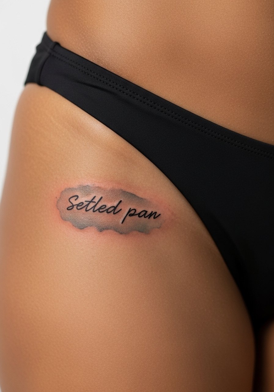
A simple word with a watercolor backdrop reads modern and quiet, but script on pelvic skin can blur if the letters are too thin. Ask for slightly heavier linework for the lettering and a separate, looser wash layer so the word keeps its edge. One camp of artists argues that script should be avoided on the pelvic region because the skin shifts and blurs lines. The other camp says if the needle depth and spacing are right it can settle fine. Name both camps in the consult and ask which approach your chosen artist uses. Healed looks at six months are usually soft, and a light touch-up around year three is common. For showing this off, a thin chain pendant necklace sits above the hipline when wearing low-rise styles.
5. Delicate Stippled Shell with Watercolor Highlights
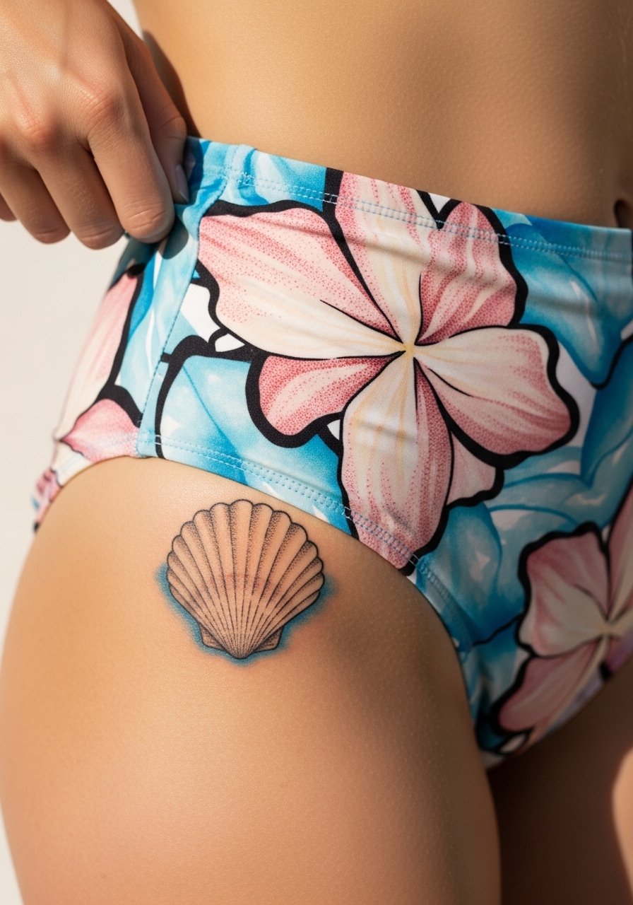
If you want texture without heavy color, stipple shading gives a tactile quality that watercolor highlights can echo. The hip is well suited to this because stipple holds up better than thin full washes in friction zones. During the chat, ask the artist for denser stippling around shadowed areas and airy washes for the highlights. This one feels like short needle passes rather than long, saturating sweeps, so session discomfort is lower. A common mistake is overlapping dense watercolor directly over delicate stipple, which blurs the dots. For the session, wear a loose drawstring skirt you can shift without tight elastic pressing on fresh ink.
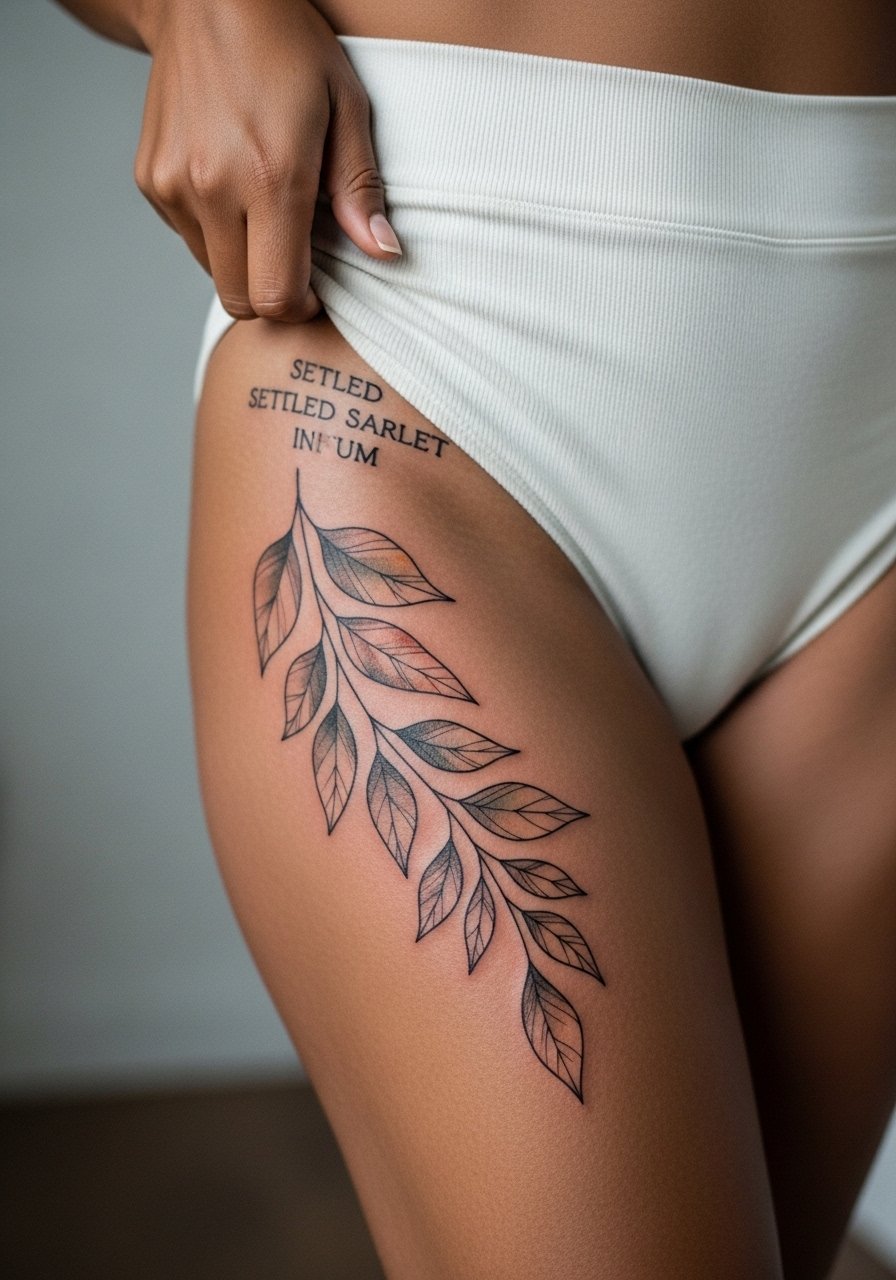
6. Petite Botanical Sprig Along the Hip Ridge
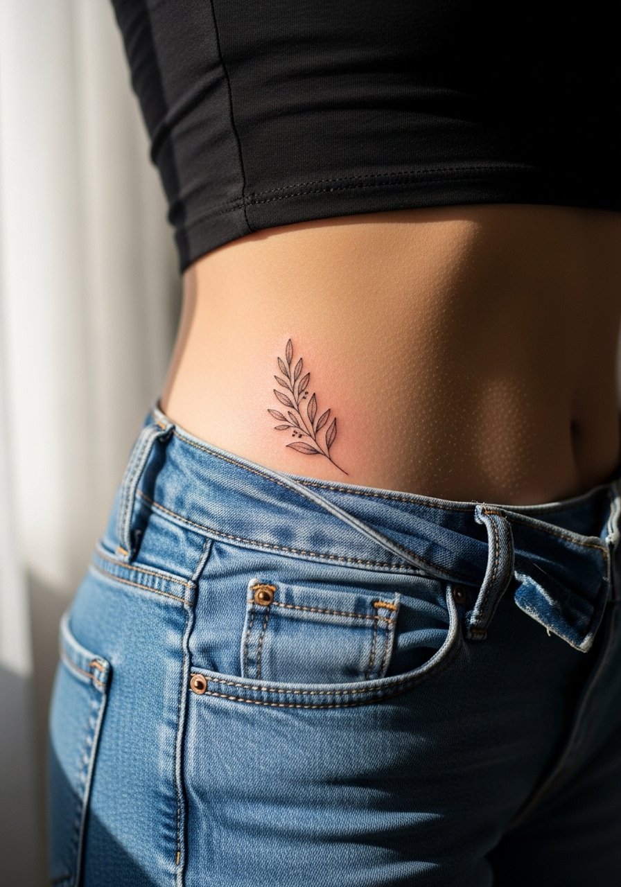
This minimalist sprig reads as personal and is a good pick for anyone worried about session time. The hip ridge is sensitive but not extreme. Make sure to ask for slightly bolder stems so the silhouette remains after washes soften. A common error is requesting ultra-fine stems with full watercolor inside petals, which tends to lose definition quickly. Plan for a 30 to 60 minute session depending on color. For the session wear, choose high-waisted jeans that can be shifted without pinching the fresh area.
Studio Day Picks
The hip, upper thigh, and side-sternum pieces above each demand different prep. These items help with access, sensitivity, and the first-week friction concerns discussed in ideas 1 through 6.
-
Stencil transfer paper kit. Lets you preview placement on the curve of the hip so small wreaths and scripts sit where you want them.
-
Topical numbing cream. Applied as directed before the appointment eases sensitivity on the hip bone and upper thigh areas.
-
Thin protective film roll. Useful for keeping hip tattoos clean during the first days of movement and clothing friction.
-
Fragrance-free gentle body wash. Cleans the area without stripping color or irritating delicate washes.
-
Aquaphor healing ointment. A thin layer helps protect small watercolor patches on the hip during the initial healing window.
7. Fanned Feather with Watercolor Veil
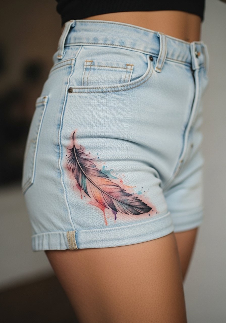
A feather that fans toward the thigh uses the body's movement to animate the design. I usually recommend a darker spine with lighter colored vanes so the form reads as the washes fade. Tell your artist to avoid thin parallel strokes jammed together because they can merge into a gray blur after a year. Sessions here feel moderate and may need positional adjustments to keep you comfortable. Expect gentle loss of the palest washes at six months. Pair this with side-slit midi skirts for evenings when you want the sweep to show.
8. Crescent Floral That Tucks Under the Waistband
This tuck-under style looks intimate and deliberate. Fair warning, anything that sits directly under the waistband will see extra abrasion during day-to-day movement. During consultation, ask for more placement above the waistband line if you want longevity without constant rub. The biggest mistake is placing saturating washes where elastic will press. Pain is mild to moderate and touch-ups are common near the waistband after heavy wear. For session clothing, try seamless high-waisted underwear so fabric edges do not irritate fresh ink.
9. Watercolor Starfield Scattered Near the Hip
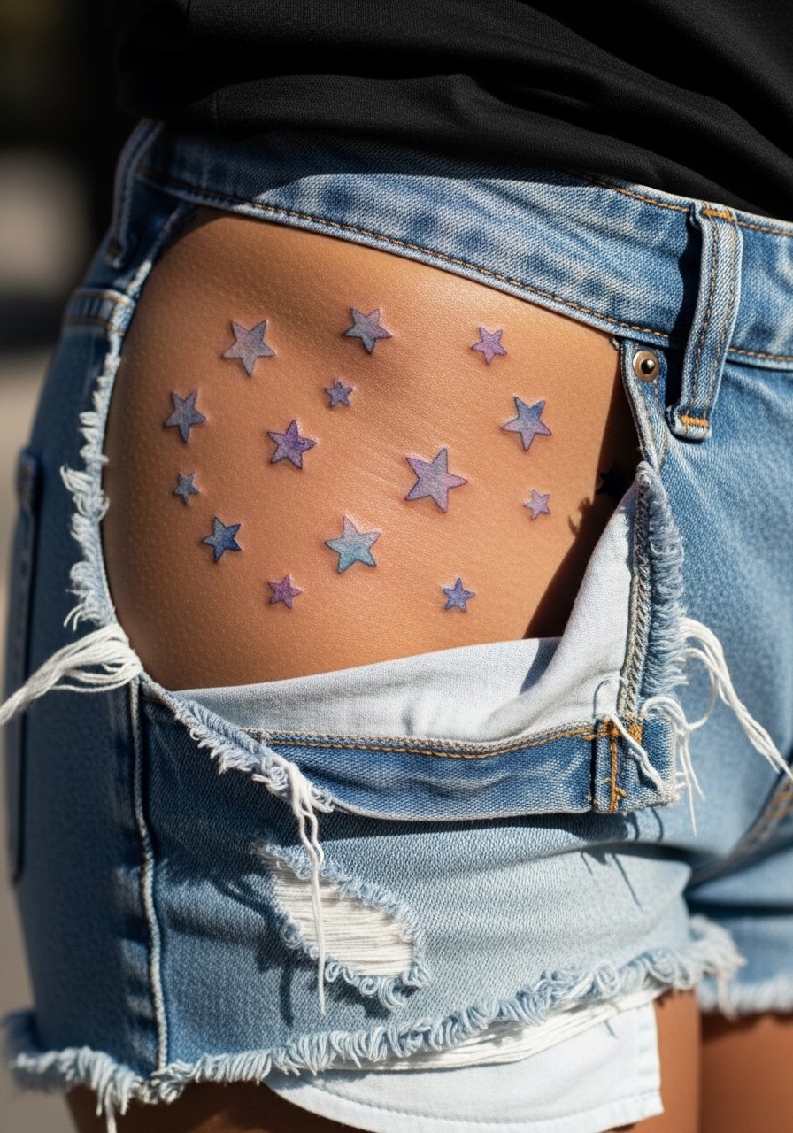
A starfield reads delicate and modular, which is handy if you want to add pieces over time. The placement is forgiving but each tiny star needs some room so dots do not merge later. Tell the artist to space clusters with negative skin space in between. The session is quick but can feel fiddly as the artist places multiple small elements. A mistake is requesting ultra-tiny stars placed tightly, which leads to merging after healing. For showing off, rolled-up pant hems and low-rise cuts let a few scattered stars peek out without overexposure.
10. Bold Outline Floral with Watercolor Inside
This design sits at the center of a debate in the watercolor community. One camp says color-first, no outlines, keeps the painterly illusion intact. The other camp insists on bold black outlines to preserve shape as washes fade. Name both camps to your artist and decide which outcome you prefer long term. Outlined flowers age with clearer silhouettes, while outline-free pieces keep a softer, fading look. Tell your artist how much line weight you want around petals. Expect outlined versions to hold recognizable form for longer and plan touch-ups at year three if you value vibrancy. For the session, a zip-up hoodie you can pull off quickly helps with access without removing too much clothing.
11. Watercolor Anchor Motif Low on the Hip
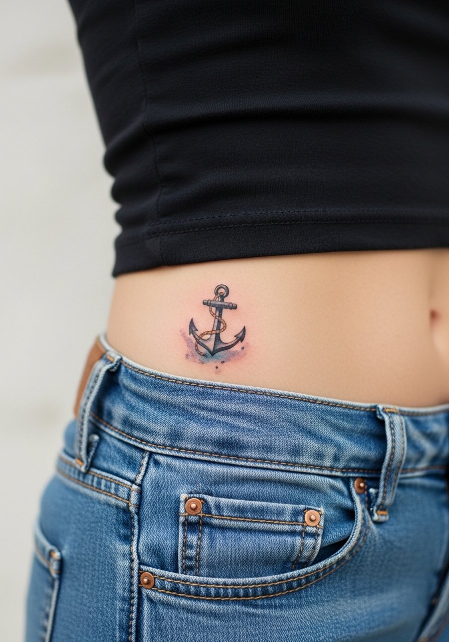
Anchors read crisp even with watercolor because the negative space around them gives structure. This placement can sit at the edge of clothing lines so plan for fabric movement. Tell the artist to push a clean outline with light washes inside to keep the anchor readable over time. The session is short but the area is prone to friction during the first week, so protective film during activities helps. A typical mistake is asking for too many tiny inner details that the washes will erase. For showcasing, low-rise denim that can be shifted briefly makes the element peek out casually.
12. Watercolor Mandala Accent on the Hip Flank
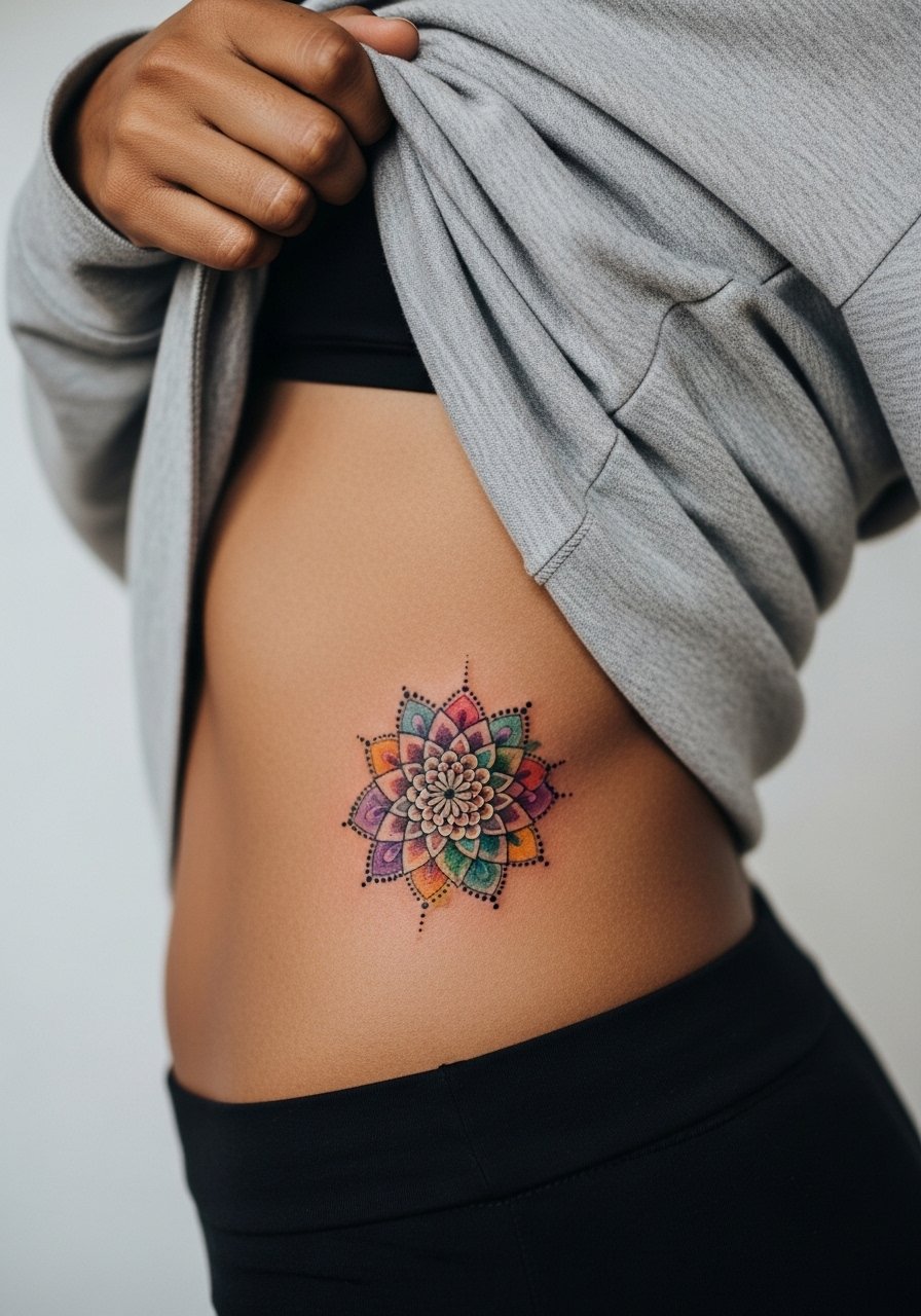
Mandalas usually rely on precise linework, so a watercolor treatment needs clear anchors or it loses definition. When consulting, request heavier outer circles and softer inner washes so the geometry remains legible. The flank can stretch with movement, so one camp of artists warns that tiny repeat elements may blur. The other camp suggests spacing and needle control can preserve mandala detail there. Be explicit about scale and ask for a mock transfer to check how it sits while standing. The session may take longer for symmetry. For evenings out, open-back tops that show just the flank let the mandala sit as a subtle statement.
13. Scripted Coordinates with Soft Wash Background
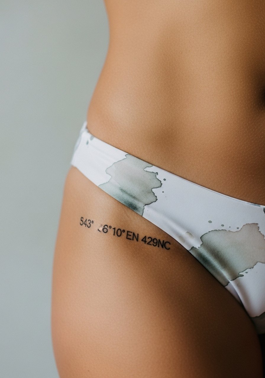
When tattoos include exact text, make the lettering slightly bolder than you think you need. Fine script on pelvic skin can soften with time. Ask for the exact coordinate text to be laid out on stencil first so you confirm spacing and font size. A common mistake is choosing a very thin script that blurs into the wash. Plan a touch-up around year two if the coordinates are important to keeping crisp. The session is generally short. For showing off, low-cut swimwear reveals the coordinates subtly.
14. Painterly Wave Cresting Along the Hip
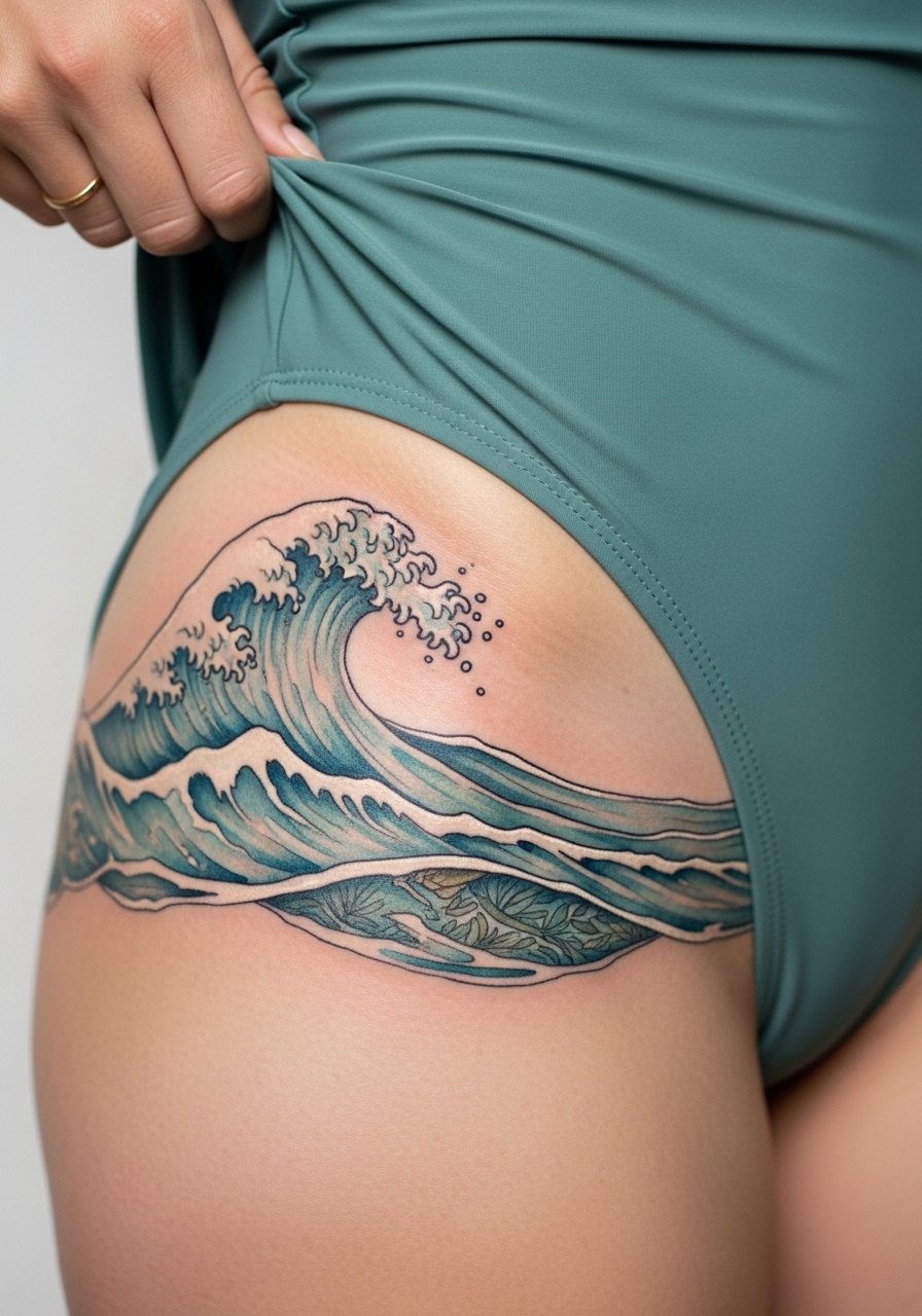
A wave plays naturally with the hip's curve and benefits from directional strokes so the motion reads even as color fades. Tell your artist you want a few darker anchor strokes in the troughs so the form keeps reading from a distance later. The hip moves a lot while walking, so expect the palest highlights to vanish first. Sessions involve layered passes and moderate discomfort near the hip bone. Avoid asking for very small, detailed foam droplets that will likely blur. For styling, a wrap skirt helps the wave show without full exposure.
15. Botanical Hip Panel That Follows the Pelvic Line
A vertical panel gives a framed look and is forgiving for gradual additions. The pelvic line is an area that experiences friction, so spacing is crucial. Ask the artist to place larger leaf shapes and keep washes out of the crease where fabric rubs. Sessions can be broken into two shorter appointments to avoid prolonged pressure on sensitive skin. A frequent error is packing too many tiny leaves tightly. For show-off outfits, a high-slit skirt reveals the panel artfully.
16. Micro-Realism Shell with Watercolor Foil
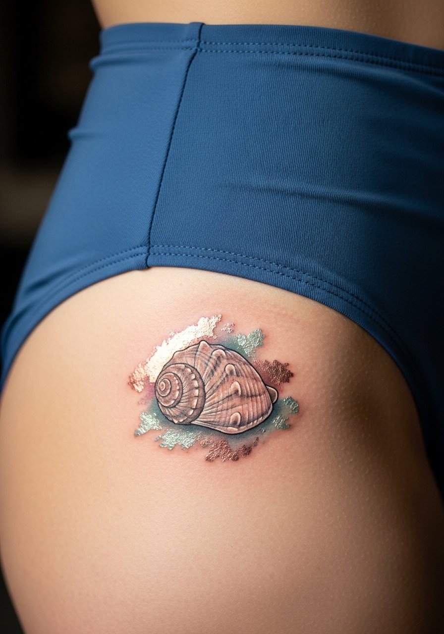
Micro-realism benefits from contrast between crisp detail and loose watercolor. On the hip, fine texture holds when the artist balances crisp edges and airy fills. Tell the artist you want detailed focal points and loose surrounding washes so the realism survives early fading. The session can be technical and longer than a simple wash, so plan a sit-down of one to two hours. A mistake is asking for too much tiny internal shading that the washes will obscure. For the appointment, wear stretchy high-rise swimwear so fabric does not press on the fresh piece.
17. Constellation Arc Along the Hip with Soft Color Halos
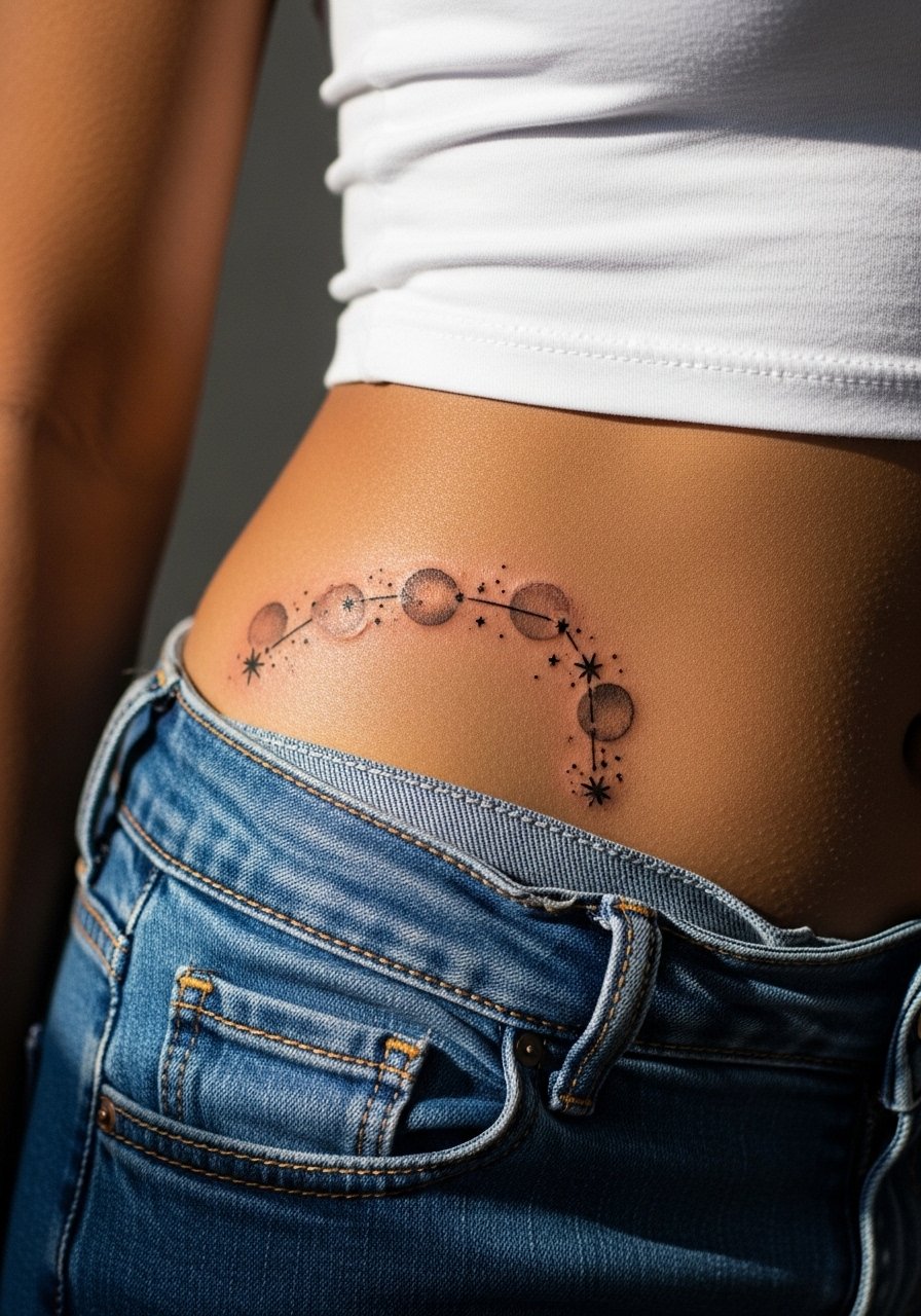
A constellation arc reads well when plotted with even spacing and small negative gaps. Because each point is small, tell your artist to keep a few slightly larger anchor stars to prevent merging. The hip is forgiving of this layout and touch-ups are straightforward if you want to add stars later. One common mistake is clustering too many tiny points in a narrow area. Session time is usually short. For casual reveals, roll the top of low-rise jeans and let a few points peek out.
Frequently Asked Questions
Q: How painful is getting a watercolor tattoo on the hip compared with other placements?
A: The hip sits in the middle of the pain scale. Expect sharper sensations near the hip bone and milder discomfort on the fatty upper thigh. Numbing cream and short breaks help, and planning session length to your comfort level is worth discussing with your artist.
Q: Will watercolor on the pelvic area fade faster because of clothing friction and sweat?
A: Yes, pelvic placements see more friction from waistbands and daily movement, which speeds up the fading of pale washes. Positioning the main color fields away from elastic lines and choosing slightly bolder anchors helps longevity. Protective film during high-activity days in the first week also reduces friction issues.
Q: Should a watercolor hip tattoo have outlines if I want it to last?
A: There are two camps. One prefers no outlines for a pure painterly effect. The other adds outlines to retain shape as washes fade. If longevity matters, discuss subtle outlines or anchor points with your artist so the piece keeps form without losing its watercolor feel.
Q: How often should I expect touch-ups for watercolor hip pieces?
A: It depends on sun exposure and friction, but many people plan for a color refresh around year two to three. Lighter washes and very pale palettes may need earlier attention. Keep touch-up expectations realistic when you choose scale and saturation.
Q: What should I wear to the appointment for a hip or pelvic tattoo?
A: Wear clothing that gives the artist clear access without exposing more than you want, such as high-waisted shorts or loose drawstring bottoms. Comfort matters because shifting or tight fabric can irritate the area during and after the session.